The shadow attributes implemented in css3 include: 1. text-shadow attribute, which can achieve text shadow effect; 2. box-shadow attribute, which can achieve border shadow effect; 3. filter attribute, which needs to be combined with drop-shadow() Used together with the function, you can set a shadow effect on the image.

The operating environment of this tutorial: Windows 7 system, CSS3&&HTML5 version, Dell G3 computer.
css3 implements shadow attribute
1. text-shadow attribute---implements text shadow effect
The text-shadow property is used to set shadowed text; you can set the pixel length, width and blur distance of the shadow, as well as the color of the shadow.
<!DOCTYPE html>
<html>
    <head>
        <meta charset="UTF-8">
        <title>css设置文本阴影效果</title>
        <style>
            h1 {
                color: red;
                text-shadow: 3px 5px 5px #656B79;
            }
        </style>
    </head>
    <body>
        <h1>文本阴影!</h1>
    </body>
</html>
2. box-shadow attribute--achieve border shadow effect
The box-shadow attribute can apply shadow to text Box, you can set the pixel length, width and blur distance of the shadow as well as the color of the shadow.
box-shadow can add shadows to elements, supporting adding one or more.
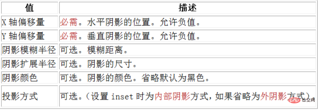
box-shadow: X轴偏移量 Y轴偏移量 阴影模糊半径 阴影扩展半径 阴影颜色 投影方式;
Parameters:

Note: inset can be written in the first or last parameter, other positions are invalid.
This parameter is optional. The value can only be positive. If the value is 0, it means that the shadow has no blur effect. The larger the value, the smaller the edge of the shadow. Vague.
css code:
#box{
     width:50px;
     height:50px;
     background:#fff;
     box-shadow:4px 4px 15px #666;
}Effect:

Shadow expansion radius:
This The parameter is optional, and the value can be positive or negative. If the value is positive, the entire shadow will expand and expand. Otherwise, if the value is negative, it will shrink.
css code:
#box{
     width:50px;
     height:50px;
     background:#fff;
     box-shadow:4px 4px 15px -3px #666;
}Effect:

X-axis offset And the Y-axis offset value can be set to a negative number
The X-axis offset is a negative number:
#box{
    width:50px;
    height:50px;
    background:#fff;
    box-shadow:-5px 5px 5px #666;
}Effect:

Y-axis offset is negative:
#box{
    width:50px;
    height:50px;
    background:#fff;
    box-shadow:5px -5px 5px #666;
}Effect:

#box{
     width:50px;
     height:50px;
     background:green;
     box-shadow:5px 4px 10px #666;
}
#box{
     width:50px;
     height:50px;
     background:#fff;
     box-shadow:5px 4px 10px #666 inset;
}
#box{
     width:50px;
     height:50px;
     background:#fff;
     box-shadow:5px 4px 10px #666 inset,
                3px 3px 5px pink,
                6px 4px 2px green;
}
3. filter attribute
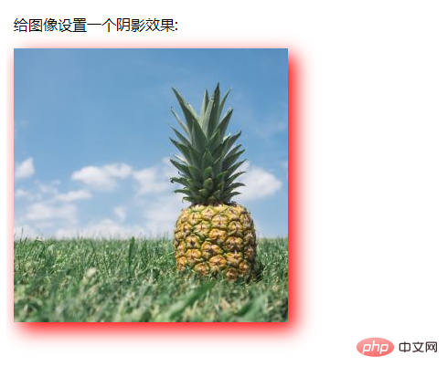
The filter attribute defines the element (usually ) Visual effect, when used with the drop-shadow() function, can set a shadow effect on the image.
 filter:drop-shadow(h-shadow v-shadow blur spread color);
查看
<!DOCTYPE html>
<html>
<head>
<style>
img {
    -webkit-filter: drop-shadow(8px 8px 10px red); /* Chrome, Safari, Opera */
    filter: drop-shadow(8px 8px 10px red);
}
</style>
</head>
<body>

<p>给图像设置一个阴影效果:</p>

<img src="/static/imghw/default1.png"  data-src="pineapple.jpg"  class="lazy"   alt="Pineapple"    style="max-width:90%"  style="max-width:90%">

</body>
</html>
(学习视频分享:css视频教程)
The above is the detailed content of What are the shadow attributes implemented in css3. For more information, please follow other related articles on the PHP Chinese website!