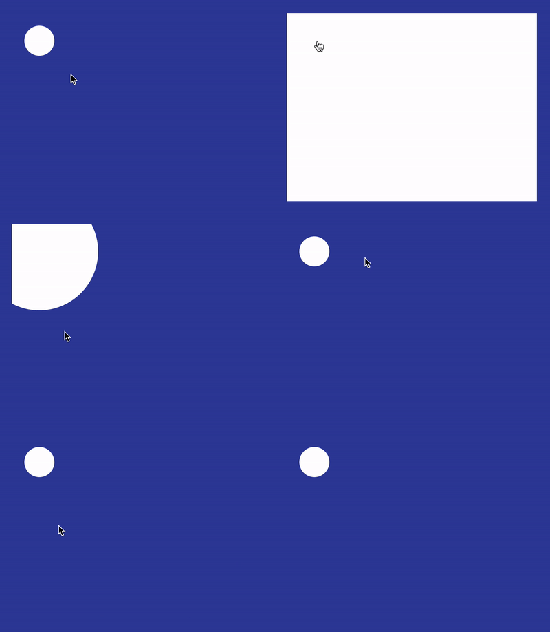
CSS3 clip-path property in action: dynamic area cropping
This article will take you to understand CSS3 clip-path (clipping path) and introduce how to use clip-path to achieve dynamic area cropping. I hope it will be helpful to everyone!

I visited CodePen today and saw such an interesting effect:

CodePen Demo -- Material Design Menu By Bennett Feely
Website: https://codepen.io/bennettfeely/pen/fHdFb
There are still some points worth exploring and learning about this effect. Let’s take a look. Get up and take a look.
How to achieve such a similar effect?
First of all, think about it, if you were asked to achieve the above effect, what would you do?
Here I simply list some possible methods:
shade box-shadow
-
gradient radial-gradient
Scale transform: scale()
Quickly go through one by one.
Use box-shadow to achieve
If you use box-shadow, the code is roughly as follows:
<div class="g-container">
    <div class="g-item"></div>
</div>The core is:
The outer layer has a mask set with
overflow: hideenWhen the inner element hovers, implement a
box-shadow : 0 0 0 0 #ffftobox-shadow: 0 0 0 420px #fffChange
The effect is as follows:

The overall animation is simulated, but its most fatal problems are two:
When our mouse leaves the circle, the entire animation The animation begins to proceed in reverse, and the white area begins to disappear. If we want to perform button operations, it cannot be completed.
Elements hidden within the rectangle after the animation is expanded are not easy to place.
So, box-shadow looks good, but I can only give up.
The code of the above Demo--CodePen Demo--box-shadow zoom in animation
Website: https://codepen.io/Chokcoco/pen/jOLRQNy
Use gradient radial-gradient to achieve
Below we use radial gradient radial-gradient Add CSS @property, you can also restore the above effect:
.g-container {
    position: relative;
    width: 400px;
    height: 300px;
    overflow: hidden;
}

.g-item {
    position: absolute;
    width: 48px;
    height: 48px;
    border-radius: 50%;
    background: #fff;
    top: 20px;
    left: 20px;
    box-shadow: 0 0 0 0 #fff;
    transition: box-shadow .3s linear;

    &:hover {
        box-shadow: 0 0 0 420px #fff;
    }
}<div class="g-container"></div>
By controlling the animation effect of the radial gradient, when hovering, the original small circle background becomes a large circle background. The effect is as follows:
- Because it is a change in the background, the mouse does not need to hover over the small circle, it only needs to enter the range of the div, and the animation will start. , this is obviously wrong
- Similar to the first
box-shadow
method, the DOM of the navigation element hidden under white is not easy to place
The code of the above Demo -- CodePen Demo -- radial-gradient zoom in animationWebsite: https://codepen.io/Chokcoco/pen/RwZOqWbemmm, there is another method, by scaling
transform: scale(), there will be certain problems, so I won’t continue to expand here.
- The mouse must hover over the circle to start the animation, and the mouse can be moved after the expansion. Move freely within the range without retracting the animation effect
- After the animation is expanded, the placement of the DOM inside should not be too troublesome. It is best if you can control the display and hiding of the content inside without using Javascript.
dynamic area cropping.
In my article --How to implement overflow: hidden without using overflow: hidden? , introduces several ways to clip elements in CSS, and among them, the most suitable one to use this effect is -- clip-path.
Usingclip-path, the dynamic clipping function can be very well implemented, and the code is also very simple:
@property --size {
syntax: '<length>';
inherits: false;
initial-value: 24px;
}
.g-container {
position: relative;
width: 400px;
height: 300px;
overflow: hidden;
background: radial-gradient(circle at 44px 44px, #fff 0, #fff var(--size), transparent var(--size), transparent 0);
transition: --size .3s linear;
&:hover {
--size: 450px;
}
}<div class="g-container"></div>
clip -path, at the beginning, use clip-path: circle(20px at 44px 44px) to cut a rectangular div into a circle. When hovering, expand the radius of the cutting circle to the entire rectangular range.
这样,我们就能完美的实现题图的效果,并且,内置的 DOM 元素,直接写进这个 div 内部即可。
<div class="g-container">
    <ul>
        <li>11111</li>
        <li>22222</li>
        <li>33333</li>
        <li>44444</li>
    </ul>
</div>效果如下:
CodePen Demo -- clip-path zoom in animation
网址:https://codepen.io/Chokcoco/pen/yLorrRm
很有意思的一个技巧,利用 clip-path 实现动态区域裁剪,希望大家能够掌握。
最后
好了,本文到此结束,希望本文对你有所帮助 :)
(学习视频分享:css视频教程)
The above is the detailed content of CSS3 clip-path property in action: dynamic area cropping. For more information, please follow other related articles on the PHP Chinese website!

Hot AI Tools

Undresser.AI Undress
AI-powered app for creating realistic nude photos

AI Clothes Remover
Online AI tool for removing clothes from photos.

Undress AI Tool
Undress images for free

Clothoff.io
AI clothes remover

Video Face Swap
Swap faces in any video effortlessly with our completely free AI face swap tool!

Hot Article

Hot Tools

Notepad++7.3.1
Easy-to-use and free code editor

SublimeText3 Chinese version
Chinese version, very easy to use

Zend Studio 13.0.1
Powerful PHP integrated development environment

Dreamweaver CS6
Visual web development tools

SublimeText3 Mac version
God-level code editing software (SublimeText3)

Hot Topics
 1386
1386
 52
52
 How to achieve wave effect with pure CSS3? (code example)
Jun 28, 2022 pm 01:39 PM
How to achieve wave effect with pure CSS3? This article will introduce to you how to use SVG and CSS animation to create wave effects. I hope it will be helpful to you!
 Use CSS skillfully to realize various strange-shaped buttons (with code)
Jul 19, 2022 am 11:28 AM
This article will show you how to use CSS to easily realize various weird-shaped buttons that appear frequently. I hope it will be helpful to you!
 How to hide elements in css without taking up space
Jun 01, 2022 pm 07:15 PM
Two methods: 1. Using the display attribute, just add the "display:none;" style to the element. 2. Use the position and top attributes to set the absolute positioning of the element to hide the element. Just add the "position:absolute;top:-9999px;" style to the element.
 How to implement lace borders in css3
Sep 16, 2022 pm 07:11 PM
In CSS, you can use the border-image attribute to achieve a lace border. The border-image attribute can use images to create borders, that is, add a background image to the border. You only need to specify the background image as a lace style; the syntax "border-image: url (image path) offsets the image border width inward. Whether outset is repeated;".
 It turns out that text carousel and image carousel can also be realized using pure CSS!
Jun 10, 2022 pm 01:00 PM
How to create text carousel and image carousel? The first thing everyone thinks of is whether to use js. In fact, text carousel and image carousel can also be realized using pure CSS. Let’s take a look at the implementation method. I hope it will be helpful to everyone!
 How to enlarge the image by clicking the mouse in css3
Apr 25, 2022 pm 04:52 PM
Implementation method: 1. Use the ":active" selector to select the state of the mouse click on the picture; 2. Use the transform attribute and scale() function to achieve the picture magnification effect, the syntax "img:active {transform: scale(x-axis magnification, y Axis magnification);}".
 How to set animation rotation speed in css3
Apr 28, 2022 pm 04:32 PM
In CSS3, you can use the "animation-timing-function" attribute to set the animation rotation speed. This attribute is used to specify how the animation will complete a cycle and set the speed curve of the animation. The syntax is "element {animation-timing-function: speed attribute value;}".
 Does css3 animation effect have deformation?
Apr 28, 2022 pm 02:20 PM
The animation effect in css3 has deformation; you can use "animation: animation attribute @keyframes ..{..{transform: transformation attribute}}" to achieve deformation animation effect. The animation attribute is used to set the animation style, and the transform attribute is used to set the deformation style. .


