 Web Front-end
 uni-app
 A brief analysis of how to create a pull-up load pull-down refresh component in uniapp
A brief analysis of how to create a pull-up load pull-down refresh component in uniapp
uniapp中怎么创建上拉加载下拉刷新组件?下面本篇文章给大家分享一个uniapp 自定义上拉加载下拉刷新组件的实现方法,希望对大家有所帮助!

该组件是结合
uview框架写的,主要结合了里面的u-loadmore组件,可配置下拉刷新加载圈的颜色及背景色,暂无数据时的图等,突出的特点就是通过设置组件的高度,适配刘海屏iPhone,且支持嵌套在各种盒子中。
iPhone手机即使我们没有开启原生的下拉刷新,上拉加载,默认也可以进行下拉和上拉的动作,我们可以在配置文件中关闭 "(disableScroll": true )。
"globalStyle": {
    "disableScroll": true ,
    "navigationStyle": "custom", // 隐藏系统导航栏
    "navigationBarTextStyle": "white"
},组件最终实现效果图
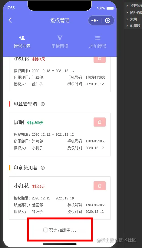

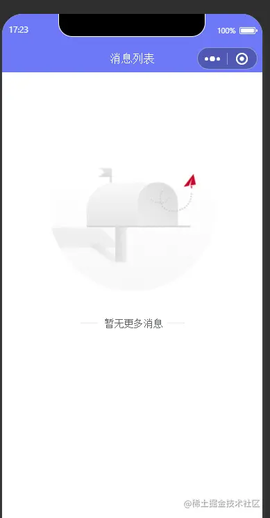
了解整个页面的结构,计算准确的滚动组件的高度

配置项个别详解
    //暂无数据的类型,就是根据不同的场景展示不同的暂无数据的图片,
    _type:{
            default:'',
            type:String
},比如列表中暂无数据(_type:nodata)

消息列表中暂无数据(_type:nomsg)

    //除了标题栏和状态栏以外的高度
    otherHeight: {
            default: 0,
            type: Number
},otherHeight具体指页面中(不确定元素)的高度,不理解请看整个页面的结构图
组件使用
1、在根目录下创建components文件夹,定义全局组件,组件名建议xxx-功能.vue,例如safe-scrollbox.vue
2、注册为全局组件(page.json)
"easycom": {
    "autoscan": true, //是否开启自动扫描,开启后将会自动扫描符合components/组件名称/组件名称.vue目录结构的组件
    "safe-(.*)": "@/components/safe-$1.vue", // 匹配components目录下组件名称/组件名称内的vue文件
    "^u-(.*)": "@/uview-ui/components/u-$1/u-$1.vue"
},3、页面内使用
<safe-scrollbox @lowerFun="lowerFun" @refreshFun="refreshFun" :otherHeight="otherHeight"
    _type="nodata" :list="sealListArr" :status="loadStatus" :isRefresh="isRefresh" bgColor="#fff">
    <view class="seal-list-container" slot="contBox">
            <sealList @showActionBox="showActionBox" :list="sealListArr" :loadings="loadings"></sealList>
    </view>
</safe-scrollbox>
组件完整代码
<template>
<!-- 滚动组件外层的框-->
<view class="">
<!-- 滚动区域 -->
<scroll-view class="scroll-component" :scroll-top="scrollTop" scroll-y="true"
:style="{
height: `calc(100vh - ${statusBarHeight}px - ${navbarHeight}px - ${otherHeight}rpx - env(safe-area-inset-bottom) )`,
}"
:lower-threshold="150"
:refresher-triggered="triggered"
:refresher-enabled="true"
refresher-default-style="none"
:refresher-threshold="20"
@refresherpulling="onPulling"
@scrolltoupper="upper" @scrolltolower="lower"
@scroll="scroll"
@refresherrefresh="refresh"
@refresherrestore="restore">
<!-- 下拉刷新提示 -->
<u-loadmore status="loading" bgColor="#fff" v-if="triggered" :icon-color="activeColor" :color="activeColor" :load-text="refreshText" margin-top="30" margin-bottom="30"/>
<slot name="contBox"> </slot>
<!-- 暂无数据 -->
<view class="no-data-box" v-if="_type&&list.length==0">
<image v-if="_type=='nodata'" mode="aspectFit"></image>
<image src="../static/imgs/nofile.png" v-if="_type=='nofile'" mode="aspectFit"></image>
<image src="../static/imgs/nomsg.png" v-if="_type=='nomsg'" mode="aspectFit"></image>
<image src="../static/imgs/nospace.png" v-if="_type=='nospace'" mode="aspectFit"></image>
<image src="../static/imgs/nofile.png" v-if="_type=='nofile'" mode="aspectFit"></image>
</view>
<!-- 上拉加载 -->
<u-loadmore :status="status" :load-text="loadText" margin-top="30" margin-bottom="30"/>
</scroll-view>
<!-- 回到顶部 -->
<view @tap="goTop" class="go-top" v-if="old.scrollTop>500">
<u-icon name="arrow-upward" color="#909399" size="56"></u-icon>
</view>
</view>
</template>import { mapGetters } from 'vuex';
export default {
props: {
// 这个数组结合暂无数据的类型主要是控制暂无数据模块的展示与隐藏
list: {
default: [],
type: Array
},
//暂无数据的类型
_type: {
default: '',
type: String
},
//控制上拉加载时提示 loadmore代表还可以继续上拉加载 nomore没有更多数据 loading 加载中
status: {
default: 'loadmore',
type: String
},
//结合这个控制下拉刷新时加载圈的显示隐藏
isRefresh: {
default: false,
type: Boolean
},
//除了标题栏和状态栏以外的高度
otherHeight: {
default: 0,
type: Number
},
//下拉加载时加载圈的背景色
bgColor: {
default: '',
type: String
},
//加载中,上拉加载时,暂无更多数据时所提示的文案
loadText: {
default: {
loadmore: '轻轻上拉获取更多数据',
loading: '努力加载中...',
nomore: '暂无更多数据'
},
type: Object
}
},
computed: {
triggered() {
return this.isRefresh;
},
...mapGetters(['activeColor', 'statusBarHeight', 'navbarHeight', 'skeletonColor'])
},
data() {
return {
old: {
scrollTop: 0
},
scrollTop: 0,
refreshText: {
loading: '正在获取最新数据...'
} //刷新文案
};
},
methods: {
onPulling() {
// 下拉
this.$emit('refreshFun');
// this.triggered = true; //下拉加载,先让其变true再变false才能关闭
},
// 自定义下拉刷新控件被下拉
refresh(e) {},
// 刷新重置
restore() {
// this.triggered = 'restore'; // 需要重置
},
// 刷新终止
onAbort() {
// console.log("onAbort");
},
upper: function(e) {
console.log(e);
},
// 上拉加载
lower: function(e) {
// console.log('上拉加载')
this.$emit('lowerFun');
// console.log(e)
// this.status='loading'
},
scroll: function(e) {
this.old.scrollTop = e.detail.scrollTop;
},
goTop: function(e) {
this.scrollTop = this.old.scrollTop;
this.$nextTick(() => {
this.scrollTop = 0;
});
}
}
};.scroll-component {
width: 750rpx;
overflow-y: scroll;
}
/deep/ .u-loading-circle {
display: flex;
align-items: center;
justify-content: center;
height: 80rpx;
width: 750rpx;
}
.go-top {
position: fixed;
bottom: 208rpx;
right: 0;
z-index: 2;
background-color: red;
width: 100rpx;
height: 100rpx;
display: flex;
justify-content: center;
align-items: center;
background: #606266;
border-radius: 50%;
}
.no-data-box {
width: 750rpx;
display: flex;
align-items: center;
justify-content: center;
padding-top: 20%;
margin-bottom: 10%;
image {
max-width: 600rpx;
}
}推荐:《uniapp教程》
The above is the detailed content of A brief analysis of how to create a pull-up load pull-down refresh component in uniapp. For more information, please follow other related articles on the PHP Chinese website!

Hot AI Tools

Undresser.AI Undress
AI-powered app for creating realistic nude photos

AI Clothes Remover
Online AI tool for removing clothes from photos.

Undress AI Tool
Undress images for free

Clothoff.io
AI clothes remover

AI Hentai Generator
Generate AI Hentai for free.

Hot Article

Hot Tools

Notepad++7.3.1
Easy-to-use and free code editor

SublimeText3 Chinese version
Chinese version, very easy to use

Zend Studio 13.0.1
Powerful PHP integrated development environment

Dreamweaver CS6
Visual web development tools

SublimeText3 Mac version
God-level code editing software (SublimeText3)

Hot Topics
 How to start preview of uniapp project developed by webstorm
Apr 08, 2024 pm 06:42 PM
Steps to launch UniApp project preview in WebStorm: Install UniApp Development Tools plugin Connect to device settings WebSocket launch preview
 Which one is better, uniapp or mui?
Apr 06, 2024 am 05:18 AM
Generally speaking, uni-app is better when complex native functions are needed; MUI is better when simple or highly customized interfaces are needed. In addition, uni-app has: 1. Vue.js/JavaScript support; 2. Rich native components/API; 3. Good ecosystem. The disadvantages are: 1. Performance issues; 2. Difficulty in customizing the interface. MUI has: 1. Material Design support; 2. High flexibility; 3. Extensive component/theme library. The disadvantages are: 1. CSS dependency; 2. Does not provide native components; 3. Small ecosystem.
 What basics are needed to learn uniapp?
Apr 06, 2024 am 04:45 AM
uniapp development requires the following foundations: front-end technology (HTML, CSS, JavaScript) mobile development knowledge (iOS and Android platforms) Node.js other foundations (version control tools, IDE, mobile development simulator or real machine debugging experience)
 What are the disadvantages of uniapp
Apr 06, 2024 am 04:06 AM
UniApp has many conveniences as a cross-platform development framework, but its shortcomings are also obvious: performance is limited by the hybrid development mode, resulting in poor opening speed, page rendering, and interactive response. The ecosystem is imperfect and there are few components and libraries in specific fields, which limits creativity and the realization of complex functions. Compatibility issues on different platforms are prone to style differences and inconsistent API support. The security mechanism of WebView is different from native applications, which may reduce application security. Application releases and updates that support multiple platforms at the same time require multiple compilations and packages, increasing development and maintenance costs.
 Which is better, uniapp or native development?
Apr 06, 2024 am 05:06 AM
When choosing between UniApp and native development, you should consider development cost, performance, user experience, and flexibility. The advantages of UniApp are cross-platform development, rapid iteration, easy learning and built-in plug-ins, while native development is superior in performance, stability, native experience and scalability. Weigh the pros and cons based on specific project needs. UniApp is suitable for beginners, and native development is suitable for complex applications that pursue high performance and seamless experience.
 In-depth comparison between Flutter and uniapp: explore their similarities, differences and characteristics
Dec 23, 2023 pm 02:16 PM
In the field of mobile application development, Flutter and uniapp are two cross-platform development frameworks that have attracted much attention. Their emergence enables developers to quickly and efficiently develop applications that support multiple platforms simultaneously. However, despite their similar goals and uses, there are some differences in details and features. Next, we will compare Flutter and uniapp in depth and explore their respective characteristics. Flutte is an open source mobile application development framework launched by Google. Flutter
 What component library does uniapp use to develop small programs?
Apr 06, 2024 am 03:54 AM
Recommended component library for uniapp to develop small programs: uni-ui: Officially produced by uni, it provides basic and business components. vant-weapp: Produced by Bytedance, with a simple and beautiful UI design. taro-ui: produced by JD.com and developed based on the Taro framework. fish-design: Produced by Baidu, using Material Design design style. naive-ui: Produced by Youzan, modern UI design, lightweight and easy to customize.


