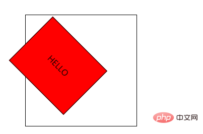
In CSS, you can use the "transform-Origin" attribute to set the position of the rotation point of the element. This attribute allows you to change the position of the transformed element. You can set the distance between the element after transformation and the X, Y and Z axes respectively. Position, the syntax is "transform-origin:X-axis direction, Y-axis direction, Z-axis direction;".

The operating environment of this tutorial: Windows 10 system, CSS3&&HTML5 version, Dell G3 computer.
css3How to set the rotation point position
The transform-Origin property allows you to change the position of the transformed element.
2D transform elements can change the X and Y axes of the element. Transform elements in 3D and also change the Z-axis of the element.
When the transform-origin attribute is not set, the rotation, shift, scaling and other operations performed by CSS deformation are deformed based on the position of the element's own center (deformation origin/center point). The transform-origin attribute in CSS3 is used to set the base point position of the rotated element. Familiar use of transform-origin combined with CSS3 animation can cause the element to rotate, shift, etc. along a certain base point.
The example is as follows:
<html>
<head>
<meta charset="utf-8">
<title>123</title>
<style>
#div1
{
position: relative;
height: 200px;
width: 200px;
margin: 100px;
padding:10px;
border: 1px solid black;
}
#div2
{
padding:50px;
position: absolute;
border: 1px solid black;
background-color: red;
transform: rotate(45deg);
transform-origin:20% 40%;
-ms-transform: rotate(45deg); /* IE 9 */
-ms-transform-origin:20% 40%; /* IE 9 */
-webkit-transform: rotate(45deg); /* Safari and Chrome */
-webkit-transform-origin:20% 40%; /* Safari and Chrome */
}
</style>
</head>
<body>
<div id="div1">
  <div id="div2">HELLO</div>
</div>
</body>
</html>Output result:

(Learning video sharing: css video tutorial)
The above is the detailed content of How to set the rotation point position in css3. For more information, please follow other related articles on the PHP Chinese website!