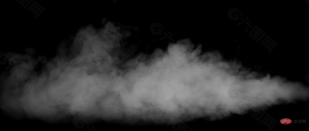
The fuzzy and grainy smoke effect can also be achieved with pure CSS. In this article, we will take a step-by-step look at whether we can better achieve some smoke effects using pure CSS.
Like this:

Look carefully at the smoke effect, there are two important features:
First look at the blur effect. When thinking of blur, most students will first think of using filter: blur().
Of course that's true, but in CSS, in addition to filters, we can also use a type of other means to simulate the blurring effect.
Let’s first look at such an effect:

Suppose, we have Such a character:
<span>C</span>
We can simulate the effect of smoke just by changing the text-shadow opacity:
span {
  text-shadow: 0 0 0 whitesmoke;
  animation: smoky 5s;
}

@keyframes smoky {
  to {
    text-shadow: 0 0 20px whitesmoke;
    opacity: 0;
  }
}Look Effect:

On the basis of the above, we can add displacement, rotation, scaling, slightly transform the above code, and add some transform transformations:
span {
  text-shadow: 0 0 0 whitesmoke;
  animation: smoky 5s;
}

@keyframes smoky {
  to {
    transform:
      translate3d(200px, -80px, 0)
      rotate(-40deg)
      skewX(70deg)
      scale(1.5);
    text-shadow: 0 0 20px whitesmoke;
    opacity: 0;
  }
}You can get the following effect:

After superimposing transform, a word will be blown away and become The feeling of smoke. On this basis, we only need to put multiple words together and use animation-delay to sequentially control each word to trigger the animation effect to get the complete smoke effect mentioned above.
The pseudo code is as follows:
    <span>C</span>
    S
    S
    // ...
// ... 上述所有 CSS 代码

@for $item from 1 through 21 {
  span:nth-of-type(#{$item}){
    animation-delay: #{(($item/10))}s;
  }
}You can get the effect of a word blown away by the wind and turned into smoke:

The above effect is not my original creation, it was first seen by this author--CodePen Demo--Smoky Text By Bennett Feely
https://codepen.io/bennettfeely/pen/lgybC
The smoke in the above smoke animation is still relatively rough. Mainly because it lacks a bit of graininess? Some of the smoke texture is missing.
To achieve a more refined smoke effect, we have to use SVG's <feturbulence> filter
We will use filter: blur next () Use <feturbulence> filter to get a more realistic smoke effect.
For a simple example, suppose there are several words like this:
<div">SMOKE</div>
Simple CSS:
div {
    background: linear-gradient(#fff, #999, #ddd, #888);
    background-clip: text;
}Get several words with gradient colors like this:
We use <feturbulence> filter to do a simple process:
<div>SMOKE</div>

<svg width="0">
  <filter id="filter">
    <feTurbulence id="turbulence" type="fractalNoise" baseFrequency=".03" numOctaves="20" />
    <feDisplacementMap in="SourceGraphic" scale="30" />
  </filter>
</svg>Use of CSSfilter: url()Introduce this filter. For better effect, I introduced this filter directly on <body>:
body {
    filter: url('#filter');
}
div {
    background: linear-gradient(#fff, #999, #ddd, #888);
    background-clip: text;
}Our font is <feturbulence> ; The filter gives a fluid feeling:
This effect can be said to have basically nothing to do with the smoke effect, but you only need to add a blur filter. A magical thing happened:
body {
    filter: url('#filter');
}
div {
    background: linear-gradient(#fff, #999, #ddd, #888);
    background-clip: text;
    filter: blur(5px);
}The whole effect instantly smoked a lot:
Okay, add it For looping animation effects, simply use JavaScript to process it:
const filter = document.querySelector("#turbulence");
let frames = 1;
let rad = Math.PI / 180;
let bfx, bfy;

function freqAnimation() {
    frames += .2

    bfx = 0.03;
    bfy = 0.03;

    bfx += 0.005 * Math.cos(frames * rad);
    bfy += 0.005 * Math.sin(frames * rad);

    bf = bfx.toString() + " " + bfy.toString();
    filter.setAttributeNS(null, "baseFrequency", bf);

    window.requestAnimationFrame(freqAnimation);
}

window.requestAnimationFrame(freqAnimation);Look at the effect:
For the complete code above, you can click here :CodePen CSS SVG Text Smoke Effect
https://codepen.io/Chokcoco/pen/wvrrwVM
Of course, the above effects can be passed:
Control<feturbulence>baseFrequencyAttribute adjustment
<feturbulence>numOctaves Attribute adjustment
of control<fedisplacementmap></fedisplacementmap> Attribute adjustment
attribute of <feturbulence> from 30 to 70. Basically, the outline of the text cannot be seen, and the text is completely atomized. We can create a hover effect like this: <p><img src="https://img.php.cn/upload/image/996/914/687/164091795715346The%20fuzzy%20and%20grainy%20smoke%20effect%20can%20also%20be%20achieved%20with%20pure%20CSS!" title="164091795715346The fuzzy and grainy smoke effect can also be achieved with pure CSS!" alt="The fuzzy and grainy smoke effect can also be achieved with pure CSS!"></p>
<blockquote>
<p>For the complete code above, you can click here: CodePen CSS SVG Text Smoke Hover Effect</p>
<p>https://codepen.io/Chokcoco/pen/ Jjrrojj</p>
</blockquote>
<p>In this way, based on <code>filter: blur() and <feturbulence> filter, we can get a very realistic smoke effect, based on the above Demonstration, we can also explore many interesting effects, which we will not go into details in this article.
Okay, this article ends here, I hope this article will be helpful to you:)
(Learning video sharing: css video tutorial)
The above is the detailed content of The fuzzy and grainy smoke effect can also be achieved with pure CSS!. For more information, please follow other related articles on the PHP Chinese website!