 Web Front-end
 CSS Tutorial
 Use pure CSS to achieve the animation effect of rotating React icons
Use pure CSS to achieve the animation effect of rotating React icons
This article will take you step by step to use pure CSS to achieve the animation effect of rotating React icons. I hope it will be helpful to everyone!

剑气 loading effect in codepen. He was greatly surprised and was ## again. #CSS Impressed. I originally wanted to work with everyone to realize 剑气 loading. After searching, Xiaobao found that Mr. Xiao Lu had achieved it, so he stopped trying to do it. Is Xiao Bao a person who can be convinced? of course!
Xiao Bao racked his brains and came up with a very interesting pattern, which is simply the Jianqi
plus version.
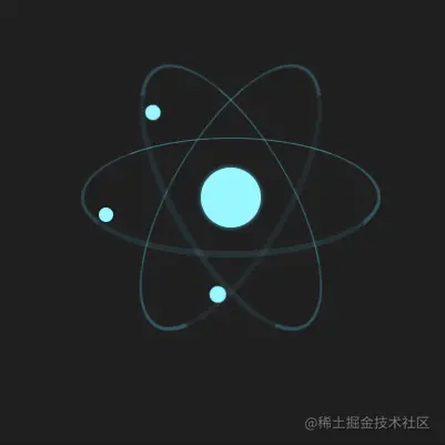
react Icon, so amazing, isn’t this Sword Qiplus? react Let the small package move*!

reacthttps://zcxiaobao.github .io/zc-demos/display/reactMoveLoading/index.html
react icon drawing
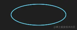
Everyone should be familiar with the icon, which consists of three identical icons. It consists of an ellipse and a central circle. Ellipses and circles are implemented using border-radius.
- html
-
<div class="react">
    <div class="electron"></div>
    <div class="electron-alpha"></div>
    <div class="electron-omega"></div>
</div>
Copy after login
.react > [class^="electron"] {
    border: #5ed3f3 solid 2px;
    border-radius: 100%;
    width: 100%;
    /* CSS变量 --electron-orbit-size值为72px */
    height: var(--electron-orbit-size);
}
Copy after login
- 60deg
- and
-60deg## respectively#<div class="code" style="position:relative; padding:0px; margin:0px;"><pre class='brush:php;toolbar:false;'>.electron-alpha { transform: rotate(60deg); } .electron-omega { transform: rotate(-60deg); }</pre><div class="contentsignin">Copy after login</div></div>Use
- pseudo-element to draw the center circle, and use absolute positioning to position the center circle to the center.
- react
The icon drawing is completed.<div class="code" style="position:relative; padding:0px; margin:0px;"><pre class='brush:php;toolbar:false;'>.react:before { position: absolute; top: 50%; left: 50%; width: var(--nucleus-size); height: var(--nucleus-size); margin-top: calc(var(--nucleus-size) / -2); margin-left: calc(var(--nucleus-size) / -2); background: var(--electron-color-hex); } .react > [class^="electron"] { position: absolute; top: 50%; margin-top: calc(var(--electron-orbit-size) / -2); }</pre><div class="contentsignin">Copy after login</div></div>
react icon animation design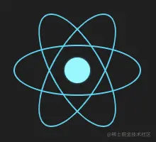
The number of days is fifty, Dao Yan is forty-nine, there is still a glimmer of hope, and it may be missing. It will form a special beauty.
Assume that the starting state isSo let’s try to remove part of the ellipse to see if it will create a cool dynamic effect?
border-left
is missing, and then it is missing in the order ofleft,bottom,right,top. Let’s take a look at the animation effect. Set animation
- Switch missing edges in order
<div class="code" style="position:relative; padding:0px; margin:0px;"><pre class='brush:php;toolbar:false;'>@keyframes electron-orbit {
  0% {
    border-top: rgba(94, 211, 243, 1) solid 2px;
    border-right: rgba(94, 211, 243, 1) solid 2px;
    border-bottom: rgba(94, 211, 243, 1) solid 2px;
    border-left: rgba(94, 211, 243, 0) solid 2px;
  }
  25% {
    border-top: rgba(94, 211, 243, 1) solid 2px;
    border-right: rgba(94, 211, 243, 1) solid 2px;
    border-bottom: rgba(94, 211, 243, 0) solid 2px;
    border-left: rgba(94, 211, 243, 1) solid 2px;
  }
  50% {
    border-top: rgba(94, 211, 243, 1) solid 1px;
    border-right: rgba(94, 211, 243, 0) solid 2px;
    border-bottom: rgba(94, 211, 243, 1) solid 4px;
    border-left: rgba(94, 211, 243, 1) solid 2px;
  }
  75% {
    border-top: rgba(94, 211, 243, 0) solid 2px;
    border-right: rgba(94, 211, 243, 1) solid 2px;
    border-bottom: rgba(94, 211, 243, 1) solid 2px;
    border-left: rgba(94, 211, 243, 1) solid 2px;
  }
  100% {
    border-top: rgba(94, 211, 243, 1) solid 2px;
    border-right: rgba(94, 211, 243, 1) solid 2px;
    border-bottom: rgba(94, 211, 243, 1) solid 2px;
    border-left: rgba(94, 211, 243, 0) solid 2px;
  }
}</pre><div class="contentsignin">Copy after login</div></div>
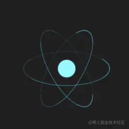
The overall effect of animation is still OK , but because the missing part is from 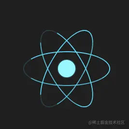 0 -> 1
Reduce the transparency of the display side, respectively
4px 2px 1px 0px
1.2s 1s 0.8s
 Only the line animation is still a bit monotonous. Continue to optimize and add small balls to the missing parts. The small balls move with the missing parts, and the small balls are also accompanied by a zooming-in effect.
@keyframes electron {
  0% {
    left: calc(var(--electron-size) / -1);
    transform: scale(1);
  }
  12.5% {
    top: 100%;
    transform: scale(1.5);
  }
  25% {
    left: 100%;
    transform: scale(1);
  }
  37.5% {
    top: 0%;
    transform: scale(0.25);
  }
  50% {
    left: calc(var(--electron-size) / -1);
    transform: scale(1);
  }
  62.5% {
    top: 100%;
    transform: scale(1.5);
  }
  75% {
    left: 100%;
    transform: scale(1);
  }
  87.5% {
    top: 0%;
    transform: scale(0.25);
  }
  100% {
    left: calc(var(--electron-size) / -1);
    transform: scale(1);
  }
} The icon moves
Add rotation, shrinking and zooming animations to the entire icon to complete the final
react loadingeffect
@keyframes react {
  0% {
    transform: rotate(0deg) scale(1);
  }
  12.5% {
    transform: rotate(-45deg) scale(0.9);
  }
  25% {
    transform: rotate(-90deg) scale(1);
  }
  37.5% {
    transform: rotate(-135deg) scale(0.9);
  }
  50% {
    transform: rotate(-180deg) scale(1);
  }
  62.5% {
    transform: rotate(-225deg) scale(0.9);
  }
  75% {
    transform: rotate(-270deg) scale(1);
  }
  87.5% {
    transform: rotate(-315deg) scale(0.9);
  }
  100% {
    transform: rotate(-360deg) scale(1);
  }
}https://zcxiaobao.github.io/zc-demos/display/reactMoveLoading/index.htmlProject address: react
Don’t forget to order a small bag if you find it helpful.(Learning video sharing: css video tutorial)
The above is the detailed content of Use pure CSS to achieve the animation effect of rotating React icons. For more information, please follow other related articles on the PHP Chinese website!

Hot AI Tools

Undresser.AI Undress
AI-powered app for creating realistic nude photos

AI Clothes Remover
Online AI tool for removing clothes from photos.

Undress AI Tool
Undress images for free

Clothoff.io
AI clothes remover

AI Hentai Generator
Generate AI Hentai for free.

Hot Article

Hot Tools

Notepad++7.3.1
Easy-to-use and free code editor

SublimeText3 Chinese version
Chinese version, very easy to use

Zend Studio 13.0.1
Powerful PHP integrated development environment

Dreamweaver CS6
Visual web development tools

SublimeText3 Mac version
God-level code editing software (SublimeText3)

Hot Topics
 How to play picture sequences smoothly with CSS animation?
Apr 04, 2025 pm 05:57 PM
How to achieve the playback of pictures like videos? Many times, we need to implement similar video player functions, but the playback content is a sequence of images. direct...
 How do you make sure that some operations are performed only once when using the useEffect hook in React's App.tsx?
Apr 04, 2025 pm 06:33 PM
In React projects, we often encounter problems with the use of lifecycle functions, especially when it comes to page refresh, how to ensure that certain operations only...
 The width of emsp spaces in HTML is inconsistent. How to reliably implement text indentation?
Apr 04, 2025 pm 11:57 PM
Regarding the problem of inconsistent width of emsp spaces in HTML and Chinese characters in many web tutorials, it is mentioned that occupying the width of a Chinese character, but the actual situation is not...
 How to use Vue 3 to implement up scrolling loading function similar to WeChat chat records?
Apr 04, 2025 pm 03:51 PM
How to achieve upward scrolling loading similar to WeChat chat records? When developing applications similar to WeChat chat records, a common question is how to...
 How to use CSS to achieve smooth playback effect of image sequences?
Apr 04, 2025 pm 04:57 PM
How to realize the function of playing pictures like videos? Many times, we need to achieve similar video playback effects in the application, but the playback content is not...
 How to implement a tight transition animation in React using react-transition-group?
Apr 04, 2025 pm 11:27 PM
Using react-transition-group in React to achieve confusion about closely following transition animations. In React projects, many developers will choose to use react-transition-group library to...
 【Rust Self-study】Introduction
Apr 04, 2025 am 08:03 AM
1.0.1 Preface This project (including code and comments) was recorded during my self-taught Rust. There may be inaccurate or unclear statements, please apologize. If you benefit from it, it's even better. 1.0.2 Why is RustRust reliable and efficient? Rust can replace C and C, with similar performance but higher security, and does not require frequent recompilation to check for errors like C and C. The main advantages include: memory security (preventing null pointers from dereferences, dangling pointers, and data contention). Thread-safe (make sure multi-threaded code is safe before execution). Avoid undefined behavior (e.g., array out of bounds, uninitialized variables, or access to freed memory). Rust provides modern language features such as generics
 How to quickly build a foreground page in a React Vite project using AI tools?
Apr 04, 2025 pm 01:45 PM
How to quickly build a front-end page in back-end development? As a backend developer with three or four years of experience, he has mastered the basic JavaScript, CSS and HTML...


