Bootstrap has two types of containers: 1. Fixed layout container. Put the default grid into the container of "class="container"" to create a fixed layout; 2. Fluid layout container, put the fluid layout container Put the grid into the fluid container with "class="container-fluid"" to create a fluid layout.

The operating environment of this tutorial: Windows7 system, bootsrap3.3.7 version, DELL G3 computer
Bootstrap container
In Bootstrap, containers are the basis of responsive layout. Bootstrap recommends that all content be defined in containers, and containers are an essential prerequisite for enabling the Bootstrap grid system.
Bootstrap provides two types of layout containers, one is a fixed-width layout container and the other is a fluid layout container. Placing the grid in some kind of container allows you to layout it accordingly.
Fixed layout
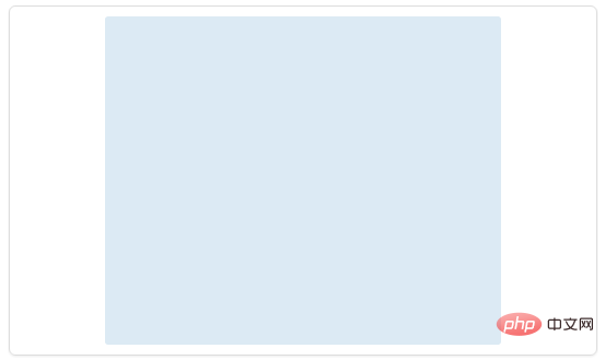
Put Bootstrap's default grid into a container with class="container" to create a fixed-width layout. Fixed layouts are centered on the entire page. For example:
<body>
  <div class="container">
    ...
  </div>
</body>The effect is as shown below (Bootstrap fixed layout container):

To put it simply, put all the content into class="container " container, you can create a centered, fixed-width layout. The specific examples are as follows:
<body>
  <div class="container">
    <div class="row">
      <div class="span4">span4</div>
      <div class="span8">span8</div>
    </div>
    <div class="row">
      <div class="span3">span3</div>
      <div class="span6">span6</div>
      <div class="span3">span3</div>
    </div>
  </div>
</body>The layout effect is shown in the figure below (Bootstrap fixed layout example):

Flowing layout
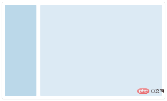
Similarly, you can create a fluid layout by placing Bootstrap's fluid grid into a fluid container with class="container-fluid". Fluid layout will fill the entire viewport width. For example:
<div class="container-fluid">
  <div class="row-fluid">
    <div class="span2">
      <!--Sidebar content-->
    </div>
    <div class="span10">
      <!--Body content-->
    </div>
  </div>
</div>The layout effect is as shown below (Bootstrap flow layout):

[Related recommendations: "bootstrap tutorial 》】
The above is the detailed content of bootstrap has several containers. For more information, please follow other related articles on the PHP Chinese website!
 Where should I fill in my place of birth: province, city or county?
 How to solve 400 bad request
 What is the reason why the network cannot be connected?
 Usage of get function in c language
 How to obtain url address
 How to solve the problem that document.cookie cannot be obtained
 Check out the top ten cryptocurrencies worth investing in
 socketpair usage
 what is drivergenius