What three states can bootstrap set for the form?
Bootstrap can set three states for the form: 1. Focus state, which tells the user that they can enter or select things; 2. Disabled state, which tells the user that they cannot enter or select things; 3. Verification Status, which tells the user whether the operation he performed is correct.

The operating environment of this tutorial: Windows 7 system, bootsrap version 3.3.7, DELL G3 computer
There are three main forms control states in Bootstrap: Focus state, disabled state, verification state.
1. Focus state: This state tells the user that they can enter or select something
The focus state passes the pseudo-class ":focus" to achieve.
bootstrap.css corresponding source code:
.form-control:focus {
    border-color: #66afe9;
    outline: 0;   //删除了outline的默认样式
    -webkit-box-shadow: inset 0 1px 1px rgba(0,0,0,.075), 0 0 8px rgba(102, 175, 233, .6);  //添加了阴影效果
    box-shadow: inset 0 1px 1px rgba(0,0,0,.075), 0 0 8px rgba(102, 175, 233, .6);
}Usage: Add the class name "form-control" to the control.
eg:
<input class="form-control" type="text" placeholder="不是焦点状态下效果">
<input class="form-control" type="text" placeholder="焦点状态下效果">
The rendering is as follows: (blue border effect in focus state)

Focus In this state, the effect of the file, radio, and checkbox controls is not exactly the same as that of the ordinary input space, because Bootstrap has done special processing for them.
bootstrap.css corresponding source code:
input[type="file"]:focus,
input[type="radio"]:focus,
input[type="checkbox"]:focus {outline: thin dotted;outline: 5px auto -webkit-focus-ring-color;outline-offset: -2px;
}2. Disabled state: This state tells the user that they cannot enter or select things
The disabled state is achieved by adding the "disabled" attribute to the form control.
bootstrap.css corresponding source code:
.form-control[disabled],
.form-control[readonly],
fieldset[disabled] .form-control {
    cursor: not-allowed;
    background-color: #eee;
    opacity: 1;
}Usage: Add the "diabled" attribute to the form control that needs to be disabled.
eg:
<input class="form-control" type="text" placeholder="不是焦点状态下效果">
<input class="form-control" type="text" placeholder="表单已禁用,不能输入"  disabled>
The rendering is as follows:

Description: The background color of the control in the disabled state is gray, and the hand shape becomes a shape that prohibits input. If the form control does not use the class name "form-control", the disabled control only has a hand shape that prohibits input.
PS: In Bootstrap, if the fieldset is set to the "disabled" attribute, the entire field is disabled.
eg:
<form role="form">
    <fieldset disabled>
        <div class="form-group">
            <label for="disabledTextInput">禁用的输入框</label>
            <input type="text" id="disabledTextInput" class="form-control" placeholder="禁止输入">
        </div>
        <div class="form-group">
            <label for="disabledSelect">禁用的下拉框</label>
            <select id="disabledSelect" class="form-control">
                <option>不可选择</option>
            </select>
        </div>
        <div class="checkbox">
            <label>
                <input type="checkbox">无法选择
            </label>
        </div>
        <button type="submit" class="btnbtn-primary">提交</button>
    </fieldset>
</form>The effect is as shown below:

PS: For a disabled domain, if the legend is If there is an input box, this input box cannot be disabled.
eg:
<form role="form">
    <fieldset disabled>
        <legend><input type="text" class="form-control" placeholder="我没被禁用" /></legend>
        <div class="form-group">
            <label for="disabledTextInput">禁用的输入框</label>
            <input type="text" id="disabledTextInput" class="form-control" placeholder="禁止输入">
        </div>
        <div class="form-group">
            <label for="disabledSelect">禁用的下拉框</label>
            <select id="disabledSelect" class="form-control">
                <option>不可选择</option>
            </select>
        </div>
        <div class="checkbox">
            <label>
                <input type="checkbox">无法选择
            </label>
        </div>
        <button type="submit" class="btnbtn-primary">提交</button>
  </fieldset>
</form>The rendering is as follows:

3. Verification status: This status tells the user whether their operation is correct
Provides 3 verification status styles in Bootstrap:
① .has-success: Success status (green)
② .has-error: Error status (red)
③ .has-warning: Warning status (yellow)
Usage: in form Just add the corresponding status class name to the -group container.
eg:
<form role="form">
    <div class="form-group has-success">
        <label class="control-label" for="inputSuccess1">成功状态</label>
        <input type="text" class="form-control" id="inputSuccess1" placeholder="成功状态" >
    </div>
    <div class="form-group has-warning">
        <label class="control-label" for="inputWarning1">警告状态</label>
        <input type="text" class="form-control" id="inputWarning1" placeholder="警告状态">
    </div>
    <div class="form-group has-error">
        <label class="control-label" for="inputError1">错误状态</label>
        <input type="text" class="form-control" id="inputError1" placeholder="错误状态">
    </div>
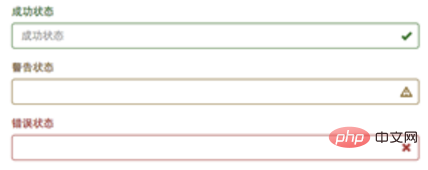
</form>Explanation: It can be seen from the effect that the three styles have the same effect except for the different colors.
In Bootstrap's form validation, different icons will be provided for different states, such as a check mark "√" for success, a cross "×" for error, etc.
If you want the form to display the corresponding icon in different states, you only need to add the class name "has-feedback" in the corresponding state.
PS: The class name "has-feedback" should be used in conjunction with "has-error", "has-warning", and "has-success".
eg:
<form role="form">
    <div class="form-group has-success has-feedback">
        <label class="control-label" for="inputSuccess">成功状态</label>
        <input type="text" class="form-control" id="inputSuccess" placeholder="成功状态" >
        <span class="glyphicon glyphicon-ok form-control-feedback"></span>
    </div>
    <div class="form-group has-warning has-feedback">
        <label class="control-label" for="inputWarning">警告状态</label>
        <input type="text" class="form-control" id="inputWarning" placeholder="警告状态" >
        <span class="glyphicon glyphicon-warning-sign form-control-feedback"></span>
  </div>
  <div class="form-group has-error has-feedback">
        <label class="control-label" for="inputError">错误状态</label>
        <input type="text" class="form-control" id="inputError" placeholder="错误状态" >
        <span class="glyphicon glyphicon-remove form-control-feedback"></span>
  </div>
</form>The effect is as follows:

Note: As can be seen from the rendering, the icons are On the right.
Note: The icons in Bootstrap are all made using @face-face, and a span element must be added to the form to achieve this.
eg:
<span class="glyphicon glyphicon-remove form-control-feedback"></span>
[Related recommendation: "bootstrap tutorial"]
The above is the detailed content of What three states can bootstrap set for the form?. For more information, please follow other related articles on the PHP Chinese website!

Hot AI Tools

Undresser.AI Undress
AI-powered app for creating realistic nude photos

AI Clothes Remover
Online AI tool for removing clothes from photos.

Undress AI Tool
Undress images for free

Clothoff.io
AI clothes remover

Video Face Swap
Swap faces in any video effortlessly with our completely free AI face swap tool!

Hot Article

Hot Tools

Notepad++7.3.1
Easy-to-use and free code editor

SublimeText3 Chinese version
Chinese version, very easy to use

Zend Studio 13.0.1
Powerful PHP integrated development environment

Dreamweaver CS6
Visual web development tools

SublimeText3 Mac version
God-level code editing software (SublimeText3)

Hot Topics
 1387
1387
 52
52
 How to get the bootstrap search bar
Apr 07, 2025 pm 03:33 PM
How to use Bootstrap to get the value of the search bar: Determines the ID or name of the search bar. Use JavaScript to get DOM elements. Gets the value of the element. Perform the required actions.
 How to use bootstrap in vue
Apr 07, 2025 pm 11:33 PM
Using Bootstrap in Vue.js is divided into five steps: Install Bootstrap. Import Bootstrap in main.js. Use the Bootstrap component directly in the template. Optional: Custom style. Optional: Use plug-ins.
 How to do vertical centering of bootstrap
Apr 07, 2025 pm 03:21 PM
Use Bootstrap to implement vertical centering: flexbox method: Use the d-flex, justify-content-center, and align-items-center classes to place elements in the flexbox container. align-items-center class method: For browsers that do not support flexbox, use the align-items-center class, provided that the parent element has a defined height.
 How to write split lines on bootstrap
Apr 07, 2025 pm 03:12 PM
There are two ways to create a Bootstrap split line: using the tag, which creates a horizontal split line. Use the CSS border property to create custom style split lines.
 How to resize bootstrap
Apr 07, 2025 pm 03:18 PM
To adjust the size of elements in Bootstrap, you can use the dimension class, which includes: adjusting width: .col-, .w-, .mw-adjust height: .h-, .min-h-, .max-h-
 How to use bootstrap button
Apr 07, 2025 pm 03:09 PM
How to use the Bootstrap button? Introduce Bootstrap CSS to create button elements and add Bootstrap button class to add button text
 How to set up the framework for bootstrap
Apr 07, 2025 pm 03:27 PM
To set up the Bootstrap framework, you need to follow these steps: 1. Reference the Bootstrap file via CDN; 2. Download and host the file on your own server; 3. Include the Bootstrap file in HTML; 4. Compile Sass/Less as needed; 5. Import a custom file (optional). Once setup is complete, you can use Bootstrap's grid systems, components, and styles to create responsive websites and applications.
 How to insert pictures on bootstrap
Apr 07, 2025 pm 03:30 PM
There are several ways to insert images in Bootstrap: insert images directly, using the HTML img tag. With the Bootstrap image component, you can provide responsive images and more styles. Set the image size, use the img-fluid class to make the image adaptable. Set the border, using the img-bordered class. Set the rounded corners and use the img-rounded class. Set the shadow, use the shadow class. Resize and position the image, using CSS style. Using the background image, use the background-image CSS property.


