 Web Front-end
 CSS Tutorial
 It's time to celebrate the New Year, use CSS to achieve a festive lantern animation effect!
It's time to celebrate the New Year, use CSS to achieve a festive lantern animation effect!
It’s time to celebrate the New Year. The following article will show you how to draw a lantern with CSS and add animation effects to achieve the effect of the lantern swinging left and right. I hope it will be helpful to everyone!

It’s the New Year~ It’s the New Year~ It’s the New Year~
Say goodbye to the old and welcome the New Year, it’s the Spring Festival with lanterns and colorful decorations~
The golden rooster dances to send Blessings are coming in the new year~
The first few lyrics of the article suddenly seem festive. No, our lanterns look like this.
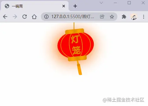
animation attribute
Drawing a lantern We definitely cannot draw a static lantern. Let’s first review the animation attribute in CSS. , which is a shorthand attribute consisting of animation-name, animation-duration, animation-timing-function, animation-delay , animation-iteration-count, animation-direction, animation-fill-mode and animation-play-state attributes. We won’t explain it here. You can learn more about it in MDN.
Let’s first take a look at the following example:
animation: swing 3s infinite ease-in-out;
In the above example, an animation sequence named swing is used. The animation sequence passes @ keyframes is created, the execution time is 3s, the animation is executed in a loop, and the last ease-in-out indicates the rhythm of animation execution.
Implementation Idea
Add
border-radiusto a rectangle to form the shape of a lantern.Add
::beforeand::afterto the rectangle to form the top and head of the lanternDraw a lantern line.
Add two thinner rectangles inside the rectangle, and form the lines of the lantern by adding border-radius.
Set the animation effect of the lantern
Add the style of the lamp spike
Next we will Implemented in steps.
Drawing the shape of the lantern
First we define the HTML structure, the code is as follows:
<!-- 灯笼容器 -->
<div class="lantern-con">
  <!-- 提着灯笼的线 -->
  <div class="lantern-line"></div>
  <!-- 灯笼主要区域 -->
  <div class="lantern-light">
  </div>
</div>
Then we draw an ellipse, and then pass ::before and ::after, draw the upper and lower lantern covers, the CSS is as follows:
/* 灯笼容器 */
.lantern-con {
  position: fixed;
  left: 160px;
}

/* 灯笼中间红色区域 */
.lantern-light {
  position: relative;
  width: 120px;
  height: 90px;
  background-color: red;
  margin: 30px;
  border-radius: 50%;
  box-shadow: -5px 5px 50px 4px #fa6c00;
  /* 设置旋转点 */
  transform-origin: top center;
  animation: swing 3s infinite ease-in-out;
}

/* 灯笼顶部和底部的样式 */
.lantern-light::before,
.lantern-light::after {
  content: '';
  position: absolute;
  border: 1px solid #dc8f03;
  width: 60px;
  height: 12px;
  /* 背景渐变 */
  background: linear-gradient(
    to right,
    #dc8f03,
    #ffa500,
    #dc8f03,
    #ffa500,
    #dc8f03
  );
  left: 30px;
}

/* 顶部位置 */
.lantern-light::before {
  top: -7px;
  border-top-left-radius: 5px;
  border-top-right-radius: 5px;
}

/* 底部位置 */
.lantern-light::after {
  bottom: -7px;
  border-bottom-left-radius: 5px;
  border-bottom-right-radius: 5px;
}

/* 提着灯笼的线的样式 */
.lantern-line {
  width: 2px;
  height: 50px;
  background-color: #dc8f03;
  position: absolute;
  left: 88px;
}
/* 灯笼的动画效果 */
@keyframes swing {
  0% {
    transform: rotate(-6deg);
  }

  50% {
    transform: rotate(6deg);
  }

  100% {
    transform: rotate(-6deg);
  }
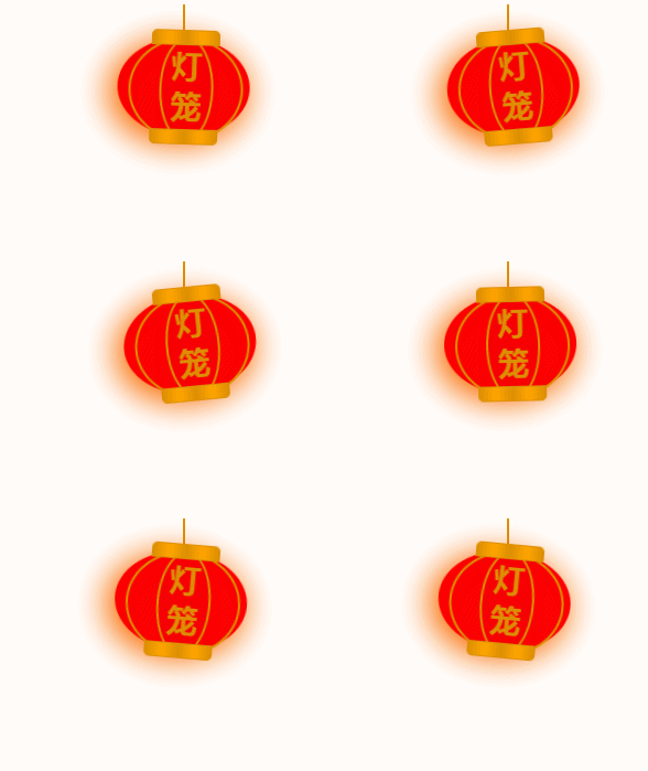
}Now a relatively basic lantern shape has been implemented, the effect is as follows:

Internal lines of the lantern
The internal lines of the lantern are realized through two rectangles. Set it to an ellipse through the border-radius property, and then draw the edges to present the lantern lines. .
<div class="lantern-light">
  <!-- 灯笼中间的线条 -->
  <div class="lantern-circle">
    <div class="lantern-rect">
      <!-- 灯笼中间的文字内容 -->
      <div class="lantern-text">灯笼</div>
    </div>
  </div>
</div>The corresponding CSS is as follows:
/* 灯笼中间的线条 */
.lantern-circle,
.lantern-rect {
  height: 90px;
  border-radius: 50%;
  border: 2px solid #dc8f03;
  background-color: rgba(216, 0, 15, 0.1);
}

/* 外层 */
.lantern-circle {
  width: 100px;
  margin: 12px 8px 8px 10px;
}

/* 内层 */
.lantern-rect {
  margin: -2px 8px 8px 26px;
  width: 45px;
}

/* 文字样式 */
.lantern-text {
  font-size: 28px;
  font-weight: bold;
  text-align: center;
  color: #dc8f03;
  margin-top: 4px;
}The effect is as follows:
Lantern Spike
Now let’s draw it Lantern spike, this thing is relatively simple. The most important thing is to add an animation effect. Its HTML structure is as follows:
<!-- 灯笼主要区域 -->
<div class="lantern-light">
  <!-- more code -->
  <!-- 灯笼穗 -->
  <div class="lantern-tassel-top">
    <div class="lantern-tassel-middle"></div>
    <div class="lantern-tassel-bottom"></div>
  </div>
</div>CSS is as follows:
/* 灯穗 */
.lantern-tassel-top {
  width: 5px;
  height: 20px;
  background-color: #ffa500;
  border-radius: 0 0 5px 5px;
  position: relative;
  margin: -5px 0 0 59px;
  /* 让灯穗也有一个动画效果 */
  animation: swing 3s infinite ease-in-out;
}

.lantern-tassel-middle,
.lantern-tassel-bottom {
  position: absolute;
  width: 10px;
  left: -2px;
}

.lantern-tassel-middle {
  border-radius: 50%;
  top: 14px;
  height: 10px;
  background-color: #dc8f03;
  z-index: 2;
}

.lantern-tassel-bottom {
  background-color: #ffa500;
  border-bottom-left-radius: 5px;
  height: 35px;
  top: 18px;
  z-index: 1;
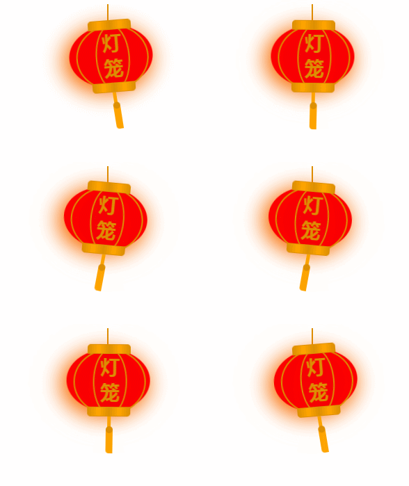
}At this point we have finished drawing this lantern.
(Learning video sharing: css video tutorial)
The above is the detailed content of It's time to celebrate the New Year, use CSS to achieve a festive lantern animation effect!. For more information, please follow other related articles on the PHP Chinese website!

Hot AI Tools

Undresser.AI Undress
AI-powered app for creating realistic nude photos

AI Clothes Remover
Online AI tool for removing clothes from photos.

Undress AI Tool
Undress images for free

Clothoff.io
AI clothes remover

AI Hentai Generator
Generate AI Hentai for free.

Hot Article

Hot Tools

Notepad++7.3.1
Easy-to-use and free code editor

SublimeText3 Chinese version
Chinese version, very easy to use

Zend Studio 13.0.1
Powerful PHP integrated development environment

Dreamweaver CS6
Visual web development tools

SublimeText3 Mac version
God-level code editing software (SublimeText3)

Hot Topics
 How to play picture sequences smoothly with CSS animation?
Apr 04, 2025 pm 05:57 PM
How to achieve the playback of pictures like videos? Many times, we need to implement similar video player functions, but the playback content is a sequence of images. direct...
 How do you make sure that some operations are performed only once when using the useEffect hook in React's App.tsx?
Apr 04, 2025 pm 06:33 PM
In React projects, we often encounter problems with the use of lifecycle functions, especially when it comes to page refresh, how to ensure that certain operations only...
 The width of emsp spaces in HTML is inconsistent. How to reliably implement text indentation?
Apr 04, 2025 pm 11:57 PM
Regarding the problem of inconsistent width of emsp spaces in HTML and Chinese characters in many web tutorials, it is mentioned that occupying the width of a Chinese character, but the actual situation is not...
 How to use Vue 3 to implement up scrolling loading function similar to WeChat chat records?
Apr 04, 2025 pm 03:51 PM
How to achieve upward scrolling loading similar to WeChat chat records? When developing applications similar to WeChat chat records, a common question is how to...
 How to use CSS to achieve smooth playback effect of image sequences?
Apr 04, 2025 pm 04:57 PM
How to realize the function of playing pictures like videos? Many times, we need to achieve similar video playback effects in the application, but the playback content is not...
 How to implement a tight transition animation in React using react-transition-group?
Apr 04, 2025 pm 11:27 PM
Using react-transition-group in React to achieve confusion about closely following transition animations. In React projects, many developers will choose to use react-transition-group library to...
 【Rust Self-study】Introduction
Apr 04, 2025 am 08:03 AM
1.0.1 Preface This project (including code and comments) was recorded during my self-taught Rust. There may be inaccurate or unclear statements, please apologize. If you benefit from it, it's even better. 1.0.2 Why is RustRust reliable and efficient? Rust can replace C and C, with similar performance but higher security, and does not require frequent recompilation to check for errors like C and C. The main advantages include: memory security (preventing null pointers from dereferences, dangling pointers, and data contention). Thread-safe (make sure multi-threaded code is safe before execution). Avoid undefined behavior (e.g., array out of bounds, uninitialized variables, or access to freed memory). Rust provides modern language features such as generics
 How to quickly build a foreground page in a React Vite project using AI tools?
Apr 04, 2025 pm 01:45 PM
How to quickly build a front-end page in back-end development? As a backend developer with three or four years of experience, he has mastered the basic JavaScript, CSS and HTML...


