20 CSS tips to quickly improve your development skills
This article will share with you 20 CSS tips to quickly improve your development skills. Come and collect them. I hope it will be helpful to everyone!

flexbox content wrapping
When we use flexbox layout, by default, when the container width is not enough, it may This will happen.
This is mainly because the default value of flex-wrap is nowrap, so we need to change the value like this.
.options-list {
  display: flex;
  flex-wrap: wrap;
}
Spacing
In the design draft provided, it is easy for designers to ignore the relationship between text and other elements under extreme circumstances. The spacing between them may end up in a situation where the text and icon are close to each other.

To deal with this situation, you need to consider whether it is in the text or icon part, and choose to add a margin value to increase the spacing after analyzing the actual situation.
.section__title {
  margin-right: 1rem;
}
But in this case, I usually consider adding margin-left to the icon. In this case, the text can still be used when there is no icon. Push to the edge of the container.
Long text content
This is simple, it is the way to deal with text that is too long. Generally, it is line wrapped or truncated and appears in the form of... As for which method to choose, it depends on the design style of the current page module.
The processing method in this article is to truncate... this.
.username {
  white-space: nowrap;
  overflow: hidden;
  text-overflow: ellipsis;
}
Prevent images from being stretched or compressed This situation is usually caused when the image is uploaded by the user, or the image is not used in the specified proportion.

The way to handle it is to directly use the object-fit attribute:
.card__thumb {
  object-fit: cover;
}Lock scroll link
The main situation is when the modal pop-up layer is clicked on the page and the page content itself is very long.
.modal__content {
  overscroll-behavior-y: contain;
  overflow-y: auto;
}overscroll-behavior Although it is good, there are currently big compatibility issues.

CSS variable fallback
This CSS variable fallback, to put it bluntly, actually uses a CSS variable when the value is invalid. "Safe value" to ensure that a certain attribute value is still available.
.message__bubble {
  max-width: calc(100% - var(--actions-width, 70px));
}However, combined with the previous processing method when writing the front-end page, you may also consider the browser's compatibility issue with var(), then an additional attribute will be added. However, judging from current browsers, it seems that this problem does not exist universally.
.message__bubble {
  max-width: 70px;
  max-width: var(--actions-width, 70px);
}Use fixed width or height
There is nothing to say about this, it is mainly a protection measure when the content is too long and overflows the container. For example, when we fix the height to 350px, the content will overflow if it is too long.

And if we replace height with min-height, the situation will be different.

Similarly, the same applies to width.
Ignored background-repeat
When using the background image, if no-repeat is not added, it will be used by default The background image is spread flat.

So, it is still a good habit to add no-repeat casually, unless you know whether the background image needs to be tiled.
.hero {
  background-image: url('..');
  background-repeat: no-repeat;
}Vertical media query This scene has not been seen by Xiaozhi on the page so far. It usually appears more likely in the middle and backend pages, such as the page effects provided by the author.

左下角是通过 position: sticky; 定位的,可能通过 fixed 定位也是一样吧,然后当浏览器的高度变小的时候,就会叠在左侧的导航上面。

显然,这样的页面效果就不对了。而如果这个时候,通过 @media 方式判断页面高度,在某个安全区外我们才让左下角这部分通过 sticky 来定位。
@media (min-height: 600px) {
  .aside__secondary {
    position: sticky;
    bottom: 0;
  }
}使用 justify-content: space-between
原文中这部分标题是 Using Justify-Content: Space-Between,但看起来更应该是 Using gap。使用什么标题不是关键,这部分主要是提到当使用 justify-content: space-between; 时,如果元素不够,元素与元素之间的间距就会拉长,因为要平均分布元素之间的间距。
比如原本是想要这样的一个效果,间距的值是固定的:

在元素数量足够的情况下,元素与元素之间的间距还是比较理想的,通过下面这个 CSS 处理方式:
.wrapper {
  display: flex;
  flex-wrap: wrap;
  justify-content: space-between;
}但,元素的数量总是会不足的时候,那么就会这样了。

可见,其实并不是想要平均分布,而只是想要在最大的极限情况下和内容不足的时候,元素之间的间距是可控的。一般来说,这个处理方式挺多的,用 margin 之类的也是可以处理,不过目前有一个兼容性并不是十分好的 gap 能完美解决这个问题。
.wrapper {
    display: flex;
    flex-wrap: wrap;
    gap: 1rem;
}
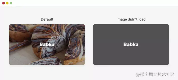
图片上的文字 用户体验上的一个细节处理问题,如果在图片上有文案,但图片没加载出来,或者加载失败的时候,添加一个背景色,以保证图片加载失败的情况下,文字与背景能区分开。

使用 CSS 网格中的固定值需注意 grid 网格布局现在开始慢慢被关注了,grid 与 flex 一样都可以做自适应的效果,也可以使用固定值的情况。在使用固定值的时候,最好是通过 @media 判断一下宽度,以便于满足最小宽度时的处理。
@media (min-width: 600px) {
  .wrapper {
    display: grid;
    grid-template-columns: 250px 1fr;
    gap: 1rem;
  }
}不过一般这种情况下,可能就直接改变页面布局了,感觉作者在这个方面上担忧是多余的。或者主要是自己未遇到过他所遇到的场景吧。
仅在需要时显示滚动条
这个没啥说的,一般大家都是把 scroll 设置为 auto。不过在个别情况下,可能这个 auto 会让元素的宽度变小,然后导致内容或者布局出现一点小瑕疵。
.element {
  overflow-y: auto;
}滚动条装订线
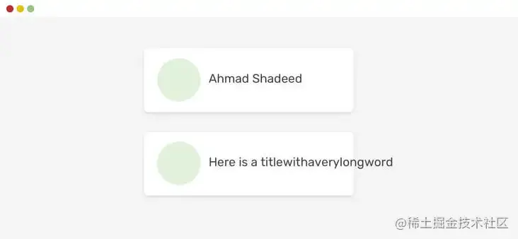
这个所谓的装订线,主要就是 scrollbar-gutter 属性,保留滚动条的空间。在上面那个 overflow 例子中提到,如果设置为 auto 的时候,可能会导致页面布局出现非意料的情况,那么 scrollbar-gutter 就可以处理这个问题了。
兼容性还是一个不可避免的话题。
假设不考虑兼容性的问题,那么我们就可以使用这个方法保留滚动条的空间。
.element {
  scrollbar-gutter: stable;
}
CSS flexbox 中的最小内容大小
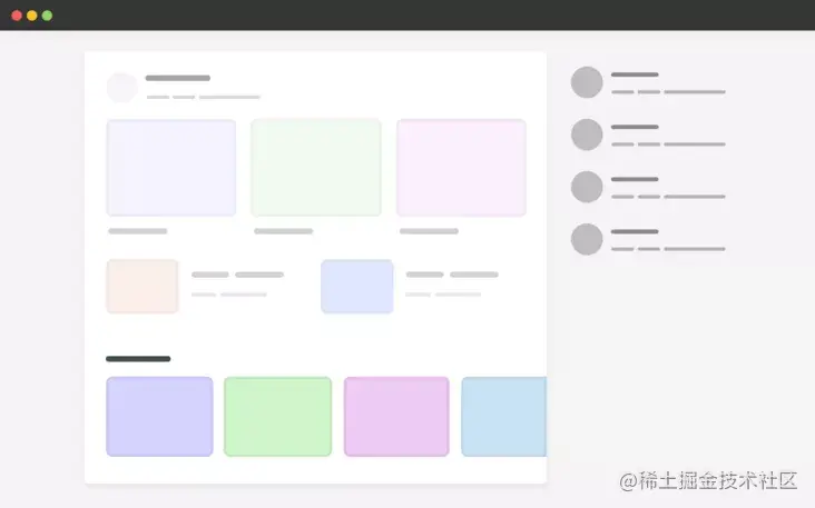
在使用 flex 布局的时候,很有可能其中某个 item 的文本内容很长,最终导致没有换行而溢出容器之外。

这种情况也并不是说没有可能,就算是使用 overflow-wrap: break-word; 也不会有效果,那么这个时候需要加上 min-width: 0; 来处理。
.card__title {
  overflow-wrap: break-word;
  min-width: 0;
}
CSS 网格中的最小内容大小
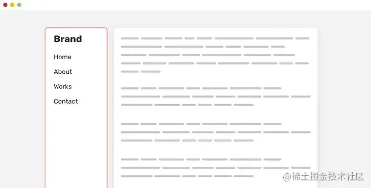
与 flexbox 类似,CSS 网格的子项有一个默认的最小内容大小,即 auto,这意味着,如果存在大于网格项的元素,它将溢出。

@media (min-width: 1020px) {
  .wrapper {
    display: grid;
    grid-template-columns: 1fr 248px;
    grid-gap: 40px;
  }
}

.carousel {
  display: flex;
  overflow-x: auto;
}对于网格这块,了解的不够深入,直接延用作者的意思就是将 grid-template-columns 的值改变一下,改为:minmax(0, 1fr) 248px 就可以得到下面这个效果。

自动适合与自动填充
当时看到效果图的时候,我还以为是 flex 布局中的情况,结果是 grid 网格布局中使用的情况。
在使用 grid 布局时,如果是这样写,利用 auto-fit 的话,就会是上面这个效果,item 不够时会被拉长。
  display: grid;
  grid-template-columns: repeat(auto-fit, minmax(250px, 1fr));
  grid-gap: 1rem;
}
而如果改为 auto-fill 的话就是下面这个效果。

对于 auto-fit 和 auto-fill 的区别可以看这张图。

图片最大宽度
作者建议可以在 reset 部分中对 img 加上最大宽度的设置,但没说具体是为什么。个人猜想是考虑图片在容器中的展示吧,同时还有一个 object-fit 属性。
img {
  max-width: 100%;
  object-fit: cover;
}位置:粘性css网格
在使用 CSS 网格布局时,如果子元素使用了 position: sticky 的话,由于网格子元素的默认对齐方式是 stretch,所以会被拉伸。

而其实我们想要的是,左侧边栏并非拉伸效果的,所以,需要通过 align-self: start; 改变一下子元素自身的对齐方式。
aside {
  align-self: start;
  position: sticky;
  top: 1rem;
}这样的话,效果就不一样了。
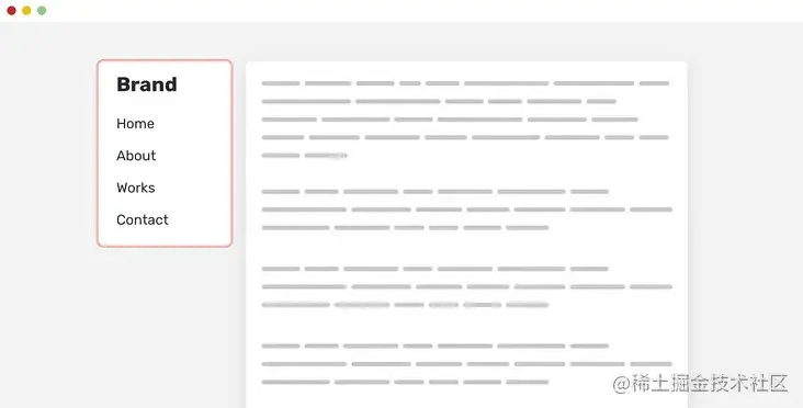
简单测试了一下,在 flex 布局中也是同样的情况,主要就是因为子元素的特性是拉伸的。
分组选择器
/* Don't do this, please */
input::-webkit-input-placeholder,
input:-moz-placeholder {
  color: #222;
}现在写 CSS 的时候基本上都不会去写带前缀的属性,而是通过构建工具来自动完成。所以平时也不会在意这个。按照作者的说法是,如果把这两个写在一起,会导致整个规则失效,建议分开写。
input::-webkit-input-placeholder {
  color: #222;
}

input:-moz-placeholder {
  color: #222;
}最后
以上内容看着其实都是挺简单,挺初级的内容,但是在日常开发过程中,对于 CSS 的注意的确有一些还是不够到位。毕竟有一些内容过于细节了。
(学习视频分享:css视频教程)
The above is the detailed content of 20 CSS tips to quickly improve your development skills. For more information, please follow other related articles on the PHP Chinese website!

Hot AI Tools

Undresser.AI Undress
AI-powered app for creating realistic nude photos

AI Clothes Remover
Online AI tool for removing clothes from photos.

Undress AI Tool
Undress images for free

Clothoff.io
AI clothes remover

AI Hentai Generator
Generate AI Hentai for free.

Hot Article

Hot Tools

Notepad++7.3.1
Easy-to-use and free code editor

SublimeText3 Chinese version
Chinese version, very easy to use

Zend Studio 13.0.1
Powerful PHP integrated development environment

Dreamweaver CS6
Visual web development tools

SublimeText3 Mac version
God-level code editing software (SublimeText3)

Hot Topics
 How to use the locally installed 'Jingnan Mai Round Body' on a web page and solve the display problem?
Apr 05, 2025 pm 02:06 PM
How to use locally installed font files on web pages In web development, users may want to use specific fonts installed on their computers to enhance the network...
 How to adapt and adjust the label size of the Element-UI horizontal menu el-menu on the PC and mobile side?
Apr 05, 2025 am 10:12 AM
The adaptation issues of the Element-UI menu component el-menu and label size adjustment During the development process of using the Element-UI framework, the flexibility and ease of use of the el-menu component...
 Element-UI el-menu component: How to adjust the size of menu labels and control the display of submenu in different modes?
Apr 05, 2025 am 10:36 AM
The label size adjustment of the Element-UI menu component el-menu and the behavior differences under the mode attributes of the Element-UI menu component will be used to determine the different mode modes of the el-menu component in the Element-UI framework...
 How to use CSS to achieve a gradient effect of the background color transition from left to right and gradually becoming lighter from top to bottom?
Apr 05, 2025 pm 12:57 PM
CSS gradient color effect implementation: Gradient background color from top to bottom In web design, how to transition from left to right in the search box and the background color under the carousel image...
 How to customize resize symbols through CSS to match background color?
Apr 05, 2025 pm 02:09 PM
How to customize resize symbols with CSS to match background color? In web design, the details of the user experience can often significantly improve the overall effect. For example...
 How to solve the problem of page jitter caused by dynamically setting elements to fixed in JavaScript?
Apr 05, 2025 am 11:39 AM
How to solve the problem of page jitter caused by dynamically setting elements to fixed by JS. When dynamically setting elements to fixed by JavaScript, you sometimes encounter page jitter...
 Under a fixed width layout, what is the relationship between the font size and the letter width?
Apr 05, 2025 pm 12:51 PM
Under fixed width layout, the subtle relationship between font size and letter width When designing web pages, we often encounter the need to line up in fixed width containers...
 How to implement a custom theme by overriding the SCSS variable of Element?
Apr 05, 2025 pm 01:45 PM
How to implement a custom theme by overriding the SCSS variable of Element? Using Element...


