In HTML5, flexbox is a layout method that ensures that elements have appropriate behavior when the page needs to adapt to different screen sizes and device types; the purpose of introducing flexbox layout is to provide a more effective Ways to arrange, align, and allocate white space to child elements in a container.

The operating environment of this tutorial: Windows 7 system, CSS3&&HTML5 version, Dell G3 computer.
Flexible box (FlexibleBox or flexbox) is a way to ensure that elements have appropriate content when the page needs to adapt to different screen sizes and device types. The way the behavior is laid out.
The purpose of introducing the flexible box layout model is to provide a more efficient way to arrange, align and allocate empty space to sub-elements in a container.
Can meet many common complex layout needs in a simple way. Its advantage is that developers only declare the behavior that the layout should have, without giving specific implementation methods. The browser is responsible for doing the actual layout. This layout model is supported in major browsers.
**Flexible box layout: display: flex; or display: inline-flex;
The difference between the two can be found in display: block ;The difference between display: inline-block; (can the parent element be displayed on one line)
The role of the flexible box: child elements can be displayed on one line, by default x is the main axis and y is the side axis ( Secondary axis)
So the child elements will be displayed on one line by default, similar to float: lef; convenient layout

After setting to flexible box :
1. Child elements are arranged on the main axis by default;
2. Child elements can set width and height; (similar to display: inline-block;)
3. When the parent element is a flexible box, if the child element wants to be centered up, down, left, and right, just margin: auto;
The impact on the child element when the flexible box is set:
1. Float and clear on the child element are invalid;
2. Sub-element vertical: -align:; (element vertical alignment) is invalid.
Attributes added to the parent element (added to the parent element, affecting the child elements)
How to set the main and secondary axes:
Flex-derection: row ;Horizontal spindle
flex-derection: row-reverse; vertical spindle
.
Whether the sub-element is wrapped? flex-wrap:
1. wrap wrap; 2. no-warp: no line wrap;
Abbreviation: flex-flow:; (Set the main axis line break method) (This setting is not recommended as it will affect the readability of the code)
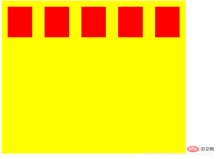
justify-content:;The child elements are in Alignment on the main axis: Add
to the parent element 1. flex-start; starting position 2. flex-end; end position
4. space-around; completely automatically allocated;
5. space-between; aligned at both ends, automatically allocated in the middle;
align-items:; alignment of child elements on the side axis Method (add to parent element)
1. flex-start; starting position 2. flex-end; end position
3. center; midpoint position 4 , baseline; baseline alignment
5. stretch; default position alignment
align-content:; the alignment of multi-line elements on the cross axis, multi-line elements are valid
1. flex-start; top alignment; 2. flex-end; bottom alignment;
3. center; middle alignment; 4. space-around; fully automatic allocation;
5. space-between; align both ends, automatically allocated in the middle;
6. stretch; default position alignment;
Item (sub-element alignment) (add to sub-elements)
align-self:; the alignment of child elements on the cross axis;
flex-start starting position
flex-end end position
center centering
stretch (this element does not Set width or height)
auto default value
Note: If the parent element has this attribute set, it will inherit alig-items:;Attribute setting
Related recommendations:html video Tutorial,css video tutorial
The above is the detailed content of What does flexbox mean in html5. For more information, please follow other related articles on the PHP Chinese website!