What does positioning mean in css
In CSS, positioning means specifying the position of an element on the web page, which is generally set using the position attribute. CSS has 5 positioning methods: 1. Static positioning (static); 2. Absolute positioning (absolute); 3. Relative positioning (relative); 4. Fixed positioning; 5. Sticky positioning.

The operating environment of this tutorial: Windows 7 system, CSS3&&HTML5 version, Dell G3 computer.
In CSS, positioning means specifying the position of an element on the web page, which is generally set using the position attribute.
CSS has 5 positioning methods, that is, the position attribute mainly has five values.
static positioning (static)
absolute positioning (absolute)
relative positioning (relative) )
Fixed positioning (fixed)
Sticky positioning (sticky)
The following are in order Introduce these five values. The last sticky is only supported by browsers in 2017, and this article will focus on it.
static attribute value
static is the default value of the position attribute. If the position attribute is omitted, the browser considers the element to be statically positioned.
At this time, the browser will determine the position of each element according to the order of the source code. This is called "normal page flow" (normal flow). Each block-level element occupies its own block, and there is no overlap between elements. This position is the default position of the element.
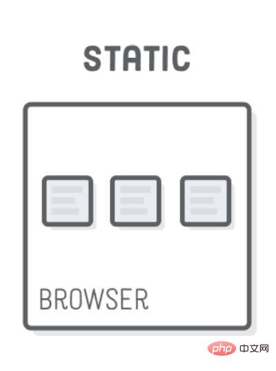
Note that the position of the element caused by static positioning is determined independently by the browser, so the four attributes top, bottom, left, and right are invalid at this time.
relative, absolute, fixed
The three attribute values of relative, absolute, and fixed have one thing in common, they are all positioned relative to a certain base point , the only difference lies in the different base points. Therefore, as long as you understand what their basic points are, it is easy to master these three attribute values.
These three types of positioning will not affect the position of other elements, so there may be overlap between elements.
relative The attribute value
relative indicates that it is offset relative to the default position (that is, the position when static), that is, the positioning base point is the element default location.
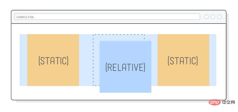

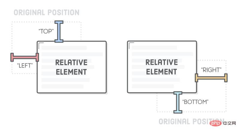
It must be used together with the four attributes top, bottom, left, and right to specify the direction and distance of the offset. .
div {
  position: relative;
  top: 20px;
}In the above code, the div element is offset 20px downward from the default position (that is, 20px from the top).
absolute attribute value
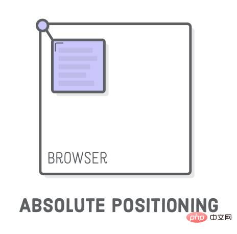
absolute means that it is offset relative to the superior element (usually the parent element), that is, the positioning base point is the parent element .
It has an important restriction: the positioning base point (usually the parent element) cannot be static positioning, otherwise the positioning base point will become the root element html of the entire web page. In addition, absolute positioning must also be used with the four attributes top, bottom, left, and right.
/*
  HTML 代码如下
  <div id="father">
    <div id="son"></div>
  </div>
*/
#father {
  positon: relative;
}
#son {
  position: absolute;
  top: 20px;
}In the above code, the parent element is positioned relative and the child element is positioned absolutely. Therefore, the positioning base point of the child element is the parent element, which is downward relative to the top of the parent element. Offset 20px. If the parent element is statically positioned, the child element in the above example is offset 20px downward from the top of the web page.
Note that absolutely positioned elements will be ignored by "normal page flow", that is, in "normal page flow", the space occupied by this element is zero, and surrounding elements are not affected.
fixed The attribute value
fixed means that it is offset relative to the viewport (viewport, browser window), that is, the positioning base point is the browse browser window. This will cause the element's position to not change as the page scrolls, as if it were fixed to the web page.
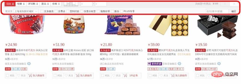
If it is used with the four attributes top, bottom, left, and right, it means that the initial position of the element is calculated based on the viewport, otherwise the initial position is the element's Default location.
div {
  position: fixed;
  top: 0;
}In the above code, the div element is always at the top of the viewport and does not change as the web page scrolls.
sticky attribute value
sticky is different from the previous four attribute values. It will produce dynamic effects, much like the combination of relative and fixed: sometimes it is relative Positioning (the positioning base point is its own default position), and sometimes it automatically becomes fixed positioning (the positioning base point is the viewport).
因此,它能够形成"动态固定"的效果。比如,网页的搜索工具栏,初始加载时在自己的默认位置(relative定位)。

页面向下滚动时,工具栏变成固定位置,始终停留在页面头部(fixed定位)。

等到页面重新向上滚动回到原位,工具栏也会回到默认位置。
sticky生效的前提是,必须搭配top、bottom、left、right这四个属性一起使用,不能省略,否则等同于relative定位,不产生"动态固定"的效果。原因是这四个属性用来定义"偏移距离",浏览器把它当作sticky的生效门槛。
它的具体规则是,当页面滚动,父元素开始脱离视口时(即部分不可见),只要与sticky元素的距离达到生效门槛,relative定位自动切换为fixed定位;等到父元素完全脱离视口时(即完全不可见),fixed定位自动切换回relative定位。
请看下面的示例代码。(注意,除了已被淘汰的 IE 以外,其他浏览器目前都支持sticky。但是,Safari 浏览器需要加上浏览器前缀-webkit-。)
#toolbar {
  position: -webkit-sticky; /* safari 浏览器 */
  position: sticky; /* 其他浏览器 */
  top: 20px;
}上面代码中,页面向下滚动时,#toolbar的父元素开始脱离视口,一旦视口的顶部与#toolbar的距离小于20px(门槛值),#toolbar就自动变为fixed定位,保持与视口顶部20px的距离。页面继续向下滚动,父元素彻底离开视口(即整个父元素完全不可见),#toolbar恢复成relative定位。
sticky 的应用
sticky定位可以实现一些很有用的效果。除了上面提到"动态固定"效果,这里再介绍两个。
堆叠效果
堆叠效果(stacking)指的是页面滚动时,下方的元素覆盖上方的元素。下面是一个图片堆叠的例子,下方的图片会随着页面滚动,覆盖上方的图片。
查看 demo:https://jsbin.com/fegiqoquki/edit?html,css,output

HTML 代码就是几张图片。
<div><img  src="/static/imghw/default1.png"  data-src="pic2.jpg"  class="lazy"   alt="What does positioning mean in css" ></div>
<div><img  src="/static/imghw/default1.png"  data-src="pic2.jpg"  class="lazy"   alt="What does positioning mean in css" ></div>
<div><img  src="/static/imghw/default1.png"  data-src="pic3.jpg"  class="lazy"   alt="What does positioning mean in css" ></div>
CSS 代码极其简单,只要两行。
div {
  position: sticky;
  top: 0;
}它的原理是页面向下滚动时,每张图片都会变成fixed定位,导致后一张图片重叠在前一张图片上面。
详细解释可以看:https://dev.to/vinceumo/slide-stacking-effect-using-position-sticky-91f
表格的表头锁定
大型表格滚动的时候,表头始终固定,也可以用sticky实现。
查看 demo:https://jsbin.com/decemanohe/edit?html,css,output
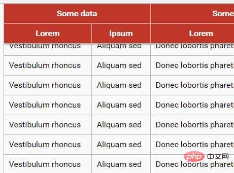
CSS 代码也很简单。
th {
  position: sticky;
  top: 0;
}需要注意的是,sticky必须设在
详细解释可以看:https://css-tricks.com/position-sticky-and-table-headers/
(学习视频分享:css视频教程)
The above is the detailed content of What does positioning mean in css. For more information, please follow other related articles on the PHP Chinese website!

Hot AI Tools

Undresser.AI Undress
AI-powered app for creating realistic nude photos

AI Clothes Remover
Online AI tool for removing clothes from photos.

Undress AI Tool
Undress images for free

Clothoff.io
AI clothes remover

AI Hentai Generator
Generate AI Hentai for free.

Hot Article

Hot Tools

Notepad++7.3.1
Easy-to-use and free code editor

SublimeText3 Chinese version
Chinese version, very easy to use

Zend Studio 13.0.1
Powerful PHP integrated development environment

Dreamweaver CS6
Visual web development tools

SublimeText3 Mac version
God-level code editing software (SublimeText3)

Hot Topics
 1376
1376
 52
52
 How to use bootstrap button
Apr 07, 2025 pm 03:09 PM
How to use the Bootstrap button? Introduce Bootstrap CSS to create button elements and add Bootstrap button class to add button text
 How to resize bootstrap
Apr 07, 2025 pm 03:18 PM
To adjust the size of elements in Bootstrap, you can use the dimension class, which includes: adjusting width: .col-, .w-, .mw-adjust height: .h-, .min-h-, .max-h-
 How to set up the framework for bootstrap
Apr 07, 2025 pm 03:27 PM
To set up the Bootstrap framework, you need to follow these steps: 1. Reference the Bootstrap file via CDN; 2. Download and host the file on your own server; 3. Include the Bootstrap file in HTML; 4. Compile Sass/Less as needed; 5. Import a custom file (optional). Once setup is complete, you can use Bootstrap's grid systems, components, and styles to create responsive websites and applications.
 How to insert pictures on bootstrap
Apr 07, 2025 pm 03:30 PM
There are several ways to insert images in Bootstrap: insert images directly, using the HTML img tag. With the Bootstrap image component, you can provide responsive images and more styles. Set the image size, use the img-fluid class to make the image adaptable. Set the border, using the img-bordered class. Set the rounded corners and use the img-rounded class. Set the shadow, use the shadow class. Resize and position the image, using CSS style. Using the background image, use the background-image CSS property.
 How to view the date of bootstrap
Apr 07, 2025 pm 03:03 PM
Answer: You can use the date picker component of Bootstrap to view dates in the page. Steps: Introduce the Bootstrap framework. Create a date selector input box in HTML. Bootstrap will automatically add styles to the selector. Use JavaScript to get the selected date.
 How to write split lines on bootstrap
Apr 07, 2025 pm 03:12 PM
There are two ways to create a Bootstrap split line: using the tag, which creates a horizontal split line. Use the CSS border property to create custom style split lines.
 How to verify bootstrap date
Apr 07, 2025 pm 03:06 PM
To verify dates in Bootstrap, follow these steps: Introduce the required scripts and styles; initialize the date selector component; set the data-bv-date attribute to enable verification; configure verification rules (such as date formats, error messages, etc.); integrate the Bootstrap verification framework and automatically verify date input when form is submitted.
 How to set the bootstrap navigation bar
Apr 07, 2025 pm 01:51 PM
Bootstrap provides a simple guide to setting up navigation bars: Introducing the Bootstrap library to create navigation bar containers Add brand identity Create navigation links Add other elements (optional) Adjust styles (optional)


