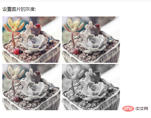
In CSS, you can use the filter attribute to change the image to gray. This attribute can add a filter effect to the image. You only need to add the "filter: grayscale (grayscale value %);" style to the image element. This will set the image to gray.

The operating environment of this tutorial: Windows 7 system, CSS3&&HTML5 version, Dell G3 computer.
In css, you can use the filter attribute to change the image to gray.
The filter attribute defines the visual effect of the element (usually  ), that is, adding filter effects to the image, such as blur and saturation.
When the value of the filter attribute is grayscale(%), the image can be converted to a grayscale image. The value defines the scale of the conversion. If the value is 100%, the image will be completely converted to grayscale, and if the value is 0%, the image will remain unchanged. Values between 0% and 100% are linear multipliers of the effect. If not set, the value defaults to 0;
Sample code:
<!DOCTYPE html>
<html>
	<head>
		<style>
			.img1 {
				-webkit-filter: grayscale(100%);
				/* Chrome, Safari, Opera */
				filter: grayscale(50%);
			}
			.img2 {
				-webkit-filter: grayscale(100%);
				/* Chrome, Safari, Opera */
				filter: grayscale(70%);
			}
			.img3 {
				-webkit-filter: grayscale(100%);
				/* Chrome, Safari, Opera */
				filter: grayscale(100%);
			}
		</style>
	</head>
	<body>

		<p>设置图片的灰度:</p>

		<img  src="/static/imghw/default1.png"  data-src="img/1.jpg"  class="lazy"      style="max-width:90%" alt="How to change image to gray using css style" >
		<img  class="img1 lazy"  src="/static/imghw/default1.png"  data-src="img/1.jpg"       style="max-width:90%" alt="How to change image to gray using css style" >
		<img  class="img2 lazy"  src="/static/imghw/default1.png"  data-src="img/1.jpg"       style="max-width:90%" alt="How to change image to gray using css style" >
		<img  class="img3 lazy"  src="/static/imghw/default1.png"  data-src="img/1.jpg"       style="max-width:90%" alt="How to change image to gray using css style" >
	</body>
</html>
(Learning video sharing: css video tutorial)
The above is the detailed content of How to change image to gray using css style. For more information, please follow other related articles on the PHP Chinese website!