
Css method to implement trapezoid: 1. Create three div elements; 2. Use the border attribute to set the first and third div elements as right-angled triangles; 3. Set the second div element to Square; 4. Use the transform attribute to splice two right triangles and a square into a trapezoid.

The operating environment of this tutorial: Windows 7 system, CSS3&&HTML5 version, Dell G3 computer.
------------------------------------css to make trapezoid----- ----------------------------------------
Let's first explain Think about it, everyone, think about how a trapezoid is formed. It has been taught in primary school mathematics textbooks. Take the isosceles trapezoid as an example. It is composed of two right triangles and a rectangle or square. Look at the sketch↓
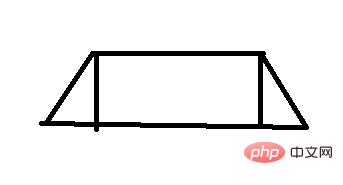
This means that we have to use a 'square' and two triangles to form a trapezoid. Doesn't everyone's ideas suddenly become clearer?
The square is easy to implement, but how to implement the triangle? Let's take a look at the implementation method of triangle:
1. First, I created a div with a class name of 'box'. Let's affectionately call it 'little box'
HTML:
<div class='box'></div>
css:
 <!--小盒子的样式-->
        .box
        {
            width:20px;
            height:20px;
            background-color:blue;
}Let’s take a look at the effect. It is actually an ordinary div with a blue background color.

2. Then, we add four border styles to the 'small box'. The borders are set wider, and the colors of the four borders are given different values to facilitate our viewing.
.box
        {
            width:50px;
            height:50px;
            background-color:blue;

            border-top:50px solid red;
            border-right:50px solid yellow;
            border-bottom:50px solid green;
            border-left:50px solid pink;
}Look at the effect, it is already a relatively fancy existence.
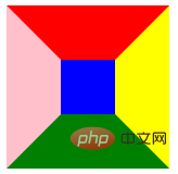
3. Then, we set the width and height of the 'small box' to 0px, remove the blue background color, and of course only the surrounding borders are left. Make up for it, and then we can add the code to see the effect.
.box
        {
            width:0px;
            height:0px;

            border-top:50px solid red;
            border-right:50px solid yellow;
            border-bottom:50px solid green;
            border-left:50px solid pink;
}Come on, apply the effect and take a look! Children, we seem to have seen 4 triangles with different colors, and the next steps are very clear.

4. Suppose we want an upward triangle. As long as the color of the upper, right and left borders of the 'small box' is set to transparent, only the lower The border is the small upward triangle. Come on and take a look!
        .box
        {
            width:0px;
            height:0px;

            border-top:50px solid rgba(0,0,0,0);
            border-right:50px solid  rgba(0,0,0,0);
            border-bottom:50px solid green;
            border-left:50px solid  rgba(0,0,0,0);
}Look at the effect! A small green upward triangle appears, \(^o^)/
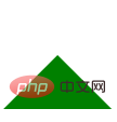
Through the above operations, we have successfully made a small triangle with css, which is Not very simple.
Without further ado, let’s take a look at how to realize the trapezoid
1. First, make three 'small boxes' No. 1, and No. 3 The small boxes are all made into small triangles, and the small box No. 2 is made into a square.
html:
<div class='box'></div>
css:
        .box,.box3
        {
            width:0px;
            height:0px;

            border-top:50px solid rgba(0,0,0,0);
            border-right:50px solid  rgba(0,0,0,0);
            border-bottom:50px solid green;
            border-left:50px solid  rgba(0,0,0,0);

            margin-bottom:10px;
            }

            .box2
        {
            width:50px;
            height:50px;
            background-color:green;
}Let’s take a look at the effect first↓
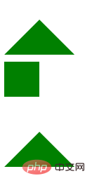
2, someone wants to ask , the shape is out, but how to put it together? Here we need to use the positioning instructions in css and transfrom in css3. If you don’t understand, there are detailed explanations in w3c. I will just achieve the effect we want here.
3. First arrange all the 'small boxes' in a row, so that the block elements are arranged in a row: you can add float to the 'small box', or you can directly set the 'small box' The display: inline-block; since my habit is to clear the float of the parent element as long as I add a float, which is troublesome, I directly set the display: inline-block of the 'small box'.

4. Finally set the displacement of No.1 and No.3 small boxes and it will be ok. Look at the code↓
       .box{
                transform: translate(54px,10px);
            }
            .box3{
                transform: translate(-54px,10px);
}Look at the effect↓
I won’t introduce the methods one by one here. Finally, I wish you all a happy study. 
css video tutorial
)The above is the detailed content of How to implement trapezoid in css. For more information, please follow other related articles on the PHP Chinese website!