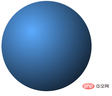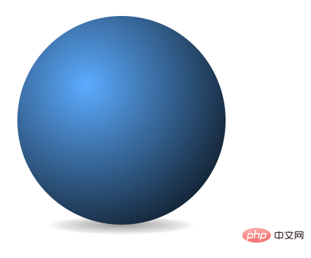
How to implement a sphere in css3: 1. Create a square element with equal width and height, and use the border-radius attribute to set it to a circle; 2. Use "background:radial-gradient(...)" Statement adds a radial gradient background color to the circular element to achieve the sphere effect.

The operating environment of this tutorial: Windows 7 system, CSS3&&HTML5 version, Dell G3 computer.
#css3 Steps to implement a sphere:
1. Basic shape
Let’s implement it first A basic circle, the HTML code is as follows:
<figure class="circle"></figure>
The new HTML5 tag figure is used here, but other tags can also be used. The figure tag is specially used to display pictures or other graphic content in web pages. In order to achieve a circular effect, add some basic styles:
.circle {
display: block;
background: black;
border-radius: 50%;
height: 300px;
width: 300px;
margin: 0;
}
2, radial gradient
The above implements the basic Circular effect, a radial gradient effect is added here to achieve a more realistic sphere.
.circle {
  display: block;
  background: black;
  border-radius: 50%;
  height: 300px;
  width: 300px;
  margin: 0;
  background: -webkit-radial-gradient(100px 100px, circle, #5cabff, #000);
  background: -moz-radial-gradient(100px 100px, circle, #5cabff, #000);
  background: radial-gradient(100px 100px, circle, #5cabff, #000);
}
3. Add shadows to enhance the three-dimensional effect
The basic sphere effect has been produced in the previous section. In order to increase the three-dimensional effect , we add a shadow at the bottom of the ball to make it more three-dimensional.
The HTML code used here is as follows:
<section class="stage">
	<figure class="circle"><span class="shadow"></span></figure>
</section>
CSS code is as follows:
.stage {
				width: 300px;
				height: 300px;
				display: inline-block;
				margin: 20px;
				-webkit-perspective: 1200px;
				-webkit-perspective-origin: 50% 50%;
			}

			.circle .shadow {
				position: absolute;
				width: 100%;
				height: 100%;
				background: -webkit-radial-gradient(50% 50%, circle, rgba(0, 0, 0, 0.4), rgba(0, 0, 0, 0.1) 40%, rgba(0, 0, 0, 0) 50%);
				-webkit-transform: rotateX(90deg) translateZ(-150px);
				z-index: -1;
			}
(Learning video sharing: css Video tutorial)
The above is the detailed content of How to realize css3 sphere. For more information, please follow other related articles on the PHP Chinese website!
 css3 tutorial
 What are the css3 gradient properties?
 How to save programs written in pycharm
 How to turn off windows security center
 mysql paging method
 How to repair win7 system if it is damaged and cannot be booted
 Introduction to the opening location of win8 running
 What are the Linux shutdown commands?
 What does url mean?