 Web Front-end
 CSS Tutorial
 Teach you step by step how to use CSS to create dynamic pie charts (with code)
Teach you step by step how to use CSS to create dynamic pie charts (with code)
How to create a pie chart with CSS? The following article will teach you step by step how to use CSS to create a dynamic pie chart. I hope it will be helpful to everyone!

Pie charts are common components that allow you to show parts of a whole, and you can use them in many different scenarios. You'll find a lot of articles about building such a component, but they usually rely on either SVG or a lot of HTML elements. In this article, I will show you how to create a pie chart using CSS and just one element.
Next we make a static pie chart, an animated pie chart, and we can also have rounded corners. Yet all this is done with just one <div> element. <p>Besides that, we can easily adjust different values using CSS variables, so we don’t have to worry about changing CSS code. </p>
<h2 id="HTML-structure-of-the-pie-chart">HTML structure of the pie chart</h2>
<p>As I mentioned above, we have a single <code><div> to which we add the percentage value (the progress of the pie chart) As main content: <div class="code" style="position:relative; padding:0px; margin:0px;"><div class="code" style="position:relative; padding:0px; margin:0px;"><pre class='brush:php;toolbar:false;'><div class="pie" style="--p:60;--b:10px;--c:purple;">60%</div></pre><div class="contentsignin">Copy after login</div></div><div class="contentsignin">Copy after login</div></div><p> We also add CSS variables as inline styles. </p><ul><li><code>--p: This variable should contain the percentage value as a number (without the % sign). It should be the same as the content.
--b: This variable will define the thickness of the border. --c: This variable will define the main color. For the sake of this article and demonstration, I used single-character variables to keep the code short. But when using code in a production environment, it's better to think about more explicit variables. Examples: --percentage, --border-thickness, and --main-color.
CSS Settings for Pie Chart
We start by styling our content. This part is easy, the code is as follows:
.pie {
  --w: 150px;
  width: var(--w);
  aspect-ratio: 1;
  display: inline-grid;
  place-content: center;
  margin: 5px;
  font-size: 25px;
  font-weight: bold;
  font-family: sans-serif;
} I define the element as inline-grid using place-content: center. We aspect-ratio: 1 is used to ensure that the element remains square. We could also use height: var(--w), but it’s always good to learn and use new CSS properties.
You may be wondering why I use a variable to define the width instead of simply setting width: 150px. I need to know the value of the width for future use, so I define it as a variable .
All the rest of the CSS is very basic text styling. Feel free to update it.
Let's move on to the fun part - the main shape of our component. To do this, we will use a pseudo-element with the following style:
.pie:before{
  content: "";
  position: absolute;
  border-radius: 50%;
  inset: 0;
  background: conic-gradient(var(--c) calc(var(--p)*1%),#0000 0);
} A pseudo-element that covers all areas, position: absolute This is done thanks to inset: 0 . Yes, it is a new CSS property, which is the abbreviation of top, right, bottom, and right.
You can read more here
https://developer.mozilla.org/en-US/docs/Web/CSS/inset
Then we turn it into a circle ( border-radius: 50%) and apply a conic-gradient(). Note that we defined the style as inline Usage of CSS variables (--c for color and --p for percentage).
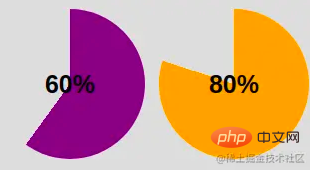
So far this will give us the following results:

We are getting closer! This conic-gradient() gives us a two-color gradient. Primary color from 0% to p%, the rest is transparent color (defined with hexadecimal value #0000).
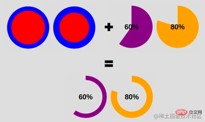
In order to keep only the border part, we will use amask to hide the middle part. This time we will use radial-gradient():
radial-gradient(farthest-side,red calc(99% - var(--b)),blue calc(100% - var(--b)))
The above as a background application will provide us with the following information:
Note the use of variables that define the border thickness--b (shown in blue above).
Now imagine that the red part is the invisible part and the blue part is the visible part. If we use the same gradient for the properties, this is what we will get:
 Our pie chart contains one element and a few lines of CSS code .
.pie {
  --w:150px;

  width: var(--w);
  aspect-ratio: 1;
  position: relative;
  display: inline-grid;
  place-content: center;
  margin: 5px;
  font-size: 25px;
  font-weight: bold;
  font-family: sans-serif;
}
.pie:before {
  content: "";
  position: absolute;
  border-radius: 50%;
  inset: 0;
  background: conic-gradient(var(--c) calc(var(--p)*1%),#0000 0);
  -webkit-mask:radial-gradient(farthest-side,#0000 calc(99% - var(--b)),#000 calc(100% - var(--b)));
          mask:radial-gradient(farthest-side,#0000 calc(99% - var(--b)),#000 calc(100% - var(--b)));
}And HTML:
<div class="pie" style="--p:60;--b:10px;--c:purple;">60%</div>
How to add rounded edgesFor this I will add an extra gradient layer to round the edge, and add a pseudo element to round the other edge. Here is an illustration to understand the trick:
 (1) Code for dome edge:
.pie:before {
  background:
    radial-gradient(farthest-side,var(--c) 98%,#0000) top/var(--b) var(--b) no-repeat,
    conic-gradient(var(--c) calc(var(--p)*1%),#0000 0);
}Except,
conic-gradient()We also added a radial-gradient() placed at the top with a size equal to the border thickness defined by --b.
(2) Code for rounding the other side: <div class="code" style="position:relative; padding:0px; margin:0px;"><pre class='brush:php;toolbar:false;'>.pie:after {
content: "";
position: absolute;
border-radius: 50%;
inset: calc(50% - var(--b)/2);
background: var(--c);
transform: rotate(calc(var(--p)*3.6deg)) translate(calc(50% - var(--w)/2));
}</pre><div class="contentsignin">Copy after login</div></div><p>该<code>inset属性将伪元素的大小设置为等于--b。请记住,它是top,right和bottom的简写left。如果我们有
left = right = 50% - b/2
这意味着我们从每一边移动到中心减去等于的偏移量b/2- 所以我们最终的宽度等于2*b/2 = b。高度的逻辑相同。
现在我们需要正确放置我们的元素,这就是我们使用 transform 属性的原因。我们的元素最初放置在中心,所以我们需要先旋转它。有了百分比,我们使用“三规则”来获得角度:
angle = percentage*360deg/100
然后我们进行平移,这里我们需要宽度,因为我们必须执行一半宽度的平移 ( w/2)。
好吧,好吧——你可能对所有这些公式有点迷失了。在下面找到一个插图以了解转换属性背后的逻辑

之后,我们用主色给伪元素上色--c,就完成了。我们有圆边的饼图。
如何为饼图制作动画
静态饼图很好,但动画饼图更好!为此,我们将动画百分比值--p从0定义值。默认情况下,我们无法为 CSS 变量设置动画,但由于有了新@property功能,它现在可以实现了。
我们注册变量:
@property --p{
syntax: '<number>';
inherits: true;
initial-value: 0;
}我们创建一个keyframes:
@keyframes p {
  from {--p:0}
}请注意,我们只需要指定from. 这样做,默认情况下,浏览器将to等于我们定义的值 ( <div class="pie" style="--p:60;">60%</div>)。
最后,我们称之为动画。您可以根据需要定义持续时间/延迟。
animation: p 1s .5s both;
注意:这种技术并未得到广泛支持。你可以在基于 Chromium 的浏览器(Chrome 和 Edge)上对其进行测试,但在 Firefox 和 Safari 上会失败。您可以查看Can I Use以跟踪支持。
(学习视频分享:css视频教程)
The above is the detailed content of Teach you step by step how to use CSS to create dynamic pie charts (with code). For more information, please follow other related articles on the PHP Chinese website!

Hot AI Tools

Undresser.AI Undress
AI-powered app for creating realistic nude photos

AI Clothes Remover
Online AI tool for removing clothes from photos.

Undress AI Tool
Undress images for free

Clothoff.io
AI clothes remover

Video Face Swap
Swap faces in any video effortlessly with our completely free AI face swap tool!

Hot Article

Hot Tools

Notepad++7.3.1
Easy-to-use and free code editor

SublimeText3 Chinese version
Chinese version, very easy to use

Zend Studio 13.0.1
Powerful PHP integrated development environment

Dreamweaver CS6
Visual web development tools

SublimeText3 Mac version
God-level code editing software (SublimeText3)

Hot Topics
 1393
1393
 52
52
 1207
1207
 24
24
 How to use bootstrap in vue
Apr 07, 2025 pm 11:33 PM
Using Bootstrap in Vue.js is divided into five steps: Install Bootstrap. Import Bootstrap in main.js. Use the Bootstrap component directly in the template. Optional: Custom style. Optional: Use plug-ins.
 The Roles of HTML, CSS, and JavaScript: Core Responsibilities
Apr 08, 2025 pm 07:05 PM
HTML defines the web structure, CSS is responsible for style and layout, and JavaScript gives dynamic interaction. The three perform their duties in web development and jointly build a colorful website.
 How to write split lines on bootstrap
Apr 07, 2025 pm 03:12 PM
There are two ways to create a Bootstrap split line: using the tag, which creates a horizontal split line. Use the CSS border property to create custom style split lines.
 Understanding HTML, CSS, and JavaScript: A Beginner's Guide
Apr 12, 2025 am 12:02 AM
WebdevelopmentreliesonHTML,CSS,andJavaScript:1)HTMLstructurescontent,2)CSSstylesit,and3)JavaScriptaddsinteractivity,formingthebasisofmodernwebexperiences.
 How to resize bootstrap
Apr 07, 2025 pm 03:18 PM
To adjust the size of elements in Bootstrap, you can use the dimension class, which includes: adjusting width: .col-, .w-, .mw-adjust height: .h-, .min-h-, .max-h-
 How to use bootstrap button
Apr 07, 2025 pm 03:09 PM
How to use the Bootstrap button? Introduce Bootstrap CSS to create button elements and add Bootstrap button class to add button text
 How to set up the framework for bootstrap
Apr 07, 2025 pm 03:27 PM
To set up the Bootstrap framework, you need to follow these steps: 1. Reference the Bootstrap file via CDN; 2. Download and host the file on your own server; 3. Include the Bootstrap file in HTML; 4. Compile Sass/Less as needed; 5. Import a custom file (optional). Once setup is complete, you can use Bootstrap's grid systems, components, and styles to create responsive websites and applications.
 How to insert pictures on bootstrap
Apr 07, 2025 pm 03:30 PM
There are several ways to insert images in Bootstrap: insert images directly, using the HTML img tag. With the Bootstrap image component, you can provide responsive images and more styles. Set the image size, use the img-fluid class to make the image adaptable. Set the border, using the img-bordered class. Set the rounded corners and use the img-rounded class. Set the shadow, use the shadow class. Resize and position the image, using CSS style. Using the background image, use the background-image CSS property.


