 Web Front-end
 CSS Tutorial
 In ten minutes, you will learn how to implement a pie chart using only one div and css.
In ten minutes, you will learn how to implement a pie chart using only one div and css.
This article brings you some related questions about how to use a div with css to implement a pathological diagram. I hope it will be helpful to you.

Please scroll to the end of the article for the complete code.
We only use one div and only css to implement the pie chart.
HTMl structure
<div class="pie" style="--p:60;--b:10px;--c:purple;">60%</div>
We added several css variables:
--p: the percentage of the progress bar (pure number, without %), the pie chart value is consistent with the div content (with %).
--b: The value of the border thickness
--c: The main color of the border
This article uses abbreviated variables. In a production environment, in order to achieve readability, we should use --p -> --percentage, --b -> --border-thickness, --c - > --main-color to represent.
Basic settings of Pie
We set the basic style for the pie chart.
.pie {
  --w: 150px; // --w -> --width
  width: var(--w);
  aspect-ratio: 1; // 纵横比,1 说明是正方形
  display: inline-grid;
  place-content: center;
  margin: 5px;
  font-size: 25px;
  font-weight: bold;
  font-family: sans-serif;
}Above we used aspect-ratio: 1; to ensure that the div is square. Of course, you can also use height: var(--w) to achieve the effect.
Next, we use pseudo elements to implement a simple pie chart:
.pie:before {
  content: "",
  position: absoute;
  border-radius: 50%;
  inset: 0; // 知识点 1
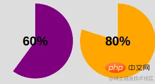
  background: conic-gradient(var(--c) calc(var(--p)*1%),#0000 0); // 知识点 2
}Knowledge point 1: inset: 0; is equivalent to top: 0; right: 0; bottom: 0; top : 0;
Knowledge point 2: conic-gradient cone gradient, css method, more content, #0000 here is the hexadecimal value of transparent.
#0000 Hex Color · Red (0%) · Green (0%) · Blue (0%).
After conic-gradient application:

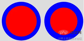
In order to make only the border area visible, we use the mask attribute to hide the middle circle part. We will use the radial-gradient() method:
radial-gradient(farthest-side,red calc(99% - var(--b)),blue calc(100% - var(--b)))
After applying the above code, the effect diagram can be obtained as follows:

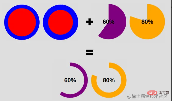
Our goal is as follows:

We can achieve this by changing the code:
<div class="pie" style="max-width:90%">60%</div>
.pie {
  --w:150px;

  width: var(--w);
  aspect-ratio: 1;
  position: relative;
  display: inline-grid;
  place-content: center;
  margin: 5px;
  font-size: 25px;
  font-weight: bold;
  font-family: sans-serif;
}
.pie:before {
  content: "";
  position: absolute;
  border-radius: 50%;
  inset: 0;
  background: conic-gradient(var(--c) calc(var(--p)*1%),#0000 0);
  -webkit-mask:radial-gradient(farthest-side,#0000 calc(99% - var(--b)),#000 calc(100% - var(--b)));
          mask:radial-gradient(farthest-side,#0000 calc(99% - var(--b)),#000 calc(100% - var(--b)));
}Add a circular edge
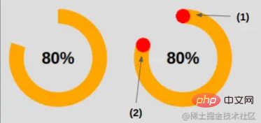
How to add a circular edge, look at the illustration below , you will understand this little trick.

For the effect (1) in the picture, place the circle at the starting edge.
.pie:before {
  background:
    radial-gradient(farthest-side, var(--c) 98%, #0000) top/var(--b) var(--b) no-repeat,
    conic-gradient(var(--c) calc(var(--p)*1%), #0000 0);
}For the effect (2) in the picture, place the circle on the edge of the end.
.pipe: after {
  content: "";
  position: absolute;
  border-radius: 50%;
  inset: calc(50% - var(--b)/2); // 知识点1
  background: var(--c);
  transform: rotate(calc(var(--p)*3.6deg)) translateY(calc(50% - var(--w)/2)); // 知识点2
}Knowledge point 1: The inset: 0; we also mentioned above - it is the abbreviation of left: 0; right: 0; bottom: 0; top: 0;.
Here we have:
left = right = 50% - b/2
Here we have moved the element to the left and right by 50% - b/2, which is equivalent to the element width being b, and centered left and right. Same thing for height.
Knowledge point 2: Calculation of rotation degrees --
angle = percentage * 360deg / 100
First rotate the element by the corresponding degree, and then move its position. This involves centering the Y axis. The text may be a little difficult to understand, so let’s understand it with the following illustrations:

Add animation
So far, what we have achieved is a static pie shape picture. We'll add animation to it next.
First register the variable:
@property --p {
syntax: '<number>';
inherits: true;
initial-value: 0;
}Then, we create the key frame:
@keyframes p {
  from {
    --p: 0
  }
}Note: Here we only need to set the --p value of from. The browser will automatically match the value in our preset to (div class="pie" style="--p:60;">60%
Finally, we call the animation .
animation: p 1s .5s both;
Hey~ Copy the code below to experience it. Of course, we also provide pictures.
Code and renderings
<div class="pie" style="--p:20"> 20%</div>
<div class="pie" style="--p:40;--c:darkblue;--b:10px"> 40%</div>
<div class="pie no-round" style="--p:60;--c:purple;--b:15px"> 60%</div>
<div class="pie animate no-round" style="--p:80;--c:orange;"> 80%</div>
<div class="pie animate" style="--p:90;--c:lightgreen"> 90%</div>
@property --p{
syntax: '<number>';
inherits: true;
initial-value: 1;
}
.pie {
--p:20;
--b:22px;
--c:darkred;
--w:150px;
width: var(--w);
aspect-ratio: 1;
position: relative;
display: inline-grid;
margin: 5px;
place-content: center;
font-size: 25px;
font-weight: bold;
font-family: sans-serif;
}
.pie:before,
.pie:after {
content: "";
position: absolute;
border-radius: 50%;
}
.pie:before {
inset: 0;
background:
radial-gradient(farthest-side,var(--c) 98%,#0000) top/var(--b) var(--b) no-repeat,
conic-gradient(var(--c) calc(var(--p)*1%),#0000 0);
-webkit-mask: radial-gradient(farthest-side,#0000 calc(99% - var(--b)),#000 calc(100% - var(--b)));
mask: radial-gradient(farthest-side,#0000 calc(99% - var(--b)),#000 calc(100% - var(--b)));
}
.pie:after {
inset: calc(50% - var(--b)/2);
background: var(--c);
transform: rotate(calc(var(--p)*3.6deg)) translateY(calc(50% - var(--w)/2));
}
.animate {
animation: p 1s .5s both;
}
.no-round:before {
background-size: 0 0, auto;
}
.no-round:after {
content: none;
}
@keyframes p{
from{--p:0}
}Renderings:

css video tutorial)
The above is the detailed content of In ten minutes, you will learn how to implement a pie chart using only one div and css.. For more information, please follow other related articles on the PHP Chinese website!

Hot AI Tools

Undresser.AI Undress
AI-powered app for creating realistic nude photos

AI Clothes Remover
Online AI tool for removing clothes from photos.

Undress AI Tool
Undress images for free

Clothoff.io
AI clothes remover

AI Hentai Generator
Generate AI Hentai for free.

Hot Article

Hot Tools

Notepad++7.3.1
Easy-to-use and free code editor

SublimeText3 Chinese version
Chinese version, very easy to use

Zend Studio 13.0.1
Powerful PHP integrated development environment

Dreamweaver CS6
Visual web development tools

SublimeText3 Mac version
God-level code editing software (SublimeText3)

Hot Topics
 1378
1378
 52
52
 How to write split lines on bootstrap
Apr 07, 2025 pm 03:12 PM
There are two ways to create a Bootstrap split line: using the tag, which creates a horizontal split line. Use the CSS border property to create custom style split lines.
 The Roles of HTML, CSS, and JavaScript: Core Responsibilities
Apr 08, 2025 pm 07:05 PM
HTML defines the web structure, CSS is responsible for style and layout, and JavaScript gives dynamic interaction. The three perform their duties in web development and jointly build a colorful website.
 How to use bootstrap in vue
Apr 07, 2025 pm 11:33 PM
Using Bootstrap in Vue.js is divided into five steps: Install Bootstrap. Import Bootstrap in main.js. Use the Bootstrap component directly in the template. Optional: Custom style. Optional: Use plug-ins.
 How to insert pictures on bootstrap
Apr 07, 2025 pm 03:30 PM
There are several ways to insert images in Bootstrap: insert images directly, using the HTML img tag. With the Bootstrap image component, you can provide responsive images and more styles. Set the image size, use the img-fluid class to make the image adaptable. Set the border, using the img-bordered class. Set the rounded corners and use the img-rounded class. Set the shadow, use the shadow class. Resize and position the image, using CSS style. Using the background image, use the background-image CSS property.
 How to resize bootstrap
Apr 07, 2025 pm 03:18 PM
To adjust the size of elements in Bootstrap, you can use the dimension class, which includes: adjusting width: .col-, .w-, .mw-adjust height: .h-, .min-h-, .max-h-
 How to set up the framework for bootstrap
Apr 07, 2025 pm 03:27 PM
To set up the Bootstrap framework, you need to follow these steps: 1. Reference the Bootstrap file via CDN; 2. Download and host the file on your own server; 3. Include the Bootstrap file in HTML; 4. Compile Sass/Less as needed; 5. Import a custom file (optional). Once setup is complete, you can use Bootstrap's grid systems, components, and styles to create responsive websites and applications.
 How to use bootstrap button
Apr 07, 2025 pm 03:09 PM
How to use the Bootstrap button? Introduce Bootstrap CSS to create button elements and add Bootstrap button class to add button text
 How to view the date of bootstrap
Apr 07, 2025 pm 03:03 PM
Answer: You can use the date picker component of Bootstrap to view dates in the page. Steps: Introduce the Bootstrap framework. Create a date selector input box in HTML. Bootstrap will automatically add styles to the selector. Use JavaScript to get the selected date.


