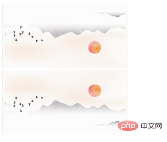
In CSS3, you can use the transform attribute with the rotate3d(), rotateX(), rotateY() and rotateZ() functions to achieve a three-dimensional flip effect. The syntax is "transform:rotate3d(x,y,z,angle )".

The operating environment of this tutorial: Windows 10 system, CSS3&&HTML5 version, Dell G3 computer.
The transform attribute applies 2D or 3D transformation to the element. This property allows us to rotate, scale, move or tilt the element.
When this attribute is used in conjunction with the four functions rotateX(), rotateY(), rotateZ() and rotate3d(), the three-dimensional flip effect can be achieved.
<!DOCTYPE html>
<html lang="en">
<head>
    <meta charset="UTF-8">
    <meta name="viewport" content="width=device-width, initial-scale=1.0">
    <meta http-equiv="X-UA-Compatible" content="ie=edge">
    <title>Document</title>
    <style>
.img1{
transform:rotateX(180deg);
}
</style>
</head>
<body>
<img  class="img1 lazy"  src="/static/imghw/default1.png"  data-src="1115.08.png"    alt="How to achieve three-dimensional flip effect in css3" ><br>
<img  src="/static/imghw/default1.png"  data-src="1115.08.png"  class="lazy"   alt="How to achieve three-dimensional flip effect in css3" >
</body>
</html>(Learning video sharing:
css video tutorial) 
The above is the detailed content of How to achieve three-dimensional flip effect in css3. For more information, please follow other related articles on the PHP Chinese website!