 Web Front-end
 CSS Tutorial
 Teach you step by step how to use pure CSS to imitate AntDesign's Logo Easter Egg effect
Teach you step by step how to use pure CSS to imitate AntDesign's Logo Easter Egg effect
How to achieve the Logo Easter Egg effect on Ant Design’s official website? This article will analyze the implementation principle and show you how to use pure CSS to realize the Easter egg effect of the Ant Design official website Logo step by step. I hope it will be helpful to everyone!
In recent projects, Ant Design has been connected a lot, which is still very good. I don’t know if you have noticed this effect. On the official website, if the mouse is placed on the logo, the icon on the letters i will keep changing. When you leave it, it will stop, and it will change again when you put it up. A little easter egg (maybe I didn’t find it before), the demonstration is as follows:
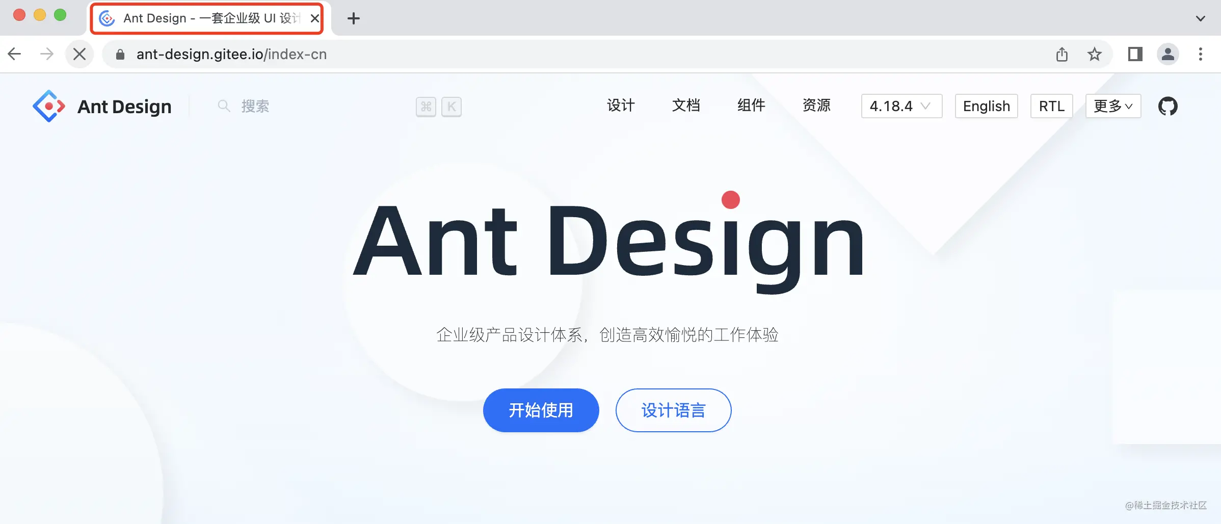
But it’s not surprising that I didn’t find it, because this effect is implemented by js and must wait for the loading to be completed before it can take effect. , and the official website is sometimes very slow. For example, when it is still loading, there is a high probability that it will not have the above hover effect

Well, after thinking about it, this effect can be achieved completely with pure CSS. The implementation cost is low and it can effectively avoid the above loading problem. Let’s take a look.
1. CSS implementation principle
The entire implementation principle is roughly as follows
Prepare a material containing all small icons
Create a CSS that changes the background position Frame-by-frame animation
Control the animation running through mouse hover
2. Material preparation
In order to avoid multiple requests, In order to facilitate the creation of animations, all the small icon materials are combined here (saved from the official website), just like the previous "Sprite picture", as follows
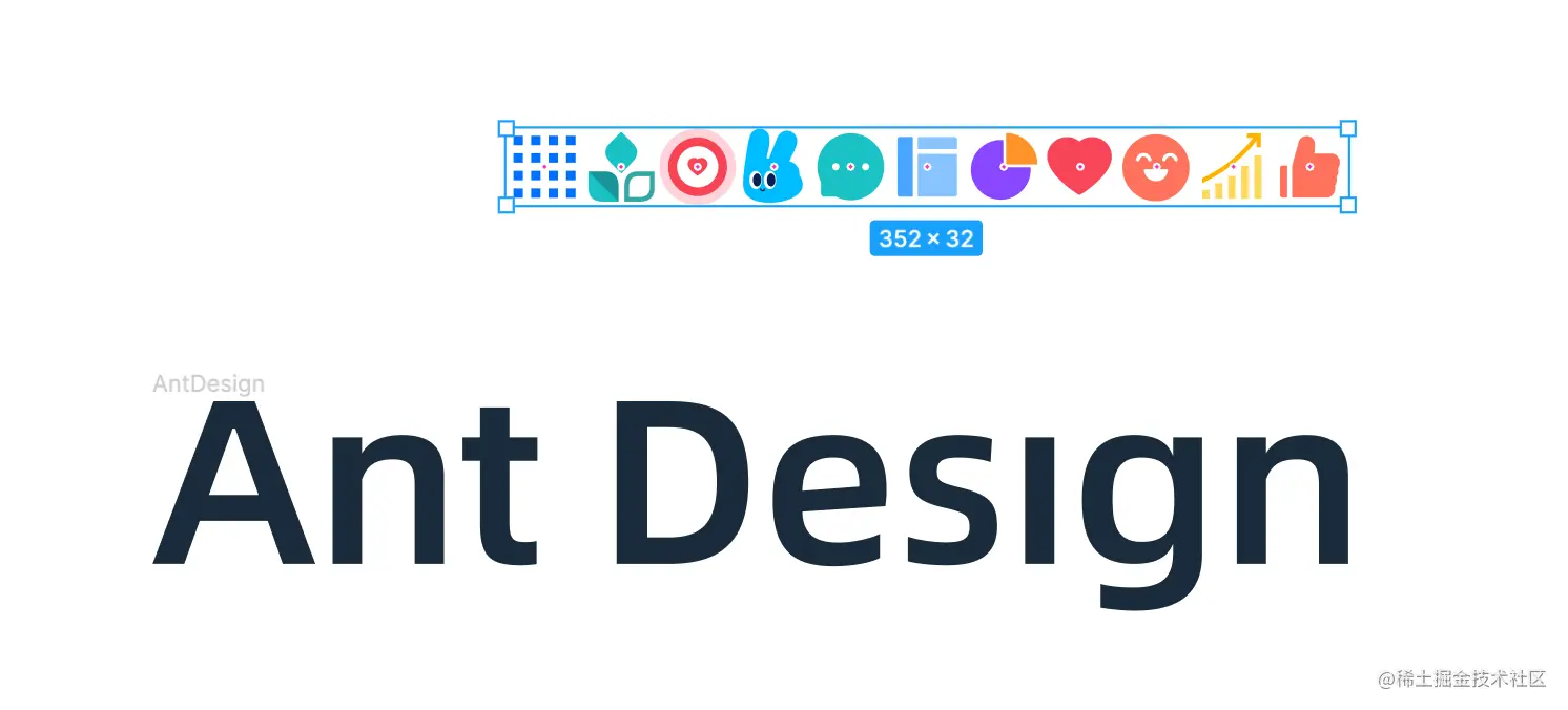
Assumptions The HTML structure is like this
<h1 id="Ant-nbsp-Design">Ant Design</h1>
For better semantics, it is recommended to retain the text here, and then hide the text through other methods (such as transparency). You can use the logo as a background image, and then use the changeable small icon Pseudo element generation (decorative elements can be generated using pseudo elements to ensure the cleanliness of HTML), the CSS is as follows
.logo{
  width: 500px;
  height: 100px;
  position: relative;
  color: transparent;
  background: url('https://imgservices-1252317822.image.myqcloud.com/image/012420220165011/c0e82c29.svg') center/contain no-repeat;
  cursor: pointer;
}
.logo::after{
  content: '';
  position: absolute;
  width: 32px;
  height: 32px;
  background: url('https://imgservices-1252317822.image.myqcloud.com/image/012420220165415/b0005044.svg') 0 / cover no-repeat;
  right: 113px;
  top: -18px;
}Static layout is calculated

2. CSS frame-by-frame animation
Then animation, you only need to use the steps() function in the CSS animation function to achieve frame-by-frame animation
First of all Define a key frame and change the background position.
@keyframes random {
  to {
    background-position: 100%;
  }
}There are a total of 11 small icons here, and the changes between them are 10 steps, so the animation settings are as follows
.logo::after{
	/*其他样式*/
  animation: random 1s steps(10) infinite;
}In this way, you get an infinite loop of frame-by-frame animation

3. Pause and run CSS animation
By default , CSS animation runs by default, but the current requirement is that it will only move when the mouse hover is moved up.
Some students may do this. There is no animation by default. An animation is created when hovering, as follows
.logo::after{
	/*默认无动画*/
}
.logo:hover::after{
  animation: random 1s steps(10) infinite;
}But there will be two problems with this:
Every time you create an animation in real time, there will be more performance consumption
Every time the mouse leaves, the position will be restored to the initial state

Therefore, this method is not advisable
In addition to the above method to control animation operation, you can also take the initiative through animation-play-state Set pause, as follows
.logo::after{
	/*其他样式*/
  animation: random 1s steps(10) infinite;
  animation-play-state: paused; /*动画暂停*/
} In this way, it will not move by default, and then "run" when hover
.logo:hover::after{
  animation-play-state: running; /*动画运行*/
}The effect is as follows

4. Specify the initial position
The default is that the small icon is the first one. If you want to specify another one, such as

How to deal with this situation
First of all, we thought that we can manually change the background position, which is the 8th one, so
.logo::after{
  /*其他样式*/
  background-position: -224px; /* 32 * 7 */
}The effect is as follows

这样下来,问题更多,由于改变了动画的起始位置,动画从第 8 个的地方运动到最右侧,左边的都不经过了,step 也需要重新调整。
除了这种方式,还可以通过动画的“负延迟”来实现,给动画添加一个负的延迟后,动画会提前运动到未来位置。
比如这里想指定到未来第7帧的位置,就可以延迟负的总运动时长的 7/ 10 ,实现如下
.logo::after{
  /*其他样式*/
  animation-delay: -.7s; /* 7 / 10 * 1s*/
}这样就不会影响原有的动画了,完美实现

完整代码可以访问:Ant Design Logo (codepen.io)
https://codepen.io/xboxyan/pen/LYOPoxz
附上完整代码(最近codepen貌似不太稳定)
.logo{
  width: 500px;
  height: 100px;
  position: relative;
  color: transparent;
  background: url('https://imgservices-1252317822.image.myqcloud.com/image/012420220165011/c0e82c29.svg') center/contain no-repeat;
  cursor: pointer;
}
.logo::after{
  content: '';
  position: absolute;
  width: 32px;
  height: 32px;
  background: url('https://imgservices-1252317822.image.myqcloud.com/image/012420220165415/b0005044.svg') 0 / cover no-repeat;
  right: 113px;
  top: -18px;
  animation: random 1s -.7s steps(10) infinite;
  animation-play-state: paused;
}
.logo:hover::after{
  animation-play-state: running;
}
@keyframes random {
  to {
    background-position: 100%;
  }
}五、总结和说明
上面就是针对 Ant Design 官网 Logo 效果的 CSS 实现,代码量非常少,而且也避免了 js 未加载完成时的问题,体验更好,下面简单总结一下
CSS 渲染是及时的,只要页面可见,就不会影响 CSS 交互
逐帧动画可以通过 CSS 动画 中的 step() 函数实现
CSS 动画可以自动运行,也可以手动暂停
通过设置负的延时,可以让 CSS 动画提前运行
当然,CSS 的优点还不只这些,打开 Ant Design 控制台,让我有点崩溃的是,居然是不断更换svg链接实现的,如果一直放在 Logo 上就会源源不断的请求图片,小图标也会出现“闪烁”的情况
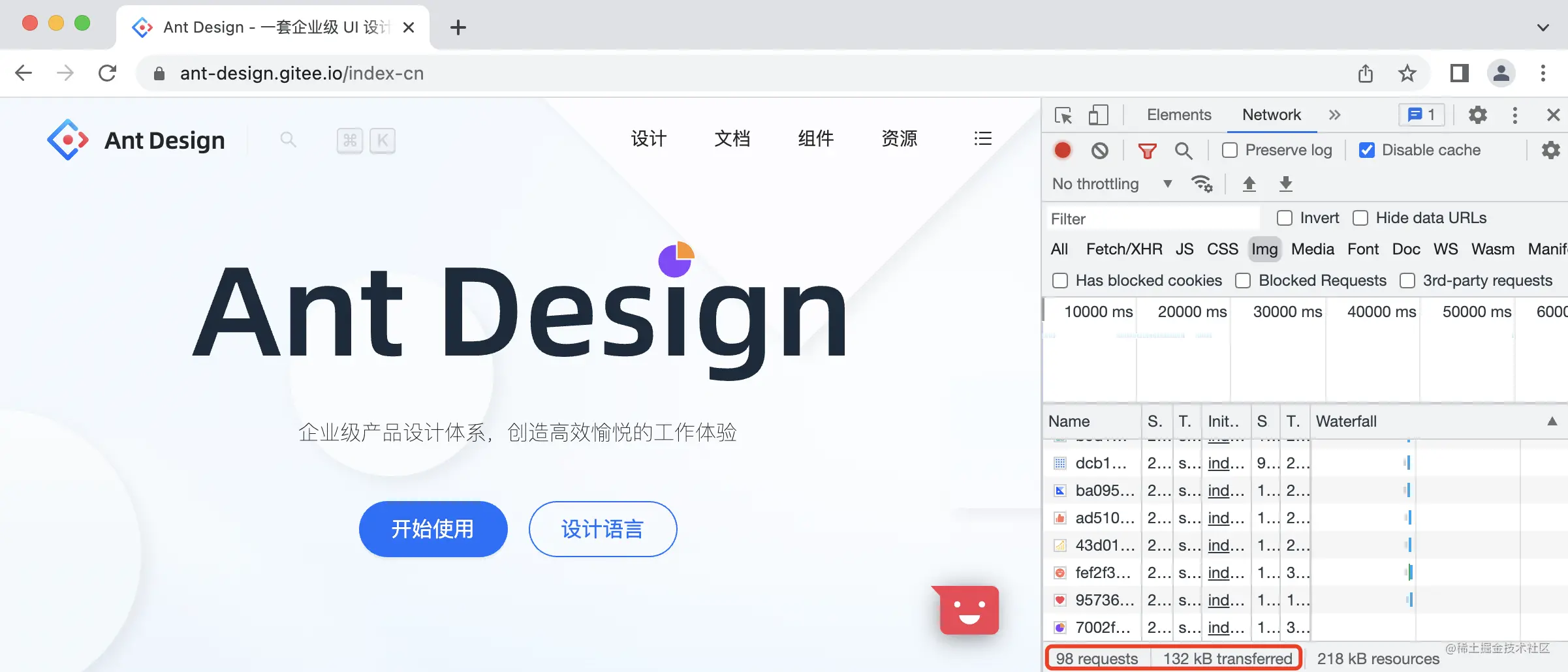
这个请求量就有点惊人了。如果有负责 Ant Design 官网的小伙伴看到这里,是不是可以优化一下呢?
最后,如果觉得还不错,对你有帮助的话,欢迎点赞、收藏、转发
(学习视频分享:css视频教程)
The above is the detailed content of Teach you step by step how to use pure CSS to imitate AntDesign's Logo Easter Egg effect. For more information, please follow other related articles on the PHP Chinese website!

Hot AI Tools

Undresser.AI Undress
AI-powered app for creating realistic nude photos

AI Clothes Remover
Online AI tool for removing clothes from photos.

Undress AI Tool
Undress images for free

Clothoff.io
AI clothes remover

AI Hentai Generator
Generate AI Hentai for free.

Hot Article

Hot Tools

Notepad++7.3.1
Easy-to-use and free code editor

SublimeText3 Chinese version
Chinese version, very easy to use

Zend Studio 13.0.1
Powerful PHP integrated development environment

Dreamweaver CS6
Visual web development tools

SublimeText3 Mac version
God-level code editing software (SublimeText3)

Hot Topics
 1359
1359
 52
52
 How to remove the default style in Bootstrap list?
Apr 07, 2025 am 10:18 AM
The default style of the Bootstrap list can be removed with CSS override. Use more specific CSS rules and selectors, follow the "proximity principle" and "weight principle", overriding the Bootstrap default style. To avoid style conflicts, more targeted selectors can be used. If the override is unsuccessful, adjust the weight of the custom CSS. At the same time, pay attention to performance optimization, avoid overuse of !important, and write concise and efficient CSS code.
 How to build a bootstrap framework
Apr 07, 2025 pm 12:57 PM
To create a Bootstrap framework, follow these steps: Install Bootstrap via CDN or install a local copy. Create an HTML document and link Bootstrap CSS to the <head> section. Add Bootstrap JavaScript file to the <body> section. Use the Bootstrap component and customize the stylesheet to suit your needs.
 How to set the bootstrap navigation bar
Apr 07, 2025 pm 01:51 PM
Bootstrap provides a simple guide to setting up navigation bars: Introducing the Bootstrap library to create navigation bar containers Add brand identity Create navigation links Add other elements (optional) Adjust styles (optional)
 How to layout bootstrap
Apr 07, 2025 pm 02:24 PM
To use Bootstrap to layout a website, you need to use a grid system to divide the page into containers, rows, and columns. First add the container, then add the rows in it, add the columns within the row, and finally add the content in the column. Bootstrap's responsive layout function automatically adjusts the layout according to breakpoints (xs, sm, md, lg, xl). Different layouts under different screen sizes can be achieved by using responsive classes.
 How to insert pictures on bootstrap
Apr 07, 2025 pm 03:30 PM
There are several ways to insert images in Bootstrap: insert images directly, using the HTML img tag. With the Bootstrap image component, you can provide responsive images and more styles. Set the image size, use the img-fluid class to make the image adaptable. Set the border, using the img-bordered class. Set the rounded corners and use the img-rounded class. Set the shadow, use the shadow class. Resize and position the image, using CSS style. Using the background image, use the background-image CSS property.
 How to upload files on bootstrap
Apr 07, 2025 pm 01:09 PM
The file upload function can be implemented through Bootstrap. The steps are as follows: introduce Bootstrap CSS and JavaScript files; create file input fields; create file upload buttons; handle file uploads (using FormData to collect data and then send to the server); custom style (optional).
 How to use bootstrap button
Apr 07, 2025 pm 03:09 PM
How to use the Bootstrap button? Introduce Bootstrap CSS to create button elements and add Bootstrap button class to add button text
 How to view the date of bootstrap
Apr 07, 2025 pm 03:03 PM
Answer: You can use the date picker component of Bootstrap to view dates in the page. Steps: Introduce the Bootstrap framework. Create a date selector input box in HTML. Bootstrap will automatically add styles to the selector. Use JavaScript to get the selected date.


