An in-depth analysis of cascading context in css
This article will talk about the cascading context in CSS, and compare the cascading levels through examples. I hope it will be helpful to everyone!

Some time ago, the company began to promote low-code platform business, and I was fortunate to participate in it. During this period, the cascading context of css was involved, and it caused me some trouble. In order to better implement business logic, I thought it would be better to study the cascading context of css in depth. Everyone must know that a web page is a two-dimensional space, but the content is three-dimensional. In addition to the more intuitive x and y, there is also a z-axis that is not very intuitive.
Cascading context elements
In our daily development process, there are several commonly used attributes involving cascading context:
position: absolute | fixed | relative | sticky
z-index
float: left | right
- ## transform
z- index: -1 0
When a cascading context has been generated involving the ancestor element, it is the descendant An element's stacking level is affected by its ancestor elements.Practical ProblemDuring the process of visual implementation, I encountered a problem: during the drag-and-drop process of nested levels, there is already a level on the nested parent element. The problem is that the ancestor and grandchild elements are affected by the ancestor elements, and will be covered by the "normal document flow" elements when dragging. After a period of research, it was found that the problem was caused by the influence of different stacking contexts. PracticeNote: The cascading context level is a child of the HTML element level, because only certain elements create cascading contexts. It can be said that elements that do not create their own stacking context will be assimilated by the parent stacking context.
1. Comparison of cascading contexts at the same level
Since there is too much code, I won’t waste space here. The demonstration is carried out, and the results of my operation are directly uploaded. Through the pictures below, we can confirm the hierarchical comparison of the same levels mentioned above.
2. Comparison of stacking contexts of different positions
For position, without using z In the case of -index, the cascading context of the sibling element is greater than the cascading context of the sibling element. In human terms, it means that the cascading context of the following elements is higher than that of the previous elements. .fixed {
position: fixed;
top: 0;
left: 0;
background: red;
}
.relative {
position: relative;
top: 20px;
left: 20px;
background: green;
}
.absolute {
position: absolute;
top: 60px;
left: 60px;
background: yellow;
}
.sticky {
position: sticky;
top: 60px;
left: 90px;
background: pink;
}
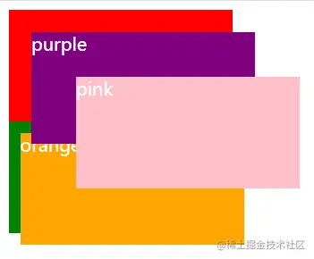
3. Comparison of stacking levels in different stacking contexts
First, let’s reproduce it The practical issues mentioned above are the implementation of cascading levels in different cascading contexts.
    .purple {
      top: 20px;
      left: 20px;
      background: purple;
      z-index: 10;
    }

    .pink {
      top: 60px;
      left: 60px;
      background: pink;
      z-index: 20;
    }

    .orange {
      top: 10px;
      left: 10px;
      background: orange;
      z-index: 999;
}css video tutorial)
The above is the detailed content of An in-depth analysis of cascading context in css. For more information, please follow other related articles on the PHP Chinese website!

Hot AI Tools

Undresser.AI Undress
AI-powered app for creating realistic nude photos

AI Clothes Remover
Online AI tool for removing clothes from photos.

Undress AI Tool
Undress images for free

Clothoff.io
AI clothes remover

AI Hentai Generator
Generate AI Hentai for free.

Hot Article

Hot Tools

Notepad++7.3.1
Easy-to-use and free code editor

SublimeText3 Chinese version
Chinese version, very easy to use

Zend Studio 13.0.1
Powerful PHP integrated development environment

Dreamweaver CS6
Visual web development tools

SublimeText3 Mac version
God-level code editing software (SublimeText3)

Hot Topics
 1359
1359
 52
52
 How to use bootstrap button
Apr 07, 2025 pm 03:09 PM
How to use the Bootstrap button? Introduce Bootstrap CSS to create button elements and add Bootstrap button class to add button text
 How to insert pictures on bootstrap
Apr 07, 2025 pm 03:30 PM
There are several ways to insert images in Bootstrap: insert images directly, using the HTML img tag. With the Bootstrap image component, you can provide responsive images and more styles. Set the image size, use the img-fluid class to make the image adaptable. Set the border, using the img-bordered class. Set the rounded corners and use the img-rounded class. Set the shadow, use the shadow class. Resize and position the image, using CSS style. Using the background image, use the background-image CSS property.
 How to remove the default style in Bootstrap list?
Apr 07, 2025 am 10:18 AM
The default style of the Bootstrap list can be removed with CSS override. Use more specific CSS rules and selectors, follow the "proximity principle" and "weight principle", overriding the Bootstrap default style. To avoid style conflicts, more targeted selectors can be used. If the override is unsuccessful, adjust the weight of the custom CSS. At the same time, pay attention to performance optimization, avoid overuse of !important, and write concise and efficient CSS code.
 How to resize bootstrap
Apr 07, 2025 pm 03:18 PM
To adjust the size of elements in Bootstrap, you can use the dimension class, which includes: adjusting width: .col-, .w-, .mw-adjust height: .h-, .min-h-, .max-h-
 How to build a bootstrap framework
Apr 07, 2025 pm 12:57 PM
To create a Bootstrap framework, follow these steps: Install Bootstrap via CDN or install a local copy. Create an HTML document and link Bootstrap CSS to the <head> section. Add Bootstrap JavaScript file to the <body> section. Use the Bootstrap component and customize the stylesheet to suit your needs.
 How to verify bootstrap date
Apr 07, 2025 pm 03:06 PM
To verify dates in Bootstrap, follow these steps: Introduce the required scripts and styles; initialize the date selector component; set the data-bv-date attribute to enable verification; configure verification rules (such as date formats, error messages, etc.); integrate the Bootstrap verification framework and automatically verify date input when form is submitted.
 How to upload files on bootstrap
Apr 07, 2025 pm 01:09 PM
The file upload function can be implemented through Bootstrap. The steps are as follows: introduce Bootstrap CSS and JavaScript files; create file input fields; create file upload buttons; handle file uploads (using FormData to collect data and then send to the server); custom style (optional).
 How to layout bootstrap
Apr 07, 2025 pm 02:24 PM
To use Bootstrap to layout a website, you need to use a grid system to divide the page into containers, rows, and columns. First add the container, then add the rows in it, add the columns within the row, and finally add the content in the column. Bootstrap's responsive layout function automatically adjusts the layout according to breakpoints (xs, sm, md, lg, xl). Different layouts under different screen sizes can be achieved by using responsive classes.


