

Little known! Use css to create aurora effect

This article will share with you how to use CSS to achieve the aurora effect. The main steps include drawing a dark background, using gradients to draw the outline of the aurora, rotating and stretching, and other related issues. I hope it will be helpful to everyone.

#Is it possible to achieve Aurora using CSS?
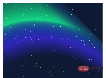
Like this:
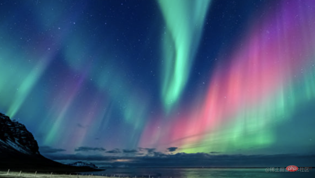
emmm, this is a bit embarrassing. However, I have tried it recently. Although it is impossible to simulate such a realistic effect, you can still use CSS to create some similar special effects. Today we will try it together.
After observing some aurora pictures, I discovered some of the more important elements in aurora animation:
Bright gradient colors based on dark backgrounds
An animation effect similar to the flow of water waves
We can try to use gradient to simulate bright gradient colors. As for the animation effect of water waves, the SVG filter feturbulence is specifically designed for this. The use of this filter has been mentioned repeatedly in many of my past articles.
In addition to gradients and SVG's <feturbulence></feturbulence> filters, we may also use mixing modes(mix-blend-mode ), CSS filters, etc. to improve the effect.
OK, after you have a general idea, the rest is to keep trying.
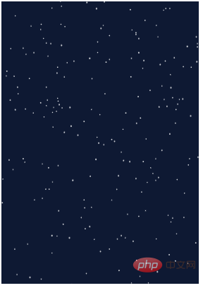
Step 1. Draw a dark background
First, we may need a dark background to represent our night sky. At the same time, embellish some stars. The stars can be simulated using box-shadow. In this way, we can complete a night sky background in 1 p:
<p class="g-wrap">
</p>
@function randomNum($max, $min: 0, $u: 1) {
 @return ($min + random($max)) * $u;
}

@function shadowSet($n, $size) {
    $shadow : 0 0 0 0 #fff;

    @for $i from 0 through $n {
        $x: randomNum(350);
        $y: randomNum(500);
        $scale: randomNum($size) / 10;

        $shadow: $shadow, #{$x}px #{$y}px 0 #{$scale}px rgba(255, 255, 255, .8);
    }

    @return $shadow;
}

.g-wrap {
    position: relative;
    width: 350px;
    height: 500px;
    background: #0b1a3a;
    overflow: hidden;

    &::before {
        content: "";
        position: absolute;
        width: 1px;
        height: 1px;
        border-radius: 50%;
        box-shadow: shadowSet(100, 6);
}This step is relatively simple, with the help of SASS , we can get such a night sky background image:
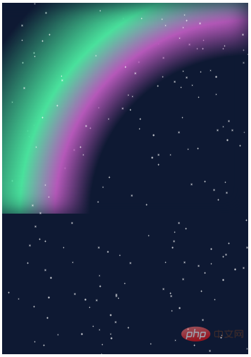
Step 2. Use gradient to draw the outline of the aurora
The next step is to use gradient to draw Create an outline effect of the aurora.
In fact, it is a radial gradient:
<p class="g-wrap">
  <p class="g-aurora"></p>
</p>
.g-aurora {
    width: 400px;
    height: 300px;
    background: radial-gradient(
        circle at 100% 100%,
        transparent 45%,
        #bd63c1 55%,
        #53e5a6 65%,
        transparent 85%
    );
}
Step 3. Rotate and stretch
At present, it seems that there is a little outline . Next, we transform the obtained gradient effect by rotating and stretching it.
.g-aurora {
    ...
    transform: rotate(45deg) scaleX(1.4);
}We can probably get such an effect:
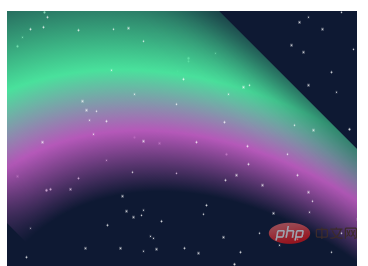
Step 4. Magical blending mode transformation!
At this point, the prototype has actually come out. But the color doesn’t look very similar. In order to blend with the dark background, here we use the blending mode mix-blend-mode.
.g-aurora {
    ...
    transform: rotate(45deg) scaleX(1.4);
    mix-blend-mode: color-dodge;
}Something magical happened, look at the effect:
The overall color looks more like the color of the aurora.
Step 5. Overlay SVG feturbulence filter
Next, we want to produce the effect of water ripples, we need to use SVG’s <feturbulence> filter
We add an SVG <feturbulence> filter and use CSS filter to reference
<p class="g-wrap">
  <p class="g-aurora"></p>
</p>
.g-aurora {
    ...
    transform: rotate(45deg) scaleX(1.4);
    mix-blend-mode: color-dodge;
    filter: url(#wave);
}We can get such an effect:

Wow, don’t you already feel that way? Through the features of feturbulence, we can almost simulate the effect of aurora!
Step 6. Let the aurora move
In the last step, we need to make our aurora move. Because SVG animation itself does not support features like animation-fill-mode: alternate. We still need to write a little JavaScript code to control the overall loop of the animation.
The approximate code is as follows:
var filter = document.querySelector("#turbulence");
var frames = 0;
var rad = Math.PI / 180;

function freqAnimation() {
  bfx = 0.005;
  bfy = 0.005;
  frames += .5
  bfx += 0.0025 * Math.cos(frames * rad);
  bfy += 0.0025 * Math.sin(frames * rad);

  bf = bfx.toString() + ' ' + bfy.toString();
  filter.setAttributeNS(null, 'baseFrequency', bf);
  window.requestAnimationFrame(freqAnimation);
}
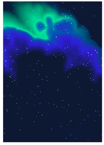
window.requestAnimationFrame(freqAnimation);At this point, we have a complete, moving aurora animation:
Some tips and other matters
There will be obvious border burr effect around the gradient element, you can use black inner shadow
box-shadow: inset ...Remove;The actual parameters of each attribute in the actual writing process seem simple, but in fact they were obtained after continuous debugging;
Mixing modes and SVG feturbulence filters are difficult to master and require constant practice and constant debugging. The color selection of Aurora in this article has not gone through too much repeated debugging. If you are willing to spend time, you can debug the effect. Better colors.
The final effect is not perfect, but it is still a good CSS SVG work. You can see the complete code here:
(Learning video sharing: css video tutorial)
The above is the detailed content of Little known! Use css to create aurora effect. For more information, please follow other related articles on the PHP Chinese website!

Hot AI Tools

Undresser.AI Undress
AI-powered app for creating realistic nude photos

AI Clothes Remover
Online AI tool for removing clothes from photos.

Undress AI Tool
Undress images for free

Clothoff.io
AI clothes remover

AI Hentai Generator
Generate AI Hentai for free.

Hot Article
Hot Tools

Notepad++7.3.1
Easy-to-use and free code editor

SublimeText3 Chinese version
Chinese version, very easy to use

Zend Studio 13.0.1
Powerful PHP integrated development environment

Dreamweaver CS6
Visual web development tools

SublimeText3 Mac version
God-level code editing software (SublimeText3)
Hot Topics
 1378
1378
 52
52

 How to resize bootstrap
Apr 07, 2025 pm 03:18 PM
How to resize bootstrap
Apr 07, 2025 pm 03:18 PM
To adjust the size of elements in Bootstrap, you can use the dimension class, which includes: adjusting width: .col-, .w-, .mw-adjust height: .h-, .min-h-, .max-h-
 How to insert pictures on bootstrap
Apr 07, 2025 pm 03:30 PM
How to insert pictures on bootstrap
Apr 07, 2025 pm 03:30 PM
There are several ways to insert images in Bootstrap: insert images directly, using the HTML img tag. With the Bootstrap image component, you can provide responsive images and more styles. Set the image size, use the img-fluid class to make the image adaptable. Set the border, using the img-bordered class. Set the rounded corners and use the img-rounded class. Set the shadow, use the shadow class. Resize and position the image, using CSS style. Using the background image, use the background-image CSS property.
 The Roles of HTML, CSS, and JavaScript: Core Responsibilities
Apr 08, 2025 pm 07:05 PM
The Roles of HTML, CSS, and JavaScript: Core Responsibilities
Apr 08, 2025 pm 07:05 PM
HTML defines the web structure, CSS is responsible for style and layout, and JavaScript gives dynamic interaction. The three perform their duties in web development and jointly build a colorful website.
 How to set up the framework for bootstrap
Apr 07, 2025 pm 03:27 PM
How to set up the framework for bootstrap
Apr 07, 2025 pm 03:27 PM
To set up the Bootstrap framework, you need to follow these steps: 1. Reference the Bootstrap file via CDN; 2. Download and host the file on your own server; 3. Include the Bootstrap file in HTML; 4. Compile Sass/Less as needed; 5. Import a custom file (optional). Once setup is complete, you can use Bootstrap's grid systems, components, and styles to create responsive websites and applications.
 How to use bootstrap button
Apr 07, 2025 pm 03:09 PM
How to use bootstrap button
Apr 07, 2025 pm 03:09 PM
How to use the Bootstrap button? Introduce Bootstrap CSS to create button elements and add Bootstrap button class to add button text
 How to write split lines on bootstrap
Apr 07, 2025 pm 03:12 PM
How to write split lines on bootstrap
Apr 07, 2025 pm 03:12 PM
There are two ways to create a Bootstrap split line: using the tag, which creates a horizontal split line. Use the CSS border property to create custom style split lines.
 How to view the date of bootstrap
Apr 07, 2025 pm 03:03 PM
How to view the date of bootstrap
Apr 07, 2025 pm 03:03 PM
Answer: You can use the date picker component of Bootstrap to view dates in the page. Steps: Introduce the Bootstrap framework. Create a date selector input box in HTML. Bootstrap will automatically add styles to the selector. Use JavaScript to get the selected date.
 How to use bootstrap in vue
Apr 07, 2025 pm 11:33 PM
How to use bootstrap in vue
Apr 07, 2025 pm 11:33 PM
Using Bootstrap in Vue.js is divided into five steps: Install Bootstrap. Import Bootstrap in main.js. Use the Bootstrap component directly in the template. Optional: Custom style. Optional: Use plug-ins.
