

What does bootstrap's responsive layout mean?

In bootstrap, responsive layout means that the same page has different layouts under different screen sizes. Responsive layout can be compatible with devices of different resolutions. You can use the grid system to divide a row into 12 evenly Grids, specify how many grids the element occupies to achieve.

The operating environment of this tutorial: Windows 10 system, bootstrap version 3.3.7, DELL G3 computer
What does bootstrap’s responsive layout mean
1. Basic concepts
Responsive layout means that the same page has different layouts under different screen sizes and can be compatible with devices of different resolutions
The traditional development method is to develop one set for the PC and another set for the mobile phone. With responsive layout, only one set is enough. The disadvantage is that CSS is relatively heavy.
Implementation: Depends on the grid system, a row is evenly divided into 12 grids, and you can specify how many grids the element occupies
* 步骤:
	(1)定义容器:相当于之前的table
			* 容器分类:
				* container:两边留白
				* container-fluid:每一种设备都是100%宽度
	(2)定义行:相当于之前的tr,样式:row
	(3)定义元素:指定该元素在不同的设备上,所占的格子数目,
				样式:col-设备代号-格子数目
Grid parameters: 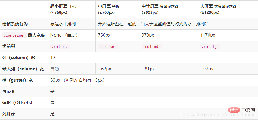
Note:
(1)一行中如果格子数目超过12,则超出部分自动换行。
(2)栅格类属性可以向上兼容。栅格类适用于与屏幕宽度大于或等于分界点大小的设备。
(3)如果真实设备宽度小于了设置栅格类属性的设备代码的最小值,会一个元素沾满一整行。
2. Example
nbsp;html>
<style>
.inner{
border:1px solid red;
}
</style><!--1.定义容器--><p>
<!--2.定义行-->
</p><p>
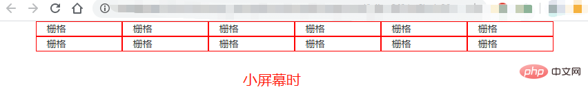
<!--3.定义元素
在大显示器一行12个格子
在pad上一行6个格子 -->
<!--这里同时定义了大屏幕和小屏幕两种情况都适用-->
</p><p>栅格</p>
<p>栅格</p>
<p>栅格</p>
<p>栅格</p>
<p>栅格</p>
<p>栅格</p>
<p>栅格</p>
<p>栅格</p>
<p>栅格</p>
<p>栅格</p>
<p>栅格</p>

The above is the detailed content of What does bootstrap's responsive layout mean?. For more information, please follow other related articles on the PHP Chinese website!

Hot AI Tools

Undresser.AI Undress
AI-powered app for creating realistic nude photos

AI Clothes Remover
Online AI tool for removing clothes from photos.

Undress AI Tool
Undress images for free

Clothoff.io
AI clothes remover

Video Face Swap
Swap faces in any video effortlessly with our completely free AI face swap tool!

Hot Article
Hot Tools

Notepad++7.3.1
Easy-to-use and free code editor

SublimeText3 Chinese version
Chinese version, very easy to use

Zend Studio 13.0.1
Powerful PHP integrated development environment

Dreamweaver CS6
Visual web development tools

SublimeText3 Mac version
God-level code editing software (SublimeText3)
Hot Topics
 1387
1387
 52
52

 How to get the bootstrap search bar
Apr 07, 2025 pm 03:33 PM
How to get the bootstrap search bar
Apr 07, 2025 pm 03:33 PM
How to use Bootstrap to get the value of the search bar: Determines the ID or name of the search bar. Use JavaScript to get DOM elements. Gets the value of the element. Perform the required actions.
 How to use bootstrap in vue
Apr 07, 2025 pm 11:33 PM
How to use bootstrap in vue
Apr 07, 2025 pm 11:33 PM
Using Bootstrap in Vue.js is divided into five steps: Install Bootstrap. Import Bootstrap in main.js. Use the Bootstrap component directly in the template. Optional: Custom style. Optional: Use plug-ins.
 How to do vertical centering of bootstrap
Apr 07, 2025 pm 03:21 PM
How to do vertical centering of bootstrap
Apr 07, 2025 pm 03:21 PM
Use Bootstrap to implement vertical centering: flexbox method: Use the d-flex, justify-content-center, and align-items-center classes to place elements in the flexbox container. align-items-center class method: For browsers that do not support flexbox, use the align-items-center class, provided that the parent element has a defined height.
 How to write split lines on bootstrap
Apr 07, 2025 pm 03:12 PM
How to write split lines on bootstrap
Apr 07, 2025 pm 03:12 PM
There are two ways to create a Bootstrap split line: using the tag, which creates a horizontal split line. Use the CSS border property to create custom style split lines.
 How to resize bootstrap
Apr 07, 2025 pm 03:18 PM
How to resize bootstrap
Apr 07, 2025 pm 03:18 PM
To adjust the size of elements in Bootstrap, you can use the dimension class, which includes: adjusting width: .col-, .w-, .mw-adjust height: .h-, .min-h-, .max-h-
 How to use bootstrap button
Apr 07, 2025 pm 03:09 PM
How to use bootstrap button
Apr 07, 2025 pm 03:09 PM
How to use the Bootstrap button? Introduce Bootstrap CSS to create button elements and add Bootstrap button class to add button text
 How to set up the framework for bootstrap
Apr 07, 2025 pm 03:27 PM
How to set up the framework for bootstrap
Apr 07, 2025 pm 03:27 PM
To set up the Bootstrap framework, you need to follow these steps: 1. Reference the Bootstrap file via CDN; 2. Download and host the file on your own server; 3. Include the Bootstrap file in HTML; 4. Compile Sass/Less as needed; 5. Import a custom file (optional). Once setup is complete, you can use Bootstrap's grid systems, components, and styles to create responsive websites and applications.
 How to insert pictures on bootstrap
Apr 07, 2025 pm 03:30 PM
How to insert pictures on bootstrap
Apr 07, 2025 pm 03:30 PM
There are several ways to insert images in Bootstrap: insert images directly, using the HTML img tag. With the Bootstrap image component, you can provide responsive images and more styles. Set the image size, use the img-fluid class to make the image adaptable. Set the border, using the img-bordered class. Set the rounded corners and use the img-rounded class. Set the shadow, use the shadow class. Resize and position the image, using CSS style. Using the background image, use the background-image CSS property.
