

This article brings you relevant knowledge about css design patterns, including issues related to OOCSS, BEM, SMACSS, ITCSS and ACSS. I hope it will be helpful to everyone.
The traditional CSS writing style is to randomly name and stack styles, resulting in confusing results. Have you ever encountered a large and complex project? , CSS code is difficult to maintain, do you want to be able to restore the physical prototype, and the code rules are orderly and easy to maintain.
Then CSS design patterns can save the situation of confusing styles and redundant lines of code in practical applications. This is also the basis for designing the CSS architecture of a project.
What? CSS also has design patterns!
Yes, CSS really has design patterns.
OOCSS is a relatively basic design pattern, and other design patterns have more or less the shadow of OOCSS. So what is OOCSS? I guess everyone already knows it when they see OO. Yes, it is object-oriented. So does object-oriented have anything to do with writing CSS? Of course there is.
Everyone is familiar with object-oriented. Let’s briefly look at the following code:
class Person {
    void study () {}
}

class Teacher extends Person {
    void study () {}
    void teach () {}
}

class Student extends Person {
    void study () {}
}There is a Person class, which has some methods, Teacher and Student both inherit Person, and some revisions and extensions have been made. Then we can think of the Person class as code written by others. Without changing other people's source code, we can add Teacher and Student to revise and expand the source code. This writing method can be applied to CSS. Let’s look at the following code scenario:
<p></p>
<p></p>
<p></p>

.menu {
   color: green;
   font-size: 14px;
}

.fix {
   color: red;
} Scenario: The designer only wants us to change the style of one of the boxes, leaving the others unchanged.
The menu cannot be changed easily at this time, because once it is changed, it will affect areas that do not need to be changed. Then we can directly use object-oriented ideas and add a separate class later for revision and expansion. Looking at the CSS we usually write in this way, isn’t it object-oriented?
Of course, OOCSS has specific principles. So what principles does it have and what are the specific principles? Let’s take a look:
Separation of containers and content As the name suggests, let’s look directly at a code example:
<p>
  </p><p>
    <a>Hello</a>
  </p>


<p>
  </p><p>
    <a>Hello</a>
  </p>


// ---------code 1-----------
.post .metadata {
  // css code
}

// ---------code 2-----------
.post {}
.metadata {
  // css code
} Scenario: In two different containers The content is the same
Let’s first look at the code 1 of the style. This is obviously not good. The container and the content are nested dependencies, and the container and content are not separated. Content styles cannot be reused. Style code 2 separates the container from the content, and the content can be reused in different containers.
The structure can be regarded as a basic object, and the skin can be regarded as another object, that is, the object and the object must be separated. The basic object cannot be changed, and the skin object must be continuously separated to modify and expand the basic object.
<p></p>

// 基础对象
.menu {
  color: green;
  font-size: 14px;
}
// 皮肤
.fix {
  color: red;
}We write OOCSS every day, and the component of Vue is OOCSS. We have the following piece of code:
// -------------定义组件-----------------
<template>
<p></p>
</template>
<script>
export default {
name: 'MateData'
}
</script>
<style>
// 基础对象
.menu {
color: green;
font-size: 14px;
}
</style>
// -----------使用组件-------------------
<template>
<mate-data></mate-data>
<mate-data></mate-data>
</template>
<style>
// 皮肤
.fix1 {
color: red;
}
.fix2 {
font-size: 20px;
}
</style>OOCSS application
Grid grid system, layout components, etc.
BEM stands for Block, Element, and Modifier, which is a front-end development theory proposed by the development team of Yandex (the most famous Internet company in Russia). BEM describes the page through Block, Element, and Modifier (the key is to solve the naming problem of multi-person collaboration).
Block is an independent block in the page and can be used on different occasions. Each page can be regarded as composed of multiple Blocks.
Element is an element that constitutes a Block. It only has meaning within the corresponding Block and depends on the existence of the Block.
Modifier is the attribute or state that describes Block or Element. The same Block or Element can have multiple Modifiers, and Modifiers cannot exist alone.
When naming, Block is used as the starting point. Different Blocks and Elements are separated by _ two bottom lines, and different Modifiers are separated by –. 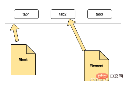
BEM is the advanced version of OOCSS. Let’s look at the picture below: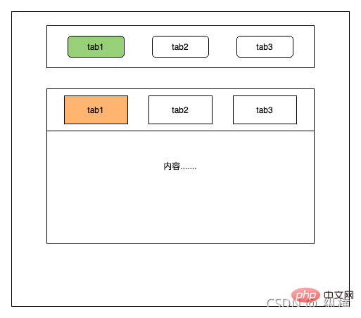
Scenario: Page The overall layout of the two tab bars is similar, only the details are different
Then when using BEM to write the style, a block menu will be defined, which contains the element menu_tab below to complete the overall layout. Use the modifier menu_tab-style1 to fine-tune the subtle parts. The code is as follows:
<!-- BEM -->
<p>
  </p><p></p>
  <p></p>
  <p></p>
  <p></p>


<p>
  </p><p></p>
  <p></p>
  <p></p>
  <p></p>
It can be seen from the above code that BEM is OOCSS.
If you are interested in BEM, you can visit the official website of BEM: https://en.bem.info/methodology/css/
Function:
Naming convention, let The page structure is clearer
In addition, regarding the symbols used in the naming convention, the team can discuss and modify them. It does not have to follow this symbol. BEM just provides an idea.
SMACSS is a way to examine your design process and as a way to fit
those rigid frameworks into a flexible thought process.
(SMACSS通过一个灵活的思维过程来检查你的设计过程和方式是否符合你的架构,更像一种规范~)
SMACSS的核心就是分类,它主要要求分为五大类分别是:Base、Layout、Modules、State、Theme
/* depth 1 */
.sidebar ul h3 {}

/* depth 2 */
.sub-title {}两段css的区别在于html和css的耦合度(这一点上和OOCSS的分离容器和内容的原则不谋而合)。可以想到,由于上面的样式规则使用了继承选择符,因此对于html的结构实际是有一定依赖的。如果html发生重构,就有可能不再具有这些样式。对应的,下面的样式规则只有一个选择符,因此不依赖于特定html结构,只要为元素添加class,就可以获得对应样式。
当然,继承选择符是有用的,它可以减少因相同命名引发的样式冲突(常发生于多人协作开发)。但是,我们不应过度使用,在不造成样式冲突的允许范围之内,尽可能使用短的、不限定html结构的选择符。这就是SMACSS的最小化适配深度的意义。
在项目中使用SMACSS时,每一个分类都是一个目录,但是在Vue中,Layout和Modules不需要单独维护目录,因为我们写的布局组件和模块组件就相当于这两个分类了。
如果想要对SMACSS更详细的了解可以访问:https://smacss-zh.vercel.app/preface.html
这是由csswizardry提倡的一个 CSS 设计方法论,它可以让CSS更好的管理和维护。
使用ITCSS主要可以帮助我们以下几点:
ITCSS的核心是分层,主要分为七层, 与SMACSS的分类相比更加精细,层
Settings: 项目使用的全局变量
Tools: mixin,function
Generic: 最基本的设定 normalize.css,reset
Base: type selector
Objects: 不经过装饰 (Cosmetic-free) 的设计模式,相当于SMACSS的Layout
Components: UI 组件
Trumps: helper 唯一可以使用 important! 的地方
下面就是ITCSS的架构模型: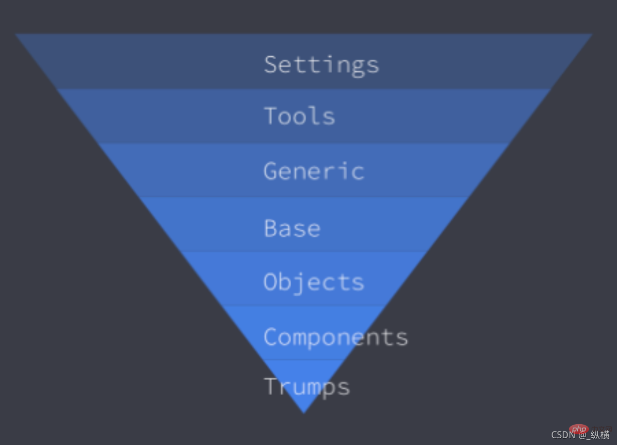
从这个模型可以看出来,越往下就越具体,越局限于使用在某个具体的东西。另外它的下一层永远继承上一层的所有样式。
各个分层例子
Settings
全局变量,比如颜色,字体大小等等
$yellow: #FAAF00;
$yellow-bright: #FAF7F0;
Tools
mixin,function 等等
@mixin sample-mixin () {
  ...
}到 Tools 为止,不会生成具体的 css
Generic
reset,normalize 等等
*,
*::before,
*::after {
  box-sizing: border-box;
}Base
type selector 比如 link, p 等等,只有这一层才使用 type selector
p {
  margin: 0
  line-height: 1.5;
}Objects
Cosmetic-free,不使用比如 color、border-color、background-color 之类的
使用这个 CSS 你在浏览器上面只可以看一片空白
主要用来做画面的 layout
.o-container {
  box-sizing: border-box;
  margin: 0 auto;
}Components
UI 组件
到这个部分,根据UI分析具体有哪些组件需要实现,可以分给多个人来同时实现
#button组件

.c-btn {
  display: flex;
  justify-content: center;
  align-items: center;
  ...

  &--primary {
    background-color: #ff5959;
    color: #fff;
  }

  &--large {
    font-size: 16px;
    padding: 16px 14px;
    ...
  }
}HTML 类似这样
<a>sample</a>
<a>sample</a>
Trumps
放各种 helper
最主要的作用是用在不适合或者不容易放在 Component 的时候
比如 margin,很可能不应该放 Component,这时候可以用 Trumps 来微调
这样可以防止你的 Component 变得非常大
只有这一层才可以使用! important,以此来避免多个! important 的混乱局面
.u-color {
  &--white {
    color: $white !important;
  }
}

.u-hidden {
  display: hidden !important;
}在使用时,每个分层都维护为一个文件夹。在Vue中使用时,Objects和Components相当于我们的组件,不需要单独维护。
另外值得注意的是,无论是SMACSS的分类还是ITCSS的分层,都是一种思想,我们可以根据实际项目来动态的添加或者删除某一个分类或者分层,不能生搬硬套。
ACSS使用了紧密的类名库。 这些类名通常被缩写,并与它们影响的内容分开。 在ACSS系统中,我们可以知道类名的作用; 但是类名称与内容类型之间没有关系,即每一个样式对应一个类,也称原子类CSS。
.float-left {
  float: left;
}
.float-right {
  float: right;
}
.z-0 {
  z-index: 0;
}
.z-auto {
  z-index: auto;
}从上面的代码中,可以看到ACSS有极强的复用性,维护成本低,但是破坏了css命名的语义化。最终很可能代码会成为下面这样。但是存在即合理,ACSS也有其作用,继续往下看。
<p>
  </p><p>1</p>
  <p>2</p>
  <p>3</p>
  <p>4</p>
  <p>5</p>
  <p>6</p>
在进行一个项目的设计时,我们可以针对多种CSS设计模式进行选型,结合不同设计模式的优点和缺点,设计一个完整银杏的CSS架构。
举例子::
假如我们选择ITCSS、BEM、ACSS进行组合,设计一个CSS架构。
在我们设计CSS架构时,我们首先想到的一定是SMACSS和ITCSS,因为它们两个对CSS进行了分类分层的划分。
SMACSS:
Base
Layout
Tools
Modules
State
Theme
ITCSS:
Setting
Generic
Base
Objects
Components
Trumps
根据上表我们可以看出ITCSS分层更加精细,所以我们选择ITCSS,接着我们继续看ITCSS的Objects和Components层,它就相当于OOCSS且相当于开发Vue组件,所以我们在开发组件时使用选择OOCSS的进阶版BEM。我们知道如果一个项目全部使用ACSS的缺点跟明显,那么我们选择ACSS的原因是因为项目中可能会存在向字体大小的这种的样式,所以我们可以把这一类样式维护在ACSS目录中。Generic和Base类似所以只保留Base即可,我假设Trumps用不到,所以也去掉这一层。所以我们的架构现在就是下面这样。
ITCSS+BEM+ACSS
Setting
Tools
Base
Objects
Components
ACSS
目录结构就是:
-|comments
-|styles
--|acss
--|base
--|settings
--|tools
讲到这里就该结束了,相信到这里大家就发现了,CSS设计模式离我们真的很近,我们大家日常写CSS时,所进行的优化和考量,也可以算成CSS的设计模式,可能没有联想到CSS设计模式这一概念。
我们平时写代码时都会划分一些文件夹对CSS进行分类维护,相信大家平时都见过和用过不少各种各样的CSS架构或规范。
设计模式提供的是一个思想,在使用时,可以灵活变化,针对不同项目或者约定,进行商定调整,整出更加银杏(人性)的CSS架构。也希望以上几个CSS设计模式,能够对大家有用。
码字不易,点赞鼓励。
谢谢大家。
(学习视频分享:css视频教程)
The above is the detailed content of Summarize and share CSS design pattern knowledge points. For more information, please follow other related articles on the PHP Chinese website!


![[Web front-end] Node.js quick start](https://img.php.cn/upload/course/000/000/067/662b5d34ba7c0227.png)


