Can css3 implement triangles?
css3 can realize triangles, and there are many ways to achieve it: 1. Use a container with zero height and width and a transparent border to draw triangles; 2. Use linear gradient linear-gradient to draw triangles; 3. Use conic-gradient Draw triangles; 4. Use clip-path to draw triangles, etc.

The operating environment of this tutorial: Windows 7 system, CSS3&&HTML5 version, Dell G3 computer.
There are many ways to implement triangles in css3. Let’s take a look:
1. Use border to draw triangles
Using border to realize triangles should be mastered by most people, and it can also be used in various aspects. What often appears in the classics is the use of containers with zero height and width and transparent borders.
<div class='top'></div> <div class='bottom'></div> <div class='left'></div> <div class='right'></div>
html, body {
  width: 100%;
  height: 100%;
  display: flex;
}

div {
  width: 0px;
  height: 0px;
  margin: auto;
}
.top {
  border: 50px solid transparent;
  border-bottom: 50px solid deeppink;
}

.left {
  border: 50px solid transparent;
  border-right: 50px solid deeppink;
}

.bottom {
  border: 50px solid transparent;
  border-top: 50px solid deeppink;
}

.right {
  border: 50px solid transparent;
  border-bottom: 50px solid deeppink;
}
2. Use linear-gradient to draw triangles
<div></div>
div {
  width: 100px;
  height: 100px;
  background: linear-gradient(45deg, deeppink, deeppink 50%, transparent 50%, transparent 100%);
}
3 , use conic-gradient to draw triangles
or gradient, above we used linear gradient to implement triangles, interestingly, in the gradient family, angular gradient conic-gradient also Can be used to implement triangles.
The method is that the center point of the angular gradient can be set, and the center point of the circle similar to the radial gradient can also be set.
We set the center point of the angular gradient at 50% 0, which is center top, the middle of the top of the container, and then perform the angular gradient, gradient Within a certain angle range, they are all triangular shapes.
Suppose we have a 200px x 100px height and width container, and set its angular gradient center point to 50% 0:

And set it to draw an angular gradient diagram starting from 90°. The schematic diagram is as follows:

As you can see, in the initial When the angular gradient graphic reaches the second side, it is all a triangle. We select a suitable angle and we can easily get a triangle:
<div class="normal"></div>
<div class="acute"></div>

.normal {
    background: conic-gradient(from 90deg at 50% 0, deeppink 0, deeppink 45deg, transparent 45.1deg);
}

.acute {
    background: conic-gradient(from 90deg at 50% 0, transparent 0, transparent 45deg, deeppink 45.1deg, deeppink 135deg, transparent 1deg);
}
##4. transform: rotate with overflow: hidden to draw triangles
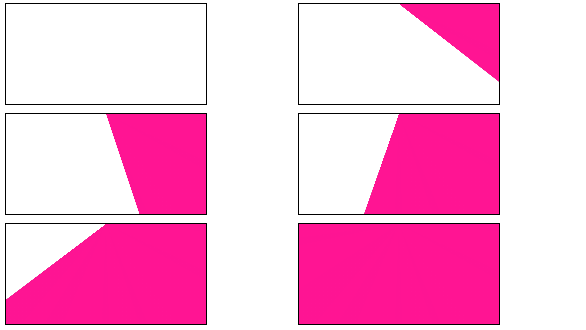
This method is relatively conventional, usetransform: rotate with overflow: hidden. You can understand it at a glance and learn it as soon as you learn it. The simple animation diagram is as follows:

left bottom to rotate , with overflow: hidden.
<div class="demo"></div>
<div class="demo-opacity"></div>
<div class="triangle"></div>
html, body {
    width: 100%;
    height: 100%;
    display: flex;
}

div {
    width: 141px;
    height: 100px;
    margin: auto;
}

.demo-opacity {
    overflow: hidden;
}

.demo,
.demo-opacity {
    position: relative;
    border: 1px solid #000;
    background: unset;

    &::before {
        content: "";
        position: absolute;
        top: 0;
        left: 0;
        right: 0;
        bottom: 0;
        animation: conicmove 3s infinite linear;
        background: deeppink;
        transform-origin: left bottom;
        z-index: -1;
    }
}

.triangle {
    position: relative;
    background: unset;
    overflow: hidden;

    &::before {
        content: "";
        position: absolute;
        top: 0;
        left: 0;
        right: 0;
        bottom: 0;
        background: deeppink;
        transform-origin: left bottom;
        transform: rotate(45deg);
        z-index: -1;
    }
}

@keyframes conicmove {
    100% {
        transform: rotate(45deg);
    }
}5. Use clip-path to draw triangles
##clip-path A very interesting one CSS properties.
The CSS property creates a clipping region where only part of the element is visible. Parts within the area are displayed and parts outside the area are hidden. The clipping region is a path defined by a reference to an embedded URL or a path to an external SVG. In other words, using
we can clip a container into whatever we want. A polygon is realized through 3 coordinate points, and the excess space will be cut off. The code is also very simple:
div {
    background: deeppink;
    clip-path: polygon(0 0, 100% 0, 0 100%, 0 0);
} (Learning video sharing :
The above is the detailed content of Can css3 implement triangles?. For more information, please follow other related articles on the PHP Chinese website!

Hot AI Tools

Undresser.AI Undress
AI-powered app for creating realistic nude photos

AI Clothes Remover
Online AI tool for removing clothes from photos.

Undress AI Tool
Undress images for free

Clothoff.io
AI clothes remover

Video Face Swap
Swap faces in any video effortlessly with our completely free AI face swap tool!

Hot Article

Hot Tools

Notepad++7.3.1
Easy-to-use and free code editor

SublimeText3 Chinese version
Chinese version, very easy to use

Zend Studio 13.0.1
Powerful PHP integrated development environment

Dreamweaver CS6
Visual web development tools

SublimeText3 Mac version
God-level code editing software (SublimeText3)

Hot Topics
 1390
1390
 52
52
 How to achieve wave effect with pure CSS3? (code example)
Jun 28, 2022 pm 01:39 PM
How to achieve wave effect with pure CSS3? This article will introduce to you how to use SVG and CSS animation to create wave effects. I hope it will be helpful to you!
 Java program to calculate the area of a triangle using determinants
Aug 31, 2023 am 10:17 AM
Introduction The Java program for calculating the area of a triangle using determinants is a concise and efficient program that can calculate the area of a triangle given the coordinates of three vertices. This program is useful for anyone learning or working with geometry, as it demonstrates how to use basic arithmetic and algebraic calculations in Java, as well as how to use the Scanner class to read user input. The program prompts the user for the coordinates of three points of the triangle, which are then read in and used to calculate the determinant of the coordinate matrix. Use the absolute value of the determinant to ensure the area is always positive, then use a formula to calculate the area of the triangle and display it to the user. The program can be easily modified to accept input in different formats or to perform additional calculations, making it a versatile tool for geometric calculations. ranks of determinants
 Use CSS skillfully to realize various strange-shaped buttons (with code)
Jul 19, 2022 am 11:28 AM
This article will show you how to use CSS to easily realize various weird-shaped buttons that appear frequently. I hope it will be helpful to you!
 How to hide elements in css without taking up space
Jun 01, 2022 pm 07:15 PM
Two methods: 1. Using the display attribute, just add the "display:none;" style to the element. 2. Use the position and top attributes to set the absolute positioning of the element to hide the element. Just add the "position:absolute;top:-9999px;" style to the element.
 How to implement lace borders in css3
Sep 16, 2022 pm 07:11 PM
In CSS, you can use the border-image attribute to achieve a lace border. The border-image attribute can use images to create borders, that is, add a background image to the border. You only need to specify the background image as a lace style; the syntax "border-image: url (image path) offsets the image border width inward. Whether outset is repeated;".
 How to enlarge the image by clicking the mouse in css3
Apr 25, 2022 pm 04:52 PM
Implementation method: 1. Use the ":active" selector to select the state of the mouse click on the picture; 2. Use the transform attribute and scale() function to achieve the picture magnification effect, the syntax "img:active {transform: scale(x-axis magnification, y Axis magnification);}".
 It turns out that text carousel and image carousel can also be realized using pure CSS!
Jun 10, 2022 pm 01:00 PM
How to create text carousel and image carousel? The first thing everyone thinks of is whether to use js. In fact, text carousel and image carousel can also be realized using pure CSS. Let’s take a look at the implementation method. I hope it will be helpful to everyone!
 How to set animation rotation speed in css3
Apr 28, 2022 pm 04:32 PM
In CSS3, you can use the "animation-timing-function" attribute to set the animation rotation speed. This attribute is used to specify how the animation will complete a cycle and set the speed curve of the animation. The syntax is "element {animation-timing-function: speed attribute value;}".


