 Web Front-end
 Bootstrap Tutorial
 What is the principle of bootstrap to implement responsive layout?
What is the principle of bootstrap to implement responsive layout?
In bootstrap, the responsive layout is implemented by using the grid system to use different class attributes for different screens. The system will automatically be divided into 12 columns. The responsive layout uses the grid system to pass a series of rows and A combination of columns to create a page layout.

The operating environment of this tutorial: Windows 10 system, bootstrap version 3.3.7, DELL G3 computer
What is the principle of bootstrap to implement responsive layout
The implementation principle of the grid system is to define the size of the container, divide it into 12 equal parts (it can also be divided into 24 or 32 parts, but 12 parts is the most common), then adjust the inner and outer margins, and finally combine it with media queries , a powerful responsive grid system was created.
The implementation principle of the grid system is to define the container size and divide it into 12 equal parts (it can also be divided into 24 or 32 parts, but 12 parts is the most common ), then adjust the inner and outer margins, and finally combine it with media queries to create a powerful responsive grid system. The grid system in the Bootstrap framework divides the container into 12 equal parts.
bootstrap advantages and disadvantages:
1.bootstrap recently released bootstrap4, which has box-flex layout and other updates, keeping up with the development of the latest web technology
2. Relatively mature, fully used and tested in a large number of projects
3. With complete documentation, it is more convenient to use
4. There are a large number of component styles, accepted Customization
Disadvantages:
1. If you have your own special needs, you need to re-customize the style. If there are a large number of non-bootstrap "style" styles in a website exists, then you need to do a lot of css rewriting, so the meaning of using the framework is lost.
2. There will be compatibility issues. Although there are many ways to be compatible with IE on the Internet, other files need to be introduced, some of which are quite small, which will inevitably cause the loading speed to slow down and affect the user experience.
Bootstrap's responsive layout uses its grid system and uses different class attributes for different screens. During development, you can only write one set of code that can be used on mobile phones, tablets, and PCs, without having to consider using media queries (writing different codes for different devices). Bootstrap's official explanation: Bootstrap provides a responsive, mobile-first fluid grid system. As the screen or viewport size increases, the system will automatically be divided into 12 columns. The grid system is used to create page layouts through a series of rows and columns.
How the grid system works:
1. Rows must be contained in .container (fixed width) or .container-fluid (100% width) in order to give it proper alignment (alignment
) and padding.
2. Create a group of columns in the horizontal direction through rows.
3. Your content should be placed in the column (column), and only the column can be used as a direct child element of the row (row).
4. Predefined classes like .row and .col-xs-4 can be used to quickly create grid layouts. Mixins defined in the Bootstrap source code can also be used to create semantic layouts.
5. Create a gap (gutter) between columns by setting the padding attribute for the column. By setting a negative margin for the .row element to offset the padding set for the .container element, the padding is indirectly offset for the columns contained in the row.
6. The columns of the grid system represent the span range by specifying a value from 1 to 12. For example, three equal-width columns can be created using three .col-xs-4.
7. If the number of columns contained in a row (row) is greater than 12, the elements of the extra columns will be arranged as a whole in another row.
8. The grid class is suitable for devices with a screen width greater than or equal to the dividing point size, and the grid class is overridden for small screens.
The following figure shows the application instructions of the grid system on various screens. 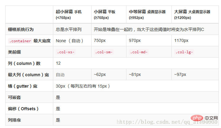
Using Bootstrap responsive layout,
First, you need to introduce the meta tag in the head, add the viewpirt attribute, the width in the content is equal to the device width, initial-scale: the page is visible for the first time. The zoom level of the area. If the value is 1, the page will be displayed according to the actual size without any scaling; maximum-scale: the minimum ratio that the user is allowed to zoom to; user-scalable: whether the user can manually zoom. The code is as follows:
<meta name="viewport" content="width=device-width, initial-scale=1, maximum-scale=1, user-scalable=no">
<link rel="stylesheet" type="text/css" href="/stylesheets/bootstrap.min.css">
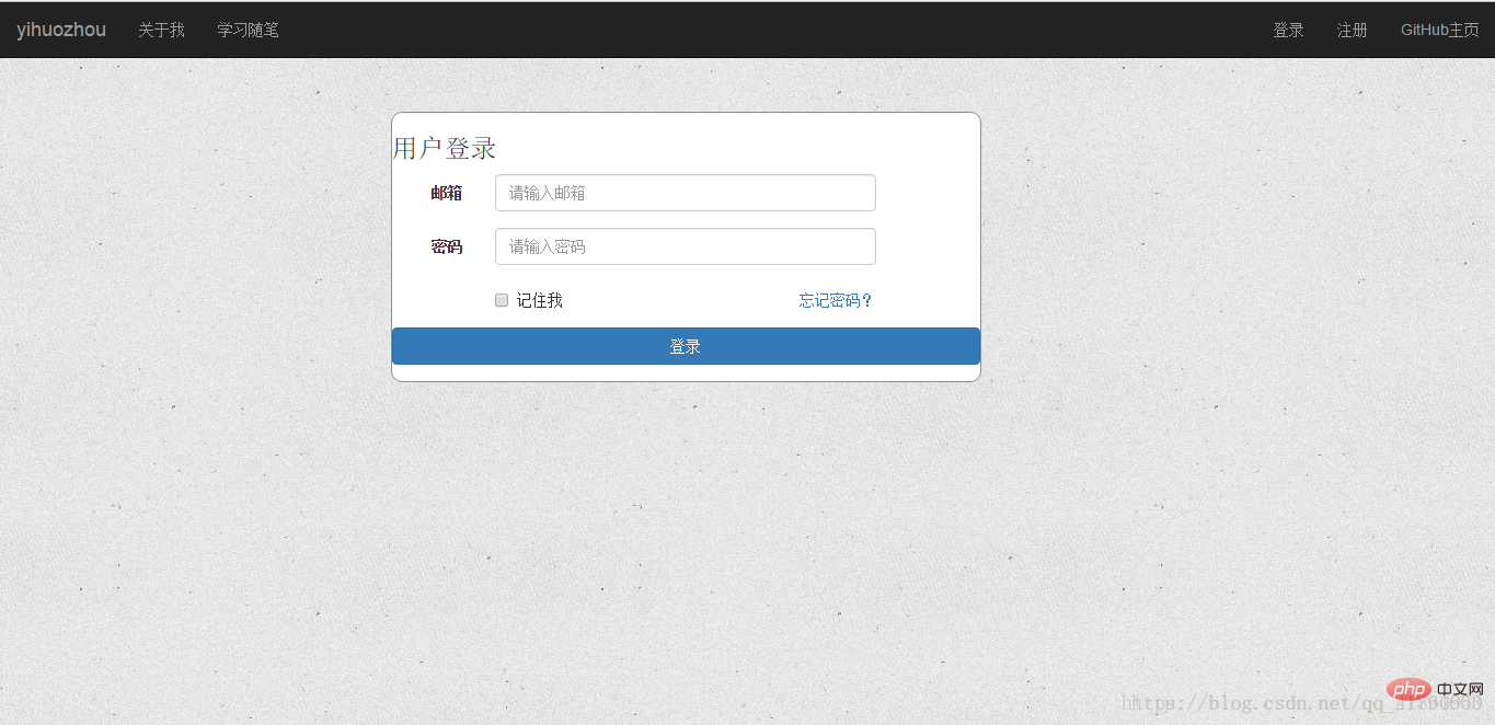
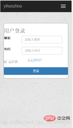
The following is a page (login form interface) using bootstrap layout, targeting ultra-small mobile phone screens (iphone5s) and PC screens (>=1200px). col-xs-12: small screen occupies 12 columns, col-lg-5: large screen occupies 5 columns, col-lg-offset-3: large screen indents 3 columns. This is a relatively simple example. If you want to adapt to other screens such as tablets, you can add the col-md-* attribute, and for large-screen phones, you can add the col-sm-* attribute. Which attribute to use for a specific screen can refer to the different uses of the Bootstrap grid system for different screens in the picture above.
<p class="container-fluid login">
  <p class="row">
    <p class="col-xs-12 col-sm-12 col-md-8 col-lg-5 col-lg-offset-3">
      <form class="form-horizontal loginForm">
        <h3 class="form-signin-heading">用户登录</h3>
        <p class="form-group">
          <label for="email" class="col-sm-2 col-xs-3 control-label">邮箱</label>
          <p class="col-sm-8 col-xs-8">
            <input type="text" class="form-control" name="email" placeholder="请输入邮箱">
              <span class="glyphicon glyphicon-ok form-control-feedback" aria-hidden="true"></span>
            </p>
        </p>
        <p class="form-group">
          <label for="password" class="col-sm-2 col-xs-3 control-label">密码</label>
          <p class="col-sm-8 col-xs-8">
            <input type="password" class="form-control" name="password" placeholder="请输入密码">
              <span class="glyphicon glyphicon-ok form-control-feedback" aria-hidden="true"></span>
            </p>
        </p>
        <p class="form-group">
          <p class="col-sm-offset-2 col-sm-4 col-xs-4 ">
            <p class="checkbox">
              <label>
                <input type="checkbox">记住我 </label>
            </p>
          </p>
          <p class="col-sm-4 col-xs-4 control-label" >
            <a href="resetPwd.html" id="forget">忘记密码?</a>
          </p>
        </p>
        <p class="form-group">
          <p class="col-sm-12 col-lg-12">
            <button type="button" class="btn btn-primary btn-block" id="submit">登录</button>
          </p>
        </p>
      </form>
    </p>
</p> Code renderings:
PC version:
Mobile version:
Related recommendations: bootstrap tutorial
The above is the detailed content of What is the principle of bootstrap to implement responsive layout?. For more information, please follow other related articles on the PHP Chinese website!

Hot AI Tools

Undresser.AI Undress
AI-powered app for creating realistic nude photos

AI Clothes Remover
Online AI tool for removing clothes from photos.

Undress AI Tool
Undress images for free

Clothoff.io
AI clothes remover

AI Hentai Generator
Generate AI Hentai for free.

Hot Article

Hot Tools

Notepad++7.3.1
Easy-to-use and free code editor

SublimeText3 Chinese version
Chinese version, very easy to use

Zend Studio 13.0.1
Powerful PHP integrated development environment

Dreamweaver CS6
Visual web development tools

SublimeText3 Mac version
God-level code editing software (SublimeText3)

Hot Topics
 How to introduce bootstrap into Eclipse
Apr 05, 2024 am 02:30 AM
Introduce Bootstrap in Eclipse in five steps: Download the Bootstrap file and unzip it. Import the Bootstrap folder into the project. Add Bootstrap dependency. Load Bootstrap CSS and JS in HTML files. Start using Bootstrap to enhance your user interface.
 How to read the bootstrap mediation effect test results in stata
Apr 05, 2024 am 01:48 AM
Interpretation steps of Bootstrap mediation effect test in Stata: Check the sign of the coefficient: Determine the positive or negative direction of the mediation effect. Test p value: less than 0.05 indicates that the mediating effect is significant. Check the confidence interval: not containing zero indicates that the mediation effect is significant. Comparing the median p-value: less than 0.05 further supports the significance of the mediation effect.
 How to introduce idea into bootstrap
Apr 05, 2024 am 02:33 AM
Steps to introduce Bootstrap in IntelliJ IDEA: Create a new project and select "Web Application". Add "Bootstrap" Maven dependency. Create an HTML file and add Bootstrap references. Replace with the actual path to the Bootstrap CSS file. Run the HTML file to use Bootstrap styles. Tip: Use a CDN to import Bootstrap or customize HTML file templates.
 750,000 rounds of one-on-one battle between large models, GPT-4 won the championship, and Llama 3 ranked fifth
Apr 23, 2024 pm 03:28 PM
Regarding Llama3, new test results have been released - the large model evaluation community LMSYS released a large model ranking list. Llama3 ranked fifth, and tied for first place with GPT-4 in the English category. The picture is different from other benchmarks. This list is based on one-on-one battles between models, and the evaluators from all over the network make their own propositions and scores. In the end, Llama3 ranked fifth on the list, followed by three different versions of GPT-4 and Claude3 Super Cup Opus. In the English single list, Llama3 overtook Claude and tied with GPT-4. Regarding this result, Meta’s chief scientist LeCun was very happy and forwarded the tweet and
 How to use bootstrap to test mediation effects
Apr 05, 2024 am 03:57 AM
The Bootstrap test uses resampling technology to evaluate the reliability of the statistical test and is used to prove the significance of the mediation effect: first, calculate the confidence interval of the direct effect, indirect effect and mediation effect; secondly, calculate the significance of the mediation type according to the Baron and Kenny or Sobel method. significance; and finally estimate the confidence interval for the natural indirect effect.
 How to read the results of bootstrap mediation test
Apr 05, 2024 am 03:30 AM
The Bootstrap mediation test evaluates the mediation effect by resampling the data multiple times: Indirect effect confidence interval: indicates the estimated range of the mediation effect. If the interval does not contain zero, the effect is significant. p-value: Evaluates the probability that the confidence interval does not contain zero, with values less than 0.05 indicating significant. Sample size: The number of data samples used for analysis. Bootstrap subsampling times: the number of repeated samplings (500-2000 times). If the confidence interval does not contain zero and the p-value is less than 0.05, the mediation effect is significant, indicating that the mediating variable explains the relationship between the independent and dependent variables.
 What is the difference between bootstrap and springboot
Apr 05, 2024 am 04:00 AM
The main difference between Bootstrap and Spring Boot is: Bootstrap is a lightweight CSS framework for website styling, while Spring Boot is a powerful, out-of-the-box backend framework for Java web application development. Bootstrap is based on CSS and HTML, while Spring Boot is based on Java and the Spring framework. Bootstrap focuses on creating the look and feel of a website, while Spring Boot focuses on back-end functionality. Spring Boot can be integrated with Bootstrap to create fully functional, beautiful
 How to export the results of bootstrap test mediation effect stata command
Apr 05, 2024 am 03:39 AM
Export the results of the Bootstrap mediation effect test in Stata: Save the results: bootstrap post Create variable list: local vars: coef se ci Export the results (CSV): export delimited results.csv, varlist(`vars') replace comma nolabel


