

What is css3 flexbox

Flexbox means "flexible box". It is a new layout mode introduced by CSS3. It is a scalable and flexible web page layout method; the Flexbox layout mode can expand and contract the elements in the flex container. to fill the available space to the maximum extent possible.
The operating environment of this tutorial: Windows 7 system, CSS3&&HTML5 version, Dell G3 computer.
Flexbox is the abbreviation of Flexible box (flexible box container). It is a new layout mode introduced by CSS3, a scalable and flexible web page layout method. It determines how elements are arranged on the page so that they appear predictably across different screen sizes and devices.
Flexbox has very powerful functions and can easily implement many complex layouts. Before it appeared, the layout methods we often used were floating or fixed-width percentages for layout, which required a large amount of code and was difficult to understand.
The flex layout is called Flexbox because of its ability to expand and contract elements within a flex container to maximize the available space. Compared with previous layout methods (such as table layout and floating elements within block elements), Flexbox is a more powerful way:
- Arrange elements in different directions
- Rearrange elements Display order
- Change the alignment of elements
- Dynamicly load elements into a container
Create a flex container:
In the parent element Add this attribute:
display: flex;
nbsp;html>


    <meta>
    <meta>
    <meta>
    <title>Document</title>

<style>
    *{
        margin: 0;
        padding: 0;
    }
    .flex-container{
        background-color: #131111;
        display: flex; /*让这个div变成弹性盒子*/
    }
    .flex-container .flex-item{
        padding: 20px;
        background-color: #b1ff84;
    }
    .flex-container .flex-item:first-child{
        background-color: #f5e25f;
    }
    .flex-container .flex-item:last-child{
        background-color: #0B5A79;
    }
</style>

    <div>
        <div>1</div>
        <div>2</div>
    </div>
Running effect:
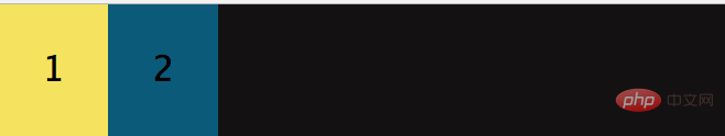
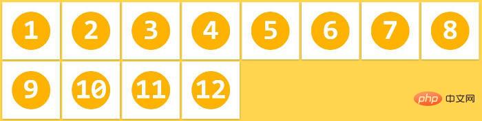
is equivalent to two divs automatically floating to the left , By default, all direct child elements are considered flex items and are arranged in a row from left to right. If the total width of the flex items is greater than the container, then the flex items will be scaled down until they fit within the flex container width.
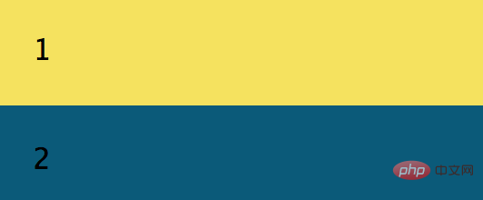
You can also arrange the two sub-divs in a row and add: flex-direction: column;
## in .flex-container. #running result:
<!DOCTYPE html>
<html>
<head>
    <meta charset="UTF-8">
    <meta name="viewport" content="width=device-width, initial-scale=1.0">
    <meta http-equiv="X-UA-Compatible" content="ie=edge">
    <title>Document</title>
</head>
<style>
    *{
        margin: 0;
        padding: 0;
    }
    .flex-container{
        background-color: #131111;
        display: flex;  /*让这个div变成弹性盒子*/
        justify-content: flex-end;
    }
    .flex-container .flex-item{
        padding: 20px;
        background-color: #b1ff84;
    }
    .flex-container .flex-item:first-child{
        background-color: #f5e25f;
    }
    .flex-container .flex-item:last-child{
        background-color: #0B5A79;
    }
</style>
<body>
    <div>
        <div>1</div>
        <div>2</div>
    </div>
</body>
</html>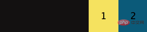 ##When the justify-content value is: center, the flex item is centered and aligned, and its operating effect is:
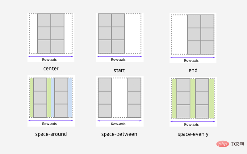
 justify-content has a total of six values, the first three are easier to understand: justify-start (default, aligned to the left), center, justify-end,
- space-evenly
- : The spacing between the starting edge of the flex container and the first flex item is equal to the spacing between each adjacent flex item. (Note from Fool's Wharf: This attribute was rarely seen before because browsers did not support it before, and chrome only supported it after version 60. By extension,
align-content: space-evenlyalso has this logic)
- space-between
- : The spacing between any two adjacent flex items is the same, but not necessarily equal to the first/last flex item and flex The spacing between container edges; the spacing between the starting edge and the first item and the spacing between the end edge and the last item are equal.
- : Each flex item in the flex container has equal spacing on each side. Note that this means that the space between two adjacent flex items will be twice the space between the first/last flex item and its nearest edge
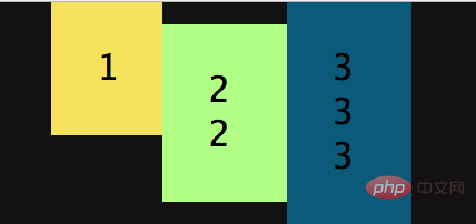
 You can also align the specified div upward or downward:
<!DOCTYPE html>
<html>
<head>
    <meta charset="UTF-8">
    <meta name="viewport" content="width=device-width, initial-scale=1.0">
    <meta http-equiv="X-UA-Compatible" content="ie=edge">
    <title>Document</title>
</head>
<style>
    *{
        margin: 0;
        padding: 0;
    }
    .flex-container{
        background-color: #131111;
        display: flex;  /*让这个div变成弹性盒子*/
        justify-content: center;
        align-items: center;
    }
    .flex-container .flex-item{
        padding: 20px;
        background-color: #b1ff84;
    }
    .flex-container .flex-item:first-child{
        background-color: #f5e25f;
    }
    .flex-container .flex-item:last-child{
        background-color: #0B5A79;
    }
    .flex-bottom{
        /* 让这个div向上 */
        align-self: flex-start;
    }
</style>
<body>
    <div>
        <!-- 多加个class属性,方便指定 -->
        <div class="flex-item flex-bottom">1</div>
        <div>2 <br />2 <br/></div>
        <div>3 <br />3<br />3</div>
    </div>
</body>
</html>Running effect:
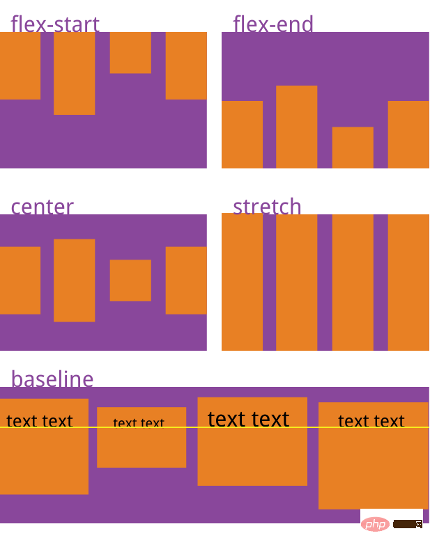
 Similarly, algin-item also has five attribute values:
flex-start | flex-end | center | baseline | stretch;
Next The picture is the corresponding effect:
 Allow flex items to be arranged in multiple rows/columns
    .flex-container{
        background-color: #131111;
        display: flex;
        flex-wrap: wrap;
}默认情况下, flex 项不允许多行/列排列(nowrap),如果 flex 容器尺寸对于所有 flex 项来说不够大,那么flex 项将被调整大小以适应单行或列排列。
通过添加 flex-wrap: wrap ,可以将溢出容器的 flex 项将被排列到另一行/列中,它也有三个取值:
nowrap(默认):不换行.
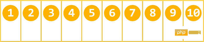
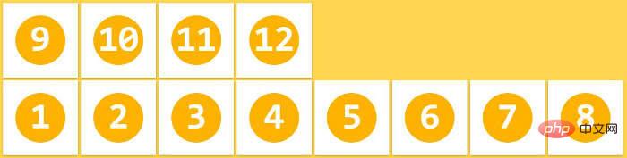
wrap:换行,第一行在上方
wrap-reverse:换行,第一行在下方
插入一段代码,看下效果:
<!DOCTYPE html>
<html>
<head>
    <meta charset="UTF-8">
    <meta name="viewport" content="width=device-width, initial-scale=1.0">
    <meta http-equiv="X-UA-Compatible" content="ie=edge">
    <title>Document</title>
</head>
<style>
    *{
        margin: 0;
        padding: 0;
    }
    .flex-container{
        background-color: #131111;
        display: flex;
        flex-wrap: wrap;
        justify-content: space-evenly;/**/
        align-content: space-evenly;
    }
    .flex-container .flex-item{
        padding: 20px;
        background-color: #b1ff84;
    }
    .flex-container .flex-item:first-child{
        background-color: #f5e25f;
    }
    .flex-container .flex-item:last-child{
        background-color: #0B5A79;
    }
    .flex-bottom{
        /* 让这个div向下 */
        align-self: stretch;
    }
</style>
<body>
    <div>
        <!-- 多加个class属性,方便指定 -->
        <div>1</div>
        <div>2</div>
        <div>3</div>
        <div>4</div>
        <div>5</div>
        <div>6</div>
        <div>7</div>
        <div>8</div>
        <div>9</div>
        <div>10</div>
    </div>
</body>
</html>运行效果:
当长度不够长时,自动换行:


当长度再短时:

拉伸 flex 项
flex-grow 只有在 flex 容器中有剩余空间时才会生效。flex 项的 flex-grow 属性指定该 flex 项相对于其他 flex 项将拉伸多少,以填充 flex 容器。默认值为1。当设置为 0 时,该 flex 项将不会被拉伸去填补剩余空间。在这个例子中,两个项的比例是 1:2,意思是在被拉伸时,第一个 flex 项将占用 1/3,而第二个 flex 项将占据余下的空间,flex-grow控制的是flex项的拉伸比例,而不是占据 flex 容器的空间比例。
<!DOCTYPE html>
<html>
<head>
    <meta charset="UTF-8">
    <meta name="viewport" content="width=device-width, initial-scale=1.0">
    <meta http-equiv="X-UA-Compatible" content="ie=edge">
    <title>Document</title>
</head>
<style>
    *{
        margin: 0;
        padding: 0;
    }
    .flex-container{
        background-color: #131111;
        display: flex;
    }
    .flex-item1{flex-grow: 0;}
    .flex-item2{flex-grow: 1;}
    .flex-item3{flex-grow: 2;}
    .flex-container{
        width:400px;
        padding:10px;
        background-color: #F0f0f0;
      }
      .flex-container .flex-item{
        padding:20px 0;
        text-align: center;
        width:90px;
        background-color: #B1FF84;
      }
      .flex-container .flex-item:first-child{
        background-color: #F5DE25;
      }
      .flex-container .flex-item:last-child{
        background-color: #90D9F7;
      }

</style>
<body>
        <div>
                <div class="flex-item flex-item1">1</div>
                <div class="flex-item flex-item2">2</div>
                <div class="flex-item flex-item3">3</div>
              </div>
</body>
</html>我将三个div全部设为width:90px;
运行效果:

将flex-container的width变为600时:

可以看出2 3 以不同的比例在填充剩余的空间,grow-shrink则是相反的,默认为1,即如果空间不足,该项目将缩小。
The above is the detailed content of What is css3 flexbox. For more information, please follow other related articles on the PHP Chinese website!

Hot AI Tools

Undresser.AI Undress
AI-powered app for creating realistic nude photos

AI Clothes Remover
Online AI tool for removing clothes from photos.

Undress AI Tool
Undress images for free

Clothoff.io
AI clothes remover

AI Hentai Generator
Generate AI Hentai for free.

Hot Article
Hot Tools

Notepad++7.3.1
Easy-to-use and free code editor

SublimeText3 Chinese version
Chinese version, very easy to use

Zend Studio 13.0.1
Powerful PHP integrated development environment

Dreamweaver CS6
Visual web development tools

SublimeText3 Mac version
God-level code editing software (SublimeText3)
Hot Topics
 1386
1386
 52
52

 How to achieve wave effect with pure CSS3? (code example)
Jun 28, 2022 pm 01:39 PM
How to achieve wave effect with pure CSS3? (code example)
Jun 28, 2022 pm 01:39 PM
How to achieve wave effect with pure CSS3? This article will introduce to you how to use SVG and CSS animation to create wave effects. I hope it will be helpful to you!
 Use CSS skillfully to realize various strange-shaped buttons (with code)
Jul 19, 2022 am 11:28 AM
Use CSS skillfully to realize various strange-shaped buttons (with code)
Jul 19, 2022 am 11:28 AM
This article will show you how to use CSS to easily realize various weird-shaped buttons that appear frequently. I hope it will be helpful to you!
 How to hide elements in css without taking up space
Jun 01, 2022 pm 07:15 PM
How to hide elements in css without taking up space
Jun 01, 2022 pm 07:15 PM
Two methods: 1. Using the display attribute, just add the "display:none;" style to the element. 2. Use the position and top attributes to set the absolute positioning of the element to hide the element. Just add the "position:absolute;top:-9999px;" style to the element.
 How to implement lace borders in css3
Sep 16, 2022 pm 07:11 PM
How to implement lace borders in css3
Sep 16, 2022 pm 07:11 PM
In CSS, you can use the border-image attribute to achieve a lace border. The border-image attribute can use images to create borders, that is, add a background image to the border. You only need to specify the background image as a lace style; the syntax "border-image: url (image path) offsets the image border width inward. Whether outset is repeated;".
 It turns out that text carousel and image carousel can also be realized using pure CSS!
Jun 10, 2022 pm 01:00 PM
It turns out that text carousel and image carousel can also be realized using pure CSS!
Jun 10, 2022 pm 01:00 PM
How to create text carousel and image carousel? The first thing everyone thinks of is whether to use js. In fact, text carousel and image carousel can also be realized using pure CSS. Let’s take a look at the implementation method. I hope it will be helpful to everyone!
 Flexible application skills of position attribute in H5
Dec 27, 2023 pm 01:05 PM
Flexible application skills of position attribute in H5
Dec 27, 2023 pm 01:05 PM
How to flexibly use the position attribute in H5. In H5 development, the positioning and layout of elements are often involved. At this time, the CSS position property will come into play. The position attribute can control the positioning of elements on the page, including relative positioning, absolute positioning, fixed positioning and sticky positioning. This article will introduce in detail how to flexibly use the position attribute in H5 development.
 CSS layout property optimization tips: position sticky and flexbox
Oct 20, 2023 pm 03:15 PM
CSS layout property optimization tips: position sticky and flexbox
Oct 20, 2023 pm 03:15 PM
CSS layout attribute optimization tips: positionsticky and flexbox In web development, layout is a very important aspect. A good layout structure can improve the user experience and make the page more beautiful and easy to navigate. CSS layout properties are the key to achieving this goal. In this article, I will introduce two commonly used CSS layout property optimization techniques: positionsticky and flexbox, and provide specific code examples. 1. positions
 How to set animation rotation speed in css3
Apr 28, 2022 pm 04:32 PM
How to set animation rotation speed in css3
Apr 28, 2022 pm 04:32 PM
In CSS3, you can use the "animation-timing-function" attribute to set the animation rotation speed. This attribute is used to specify how the animation will complete a cycle and set the speed curve of the animation. The syntax is "element {animation-timing-function: speed attribute value;}".
