This article will share with you an out-of-the-box Vue3 component library: Varlet. Let’s take a look at its functional features and briefly understand how to use it. I hope it will be helpful to everyone!
I believe many developers have had this idea: because they are interested in a certain technology stack or star open source project, they have the idea and practice of developing new projects in the expansion direction, and they also hope to This new open source project can also receive the same attention as other high-quality open source projects, but not every project can become popular and obtain high star numbers.
However, the developer of the open source project introduced today has achieved a gorgeous counterattack from scratch to one in the past year. Let’s do it together Look what a treasure project this is.
Varlet is a Material style mobile terminalcomponent library developed based on Vue3, and was recommended by Vue author You Yuxi at this year's Vue JS Live. However, it has been less than a year since the project was born. [Related recommendations: vuejs video tutorial]
I learned from a technical blog of the author of Varlet that the author is a Sichuan front-end developer who graduated from a junior college and works in Wuxi. Last year, because my unit planned to develop a component library related to Vue3, by chance, the author volunteered to take over the job. However, the company did not intend to provide support due to cost, return on investment and other reasons. Then the author and two friends decided to continue.

This component library is standardized based on the design of Material Design. During this period, the author and the cooperating partners jointly referred to the community's finished products and combined with the interests of domestic developers api. As for why Material was chosen, the author described it in the official document:
In early mobile devices, large color blocks and strong contrasting colors placed high demands on display devices, while non-linear animation and water Ripple has certain requirements on the GPU. As a result, the Material style does not have a good experience in the mobile browser environment, and more flat and plain styles are chosen to invest in products. However, as the efficiency of runtime processing of modern devices and new js frameworks gradually improves, browsers have more free time and ability to process animation effects, and Material Design will bring a better experience to applications.
After many repeated deliberations, the component library has vaguely taken shape. From now on, Varlet is also officially open source and adopts the MIT open source license.

In the days that followed, Varlet was not only recommended by teacher Ruan Yifeng, but also recognized by the foreign open source technology community, including the Antfu master of the Vite core team. PR for this component library. Not long ago, at Vue3’s 2021 annual summary sharing meeting, Master You Yuxi also recommended Varlet. Some time ago, the varlet-ui project, which was open source on Gitee, was evaluated and recommended by Gitee. The project address is: https://gitee.com/varlet/varlet-ui
So what exactly does Varlet have? What about the charm that attracts so many great people and high-quality platform promotions?
CDN
varlet.js contains all the styles and logic of the component library, so you only need to import it.
<div></div>
<script></script>
<script></script>
<script>
const app = Vue.createApp({
template: '<var-button>按钮'
})
app.use(Varlet).mount('#app')
</script>Webpack/Vite
# 通过 npm、yarn 或 pnpm 安装

# npm
npm i @varlet/ui -S

# yarn
yarn add @varlet/ui

# pnpm
pnpm add @varlet/ui
import App from './App.vue'
import Varlet from '@varlet/ui'
import { createApp } from 'vue'
import '@varlet/ui/es/style.js'

createApp(App).use(Varlet).mount('#app')
Manual introduction
Each component is a Vue plug-in and consists of component logic and style files, as follows Manually introduced for use.
import { createApp } from 'vue'
import { Button } from '@varlet/ui'
import '@varlet/ui/es/button/style/index.js'

createApp().use(Button)Automatic introduction
All components in the template will be automatically scanned by the unplugin-vue-components plug-in, and the plug-in will automatically introduce the components Logic and style files and register components.
# 安装插件

# npm
npm i unplugin-vue-components -D

# yarn
yarn add unplugin-vue-components -D

# pnpm
pnpm add unplugin-vue-components -D
Vue Cli
// vue.config.js
const Components = require('unplugin-vue-components/webpack')
const { VarletUIResolver } = require('unplugin-vue-components/resolvers')

module.exports = {
  configureWebpack: {
    plugins: [
      Components({
        resolvers: [VarletUIResolver()]
      })
    ]
  }
}Vite
// vite.config.js
import vue from '@vitejs/plugin-vue'
import components from 'unplugin-vue-components/vite'
import { VarletUIResolver } from 'unplugin-vue-components/resolvers'
import { defineConfig } from 'vite'

export default defineConfig({
  plugins: [
    vue(),
    components({
      resolvers: [VarletUIResolver()]
    })
  ]
})After completing the configuration, you can use it as follows
<template>
  <var-button>默认按钮</var-button>
</template>
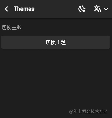
This project provides a dark mode theme. The advantage of dark mode is that it has higher readability in low-light environments.

<var-button>切换主题</var-button>复制代码
import dark from '@varlet/ui/es/themes/dark'
import { StyleProvider } from '@varlet/ui'

export default {
  setup() {
    let currentTheme

    const toggleTheme = () => {
      currentTheme = currentTheme ? null : dark
      StyleProvider(currentTheme)
    }

    return { toggleTheme }
  }
}Inject the text color and background color variables recommended by the component library to control the overall color
body {
  transition: background-color .25s;
  color: var(--color-text);
  background-color: var(--color-body);
}前往下列网址:https://varlet.gitee.io/varlet-ui/#/zh-CN/quickstart
点击界面右上方:
The above is the detailed content of Treasure item! Share an out-of-the-box Vue3 component library: Varlet. For more information, please follow other related articles on the PHP Chinese website!
 The difference between vue2.0 and 3.0
 What is the difference between css framework and component library
 What are the life cycles of vue3
 How to solve an error in the script of the current page
 How to open jar files
 Detailed explanation of imp command in oracle
 Check if the port is open in linux
 How to use the norm function in python
 Tutorial on merging multiple words into one word