 Web Front-end
 CSS Tutorial
 You can also use CSS to process images and turn them into 'pixel style'!
You can also use CSS to process images and turn them into 'pixel style'!
How to turn pictures into "pseudo-pixel style"? This article will introduce to you how to use CSS to process images and convert them into "pixel style". I hope it will be helpful to you!

What is pixel style?
Pixel style is a kind of using fixed-size solid color pixel squares as the basic unit for creation, including but not limited to painting,Architecture, Game is an art style in various fields.
The most familiar one is of course the pixel graphics of the early video games~
["Mario" on the early red and white consoles Pixel image]
Of course, early video games adopted pixel style, which was actually a historical helplessness. The limitations of hardware conditions forced game developers to choose this Strong liquidity, Performance overhead low art style.
However, Today pixel style is still popular in various fields, and it has been given more aesthetic and retro meanings.
Idea Analysis
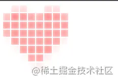
First look at the original picture of the "Love Picture" to be processed this time:

[Love Picture]
To turn such a picture into pixels, the first idea popped into my mind:
Idea 1: Cutting and filling through canvas
Use canvas to cut the picture into N*N blocks, and then calculate the median color value of each area separately and fill it with a solid color. Yes, this idea can undoubtedly solve the problem quickly and flexibly.
But in this way, without using CSS, wouldn’t colleague Ayang’s first date be completely ruined?
❌❌
No, no, no! I have to change my mind and use CSS to implement it! (Recommended learning: css video tutorial)
Idea 2: Use a large radius Gaussian blur filter to get the median value
The main idea is as follows:
Divide the image into N divs, each div holds a part of the image.
Each div is passed through css-filter once
blur (Gaussian blur), visually achieveTake the median value and fill the divEffect.
According to this idea, there is actually only one difficulty. How to make each div hold part of the image?
Oh, this is not a problem for me I have a big heart to help my colleagues.
Implementation
It’s actually not difficult:
First, we use 8*8 to divide a div into 64 parts, which is undoubtedly the grid layout.

Code:
<style>
.mask-group {
width: 128px;
height: 128px;
display: grid;
grid-template-columns: repeat(8,1fr);
grid-template-rows: repeat(8,1fr);
}
</style>
<script>
const el = document.querySelector('.mask-group')
for(let i = 0; i< 64; i++) {
const itemEl = document.createElement('div')
itemEl.className = 'mask-item'
el.appendChild(itemEl)
}
}
</script>Then we set a heart shape for each .mask-item element Background
Then the effect becomes like this, because the background of each picture starts from the upper left corner, so it definitely does not meet expectations.

Next: We need to insert this sentence in the js traversal:
itemEl.style.backgroundPosition = `-${Math.floor(i%8) * 16}px -${Math.floor(i/8) * 16}px `The function of this line of code is to give each .mask-item The element is individually assigned a background-position style, and the upper left corner of the background image of all .mask-item elements is calculated to overlap with a coordinate point.
The effect is as shown:

3. Add interval and Gaussian blur
According to the idea, we only need to add interval to div, and then add Gaussian blur to achieve the effect.
So the code is as follows:
.mask-group {
  /* 以下为新增 */
  grid-row-gap: 2px;
  grid-column-gap: 2px;
}
.mask-item {
  /* 以下为新增 */
  filter: blur(8px)
}But the effect is:

What is the problem? Gaussian Blur actually affects areas outside inner-box! !
- mask-image Limits the visible area
No way, in order to limit the Gaussian blur effect area, I can only use mask-image.
First make a 16*16 pixel pure black all-black.png file.
The code is as follows:
.mask-item {
  /* 以下为新增 */
  -webkit-mask-image: url('./all-black.png');
  mask-image: url('./all-black.png');
}Rendering:

Hey, it’s like that now, but because of Gauss## Because of #, the color is a lot lighter, it’s okay, just fine-tune it.
- Adjust color
.mask-item {
  /* 以下为更改 */
  filter: blur(8px) contrast(400%) saturate(400%);
}
大功告成!!
故事结局
万万没想到,同事阿洋还是没能完成和产品妹妹小美的约会。
原因居然是:产品妹妹觉得我写代码的样子过于靓仔,非要和我约会!

--全剧终--
(学习视频分享:web前端)
The above is the detailed content of You can also use CSS to process images and turn them into 'pixel style'!. For more information, please follow other related articles on the PHP Chinese website!

Hot AI Tools

Undresser.AI Undress
AI-powered app for creating realistic nude photos

AI Clothes Remover
Online AI tool for removing clothes from photos.

Undress AI Tool
Undress images for free

Clothoff.io
AI clothes remover

Video Face Swap
Swap faces in any video effortlessly with our completely free AI face swap tool!

Hot Article

Hot Tools

Notepad++7.3.1
Easy-to-use and free code editor

SublimeText3 Chinese version
Chinese version, very easy to use

Zend Studio 13.0.1
Powerful PHP integrated development environment

Dreamweaver CS6
Visual web development tools

SublimeText3 Mac version
God-level code editing software (SublimeText3)

Hot Topics
 1387
1387
 52
52
 How to use bootstrap in vue
Apr 07, 2025 pm 11:33 PM
Using Bootstrap in Vue.js is divided into five steps: Install Bootstrap. Import Bootstrap in main.js. Use the Bootstrap component directly in the template. Optional: Custom style. Optional: Use plug-ins.
 The Roles of HTML, CSS, and JavaScript: Core Responsibilities
Apr 08, 2025 pm 07:05 PM
HTML defines the web structure, CSS is responsible for style and layout, and JavaScript gives dynamic interaction. The three perform their duties in web development and jointly build a colorful website.
 How to write split lines on bootstrap
Apr 07, 2025 pm 03:12 PM
There are two ways to create a Bootstrap split line: using the tag, which creates a horizontal split line. Use the CSS border property to create custom style split lines.
 Understanding HTML, CSS, and JavaScript: A Beginner's Guide
Apr 12, 2025 am 12:02 AM
WebdevelopmentreliesonHTML,CSS,andJavaScript:1)HTMLstructurescontent,2)CSSstylesit,and3)JavaScriptaddsinteractivity,formingthebasisofmodernwebexperiences.
 How to resize bootstrap
Apr 07, 2025 pm 03:18 PM
To adjust the size of elements in Bootstrap, you can use the dimension class, which includes: adjusting width: .col-, .w-, .mw-adjust height: .h-, .min-h-, .max-h-
 How to use bootstrap button
Apr 07, 2025 pm 03:09 PM
How to use the Bootstrap button? Introduce Bootstrap CSS to create button elements and add Bootstrap button class to add button text
 How to set up the framework for bootstrap
Apr 07, 2025 pm 03:27 PM
To set up the Bootstrap framework, you need to follow these steps: 1. Reference the Bootstrap file via CDN; 2. Download and host the file on your own server; 3. Include the Bootstrap file in HTML; 4. Compile Sass/Less as needed; 5. Import a custom file (optional). Once setup is complete, you can use Bootstrap's grid systems, components, and styles to create responsive websites and applications.
 How to insert pictures on bootstrap
Apr 07, 2025 pm 03:30 PM
There are several ways to insert images in Bootstrap: insert images directly, using the HTML img tag. With the Bootstrap image component, you can provide responsive images and more styles. Set the image size, use the img-fluid class to make the image adaptable. Set the border, using the img-bordered class. Set the rounded corners and use the img-rounded class. Set the shadow, use the shadow class. Resize and position the image, using CSS style. Using the background image, use the background-image CSS property.


