How to achieve circular rotation effect in css3
Method: 1. Use "border-radius:100%" to set the element to be circular; 2. Use "@keyframes name {100%{transform:rotate(360deg);}}" to set animation; 3. , use "animation: name time" to bind animation effects to elements.

The operating environment of this tutorial: Windows 10 system, CSS3&&HTML5 version, Dell G3 computer.
How to achieve circular rotation effect in css3
border-radius allows you to set the rounded corners of the outer border of an element. Determines a circle when using one radius and an ellipse when using two radii. The intersection of this (oval) circle and the border creates a rounded corner effect.
Using @keyframes rules, you can create animations.
Create animations by gradually changing from one CSS style setting to another.
You can change the CSS style settings multiple times during the animation process.
Specify when the change occurs using %, or the keywords "from" and "to", which are the same as 0% to 100%.
0% is when the animation starts, 100% is when the animation is completed.
For best browser support you should always define selectors for 0% and 100%.
The syntax is:
@keyframes animationname {keyframes-selector {css-styles;}}The animation attribute syntax is:
animation: name duration timing-function delay iteration-count direction fill-mode play-state;
animation-name Specifies the name of the keyframe to be bound to the selector
animation-duration The animation specifies how many seconds or milliseconds it takes to complete
animation-timing-function Sets how the animation will complete a cycle
animation-delay sets the delay interval before the animation starts.
animation-iteration-count Defines the number of times the animation is played.
animation-direction Specifies whether the animation should be played in reverse in turn.
animation-fill-mode specifies the style to be applied to the element when the animation is not playing (when the animation is completed, or when there is a delay before the animation starts playing).
animation-play-state Specifies whether the animation is running or paused.
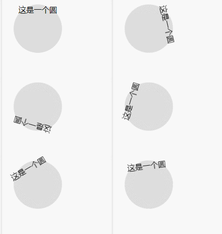
The example is as follows:
<html>
<head>
<meta charset="utf-8">
<title>123</title>
<style>
#example1
{
background:#dddddd;
width:100px;
height:100px;
border-radius:100%;
text-align:center;
animation:fadenum 5s;
}
@keyframes fadenum{
   100%{transform:rotate(360deg);}
}
</style>
</head>
<body>
<div id="example1">
  这是一个圆
</div>
<br><br>
</body>
</html>Output result:

(Learning video sharing: css video Tutorial)
The above is the detailed content of How to achieve circular rotation effect in css3. For more information, please follow other related articles on the PHP Chinese website!

Hot AI Tools

Undresser.AI Undress
AI-powered app for creating realistic nude photos

AI Clothes Remover
Online AI tool for removing clothes from photos.

Undress AI Tool
Undress images for free

Clothoff.io
AI clothes remover

AI Hentai Generator
Generate AI Hentai for free.

Hot Article

Hot Tools

Notepad++7.3.1
Easy-to-use and free code editor

SublimeText3 Chinese version
Chinese version, very easy to use

Zend Studio 13.0.1
Powerful PHP integrated development environment

Dreamweaver CS6
Visual web development tools

SublimeText3 Mac version
God-level code editing software (SublimeText3)

Hot Topics
 How to set unknown attributes in vscode vscode method to set unknown attributes
May 09, 2024 pm 02:43 PM
1. First, open the settings icon in the lower left corner and click the settings option. 2. Then, find the CSS column in the jumped window. 3. Finally, change the drop-down option in the unknownproperties menu to the error button.
 Graphical steps for setting the default properties of CSS in Visual Studio 2019
May 09, 2024 pm 02:01 PM
1. Open Visual Studio 2019, find its option settings, and click CSS. 2. Here you can see the technical settings of the following attributes. 3. Now you can set text and fill borders here. 4. At this time, you can also set the floating positioning here. 5. At this moment, you can also set the border and background here to complete the operation. 6. Finally, click the OK button here to set the CSS default properties.
 How to isolate styles in components in vue
May 09, 2024 pm 03:57 PM
Style isolation in Vue components can be achieved in four ways: Use scoped styles to create isolated scopes. Use CSS Modules to generate CSS files with unique class names. Organize class names using BEM conventions to maintain modularity and reusability. In rare cases, it is possible to inject styles directly into the component, but this is not recommended.
 The difference between v-show and v-if in vue
May 09, 2024 pm 01:48 PM
The main difference between v-show and v-if in Vue is: v-show: controls the display of elements by changing the display style attribute. It is lightweight and performance-friendly for elements that frequently switch to display/hide; but it will retain the space occupied by the elements. , may cause flickering. v-if: Insert or delete elements through conditions, affecting the layout flow and avoiding flickering; however, the cost of destroying and re-creating elements is high, and it is not suitable for frequently switching displayed/hidden elements.
 How to register for Bitstamp exchange pro? Is it safe? Is it formal?
Aug 13, 2024 pm 06:36 PM
How to register BitstampPro? Visit the BitstampPro website. Fill in your personal information and email address. Create a password and accept the terms. Verify email address. Is BitstampPro safe? Authentication required. Enforce the use of two-factor authentication. Most assets are stored in cold storage. Use HTTPS to encrypt communication. Conduct regular security audits. Is BitstampPro legitimate? Registered in Luxembourg. Regulated by the Luxembourg Financial Supervisory Committee. Comply with anti-money laundering and know-your-customer regulations.
 How to implement the custom table function of clicking to add data in dcat admin?
Apr 01, 2025 am 07:09 AM
How to implement the table function of custom click to add data in dcatadmin (laravel-admin) When using dcat...
 The latest ranking list of virtual currency trading platform APP (inventory of top 10 virtual currency trading platforms)
Mar 04, 2025 pm 03:51 PM
This article lists the top ten leading cryptocurrency exchanges in the world, including OKX, Binance, Gate.io, Huobi, Kraken, Coinbase, KuCoin, Crypto.com, Bitfinex and Bitstamp. With their strong technical strength, rich product lines, strict compliance operations and innovative ecological construction, these exchanges have taken the lead in the global cryptocurrency market. The article will introduce their special functions, technical architecture, security measures, compliance qualifications and ecosystem construction respectively, providing reference for investors to choose a suitable trading platform.
 What is the format of the source file?
May 09, 2024 pm 10:51 PM
Source files are uncompiled files containing original code or data, and their formats vary between programming languages and applications. Common formats include text files (.txt, .csv), programming languages (such as .py, .java), markup languages (such as .html, .css), image files (such as .png, .jpg), video files (such as .mp4, .avi), and other formats such as JSON (.json), PDF (.pdf), Word document (.doc), etc.


