css3 defines the gradient syntax: 1. "linear-gradient (gradient direction, color 1, color 2, ...);", used to define linear gradients; 2. "radial-gradient (circle) The type gradient size gradient position, color 1, color 2);" is used to define a radial gradient.

The operating environment of this tutorial: Windows 10 system, CSS3&&HTML5 version, Dell G3 computer.
CSS3 gradients (gradients) allow you to display smooth transitions between two or more specified colors.
Previously, you had to use images to achieve these effects. However, by using CSS3 gradients, you can reduce download time and bandwidth usage. Additionally, elements with gradients look better when zoomed in because the gradient is generated by the browser.
CSS3 defines two types of gradients:
Linear Gradients- Down/Up/Left /Right/Diagonally
Radial Gradient(Radial Gradients)- Defined by their center
CSS3 Linear Gradient
In order to create a linear gradient, you must define at least two color nodes. The color node is the color you want to show a smooth transition. At the same time, you can also set a starting point and a direction (or an angle).
Syntax
background-image: linear-gradient(direction, color-stop1, color-stop2, ...);
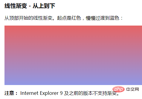
Linear gradient - top to bottom (default)
The example below demonstrates a linear gradient starting from the top. The starting point is red, slowly transitioning to blue:
<html>
<head>
<meta charset="utf-8">
<title>123</title>
<style>
#grad1 {
    height: 200px;
background-color: red; /* 浏览器不支持时显示 */
    background-image: linear-gradient(#e66465, #9198e5);
}
</style>
</head>
<body>
<h3>线性渐变 - 从上到下</h3>
<p>从顶部开始的线性渐变。起点是红色,慢慢过渡到蓝色:</p>
<div id="grad1"></div>
<p><strong>注意:</strong> Internet Explorer 9 及之前的版本不支持渐变。</p>
</body>
</html>Output result:

##CSS3 Radial Gradient
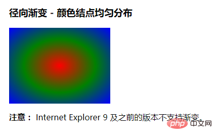
A radial gradient is defined by its center. In order to create a radial gradient, you must also define at least two color nodes. The color node is the color you want to show a smooth transition. At the same time, you can also specify the center, shape (circle or oval), and size of the gradient. By default, the center of the gradient is center (meaning at the center point), the shape of the gradient is ellipse (meaning an ellipse), and the size of the gradient is farthest-corner (meaning to the farthest corner). Syntaxbackground-image: radial-gradient(shape size at position, start-color, ..., last-color);
<html>
<head>
<meta charset="utf-8">
<title>123</title>
<style>
#grad1 {
    height: 150px;
    width: 200px;
    background-color: red; /* 浏览器不支持的时候显示 */
    background-image: radial-gradient(red, green, blue); /* 标准的语法(必须放在最后) */
}
</style>
</head>
<body>
<h3>径向渐变 - 颜色结点均匀分布</h3>
<div id="grad1"></div>
<p><strong>注意:</strong> Internet Explorer 9 及之前的版本不支持渐变。</p>
</body>
</html>
css video tutorial)
The above is the detailed content of What does css3 define gradient syntax?. For more information, please follow other related articles on the PHP Chinese website!