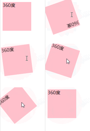
Method: 1. Use "element:hover{animation:name time;}" to bind the animation style when the mouse is hovering; 2. Use "keyframes name {100%{transform:rotate(360deg) ;}}" Just specify the 360-degree rotation action.

The operating environment of this tutorial: Windows 10 system, CSS3&&HTML5 version, Dell G3 computer.
Step one: Use the :hover selector to set the style of the element when the mouse is hovering.
:Hover is a special style added when the mouse moves over the link.
Tip: The :hover selector can be used on all elements, not just links.
The animation attribute can bind an animation style to an element.
Step 2: Use keyframes rules and transform:rotate to set the 360 rotation of the element.
Using @keyframes rules, you can create animations.
Create animations by gradually changing from one CSS style setting to another.
You can change the CSS style settings multiple times during the animation process.
Specify when the change occurs using %, or the keywords "from" and "to", which are the same as 0% to 100%.
The example is as follows:
<html>
<head>
    <style>
        div{
            width:100px;
            height:100px;
            background-color:pink;

        }
        div:hover{
        animation:fadenum 3s;
        }
        @keyframes fadenum{
   100%{transform:rotate(360deg);}
}
    </style>
</head>
<body>
    <div>360度</div>
</body>
</html>Output result:

(Learning video sharing: css video tutorial)
The above is the detailed content of How to create a 360-degree rotation effect on mouse hover with CSS3. For more information, please follow other related articles on the PHP Chinese website!