 Web Front-end
 CSS Tutorial
 Pure CSS to realize the battery charging animation effect of water ripples
Pure CSS to realize the battery charging animation effect of water ripples
This article will introduce to you how to skillfully use CSS to achieve the battery charging animation effect of water ripples. It has certain reference value. Friends in need can refer to it. I hope it will be helpful to everyone.

We know that the three major languages that make up the front-end are: html, css and js, among which The most mysterious thing is css, why do you say that? Since the emergence of animation, transition and other attributes, it can be said that as long as you can’t think of it, there is nothing you can’t do ~
The previous article introduced a mobile phone charging animation effect, and I will continue it today. Compared with the previous article, The article is a bit simple, but for the sake of my girlfriend, I will write it here~
Special effects: Battery charging special effects, the overall special effects can be seen at the top
Prerequisite knowledge:
If you want to complete this special effect, you must know some prerequisite attributes. Let’s briefly introduce them:
animation , transform and filter will not be introduced in detail. Basically all animations will use these two properties. [Recommended learning: css video tutorial]
box-shadow
##box-shadow:Shadow
Usage: box-shadow: h-shadow v-shadow blur spread color inset;- h-shadow: required, horizontal shadow position, negative values allowed
- v-shadow: Required. The position of the vertical shadow. Negative values allowed
- blur: blur distance
- spread: size of shadow
- color: Shadow color
- inset: Change the shadow from the outer shadow (at the start) to the inner shadow
border-radius
border-radius: Set rounded corners
You can set four values, which are the same asmargin and padding
Upper left corner, Upper right corner, Lower right corner, Lower left corner .
- If the lower left corner is omitted, the upper right corner is the same.
- If the lower right corner is omitted, the upper left corner is the same.
- If the upper right corner is omitted, the upper left corner is the same.
linear-gradient()
linear-gradient(): Gradient, used to create a gradient that represents two or more Picture of linear gradient of colors.
Usage:background-image: linear-gradient(direction, color-stop1, color-stop2, ...);
- direction : Use the angle value to specify the direction (or angle) of the gradient, and specify the direction
- color...: What colors change to what colors in sequence
border-radius, and add box -shadowAdd shadow to enhance the three-dimensional effect
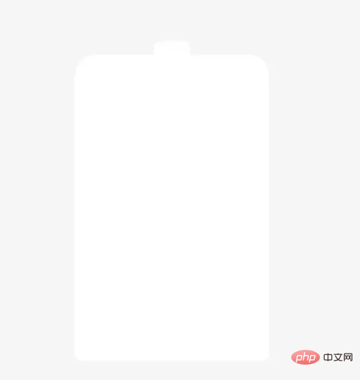 ##Charging effect
You can use positioning layout here and control it through
top The position of the water. The larger the value of top, the lower the water. The smaller the value of top, the higher the water. We set the water level to 80% and pass
To set a gradient color of water:
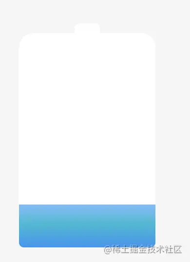 Then the animation is very simple, you only need to control the
value It will cause the water to rise, like this
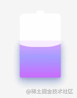 The points that need to be noted at this time are:
- The water level is moving. In order to enhance the three-dimensional effect, you can set a shadow, which can have a progressive effect, so the color is best slightly slightly Make it darker, and the color is better to be closer
- Change color or pass: filter: hue-rotate();
- This attribute controls
    .content{ //容器
        border-radius: 15px 15px 5px 5px;
        &::after{
            position: absolute;
            top: 80%;
            background: linear-gradient(to bottom, #7abcff 0%, #00BCD4 44%, #2196F3 100%);
            border-radius: 0px 0px 5px 5px;
            box-shadow: 0 14px 28px rgba(33, 150, 243, 0), 0 10px 10px rgba(9, 188, 215, 0.08);
            animation: change 10s linear infinite;
            filter: hue-rotate(90deg);
        }
    }
    @keyframes change {
          30% {
            box-shadow: 0 14px 28px rgba(0, 150, 136, 0.83), 0px 4px 10px rgba(8, 117, 134, 0.4);
          }
          50%{
            filter: hue-rotate(60deg);
          }
          80% {
            top: 20%;
            border-radius: 0 0 5px 5px;
            box-shadow: 0 14px 28px rgba(6, 136, 153, 0.2), 0 10px 10px rgba(12, 10, 112, 0.08);
          }
          100% {
              top: 0%;
              filter: hue-rotate(0deg);
              border-radius: 15px 15px 5px 5px;
              box-shadow: 0 14px 28px rgba(7, 93, 104, 0), 0 10px 10px rgba(31, 3, 68, 0.4);
          }
        }
Copy after login
 Water ripple special effect
I believe everyone has seen this special effect. The idea is to set the background color at the approximate position above, cover it with the same background color,
and then The
translate attribute is used, by converting the x, y values, and then by constantly rotating the angle. As for why the value is this value, I can’t figure it out. clear. . . Anyone who knows can leave a message in the comment area.<div class="code" style="position:relative; padding:0px; margin:0px;"><pre class='brush:php;toolbar:false;'>p{ //复盖
border-radius: 45% 47% 44% 42%;
transform: translate(-50%, 0);
animation: move 10s linear infinite;
}
@keyframes move {
100% {
transform: translate(-50%, -160px) rotate(720deg);
}
}</pre><div class="contentsignin">Copy after login</div></div><p><img src="/static/imghw/default1.png" data-src="https://img.php.cn/upload/image/256/812/408/1650250971855508.gif" class="lazy" title="1650250971855508.gif" alt="Pure CSS to realize the battery charging animation effect of water ripples"/></p><p>此时,我们发现这个效果并不太真实,进行多覆盖两个,改变旋转值和<code>border-radius的值来设置水面不重叠,但又有差距的效果
p{
    &:nth-child(2){
      border-radius: 38% 46% 43% 47%;
      transform: translate(-50%, 0) rotate(-135deg);
    }
    &:nth-child(3){
      border-radius: 42% 46% 37% 40%;
      transform: translate(-50%, 0) rotate(135deg);
    }
}此时的效果就非常真实了
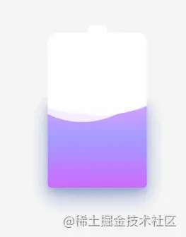
End
不得不说css真的很神奇,最神秘的莫过于css,喜欢的点个赞??支持下吧(● ̄(エ) ̄●)
(学习视频分享:web前端)
The above is the detailed content of Pure CSS to realize the battery charging animation effect of water ripples. For more information, please follow other related articles on the PHP Chinese website!

Hot AI Tools

Undresser.AI Undress
AI-powered app for creating realistic nude photos

AI Clothes Remover
Online AI tool for removing clothes from photos.

Undress AI Tool
Undress images for free

Clothoff.io
AI clothes remover

AI Hentai Generator
Generate AI Hentai for free.

Hot Article

Hot Tools

Notepad++7.3.1
Easy-to-use and free code editor

SublimeText3 Chinese version
Chinese version, very easy to use

Zend Studio 13.0.1
Powerful PHP integrated development environment

Dreamweaver CS6
Visual web development tools

SublimeText3 Mac version
God-level code editing software (SublimeText3)

Hot Topics
 1385
1385
 52
52
 How to use bootstrap in vue
Apr 07, 2025 pm 11:33 PM
Using Bootstrap in Vue.js is divided into five steps: Install Bootstrap. Import Bootstrap in main.js. Use the Bootstrap component directly in the template. Optional: Custom style. Optional: Use plug-ins.
 The Roles of HTML, CSS, and JavaScript: Core Responsibilities
Apr 08, 2025 pm 07:05 PM
HTML defines the web structure, CSS is responsible for style and layout, and JavaScript gives dynamic interaction. The three perform their duties in web development and jointly build a colorful website.
 How to write split lines on bootstrap
Apr 07, 2025 pm 03:12 PM
There are two ways to create a Bootstrap split line: using the tag, which creates a horizontal split line. Use the CSS border property to create custom style split lines.
 Understanding HTML, CSS, and JavaScript: A Beginner's Guide
Apr 12, 2025 am 12:02 AM
WebdevelopmentreliesonHTML,CSS,andJavaScript:1)HTMLstructurescontent,2)CSSstylesit,and3)JavaScriptaddsinteractivity,formingthebasisofmodernwebexperiences.
 How to resize bootstrap
Apr 07, 2025 pm 03:18 PM
To adjust the size of elements in Bootstrap, you can use the dimension class, which includes: adjusting width: .col-, .w-, .mw-adjust height: .h-, .min-h-, .max-h-
 How to set up the framework for bootstrap
Apr 07, 2025 pm 03:27 PM
To set up the Bootstrap framework, you need to follow these steps: 1. Reference the Bootstrap file via CDN; 2. Download and host the file on your own server; 3. Include the Bootstrap file in HTML; 4. Compile Sass/Less as needed; 5. Import a custom file (optional). Once setup is complete, you can use Bootstrap's grid systems, components, and styles to create responsive websites and applications.
 How to insert pictures on bootstrap
Apr 07, 2025 pm 03:30 PM
There are several ways to insert images in Bootstrap: insert images directly, using the HTML img tag. With the Bootstrap image component, you can provide responsive images and more styles. Set the image size, use the img-fluid class to make the image adaptable. Set the border, using the img-bordered class. Set the rounded corners and use the img-rounded class. Set the shadow, use the shadow class. Resize and position the image, using CSS style. Using the background image, use the background-image CSS property.
 How to use bootstrap button
Apr 07, 2025 pm 03:09 PM
How to use the Bootstrap button? Introduce Bootstrap CSS to create button elements and add Bootstrap button class to add button text


