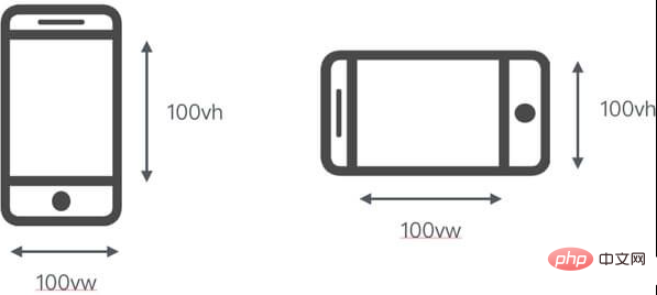
In CSS, vw is a window unit and a relative unit, which means a percentage of the window width; vw is relative to the width of the window, and the window is the visible area of the client browser. The window is divided into 100 units, and the size of 1vw is one percent of the width of the window.

The operating environment of this tutorial: Windows 10 system, CSS3&&HTML5 version, Dell G3 computer.
CSS unit is a unit of measurement, including size units and color units. We often use facing units to avoid confusing the layout of the web page in different views.
vw is the abbreviation of Viewport's width. 1vw is always equal to one percent of the current viewport width. vw is a window unit and a relative unit. The viewport is divided into 100 units of vw relative to its width.
The advantage of vw is that it can directly obtain the width, but using % cannot correctly obtain the width of the visual area without setting the body width, so this is a good advantage.
The viewport here refers to the visible area of the browser, as shown below:

Sample code:
h1{font-size:8vw;}If the view The width of the mouth is 200mm, then the font size of the h1 element in the above code will be 16mm, that is (8x200)/100
The example is as follows:
<html>
<style>
.p1{font-size:5vw;}
.p2{font-size:5px;}
</style>
</head>
<body>
<p class="p1">相对于viewport宽度大小的文字</p>
<p class="p2">px宽度大小的文字</p>
</body>
</html>Output result:

(Learning video sharing: css video tutorial)
The above is the detailed content of What is vw in css. For more information, please follow other related articles on the PHP Chinese website!