What does css positioning layout mean?
Positioning layout in css refers to the way that elements can be separated from their original positions and positioned to any position on the page; positioning layout can be divided into static positioning (static), absolute positioning (absolute), relative positioning (relative) ), fixed positioning (fixed) and sticky positioning (sticky) five positioning methods.

The operating environment of this tutorial: Windows 10 system, CSS3&&HTML5 version, Dell G3 computer.
What does css positioning layout mean
Positioning layout of CSS layout Positioning layout (Position) means that the element can be separated from its original position and positioned to any position on the page.
Using position, left, right, top, and bottom, you can change the existing position of the element, such as making the element jump out of the normal layout flow and fix it at a certain position on the page.
Positioning layout in css is divided into static, relative, absolute, fixed and sticky layout
一, position: static; (static layout)
The default positioning of HTML elements is static. The default positioning is in the document flow. Elements with position: static; style will not be affected by left, right, bottom, top influence. It will not change its position in the normal flow due to any special positioning method
Example is as follows:
<!DOCTYPE html>
<html>
<head>
<meta charset="utf-8">
<title>123</title>
<style>
div.static {
    position: static;
    border: 3px solid #73AD21;
}
</style>
</head>
<body>
<h2 id="position-nbsp-static">position: static;</h2>
<p>使用 position: static; 定位的元素,无特殊定位,遵循正常的文档流对象:</p>
<div class="static">
该元素使用了 position: static;
</div>
</body>
</html>Output result:

2. Position: relative; (relative positioning)
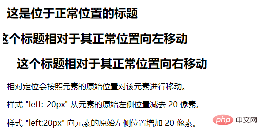
Relative positioning is to move the element relative to its position in the original standard flow, through left, right, bottom, Adjust the top attribute
Note:
Elements that are set to relative positioning do not break away from the document flow, which means that they distinguish between inline elements/block-level elements. /Inline block element
Because it does not break away from the document flow, then we can add magin and padding
in the same direction only Set an attribute, that is, left, right. Select an attribute setting. If top is set, bottom cannot be set.
Usage scenario:
Combined with absolute positioning Use
to fine-tune elements
The example is as follows:
<!DOCTYPE html>
<html>
<head>
<meta charset="utf-8">
<title>123</title>
<style>
h2.pos_left
{
position:relative;
left:-20px;
}
h2.pos_right
{
position:relative;
left:20px;
}
</style>
</head>
<body>
<h2 id="这是位于正常位置的标题">这是位于正常位置的标题</h2>
<h2 id="这个标题相对于其正常位置向左移动">这个标题相对于其正常位置向左移动</h2>
<h2 id="这个标题相对于其正常位置向右移动">这个标题相对于其正常位置向右移动</h2>
<p>相对定位会按照元素的原始位置对该元素进行移动。</p>
<p>样式 "left:-20px" 从元素的原始左侧位置减去 20 像素。</p>
<p>样式 "left:20px" 向元素的原始左侧位置增加 20 像素。</p>
</body>
</html>Output result:
##3. position: absolute;(absolute positioning)
Reference point for absolute positioning- By default, regardless of the ancestor element, the body is used as the reference point.
- However, when there is a positioning flow element in the ancestor element (using absolute/relative/fixed positioning), then the element is the reference point
- If its ancestor element contains multiple positioning flow elements, select the closest positioning flow element as the reference point
- Absolutely The positioned element is out of the document flow
- Because it is out of the document flow, it does not distinguish between inline elements/block-level elements/inline block elements
- Absolutely positioned elements will ignore the padding of their ancestor elements
<!DOCTYPE html>
<html>
<head>
<meta charset="utf-8">
<title>123</title>
<style>
h2
{
position:absolute;
left:100px;
top:150px;
}
</style>
</head>
<body>
<h2 id="这是一个绝对定位了的标题">这是一个绝对定位了的标题</h2>
<p>用绝对定位,一个元素可以放在页面上的任何位置。标题下面放置距离左边的页面100 px和距离页面的顶部150 px的元素。.</p>
</body>
</html> 
4. position: fixed;(fixed positioning)
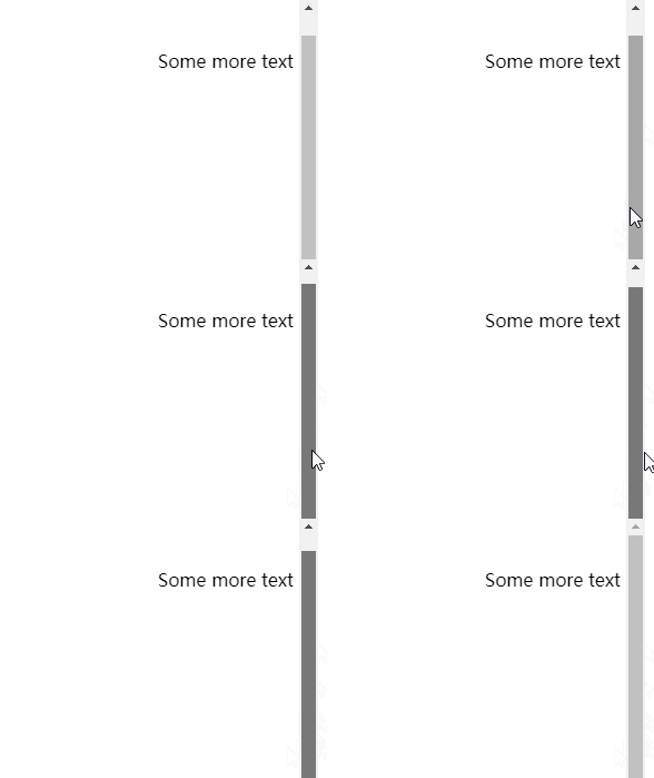
The element with fixed positioning is positioned relative to the viewport, which means that it will not follow the As the scroll bar scrolls, it is always at the position of a viewport, and its position is adjusted through the left, right, bottom, and top attributesNotes- ##Fixed The positioned element is out of the document flow
- Same as absolute positioning, no distinction is made between inline elements/block-level elements/inline block elements
- The example is as follows:
<!DOCTYPE html>
<html>
<head>
<meta charset="utf-8">
<title>123</title>
<style>
p.pos_fixed
{
position:fixed;
top:30px;
right:5px;
}
</style>
</head>
<body>
<p class="pos_fixed">Some more text</p>
<p><b>注意:</b> IE7 和 IE8 支持只有一个 !DOCTYPE 指定固定值.</p>
<p>Some text</p><p>Some text</p><p>Some text</p><p>Some text</p><p>Some text</p><p>Some text</p><p>Some text</p><p>Some text</p><p>Some text</p><p>Some text</p><p>Some text</p><p>Some text</p><p>Some text</p><p>Some text</p><p>Some text</p><p>Some text</p><p>Some text</p><p>Some text</p><p>Some text</p><p>Some text</p><p>Some text</p><p>Some text</p><p>Some text</p><p>Some text</p><p>Some text</p><p>Some text</p><p>Some text</p><p>Some text</p><p>Some text</p><p>Some text</p><p>Some text</p><p>Some text</p><p>Some text</p><p>Some text</p>
</body>
</html>Output result:
 ##5. Position: sticky; (sticky positioning)
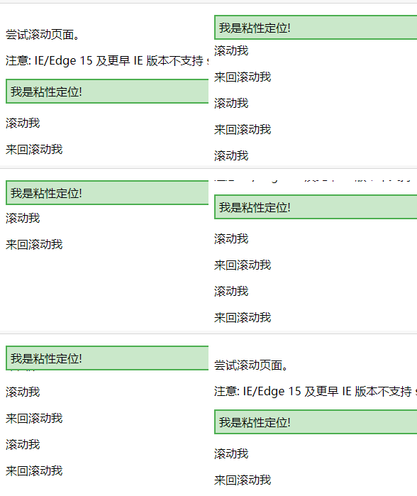
This positioning combines relative positioning and fixed positioning. It is positioned to a certain position through relative positioning. When the viewport reaches this position, it is fixed. For example: set top:50px, then when the sticky element reaches the relative distance The position of the top 50px of the positioned element is fixed and will no longer move upward (this is equivalent to fixed positioning).
NoteSticky positioned elements do not break away from the document flow- Set position: sticky; and give One of (left, right, bottom, top) can
- Using conditions
- One of the four values of top, bottom, left, and right must be specified, otherwise it will only be in relative positioning
- The height of the parent element cannot be low Based on the height of the sticky element
- The sticky element only takes effect within its parent element
- The example is as follows:
<!DOCTYPE html>
<html>
<head>
<meta charset="utf-8">
<title>123</title>
<style>
div.sticky {
  position: -webkit-sticky;
  position: sticky;
  top: 0;
  padding: 5px;
  background-color: #cae8ca;
  border: 2px solid #4CAF50;
}
</style>
</head>
<body>
<p>尝试滚动页面。</p>
<p>注意: IE/Edge 15 及更早 IE 版本不支持 sticky 属性。</p>
<div class="sticky">我是粘性定位!</div>
<div style="padding-bottom:2000px">
  <p>滚动我</p>
  <p>来回滚动我</p>
  <p>滚动我</p>
  <p>来回滚动我</p>
  <p>滚动我</p>
  <p>来回滚动我</p>
</div>
</body>
</html>输出结果:
(学习视频分享:css视频教程)
The above is the detailed content of What does css positioning layout mean?. For more information, please follow other related articles on the PHP Chinese website!

Hot AI Tools

Undresser.AI Undress
AI-powered app for creating realistic nude photos

AI Clothes Remover
Online AI tool for removing clothes from photos.

Undress AI Tool
Undress images for free

Clothoff.io
AI clothes remover

AI Hentai Generator
Generate AI Hentai for free.

Hot Article

Hot Tools

Notepad++7.3.1
Easy-to-use and free code editor

SublimeText3 Chinese version
Chinese version, very easy to use

Zend Studio 13.0.1
Powerful PHP integrated development environment

Dreamweaver CS6
Visual web development tools

SublimeText3 Mac version
God-level code editing software (SublimeText3)

Hot Topics
 What does placeholder mean in vue
May 07, 2024 am 09:57 AM
In Vue.js, the placeholder attribute specifies the placeholder text of the input element, which is displayed when the user has not entered content, provides input tips or examples, and improves form accessibility. Its usage is to set the placeholder attribute on the input element and customize the appearance using CSS. Best practices include being relevant to the input, being short and clear, avoiding default text, and considering accessibility.
 What is node in js
May 07, 2024 pm 09:06 PM
Nodes are entities in the JavaScript DOM that represent HTML elements. They represent a specific element in the page and can be used to access and manipulate that element. Common node types include element nodes, text nodes, comment nodes, and document nodes. Through DOM methods such as getElementById(), you can access nodes and operate on them, including modifying properties, adding/removing child nodes, inserting/replacing nodes, and cloning nodes. Node traversal helps navigate within the DOM structure. Nodes are useful for dynamically creating page content, event handling, animation, and data binding.
 What language is the browser plug-in written in?
May 08, 2024 pm 09:36 PM
Browser plug-ins are usually written in the following languages: Front-end languages: JavaScript, HTML, CSS Back-end languages: C++, Rust, WebAssembly Other languages: Python, Java
 How to set unknown attributes in vscode vscode method to set unknown attributes
May 09, 2024 pm 02:43 PM
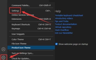
1. First, open the settings icon in the lower left corner and click the settings option. 2. Then, find the CSS column in the jumped window. 3. Finally, change the drop-down option in the unknownproperties menu to the error button.
 Can less files in vue introduce data?
May 07, 2024 pm 12:06 PM
Yes, Less files in Vue can introduce data through CSS variables and Less mixins: create a JSON file containing data. Import JSON files using the @import rule. Access JSON data using CSS variables or Less mixins.
 How to use less style in vue
May 07, 2024 pm 12:03 PM
Using LESS styles in Vue improves code maintainability and extensibility, specifically: Install the LESS compiler and LESS language plugin. Use lang="less" in the .vue file to specify the LESS style. Configure webpack in the Vue.js configuration file to compile LESS to CSS. The main advantages of the LESS style include: Using variables enhances maintainability and reusability. Use blending to simplify the use of repeating styles. Use functions to easily handle color and style manipulation.
 Graphical steps for setting the default properties of CSS in Visual Studio 2019
May 09, 2024 pm 02:01 PM
1. Open Visual Studio 2019, find its option settings, and click CSS. 2. Here you can see the technical settings of the following attributes. 3. Now you can set text and fill borders here. 4. At this time, you can also set the floating positioning here. 5. At this moment, you can also set the border and background here to complete the operation. 6. Finally, click the OK button here to set the CSS default properties.
 How to isolate styles in components in vue
May 09, 2024 pm 03:57 PM
Style isolation in Vue components can be achieved in four ways: Use scoped styles to create isolated scopes. Use CSS Modules to generate CSS files with unique class names. Organize class names using BEM conventions to maintain modularity and reusability. In rare cases, it is possible to inject styles directly into the component, but this is not recommended.


