

What three new border effects are added to css3?

There are three new border effects in css3: 1. Border image "border-image", which can add a background image to the border; 2. Border rounded corners "border-radius", which can add one or more A rounded corner effect; 3. Border shadow "box-shadow", which can add one or more shadows to the element box.
The operating environment of this tutorial: Windows 7 system, CSS3&&HTML5 version, Dell G3 computer.
css3 adds three new border effects
| Attribute | Description | CSS |
|---|---|---|
| border-image | Sets the shorthand properties for all border images. | 3 |
| border-radius | A shorthand property for setting all four border-*-radius properties | 3 |
| Append the shadow of one or more drop-down boxes | 3 |
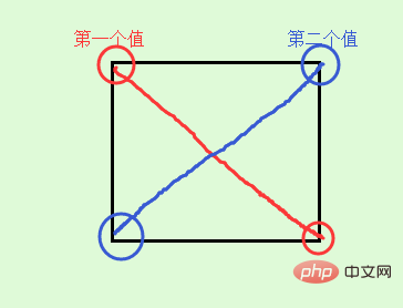 If there are three values, then the first value is to set top-left, and the second value is top-right and bottom-left and they will be equal, and the third value is to set bottom-right.
  If there are four values, then the first value is to set top-left, and the second value is to set top-right, the third value is to set bottom-right, and the fourth value is to set bottom- left
| 值 | 说明 |
|---|---|
| h-shadow | 必需的。水平阴影的位置。允许负值 |
| v-shadow | 必需的。垂直阴影的位置。允许负值 |
| blur | 可选。模糊距离 |
| spread | 可选。阴影的大小 |
| color | 可选。阴影的颜色。 |
| inset | 可选。从外层的阴影(开始时)改变阴影内侧阴影 |
注意:boxShadow 属性把一个或多个下拉阴影添加到框上。该属性是一个用逗号分隔阴影的列表,每个阴影由 2-4 个长度值、一个可选的颜色值和一个可选的 inset 关键字来规定。省略长度的值是 0。
box-shadow属性的使用
1、水平垂直偏移为0也可以有阴影
如果offset-x或offset-y值为0,则阴影在元素背后,此时给blur-radius值或spread值可以产生阴影效果。
例子:
第一个div通过设置blur-radius产生阴影效果。
第二个div通过设置spread正值产生阴影效果。
第三个div通过设置spread负值产生阴影效果。
但是有一点要注意:扩展阴影必须和阴影模糊半径配合使用。
我个人觉得应该是没有配合使用这一说,但不可能只设置扩展阴影,因为扩展阴影和阴影模糊的取值都可以为正。如果只有扩展阴影的话,会被浏览器当做模糊阴影来解析,所以也可以简单理解为“扩展阴影必须和阴影模糊半径配合使用”,如果只用扩展阴影,可以写成:box-shadow:0 0 0 1px;。
<style type="text/css">
div{
    width: 100px;
    height: 100px;
    margin:50px;
    border: 10px dotted pink;
    display: inline-block;
}
.blur{
        box-shadow: 0 0  20px ;
        /*box-shadow: 0 0  20px green;*/ /*也可以自定义颜色*/
}
.spread-positive{
        box-shadow: 0 0 20px 5px ;
        /* box-shadow: 0 0 20px 5px green;*/ /*也可以自定义颜色*/
}
.spread-negative{
        box-shadow: 0 0 20px -5px ;
        /* box-shadow: 0 0 20px -5px green;*/ /*也可以自定义颜色*/
}
</style>
<body>
<div class="blur"></div>
<div class="spread-positive"></div>
<div class="spread-negative"></div>
</body>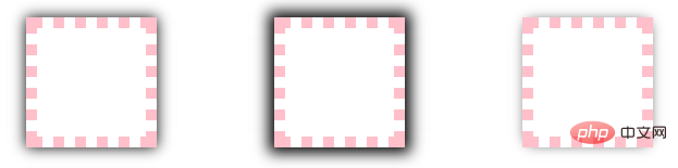
2、设置水平垂直偏移得到阴影效果
outset情况:水平垂直偏移为0,但是不设置blur和spread,看不到阴影,因为此时box-shadow的周长和border-box一样,所以可以通过设置偏移让阴影显示出来。
inset情况:水平垂直偏移为0,不设置blur和spread,同样看不到阴影,因为此时box-shadow的周长和padding-box一样,同样可通过设置偏移让阴影显示出来。
例子:
<style type="text/css">
div{
    width: 100px;
    height: 100px;
    margin:50px;
    border: 10px dotted pink;
    display: inline-block;
}
.shadow0{box-shadow: 0 0;}
.shadow1{box-shadow: 1px 1px;}
.shadow10{box-shadow: 10px 10px;}
.inset-shadow0{box-shadow: 0 0 inset;}
.inset-shadow1{box-shadow: 1px 1px inset;}
.inset-shadow10{box-shadow: 10px 10px inset;}
</style>
<body>
    <div class="shadow0"></div>
    <div class="shadow1"></div>
    <div class="shadow10"></div>
    <div class="inset-shadow0"></div>
    <div class="inset-shadow1"></div>
    <div class="inset-shadow10"></div>
</body>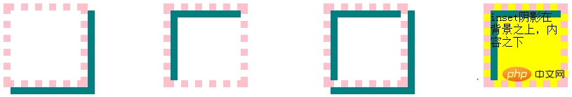
3、投影方式
投影方式默认是outset,即外部投影,可设置inset让向内投影。
例子:第一个div默认outset,第二个设置inset,第三个同时设置两个阴影可以更好的看到outset和inset的关系,第四个div可以看出inset阴影在背景之上,内容之下。
<style type="text/css">
div{
    width: 100px;
    height: 100px;
    margin:50px;
    border: 10px dotted pink;
    display: inline-block;
    vertical-align: top;
}
.outset{
    box-shadow: 10px 10px teal;
}
.inset{
    box-shadow: 10px 10px teal inset;
}
.double{
    box-shadow: 10px 10px teal inset,10px 10px teal;
}
.bg{
    background-color: yellow;
}
</style>
<body>
    <div class="outset"></div>
    <div class="inset"></div>
    <div class="double"></div>
    <div class="inset bg">inset阴影在背景之上,内容之下</div>
</body>
4、如果元素同时指定border-radius属性,则阴影呈现相同的圆角。
<style type="text/css">
 div{
 width: 100px;
    height: 100px;
    margin:50px;
    border: 10px dotted pink;
    display: inline-block;
    border-radius: 50px;
 }
.shadow{
    box-shadow: 0 0  10px 10px green;
}
</style>
<body>
<div class="shadow"></div>
</body>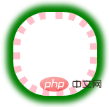
The above is the detailed content of What three new border effects are added to css3?. For more information, please follow other related articles on the PHP Chinese website!

Hot AI Tools

Undresser.AI Undress
AI-powered app for creating realistic nude photos

AI Clothes Remover
Online AI tool for removing clothes from photos.

Undress AI Tool
Undress images for free

Clothoff.io
AI clothes remover

AI Hentai Generator
Generate AI Hentai for free.

Hot Article
Hot Tools

Notepad++7.3.1
Easy-to-use and free code editor

SublimeText3 Chinese version
Chinese version, very easy to use

Zend Studio 13.0.1
Powerful PHP integrated development environment

Dreamweaver CS6
Visual web development tools

SublimeText3 Mac version
God-level code editing software (SublimeText3)
Hot Topics
 1376
1376
 52
52

 How to achieve wave effect with pure CSS3? (code example)
Jun 28, 2022 pm 01:39 PM
How to achieve wave effect with pure CSS3? (code example)
Jun 28, 2022 pm 01:39 PM
How to achieve wave effect with pure CSS3? This article will introduce to you how to use SVG and CSS animation to create wave effects. I hope it will be helpful to you!
 Use CSS skillfully to realize various strange-shaped buttons (with code)
Jul 19, 2022 am 11:28 AM
Use CSS skillfully to realize various strange-shaped buttons (with code)
Jul 19, 2022 am 11:28 AM
This article will show you how to use CSS to easily realize various weird-shaped buttons that appear frequently. I hope it will be helpful to you!
 How to hide elements in css without taking up space
Jun 01, 2022 pm 07:15 PM
How to hide elements in css without taking up space
Jun 01, 2022 pm 07:15 PM
Two methods: 1. Using the display attribute, just add the "display:none;" style to the element. 2. Use the position and top attributes to set the absolute positioning of the element to hide the element. Just add the "position:absolute;top:-9999px;" style to the element.
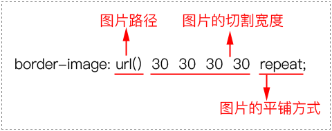
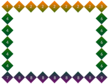
 How to implement lace borders in css3
Sep 16, 2022 pm 07:11 PM
How to implement lace borders in css3
Sep 16, 2022 pm 07:11 PM
In CSS, you can use the border-image attribute to achieve a lace border. The border-image attribute can use images to create borders, that is, add a background image to the border. You only need to specify the background image as a lace style; the syntax "border-image: url (image path) offsets the image border width inward. Whether outset is repeated;".
 It turns out that text carousel and image carousel can also be realized using pure CSS!
Jun 10, 2022 pm 01:00 PM
It turns out that text carousel and image carousel can also be realized using pure CSS!
Jun 10, 2022 pm 01:00 PM
How to create text carousel and image carousel? The first thing everyone thinks of is whether to use js. In fact, text carousel and image carousel can also be realized using pure CSS. Let’s take a look at the implementation method. I hope it will be helpful to everyone!
 How to enlarge the image by clicking the mouse in css3
Apr 25, 2022 pm 04:52 PM
How to enlarge the image by clicking the mouse in css3
Apr 25, 2022 pm 04:52 PM
Implementation method: 1. Use the ":active" selector to select the state of the mouse click on the picture; 2. Use the transform attribute and scale() function to achieve the picture magnification effect, the syntax "img:active {transform: scale(x-axis magnification, y Axis magnification);}".
 Does css3 animation effect have deformation?
Apr 28, 2022 pm 02:20 PM
Does css3 animation effect have deformation?
Apr 28, 2022 pm 02:20 PM
The animation effect in css3 has deformation; you can use "animation: animation attribute @keyframes ..{..{transform: transformation attribute}}" to achieve deformation animation effect. The animation attribute is used to set the animation style, and the transform attribute is used to set the deformation style. .
 css3 what is adaptive layout
Jun 02, 2022 pm 12:05 PM
css3 what is adaptive layout
Jun 02, 2022 pm 12:05 PM
Adaptive layout, also known as "responsive layout", refers to a web page layout that can automatically recognize the screen width and make corresponding adjustments; such a web page can be compatible with multiple different terminals instead of making a specific version for each terminal. . Adaptive layout was born to solve the problem of mobile web browsing, and can provide a good user experience for users using different terminals.
