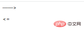
Method: 1. Define an empty element; 2. Use "::before" and content to insert horizontal lines, the syntax is "Element::before{content:"——"}"; 3. Use ": :after" and content insert arrows, the syntax is "Element::after{content:">"}".

The operating environment of this tutorial: Windows 7 system, CSS3&&HTML5 version, Dell G3 computer.
css implementation of arrows with horizontal lines
Implementation method:
Define an empty element , (for example, a span tag that does not contain content)
Use the ::before selector and the content attribute to insert a horizontal line
Use::after Selector and content attribute insertion arrow
Implementation example:
<!DOCTYPE html>
<html>
<head>
    <meta charset="UTF-8">
    <title>Document</title>
    <style>
        span::before{
content: "——";
}
span::after{
content: ">";
}
p::before{
content: "<";
}
p::after{
content: "=";
}
    </style>
</head>

<body>
    <span></span>
<p></p>
</body>

</html>
Description: ::before selection The ::after selector
::before selector inserts content before the selected element.
::after selector inserts content after the selected element.
Both the ::before selector and the ::after selector need to use the content attribute to specify the content to be inserted.
Extended knowledge: usage scenarios of content
The definition of content mentioned that it is used in conjunction with the :before and :after pseudo-elements . :before and :after are the most common pseudo-elements, and everyone must be familiar with them.
Let’s briefly introduce :before and :after:
Let’s take a look at the main usage scenarios:
Insert characters
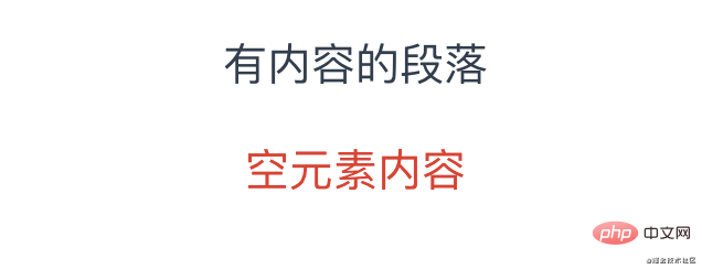
Using content to insert characters generally sets default values for empty elements. Similar to the placeholder attribute of input, it is only displayed when the element has no content. The code is as follows:
<p>有内容的段落</p>
<p></p>
<!--:empty 是一个 CSS 选择器,当元素里面无内容的时候进行匹配-->
p:empty::before {
content: '空元素内容';
color: red;
}The effect is as follows:

Auxiliary element generation
The core point at this time is not the content generated by content, but the pseudo element itself. Usually we put content property value is set to an empty string, and other CSS code is used to generate helper elements, or to achieve graphic effects, or to achieve a specific layout.
Graphic effect
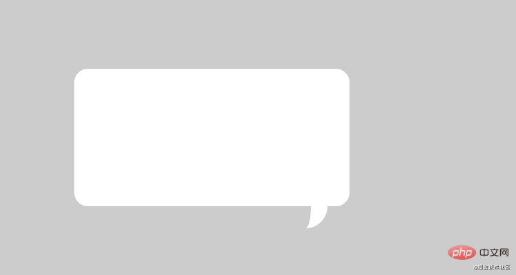
Use the ::after pseudo-element to insert an anonymous replacement element, set the content to empty, this element has no content, and style it through CSS to achieve the desired graphic effect. The code is as follows:
<div class="content-box"></div>
.content-box {
height: 100px;
width: 200px;
border-radius: 10px;
position: relative;
background: #fff;
}
.content-box::after {
content: '';
position: absolute;
top: 100%;
right: 16px;
width: 4px;
height: 16px;
border-width: 0;
border-right: 12px solid #fff;
border-radius: 0 0 32px 0;
}The effect is as follows:

Clear the float
Clear the float Mainly to solve the problem of the internal height of the parent element being 0 due to the floating of the child elements. The code is as follows:
<div class="info-box clear">
<div class="left">左</div>
<div class="right">右</div>
</div>
.clear::after {
content: '';
display: block;
clear: both;
}The above three are indispensable:
Clear the float by adding an element and touch the BFC so that the height of the element can adapt to the height of the sub-box.
Image generation
Use the url function directly to display images. You can add images before and after text, or directly replace text.
The picture directly replaces the text. The code is as follows:
<p class="img-test">文字</p>
.img-test {
display: block;
height: 20px;
width: 20px;
border-radius: 100%;
content: url('../assets/test2.jpg');
}Add pictures before and after the text. The code is as follows:
<!--方案一 -->
.img-test::after {
content: url('../assets/test2.jpg');
}
<!--方案二 -->
.img-test::after {
content: '';
display: block;
height: 20px;
width: 20px;
background: url('../assets/test2.jpg');
}In the first scheme, the pseudo element sets the picture through content. The size of the picture does not change. Easy to control, the displayed image is the original size, which is relatively blurry. Generally, the background image in Scheme 2 is used, and the size can be set as needed.
attr attribute value content generation
Use attr to obtain the element attribute value to achieve the effect. It is generally used to obtain the connection of a tag. The code is as follows:
<a class="baidu-link" href="https://baidu.com"> 百度一下,你就知道!</a>

.baidu-link::after {
  content: " (" attr(href) ") "
}The effect is as follows:

(Learning video sharing: css video tutorial, web front-end)
The above is the detailed content of How to implement arrows with horizontal lines in css. For more information, please follow other related articles on the PHP Chinese website!