What is the class name for clearing floats in bootstrap
The class name for clearing floats in bootstrap is clearfix; clearfix is an auxiliary class in bootstrap. You can easily clear floating point numbers by adding ".clearfix" to the parent element. The syntax is "
".

The operating environment of this tutorial: Windows 10 system, bootstrap version 3.3.7, DELL G3 computer
bootstrap clears floating What is the class name?
We know that clearing floats is a very tedious task when writing static pages.
So general CSS frameworks will have styles used to clear floats.
In bootstrap, this style is called clearfix.
Just add clearfix to the parent element of the floating element that needs to be cleared.
Clearfix is used to easily clear floating point numbers by adding .clearfix to the parent element
The syntax is similar:
<div class="clearfix">...</div>
Examples are as follows:
Create a new html file, named test.html, to explain which class to use to clear floats in bootstrap. Use the link tag to load the bootstrap.min.css file.
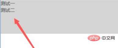
Inside the div tag, use div to create two lines of text. Add the class attribute to the outer div, and set its width to 350px, height to 100px, and background color to gray through class.
Add another div before the two inner divs, and add the clear floating class name clearfix to it, so that the floating of the upper and lower divs does not affect each other.
<!DOCTYPE html>
<html lang="en">
<head>
    <meta charset="UTF-8">
    <meta name="viewport" content="width=device-width, initial-scale=1.0">
    <meta http-equiv="X-UA-Compatible" content="ie=edge">
    <title>Document</title>
    <link rel="stylesheet" href="js/bootstrap.min.css">
</head>
<body>
    <style>
        .mytest{
            width:400px;
            height:50px;
            background:#ccc;
        }
    </style>
    <div class="mytest">
        <div class="pull-left">测试一</div>
        <div class="clearfix"></div>
        <div class="pull-left">测试二</div>
    </div>
</body>
</html>Open the test.html file in the browser to check the effect.

Related recommendations: bootstrap tutorial
The above is the detailed content of What is the class name for clearing floats in bootstrap. For more information, please follow other related articles on the PHP Chinese website!

Hot AI Tools

Undresser.AI Undress
AI-powered app for creating realistic nude photos

AI Clothes Remover
Online AI tool for removing clothes from photos.

Undress AI Tool
Undress images for free

Clothoff.io
AI clothes remover

AI Hentai Generator
Generate AI Hentai for free.

Hot Article

Hot Tools

Notepad++7.3.1
Easy-to-use and free code editor

SublimeText3 Chinese version
Chinese version, very easy to use

Zend Studio 13.0.1
Powerful PHP integrated development environment

Dreamweaver CS6
Visual web development tools

SublimeText3 Mac version
God-level code editing software (SublimeText3)

Hot Topics
 1377
1377
 52
52
 How to do vertical centering of bootstrap
Apr 07, 2025 pm 03:21 PM
Use Bootstrap to implement vertical centering: flexbox method: Use the d-flex, justify-content-center, and align-items-center classes to place elements in the flexbox container. align-items-center class method: For browsers that do not support flexbox, use the align-items-center class, provided that the parent element has a defined height.
 How to get the bootstrap search bar
Apr 07, 2025 pm 03:33 PM
How to use Bootstrap to get the value of the search bar: Determines the ID or name of the search bar. Use JavaScript to get DOM elements. Gets the value of the element. Perform the required actions.
 How to use bootstrap button
Apr 07, 2025 pm 03:09 PM
How to use the Bootstrap button? Introduce Bootstrap CSS to create button elements and add Bootstrap button class to add button text
 How to resize bootstrap
Apr 07, 2025 pm 03:18 PM
To adjust the size of elements in Bootstrap, you can use the dimension class, which includes: adjusting width: .col-, .w-, .mw-adjust height: .h-, .min-h-, .max-h-
 How to write split lines on bootstrap
Apr 07, 2025 pm 03:12 PM
There are two ways to create a Bootstrap split line: using the tag, which creates a horizontal split line. Use the CSS border property to create custom style split lines.
 How to view the date of bootstrap
Apr 07, 2025 pm 03:03 PM
Answer: You can use the date picker component of Bootstrap to view dates in the page. Steps: Introduce the Bootstrap framework. Create a date selector input box in HTML. Bootstrap will automatically add styles to the selector. Use JavaScript to get the selected date.
 How to set up the framework for bootstrap
Apr 07, 2025 pm 03:27 PM
To set up the Bootstrap framework, you need to follow these steps: 1. Reference the Bootstrap file via CDN; 2. Download and host the file on your own server; 3. Include the Bootstrap file in HTML; 4. Compile Sass/Less as needed; 5. Import a custom file (optional). Once setup is complete, you can use Bootstrap's grid systems, components, and styles to create responsive websites and applications.
 How to insert pictures on bootstrap
Apr 07, 2025 pm 03:30 PM
There are several ways to insert images in Bootstrap: insert images directly, using the HTML img tag. With the Bootstrap image component, you can provide responsive images and more styles. Set the image size, use the img-fluid class to make the image adaptable. Set the border, using the img-bordered class. Set the rounded corners and use the img-rounded class. Set the shadow, use the shadow class. Resize and position the image, using CSS style. Using the background image, use the background-image CSS property.


