
 Web Front-end
Bootstrap Tutorial
A brief analysis of the usage of list group, paging and progress bar components in Bootstrap
Web Front-end
Bootstrap Tutorial
A brief analysis of the usage of list group, paging and progress bar components in Bootstrap
A brief analysis of the usage of list group, paging and progress bar components in Bootstrap

How to implement list groups, paging and progress bars in
Bootstrap? The following article will introduce to you the usage of list group, paging and progress bar components in Bootstrap. I hope it will be helpful to you!

List group
- Use .list-group to select the list group
- Add
.activeto a.list-group-itemto indicate the current active selection. [Related recommendations: "bootstrap Tutorial"] - Add
.disabledto a.list-group-itemto make it appear disabled - Use
<a>or<button>to create actionables with hover, disabled and active states by adding.list-group- item-actionList group item - Add
.list-group-flushto remove some borders and rounded corners to render the list group edge-to-edge in the parent container (e.g. card) Project - Add
.list-group-horizontalto change the layout of list group items from vertical to horizontal across all breakpoints - Use context class to set background with state Style and color of list items
- With the help of some utilities, add badges to any list group item to show unread count, activity, etc.
Code exercise:
		<ul class="list-group">
			<li class="list-group-item active">列表组一</li>
			<li class="list-group-item">列表组二</li>
			<li class="list-group-item disabled">列表组三</li>
		</ul>
		<br />
		<div class="list-group list-group-flush">
			<a href="#" class="list-group-item active list-group-item-action">列表组一</a>
			<a href="#" class="list-group-item list-group-item-action">列表组二</a>
			<a href="#" class="list-group-item disabled list-group-item-action">列表组三</a>
		</div>
		<br />
		<ul class="list-group list-group-horizontal-sm">
			<li class="list-group-item active">列表组一</li>
			<li class="list-group-item list-group-item-danger">列表组二</li>
			<li class="list-group-item disabled">列表组三</li>
		</ul>
		<br />
		<ul class="list-group">
			<li class="list-group-item d-flex justify-content-between align-items-center">列表组一
			<span class="badge badge-danger">标记</span></li>
			<li class="list-group-item">列表组二</li>
			<li class="list-group-item disabled">列表组三</li>
		</ul>
Pagination
Add .pagination, add word tag .page-item, add link tag .page-link
You can add .pagination-lg or .pagination-sm to set the size paging effect
You can add .justify-content-* to set the center, left, and right settings.
Code exercise:
		<ul class="pagination pagination-sm justify-content-center">
			<li class="page-item"><a href="#" class="page-link">首页</a></li>
			<li class="page-item"><a href="#" class="page-link">1</a></li>
			<li class="page-item"><a href="#" class="page-link">2</a></li>
			<li class="page-item"><a href="#" class="page-link">下一页</a></li>
		</ul>
Progress bar
- We use
.progressas the outermost element to indicate the maximum value of the progress bar. - We use
.progress-barinternally to indicate progress so far. -
.progress-barIts width needs to be set through inline styles, utility classes, or custom CSS properties. - You can add a label to the progress bar by adding text within the
.progress-barelement. - sets a
heightvalue for.progress, so if you change that value, the inner.progress-barwill automatically Adjust the size accordingly. - The appearance of a single progress bar can be changed by using the tool class related to the background color.
- If necessary, multiple progress bars can be added within a progress bar (progress) component.
- Add
.progress-bar-stripedto any.progress-barto add a striped style. This is done through the gradient function of CSS in the progress bar. ) is achieved by applying a stripe effect to the background color. - Striped gradients can also have animated effects. Add
.progress-bar-animatedto.progress-barto use the CSS3 animation function to add an animation effect of stripes rolling from right to left.
Code practice:
		<div class="progress">
			<div class="progress-bar w-50 ">
			</div>
		</div>
		<br />
		<div class="progress" style="height: 30px;">
			<div class="progress-bar bg-danger" style="width: 35%;">
				30%
			</div>
		</div>
		<br>
		<div class="progress">
			<div class="progress-bar bg-success w-25"></div>
			<div class="progress-bar bg-danger w-25"></div>
			<div class="progress-bar bg-info w-25"></div>
		</div>
		<br />
		<div class="progress">
			<div class="progress-bar w-50 bg-info progress-bar-striped progress-bar-animated">
			</div>
		</div>
For more knowledge about bootstrap, please visit: bootstrap basic tutorial! !
The above is the detailed content of A brief analysis of the usage of list group, paging and progress bar components in Bootstrap. For more information, please follow other related articles on the PHP Chinese website!

Hot AI Tools

Undresser.AI Undress
AI-powered app for creating realistic nude photos

AI Clothes Remover
Online AI tool for removing clothes from photos.

Undress AI Tool
Undress images for free

Clothoff.io
AI clothes remover

AI Hentai Generator
Generate AI Hentai for free.

Hot Article
Hot Tools

Notepad++7.3.1
Easy-to-use and free code editor

SublimeText3 Chinese version
Chinese version, very easy to use

Zend Studio 13.0.1
Powerful PHP integrated development environment

Dreamweaver CS6
Visual web development tools

SublimeText3 Mac version
God-level code editing software (SublimeText3)
Hot Topics


 How to introduce bootstrap into Eclipse
Apr 05, 2024 am 02:30 AM
How to introduce bootstrap into Eclipse
Apr 05, 2024 am 02:30 AM
Introduce Bootstrap in Eclipse in five steps: Download the Bootstrap file and unzip it. Import the Bootstrap folder into the project. Add Bootstrap dependency. Load Bootstrap CSS and JS in HTML files. Start using Bootstrap to enhance your user interface.
 How to introduce idea into bootstrap
Apr 05, 2024 am 02:33 AM
How to introduce idea into bootstrap
Apr 05, 2024 am 02:33 AM
Steps to introduce Bootstrap in IntelliJ IDEA: Create a new project and select "Web Application". Add "Bootstrap" Maven dependency. Create an HTML file and add Bootstrap references. Replace with the actual path to the Bootstrap CSS file. Run the HTML file to use Bootstrap styles. Tip: Use a CDN to import Bootstrap or customize HTML file templates.
 How to read the bootstrap mediation effect test results in stata
Apr 05, 2024 am 01:48 AM
How to read the bootstrap mediation effect test results in stata
Apr 05, 2024 am 01:48 AM
Interpretation steps of Bootstrap mediation effect test in Stata: Check the sign of the coefficient: Determine the positive or negative direction of the mediation effect. Test p value: less than 0.05 indicates that the mediating effect is significant. Check the confidence interval: not containing zero indicates that the mediation effect is significant. Comparing the median p-value: less than 0.05 further supports the significance of the mediation effect.
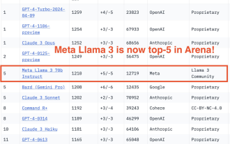 750,000 rounds of one-on-one battle between large models, GPT-4 won the championship, and Llama 3 ranked fifth
Apr 23, 2024 pm 03:28 PM
750,000 rounds of one-on-one battle between large models, GPT-4 won the championship, and Llama 3 ranked fifth
Apr 23, 2024 pm 03:28 PM
Regarding Llama3, new test results have been released - the large model evaluation community LMSYS released a large model ranking list. Llama3 ranked fifth, and tied for first place with GPT-4 in the English category. The picture is different from other benchmarks. This list is based on one-on-one battles between models, and the evaluators from all over the network make their own propositions and scores. In the end, Llama3 ranked fifth on the list, followed by three different versions of GPT-4 and Claude3 Super Cup Opus. In the English single list, Llama3 overtook Claude and tied with GPT-4. Regarding this result, Meta’s chief scientist LeCun was very happy and forwarded the tweet and
 How to read the results of bootstrap mediation test
Apr 05, 2024 am 03:30 AM
How to read the results of bootstrap mediation test
Apr 05, 2024 am 03:30 AM
The Bootstrap mediation test evaluates the mediation effect by resampling the data multiple times: Indirect effect confidence interval: indicates the estimated range of the mediation effect. If the interval does not contain zero, the effect is significant. p-value: Evaluates the probability that the confidence interval does not contain zero, with values less than 0.05 indicating significant. Sample size: The number of data samples used for analysis. Bootstrap subsampling times: the number of repeated samplings (500-2000 times). If the confidence interval does not contain zero and the p-value is less than 0.05, the mediation effect is significant, indicating that the mediating variable explains the relationship between the independent and dependent variables.
 How to use bootstrap to test mediation effects
Apr 05, 2024 am 03:57 AM
How to use bootstrap to test mediation effects
Apr 05, 2024 am 03:57 AM
The Bootstrap test uses resampling technology to evaluate the reliability of the statistical test and is used to prove the significance of the mediation effect: first, calculate the confidence interval of the direct effect, indirect effect and mediation effect; secondly, calculate the significance of the mediation type according to the Baron and Kenny or Sobel method. significance; and finally estimate the confidence interval for the natural indirect effect.
 What is the difference between bootstrap and springboot
Apr 05, 2024 am 04:00 AM
What is the difference between bootstrap and springboot
Apr 05, 2024 am 04:00 AM
The main difference between Bootstrap and Spring Boot is: Bootstrap is a lightweight CSS framework for website styling, while Spring Boot is a powerful, out-of-the-box backend framework for Java web application development. Bootstrap is based on CSS and HTML, while Spring Boot is based on Java and the Spring framework. Bootstrap focuses on creating the look and feel of a website, while Spring Boot focuses on back-end functionality. Spring Boot can be integrated with Bootstrap to create fully functional, beautiful
 How to export the results of bootstrap test mediation effect stata command
Apr 05, 2024 am 03:39 AM
How to export the results of bootstrap test mediation effect stata command
Apr 05, 2024 am 03:39 AM
Export the results of the Bootstrap mediation effect test in Stata: Save the results: bootstrap post Create variable list: local vars: coef se ci Export the results (CSV): export delimited results.csv, varlist(`vars') replace comma nolabel
