Vscode smart prompt plug-in sharing: nutui-vscode-extension
This article will share with you a Vscode smart prompt plug-in: nutui-vscode-extension, and give you a 360-degree understanding of it, and introduce how to use it. I hope it will be helpful to everyone!

It has been one year since the NutUI v3 version was released. Both internal and external developers within the group are developing and using it in different business scenarios. We feel that I am proud but also under increased pressure. I am actively working hard to fix various issues raised by developers, expand component functions, and satisfy developers' demands as much as possible. Since this year, multi-technology stack (React), component-level UI customization, internationalization and code intelligent prompt capabilities have been gradually added. This article will introduce the function of code intelligent prompts (Vscode plug-in), and give you a detailed analysis of the implementation of NutUI-Vscode. [Recommended learning: "vscode introductory tutorial"]
Intuitive experience
What is a code smart prompt ? In order to give everyone an intuitive understanding, let us first carefully observe the following two gif pictures~
The component library does not have any code prompts
After the component library has smart prompts
I wonder if you have any questions after looking at the above two pictures. What do you think? Obviously, after we use smart prompts, whether it is to quickly view documents or view component properties, it will be very convenient to check. Of course, the development efficiency will definitely be significantly improved. So, let us come and experience it for ourselves~
Usage Guide
Tips: NutUI official website-development tool support, here is also a brief introduction Oh~
https://nutui.jd.com/#/ide
- Install
nutui-vscode- invscodeextensionplugin
- Install
veturplugin. If you don’t know this plug-in, here has an introduction
After installing the above two plug-ins, restart our vscode , you can happily experience the smart prompt function of NutUI, isn’t it too simple~
The experience is over, is it time to get familiar with it with me? principle. Since we are developing the
vscodeplug-in, we must first be familiar with its development, debugging, and release processes. A document is given to you. Look here:https://code.visualstudio.com/docs
After you are familiar with the basic vscode development process, follow me step by step Unveil the mystery of this smart reminder function~
360 Comprehensive Interpretation
Quickly view component documentation
As you can see from the picture above, when we use NutUI for development, we finish writing A component nut-button, when the mouse hovers over the component, a prompt will appear. Click the prompt to open the official documentation of the Button component. We can quickly check the corresponding API to develop using it.
First we need to find the corresponding hook function activate in the project generated by vscode, register a Provider in it, and then target Defined type files files are parsed through provideHover.
const files = ['vue', 'typescript', 'javascript', 'react'];

export function activate(context: vscode.ExtensionContext) {
  context.subscriptions.push(
    vscode.languages.registerHoverProvider(files, {
      provideHover
    })
  );
} Let’s take a closer look at how provideHover is implemented?
const LINK_REG = /(?<=<nut-)([\w-]+)/g;
const BIG_LINK_REG = /(?<=<Nut-)([\w-])+/g;
const provideHover = (document: vscode.TextDocument, position: vscode.Position) => {
  const line = document.lineAt(position); //根据鼠标的位置读取当前所在行
  const componentLink = line.text.match(LINK_REG) ?? [];//对 nut-开头的字符串进行匹配
  const componentBigLink = line.text.match(BIG_LINK_REG) ?? [];
  const components = [...new Set([...componentLink, ...componentBigLink.map(kebabCase)])]; //匹配出当前Hover行所包含的组件

  if (components.length) {
    const text = components
      .filter((item: string) => componentMap[item])
      .map((item: string) => {
        const { site } = componentMap[item];

        return new vscode.MarkdownString(
          `[NutUI -> $(references) 请查看 ${bigCamelize(item)} 组件官方文档](${DOC}${site})\n`,
          true
        );
      });

    return new vscode.Hover(text);
  }
}; Through the API provided by vscode and the corresponding regular matching, obtain the components contained in the current Hover line, and then traverse Return the MarkDownString corresponding to different components, and finally return the vscode.Hover object.
Those of you who are careful may have noticed that it also contains a componentMap, which is an object that contains the official website link addresses of all components and props information. , its general content is as follows:
export interface ComponentDesc {
site: string;
props?: string[];
}
export const componentMap: Record<string, ComponentDesc> = {
actionsheet: {
site: '/actionsheet',
props: ["v-model:visible=''"]
},
address: {
site: '/address',
props: ["v-model:visible=''"]
},
addresslist: {
site: '/addresslist',
props: ["data=''"]
}
...
}为了能够保持每次组件的更新都会及时同步,componentMap 这个对象的生成会通过一个本地脚本执行然后自动注入,每次在更新发布插件的时候都会去执行一次,保证和现阶段的组件以及对应的信息保持一致。这里的组件以及它所包含的信息都需要从项目目录中获取,这里的实现和后面讲的一些内容相似,大家可以先想一下实现方式,具体实现细节在后面会一起详解~
组件自动补全
我们使用 NutUI 组件库进行项目开发,当我们输入 nut- 时,编辑器会给出我们目前组件库中包含的所有组件,当我们使用上下键快速选中其中一个组件进行回车,这时编辑器会自动帮我们补全选中的组件,并且能够带出当前所选组件的其中一个 props,方便我们快速定义。
这里的实现,同样我们需要在 vscode 的钩子函数 activate 中注册一个 Provider。
vscode.languages.registerCompletionItemProvider(files, {
    provideCompletionItems,
    resolveCompletionItem
})其中,provideCompletionItems ,需要输出用于自动补全的当前组件库中所包含的组件 completionItems。
const provideCompletionItems = () => {
  const completionItems: vscode.CompletionItem[] = [];
  Object.keys(componentMap).forEach((key: string) => {
    completionItems.push(
      new vscode.CompletionItem(`nut-${key}`, vscode.CompletionItemKind.Field),
      new vscode.CompletionItem(bigCamelize(`nut-${key}`), vscode.CompletionItemKind.Field)
    );
  });
  return completionItems;
};resolveCompletionItem 定义光标选中当前自动补全的组件时触发的动作,这里我们需要重新定义光标的位置。
const resolveCompletionItem = (item: vscode.CompletionItem) => {
const name = kebabCase(<string>item.label).slice(4);
const descriptor: ComponentDesc = componentMap[name];
const propsText = descriptor.props ? descriptor.props : '';
const tagSuffix = `</${item.label}>`;
item.insertText = `<${item.label} ${propsText}>${tagSuffix}`;
item.command = {
title: 'nutui-move-cursor',
command: 'nutui-move-cursor',
arguments: [-tagSuffix.length - 2]
};
return item;
};其中, arguments代表光标的位置参数,一般我们自动补全选中之后光标会在 props 的引号中,便于用来定义,我们结合目前补全的字符串的规律,这里光标的位置是相对确定的。就是闭合标签的字符串长度 -tagSuffix.length,再往前面 2 个字符的位置。即 arguments: [-tagSuffix.length - 2]。
最后,nutui-move-cursor 这个命令的执行需要在 activate 钩子函数中进行注册,并在 moveCursor 中执行光标的移动。这样就实现了我们的自动补全功能。
const moveCursor = (characterDelta: number) => {
  const active = vscode.window.activeTextEditor!.selection.active!;
  const position = active.translate({ characterDelta });
  vscode.window.activeTextEditor!.selection = new vscode.Selection(position, position);
};

export function activate(context: vscode.ExtensionContext) {
  vscode.commands.registerCommand('nutui-move-cursor', moveCursor);
}什么?有了这些还不够?有没有更加智能化的,我不用看组件文档,照样可以轻松开发。emm~~~,当然,请听下文讲解
vetur 智能化提示
提到 vetur,熟悉 Vue 的同学一定不陌生,它是 Vue 官方开发的插件,具有代码高亮提示、识别 Vue 文件等功能。通过借助于它,我们可以做到自己组件库里的组件能够自动识别 props 并进行和官网一样的详细说明。
vetur详细介绍看这里
https://vuejs.github.io/vetur/guide/component-data.html#workspace-component-data
像上面一样,我们在使用组件 Button 时,它会自动提示组件中定义的所有属性。当按上下键快速切换时,右侧会显示当前选中属性的详细说明,这样,我们无需查看文档,这里就可以看到每个属性的详细描述以及默认值,这样的开发简直爽到起飞~
仔细读过文档就可以了解到,vetur 已经提供给了我们配置项,我们只需要简单配置下即可,像这样:
//packag.json
{
    ...
    "vetur": {
        "tags": "dist/smartips/tags.json",
        "attributes": "dist/smartips/attributes.json"
    },
    ...
}tags.json 和 attributes.json 需要包含在我们的打包目录中。当前这两个文件的内容,我们也可以看下:
// tags.json
{
  "nut-actionsheet": {
      "attributes": [
        "v-model:visible",
        "menu-items",
        "option-tag",
        "option-sub-tag",
        "choose-tag-value",
        "color",
        "title",
        "description",
        "cancel-txt",
        "close-abled"
      ]
  },
  ...
}//attributes.json
{
"nut-actionsheet/v-model:visible": {
"type": "boolean",
"description": "属性说明:遮罩层可见,默认值:false"
},
"nut-actionsheet/menu-items": {
"type": "array",
"description": "属性说明:列表项,默认值:[ ]"
},
"nut-actionsheet/option-tag": {
"type": "string",
"description": "属性说明:设置列表项标题展示使用参数,默认值:'name'"
},
...
}很明显,这两个文件也是需要我们通过脚本生成。和前面提到的一样,这里涉及到组件以及和它们关联的信息,为了能够保持一致并且维护一份,我们这里通过每个组件源码下面的 doc.md 文件来获取。因为,这个文件中包含了组件的 props 以及它们的详细说明和默认值。
组件 props 详细信息
tags, attibutes, componentMap 都需要获取这些信息。
我们首先来看看 doc.md 中都包含什么?
## 介绍
## 基本用法
...
### Prop

| 字段     | 说明                                                             | 类型   | 默认值 |
| -------- | ---------------------------------------------------------------- | ------ | ------ |
| size     | 设置头像的大小,可选值为:large、normal、small,支持直接输入数字   | String | normal |
| shape    | 设置头像的形状,可选值为:square、round            | String | round  |
...
每个组件的 md 文档,我们预览时是通过 vite 提供的插件 vite-plugin-md,来生成对应的 html,而这个插件里面引用到了 markdown-it 这个模块。所以,我们现在想要解析 md 文件,也需要借助于 markdown-it 这个模块提供的 parse API.
// Function getSources
let sources = MarkdownIt.parse(data, {});
// data代表文档内容,sources代表解析出的list列表。这里解析出来的是Token列表。在Token 中,我们只关心 type 即可。因为我们要的是 props,这部分对应的 Token 的 type 就是 table_open 和 table_close 中间所包含的部分。考虑到一个文档中有多个 table。这里我们始终取第一个,*** 这也是要求我们的开发者在写文档时需要注意的地方 ***。
拿到了中间的部分之后,我们只要在这个基础上再次进行筛选,选出 tr_open 和 tr_close 中间的部分,然后再筛选中间 type = inline 的部分。最后取 Token 这个对象中的 content 字段即可。然后在根据上面三个文件不同的需求做相应的处理即可。
const getSubSources = (sources) => {
  let sourcesMap = [];
  const startIndex = sources.findIndex((source) => source.type === TYPE_IDENTIFY_OPEN);
  const endIndex = sources.findIndex((source) => source.type === TYPE_IDENTIFY_CLOSE);
  sources = sources.slice(startIndex, endIndex + 1);
  while (sources.filter((source) => source.type === TR_TYPE_IDENTIFY_OPEN).length) {
    let trStartIndex = sources.findIndex((source) => source.type === TR_TYPE_IDENTIFY_OPEN);
    let trEndIndex = sources.findIndex((source) => source.type === TR_TYPE_IDENTIFY_CLOSE);
    sourcesMap.push(sources.slice(trStartIndex, trEndIndex + 1));
    sources.splice(trStartIndex, trEndIndex - trStartIndex + 1);
  }
  return sourcesMap;
};好了,以上就是解析的全部内容了。总结起来就那么几点:
1、创建一个基于 vscode 的项目,在它提供的钩子中注册不同行为的 command 和 languages,并实现对应的行为
2、结合 vetur,配置 packages.json
3、针对 map json 文件,需要提供相应的生成脚本,确保信息的一致性。这里解析 md 需要使用 markdown-it 给我们提供的 parse 功能。
最后
本文从直观体验到实际使用再到实现原理分析,一步步带着大家感受了 NutUI 和 VSCode 结合,给大家带来的福利,让大家能在开发上有了全新的体验,同时,也让我们的组件库越发充满了魅力。接下来,让我们共同携手,让它发挥出更加强大的价值~
更多关于VSCode的相关知识,请访问:vscode教程!!
The above is the detailed content of Vscode smart prompt plug-in sharing: nutui-vscode-extension. For more information, please follow other related articles on the PHP Chinese website!

Hot AI Tools

Undresser.AI Undress
AI-powered app for creating realistic nude photos

AI Clothes Remover
Online AI tool for removing clothes from photos.

Undress AI Tool
Undress images for free

Clothoff.io
AI clothes remover

AI Hentai Generator
Generate AI Hentai for free.

Hot Article

Hot Tools

Notepad++7.3.1
Easy-to-use and free code editor

SublimeText3 Chinese version
Chinese version, very easy to use

Zend Studio 13.0.1
Powerful PHP integrated development environment

Dreamweaver CS6
Visual web development tools

SublimeText3 Mac version
God-level code editing software (SublimeText3)

Hot Topics
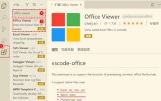 How to view word documents in vscode How to view word documents in vscode
May 09, 2024 am 09:37 AM
First, open the vscode software on the computer, click the [Extension] icon on the left, as shown in ① in the figure. Then, enter [officeviewer] in the search box of the extension interface, as shown in ② in the figure. Then, from the search Select [officeviewer] to install in the results, as shown in ③ in the figure. Finally, open the file, such as docx, pdf, etc., as shown below
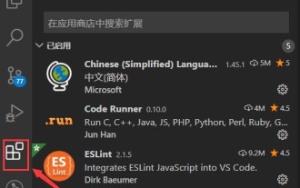 How to draw a flow chart with vscode_How to draw a flow chart with visual_studio code
Apr 23, 2024 pm 02:13 PM
First, open visual studio code on the computer, click the four square buttons on the left, then enter draw.io in the search box to query the plug-in, click Install. After installation, create a new test.drawio file, then select the test.drawio file, enter the editing mode on the left There are various graphics on the side. You can draw the flow chart by selecting at will. After drawing, click File → Embed → svg and then select Embed. Copy the svg code. Paste the copied svg code into the html code. Open the html web page and you can see it. Click on the picture on the web page to jump to the flow chart. On this page, you can zoom in and out of the flow chart. Here, we choose to click on the pencil pattern in the lower right corner to jump to the web page.
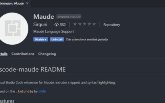 How to write Maude in Vscode_How to write Maude in Vscode
Apr 23, 2024 am 10:25 AM
First, you can search for the Maude plug-in in the vscode plug-in manager. Then, create a new file with the extension maude to use maude's code snippets and syntax highlighting. Terminal -> New Terminal can open the vscode built-in terminal in the current folder to run the maude or full-maude program. In maude's official tutorial, there are also examples of http clients, which can be called and run as shown in the figure. If you want to associate files with the fm extension, open settings, search for fileassociations in user settings, and open settings.json. Just add an entry to the file association, that is, the entry from *.fm to maude. But full
 Caltech Chinese use AI to subvert mathematical proofs! Speed up 5 times shocked Tao Zhexuan, 80% of mathematical steps are fully automated
Apr 23, 2024 pm 03:01 PM
LeanCopilot, this formal mathematics tool that has been praised by many mathematicians such as Terence Tao, has evolved again? Just now, Caltech professor Anima Anandkumar announced that the team released an expanded version of the LeanCopilot paper and updated the code base. Image paper address: https://arxiv.org/pdf/2404.12534.pdf The latest experiments show that this Copilot tool can automate more than 80% of the mathematical proof steps! This record is 2.3 times better than the previous baseline aesop. And, as before, it's open source under the MIT license. In the picture, he is Song Peiyang, a Chinese boy. He is
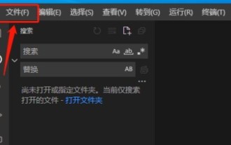 How to enable background updates in vscode How to enable background updates in vscode
May 09, 2024 am 09:52 AM
1. First, after opening the interface, click the file menu in the upper left corner. 2. Then, click the settings button in the preferences column. 3. Then, in the settings page that jumps, find the update section. 4. Finally, click the mouse to check and enable it. Download and install the new VSCode version button in the background on Windows and restart the program.
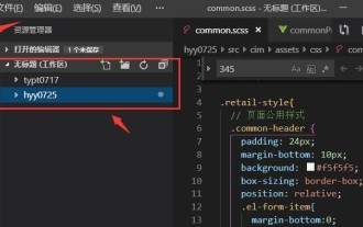 How to add files to vscode workspace How to add files to vscode workspace
May 09, 2024 am 09:43 AM
1. First, open the vscode software, click the explorer icon, and find the workspace window 2. Then, click the file menu in the upper left corner and find the add folder to workspace option 3. Finally, find the folder location in the local disk , click the add button
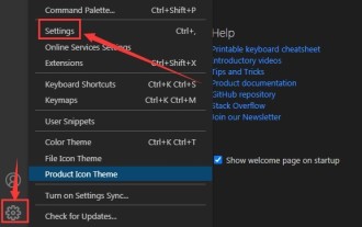 How to disable wsl configuration file in vscode How to disable wsl configuration file in vscode
May 09, 2024 am 10:30 AM
1. First, open the settings option in the settings menu. 2. Then, find the terminal column in the commonly used page. 3. Finally, uncheck the usewslprofiles button on the right side of the column.
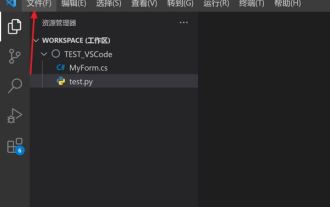 How to set animation smooth insertion in VScode VScode tutorial to set animation smooth insertion
May 09, 2024 am 09:49 AM
1. First, after opening the interface, click the workspace interface 2. Then, in the open editing panel, click the File menu 3. Then, click the Settings button under the Preferences column 4. Finally, click the mouse to check the CursorSmoothCaretAnimation button and save Just set it


