
 Web Front-end
JS Tutorial
JS CSS implements exquisite secondary navigation effect code_javascript skills
Web Front-end
JS Tutorial
JS CSS implements exquisite secondary navigation effect code_javascript skills
JS CSS implements exquisite secondary navigation effect code_javascript skills

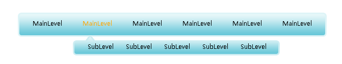
The example in this article describes the JS CSS code to implement exquisite secondary navigation effects. Share it with everyone for your reference. The details are as follows:
This is a beautiful secondary navigation based on JS CSS, suitable for friends who want to learn some basic points and basic js knowledge and skills. In fact, the completion of this menu requires not only basic knowledge, but also ingenious ideas after being familiar with CSS. You may be able to write menus, but writing good menus is not that easy.
The screenshot of the running effect is as follows:
The online demo address is as follows:
http://demo.jb51.net/js/2015/js-css-jm-2l-nav-menu-codes/
The specific code is as follows:
<!DOCTYPE html PUBLIC "-//W3C//DTD XHTML 1.0 Transitional//EN"
"http://www.w3.org/TR/xhtml1/DTD/xhtml1-transitional.dtd">
<html xmlns="http://www.w3.org/1999/xhtml">
<head>
<meta http-equiv="Content-Type" content="text/html; charset=utf-8" />
<title>js+css精美二级导航</title>
<style>
<!--
body {margin0; padding:0; text-transform:capitalize;}
ul,li {margin:0; padding:0; list-style-type:none;}
.menu {width:606px; height:48px; background:url(images/nav.gif) 0 0 no-repeat;}
.inner {padding:0 0 0 9px;}
.menu li {float:left; font-size:12px;}
.menu li a {text-decoration:none; color:#000; display:block; padding:0 20px; font:12px/44px "微软雅黑";}
.menu li a:hover {text-decoration:none; color:orange; font:12px/44px "微软雅黑";}
.menu li ul {visibility:hidden; position:absolute;}
.menu li.hover ul {/*ie6不支持li:hover所以在这里写成li.hover以方便js取样式*/visibility:visible; position:absolute; display:block; width:408px; padding:0 0 0 18px; background:url(images/subUlBg.gif) 0 0 no-repeat;}
.menu ul ul li a {padding:0 1em; line-height:48px;}
.menu ul ul li a:hover {padding:0 1em; line-height:48px;}
.menu {margin:50px auto;}
p {text-align:center; font:12px/200% "微软雅黑"; color:skyblue; }
p a {color:skyblue;}
-->
</style>
</head>
<body>
<script language="javascript" type="text/javascript">
 function showSubLevel(Obj){
 Obj.className="hover";
 }
 function hideSubLevel(Obj){
 Obj.className="";
 }
</script>
<div class="menu">
 <ul class="inner">
 <li onmouseover="showSubLevel(this)" onmouseout="hideSubLevel(this)"><a href="#">mainLevel</a>
 <ul>
 <li><a href="#">subLevel</a></li>
 <li><a href="#">subLevel</a></li>
 <li><a href="#">subLevel</a></li>
 <li><a href="#">subLevel</a></li>
 <li><a href="#">subLevel</a></li>
 </ul>
 </li>
 <li onmouseover="showSubLevel(this)" onmouseout="hideSubLevel(this)"><a href="#">mainLevel</a>
 <ul>
 <li><a href="#">subLevel</a></li>
 <li><a href="#">subLevel</a></li>
 <li><a href="#">subLevel</a></li>
 <li><a href="#">subLevel</a></li>
 <li><a href="#">subLevel</a></li>
 </ul>
 </li>
 <li onmouseover="showSubLevel(this)" onmouseout="hideSubLevel(this)"><a href="#">mainLevel</a>
 <ul>
 <li><a href="#">subLevel</a></li>
 <li><a href="#">subLevel</a></li>
 <li><a href="#">subLevel</a></li>
 <li><a href="#">subLevel</a></li>
 <li><a href="#">subLevel</a></li>
 </ul>
 </li>
 <li onmouseover="showSubLevel(this)" onmouseout="hideSubLevel(this)"><a href="#">mainLevel</a>
 <ul>
 <li><a href="#">subLevel</a></li>
 <li><a href="#">subLevel</a></li>
 <li><a href="#">subLevel</a></li>
 <li><a href="#">subLevel</a></li>
 <li><a href="#">subLevel</a></li>
 </ul>
 </li>
 <li onmouseover="showSubLevel(this)" onmouseout="hideSubLevel(this)"><a href="#">mainLevel</a>
 <ul>
 <li><a href="#">subLevel</a></li>
 <li><a href="#">subLevel</a></li>
 <li><a href="#">subLevel</a></li>
 <li><a href="#">subLevel</a></li>
 <li><a href="#">subLevel</a></li>
 </ul>
 </li>
 <li onmouseover="showSubLevel(this)" onmouseout="hideSubLevel(this)"><a href="#">mainLevel</a>
 <ul>
 <li><a href="#">subLevel</a></li>
 <li><a href="#">subLevel</a></li>
 <li><a href="#">subLevel</a></li>
 <li><a href="#">subLevel</a></li>
 <li><a href="#">subLevel</a></li>
 </ul>
 </li>
 </ul>
</div>
<p>Made by Jacktomato<br />
适合想学一些简体、基本的js朋友们</p>
</body>
</html>I hope this article will be helpful to everyone’s JavaScript programming.

Hot AI Tools

Undresser.AI Undress
AI-powered app for creating realistic nude photos

AI Clothes Remover
Online AI tool for removing clothes from photos.

Undress AI Tool
Undress images for free

Clothoff.io
AI clothes remover

AI Hentai Generator
Generate AI Hentai for free.

Hot Article
Hot Tools

Notepad++7.3.1
Easy-to-use and free code editor

SublimeText3 Chinese version
Chinese version, very easy to use

Zend Studio 13.0.1
Powerful PHP integrated development environment

Dreamweaver CS6
Visual web development tools

SublimeText3 Mac version
God-level code editing software (SublimeText3)
Hot Topics
 1359
1359
 52
52

 How to remove the default style in Bootstrap list?
Apr 07, 2025 am 10:18 AM
How to remove the default style in Bootstrap list?
Apr 07, 2025 am 10:18 AM
The default style of the Bootstrap list can be removed with CSS override. Use more specific CSS rules and selectors, follow the "proximity principle" and "weight principle", overriding the Bootstrap default style. To avoid style conflicts, more targeted selectors can be used. If the override is unsuccessful, adjust the weight of the custom CSS. At the same time, pay attention to performance optimization, avoid overuse of !important, and write concise and efficient CSS code.
 How to resize bootstrap
Apr 07, 2025 pm 03:18 PM
How to resize bootstrap
Apr 07, 2025 pm 03:18 PM
To adjust the size of elements in Bootstrap, you can use the dimension class, which includes: adjusting width: .col-, .w-, .mw-adjust height: .h-, .min-h-, .max-h-
 How to use bootstrap button
Apr 07, 2025 pm 03:09 PM
How to use bootstrap button
Apr 07, 2025 pm 03:09 PM
How to use the Bootstrap button? Introduce Bootstrap CSS to create button elements and add Bootstrap button class to add button text
 How to upload files on bootstrap
Apr 07, 2025 pm 01:09 PM
How to upload files on bootstrap
Apr 07, 2025 pm 01:09 PM
The file upload function can be implemented through Bootstrap. The steps are as follows: introduce Bootstrap CSS and JavaScript files; create file input fields; create file upload buttons; handle file uploads (using FormData to collect data and then send to the server); custom style (optional).
 How to layout bootstrap
Apr 07, 2025 pm 02:24 PM
How to layout bootstrap
Apr 07, 2025 pm 02:24 PM
To use Bootstrap to layout a website, you need to use a grid system to divide the page into containers, rows, and columns. First add the container, then add the rows in it, add the columns within the row, and finally add the content in the column. Bootstrap's responsive layout function automatically adjusts the layout according to breakpoints (xs, sm, md, lg, xl). Different layouts under different screen sizes can be achieved by using responsive classes.
 How to build a bootstrap framework
Apr 07, 2025 pm 12:57 PM
How to build a bootstrap framework
Apr 07, 2025 pm 12:57 PM
To create a Bootstrap framework, follow these steps: Install Bootstrap via CDN or install a local copy. Create an HTML document and link Bootstrap CSS to the <head> section. Add Bootstrap JavaScript file to the <body> section. Use the Bootstrap component and customize the stylesheet to suit your needs.
 How to insert pictures on bootstrap
Apr 07, 2025 pm 03:30 PM
How to insert pictures on bootstrap
Apr 07, 2025 pm 03:30 PM
There are several ways to insert images in Bootstrap: insert images directly, using the HTML img tag. With the Bootstrap image component, you can provide responsive images and more styles. Set the image size, use the img-fluid class to make the image adaptable. Set the border, using the img-bordered class. Set the rounded corners and use the img-rounded class. Set the shadow, use the shadow class. Resize and position the image, using CSS style. Using the background image, use the background-image CSS property.
 How to change the size of a Bootstrap list?
Apr 07, 2025 am 10:45 AM
How to change the size of a Bootstrap list?
Apr 07, 2025 am 10:45 AM
The size of a Bootstrap list depends on the size of the container that contains the list, not the list itself. Using Bootstrap's grid system or Flexbox can control the size of the container, thereby indirectly resizing the list items.
