How to use rotate3d method in css3
In CSS3, the rotate3d() method is used to define the 3D transformation of an element. It moves the element around a fixed axis without deforming it. The amount of movement is defined by the specified angle; if the parameter is set to a positive number, the element will Move clockwise. If the parameter is set to a negative number, the element will move counterclockwise. The syntax is "transform:rotate3d(x,y,z,angle)".

The operating environment of this tutorial: Windows 10 system, CSS3&&HTML5 version, Dell G3 computer.
How to use the rotate3d method in css3
rotate3d() CSS function defines a transformation that moves the element around a fixed axis without deforming it. The amount of motion is defined by the specified angle; if positive, the motion will be clockwise, if negative, it will be counterclockwise.
In 3D space, rotation has 3 free dimensions, describing the axis of rotation. The axis of rotation is defined by a set of [x, y, z] vectors and is passed through the transform origin point (i.e. defined via the transform-origin CSS property). If these vectors are assigned non-standard values, i.e. when the sum of the squares of the 3 coordinate values is not equal to 1, it will be implicitly normalized internally. Non-standard vectors, such as null and [0, 0, 0], will cause rotation to have no effect, but will not affect other effects of the entire CSS property (Translator's Note: such as multiple transformations in transform).
In contrast to planar rotations, combinations of 3D rotations are generally not commutative; this means that the order of values defining the rotation rules is strictly controlled.
Syntax
rotate3d(x, y, z, a)
Value
x
type, which can be a value between 0 and 1, indicating the X coordinate direction of the rotation axis Vector. y
type, which can be a value between 0 and 1, representing the vector in the Y coordinate direction of the rotation axis. z
type, which can be a value between 0 and 1, representing the vector in the Z coordinate direction of the rotation axis. a
type, indicating the rotation angle. Positive angle values represent clockwise rotation, and negative values represent counterclockwise rotation.
The example is as follows:
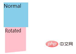
Rotate around the Y axis
HTML
<div>Normal</div>
<div class="rotated">Rotated</div>
Copy to Clipboard
CSS
body {
  perspective: 800px;
}
div {
  width: 80px;
  height: 80px;
  background-color: skyblue;
}
.rotated {
  transform: rotate3d(0, 1, 0, 60deg);
  background-color: pink;
}
Copy to ClipboardEffect

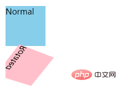
Rotate around custom axis
HTML
<div>Normal</div>
<div class="rotated">Rotated</div>
Copy to Clipboard
CSS
body {
  perspective: 800px;
}
div {
  width: 80px;
  height: 80px;
  background-color: skyblue;
}
.rotated {
  transform: rotate3d(1, 2, -1, 192deg);
  background-color: pink;
}
Copy to ClipboardEffect

(Learning video sharing: css video tutorial)
The above is the detailed content of How to use rotate3d method in css3. For more information, please follow other related articles on the PHP Chinese website!

Hot AI Tools

Undresser.AI Undress
AI-powered app for creating realistic nude photos

AI Clothes Remover
Online AI tool for removing clothes from photos.

Undress AI Tool
Undress images for free

Clothoff.io
AI clothes remover

AI Hentai Generator
Generate AI Hentai for free.

Hot Article

Hot Tools

Notepad++7.3.1
Easy-to-use and free code editor

SublimeText3 Chinese version
Chinese version, very easy to use

Zend Studio 13.0.1
Powerful PHP integrated development environment

Dreamweaver CS6
Visual web development tools

SublimeText3 Mac version
God-level code editing software (SublimeText3)

Hot Topics
 1377
1377
 52
52
 How to insert pictures on bootstrap
Apr 07, 2025 pm 03:30 PM
There are several ways to insert images in Bootstrap: insert images directly, using the HTML img tag. With the Bootstrap image component, you can provide responsive images and more styles. Set the image size, use the img-fluid class to make the image adaptable. Set the border, using the img-bordered class. Set the rounded corners and use the img-rounded class. Set the shadow, use the shadow class. Resize and position the image, using CSS style. Using the background image, use the background-image CSS property.
 How to set up the framework for bootstrap
Apr 07, 2025 pm 03:27 PM
To set up the Bootstrap framework, you need to follow these steps: 1. Reference the Bootstrap file via CDN; 2. Download and host the file on your own server; 3. Include the Bootstrap file in HTML; 4. Compile Sass/Less as needed; 5. Import a custom file (optional). Once setup is complete, you can use Bootstrap's grid systems, components, and styles to create responsive websites and applications.
 How to use bootstrap button
Apr 07, 2025 pm 03:09 PM
How to use the Bootstrap button? Introduce Bootstrap CSS to create button elements and add Bootstrap button class to add button text
 How to resize bootstrap
Apr 07, 2025 pm 03:18 PM
To adjust the size of elements in Bootstrap, you can use the dimension class, which includes: adjusting width: .col-, .w-, .mw-adjust height: .h-, .min-h-, .max-h-
 How to write split lines on bootstrap
Apr 07, 2025 pm 03:12 PM
There are two ways to create a Bootstrap split line: using the tag, which creates a horizontal split line. Use the CSS border property to create custom style split lines.
 How to view the date of bootstrap
Apr 07, 2025 pm 03:03 PM
Answer: You can use the date picker component of Bootstrap to view dates in the page. Steps: Introduce the Bootstrap framework. Create a date selector input box in HTML. Bootstrap will automatically add styles to the selector. Use JavaScript to get the selected date.
 The Roles of HTML, CSS, and JavaScript: Core Responsibilities
Apr 08, 2025 pm 07:05 PM
HTML defines the web structure, CSS is responsible for style and layout, and JavaScript gives dynamic interaction. The three perform their duties in web development and jointly build a colorful website.
 How to use bootstrap in vue
Apr 07, 2025 pm 11:33 PM
Using Bootstrap in Vue.js is divided into five steps: Install Bootstrap. Import Bootstrap in main.js. Use the Bootstrap component directly in the template. Optional: Custom style. Optional: Use plug-ins.


