
 Web Front-end
CSS Tutorial
It turns out that text carousel and image carousel can also be realized using pure CSS!
Web Front-end
CSS Tutorial
It turns out that text carousel and image carousel can also be realized using pure CSS!
It turns out that text carousel and image carousel can also be realized using pure CSS!

How to create text carousel and image carousel? The first thing everyone thinks of is whether to use js. In fact, text carousel and image carousel can also be realized using pure CSS. Let’s take a look at the implementation method. I hope it will be helpful to everyone!

Today, I would like to share an animation technique that can be used in actual business. [Recommended learning: css video tutorial]
Skillfully use frame-by-frame animation and tween animation to achieve an infinite loop carousel effect, like this:
Seeing the above diagram, some students can’t help but ask, isn’t this a very simple displacement animation?
Let’s do a simple analysis. On the surface, it seems that only the transform: translate() of the element is in displacement, But pay attention, there are two difficulties here :
This is an infinite carousel effect. Our animation needs to support infinite carousel switching of any number of elements.
Because it is a carousel Play, so when running to the last one, the animation needs to be cut to the first element
At this point, you can pause and think about it. If there are 20 elements, you need to do something similar. Infinite carousel broadcast, implemented using CSS, how would you do it?
Frame-by-frame animation control overall switching
First of all, I need to use the frame-by-frame animation effect, also known as the step easing function, using In animation-timing-function, the syntax of steps is as follows:
{
    /* Keyword values */
    animation-timing-function: step-start;
    animation-timing-function: step-end;
    /* Function values */
    animation-timing-function: steps(6, start)
    animation-timing-function: steps(4, end);
} If you don’t know much about the syntax of steps, I strongly recommend that you read my article first Article - An in-depth explanation of CSS animation, which plays a vital role in understanding this article.
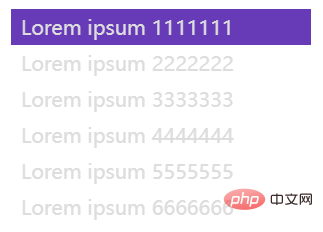
Okay, let’s use the example at the beginning of the article. Suppose we have such an HTML structure:
<div class="g-container">
<ul>
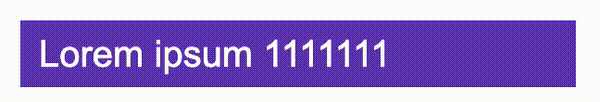
<li>Lorem ipsum 1111111</li>
<li>Lorem ipsum 2222222</li>
<li>Lorem ipsum 3333333</li>
<li>Lorem ipsum 4444444</li>
<li>Lorem ipsum 5555555</li>
<li>Lorem ipsum 6666666</li>
</ul>
</div>First, we implement such a simple layout:
Here, to achieve the carousel effect and any number, we can use animation-timing-function: steps():
:root {
  // 轮播的个数
  --s: 6;
  // 单个 li 容器的高度
  --h: 36;
  // 单次动画的时长
  --speed: 1.5s;
}
.g-container {
  width: 300px;
  height: calc(var(--h) * 1px);
}
ul {
  display: flex;
  flex-direction: column;
  animation: move calc(var(--speed) * var(--s)) steps(var(--s)) infinite;
}
ul li {
  width: 100%;
}
@keyframes move {
  0% {
    transform: translate(0, 0);
  }
  100% {
    transform: translate(0, calc(var(--s) * var(--h) * -1px));
  }
}Don’t panic when you see the above several CSS variables, it’s actually easy to understand:
calc(var(--speed) * var(--s) ): The time consumption of a single animation* The number of carousels, that is, the total animation durationsteps(var(--s))It is the number of frames of frame-by-frame animation, here it issteps(6), which is easy to understandcalc(var(--s) * var (--h) * -1px))The height of a single li container * the number of carousels, which is actually the overall height of ul, used to set the end value of frame-by-frame animation
The above effect is actually as follows:
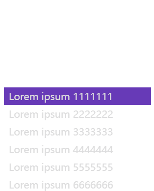
If you add overflow: hidden to the container, this is the effect :

In this way, we get the overall structure. At least, the entire effect is cyclic.
But since it is only a frame-by-frame animation, you can only see the switching, but there is no transition animation effect between each frame. So, next, we have to introduce tweening animation.
Use tweening animation to achieve switching between two sets of data
We need to use tweening animation to achieve a dynamic switching effect.
This step is actually very simple. What we have to do is to move a set of data from state A to state B using transform.
If you take one out for demonstration alone, the approximate code is as follows:
<div class="g-container">
  <ul style="--s: 6">
    <li>Lorem ipsum 1111111</li>
    <li>Lorem ipsum 2222222</li>
    <li>Lorem ipsum 3333333</li>
    <li>Lorem ipsum 4444444</li>
    <li>Lorem ipsum 5555555</li>
    <li>Lorem ipsum 6666666</li>
  </ul>
</div>:root {
--h: 36;
--speed: 1.2s;
}
ul li {
height: 36px;
animation: liMove calc(var(--speed)) infinite;
}
@keyframes liMove {
0% {
transform: translate(0, 0);
}
80%,
100% {
transform: translate(0, -36px);
}
}A very simple animation:

Based on the above effects, if we combine the frame-by-frame animation mentioned at the beginning with the tween animation, the overall movement of ul overlaps with the single movement of li Together:
:root {
  // 轮播的个数
  --s: 6;
  // 单个 li 容器的高度
  --h: 36;
  // 单次动画的时长
  --speed: 1.5s;
}
.g-container {
  width: 300px;
  height: calc(var(--h) * 1px);
}
ul {
  display: flex;
  flex-direction: column;
  animation: move calc(var(--speed) * var(--s)) steps(var(--s)) infinite;
}
ul li {
  width: 100%;
  animation: liMove calc(var(--speed)) infinite;
}
@keyframes move {
  0% {
    transform: translate(0, 0);
  }
  100% {
    transform: translate(0, calc(var(--s) * var(--h) * -1px));
  }
}
@keyframes liMove {
  0% {
    transform: translate(0, 0);
  }
  80%,
  100%  {
    transform: translate(0, calc(var(--h) * -1px));
  }
}can get such an effect:
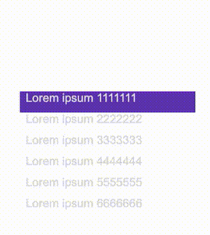
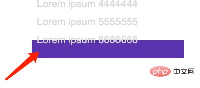
frame-by-frame animation and tween animation, we have almost achieved a carousel effect.
当然,有一点瑕疵,可以看到,最后一组数据,是从第六组数据 transform 移动向了一组空数据:
末尾填充头部第一组数据
实际开发过轮播的同学肯定知道,这里,其实也很好处理,我们只需要在末尾,补一组头部的第一个数据即可:
改造下我们的 HTML:
<div class="g-container">
  <ul>
    <li>Lorem ipsum 1111111</li>
    <li>Lorem ipsum 2222222</li>
    <li>Lorem ipsum 3333333</li>
    <li>Lorem ipsum 4444444</li>
    <li>Lorem ipsum 5555555</li>
    <li>Lorem ipsum 6666666</li>
    <!--末尾补一个首条数据-->
    <li>Lorem ipsum 1111111</li>
  </ul>
</div>这样,我们再看看效果:
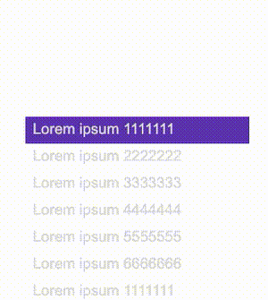
Beautiful!如果你还有所疑惑,我们给容器加上 overflow: hidden,实际效果如下,通过额外添加的最后一组数据,我们的整个动画刚好完美的衔接上,一个完美的轮播效果:
完整的代码,你可以戳这里:CodePen Demo -- Vertical Infinity Loop
https://codepen.io/Chokcoco/pen/RwQVByx
横向无限轮播
当然,实现了竖直方向的轮播,横向的效果也是一样的。
并且,我们可以通过在 HTML 结构中,通过 style 内填写 CSS 变量值,传入实际的 li 个数,以达到根据不同 li 个数适配不同动画:
<div class="g-container">
  <ul style="--s: 6">
    <li>Lorem ipsum 1111111</li>
    <li>Lorem ipsum 2222222</li>
    <li>Lorem ipsum 3333333</li>
    <li>Lorem ipsum 4444444</li>
    <li>Lorem ipsum 5555555</li>
    <li>Lorem ipsum 6666666</li>
    <!--末尾补一个首尾数据-->
    <li>Lorem ipsum 1111111</li>
  </ul>
</div>整个动画的 CSS 代码基本是一致的,我们只需要改变两个动画的 transform 值,从竖直位移,改成水平位移即可:
:root {
  --w: 300;
  --speed: 1.5s;
}
.g-container {
  width: calc(--w * 1px);
  overflow: hidden;
}
ul {
  display: flex;
  flex-wrap: nowrap;
   animation: move calc(var(--speed) * var(--s)) steps(var(--s)) infinite;
}
ul li {
  flex-shrink: 0;
  width: 100%;
  height: 100%;
  animation: liMove calc(var(--speed)) infinite;
}
@keyframes move {
  0% {
    transform: translate(0, 0);
  }
  100% {
    transform: translate(calc(var(--s) * var(--w) * -1px), 0);
  }
}
@keyframes liMove {
  0% {
    transform: translate(0, 0);
  }
  80%,
  100%  {
    transform: translate(calc(var(--w) * -1px), 0);
  }
}这样,我们就轻松的转化为了横向的效果:
完整的代码,你可以戳这里:CodePen Demo -- Horizontal Infinity Loop
https://codepen.io/Chokcoco/pen/JjpNBXY
轮播图?不在话下
OK,上面的只是文字版的轮播,那如果是图片呢?
没问题,方法都是一样的。基于上述的代码,我们可以轻松地将它修改一下后得到图片版的轮播效果。
代码都是一样的,就不再列出来,直接看看效果:

完整的代码,你可以戳这里:CodePen Demo -- Horizontal Image Infinity Loop
https://codepen.io/Chokcoco/pen/GRQvqgq
掌握了这个技巧之后,你可以将它运用在非常多只需要简化版的轮播效果之上。
再简单总结一下,非常有意思的技巧:
利用 逐帧动画,实现整体的轮播的循环效果
利用 补间动画,实现具体的 状态A 向 状态B* 的动画效果
逐帧动画 配合 补间动画 构成整体轮播的效果
通过向 HTML 结构末尾补充一组头部数据,实现整体动画的衔接
通过 HTML 元素的 style 标签,利用 CSS 变量,填入实际的参与循环的 DOM 个数,可以实现 JavaScript 与 CSS 的打通
(学习视频分享:web前端)
The above is the detailed content of It turns out that text carousel and image carousel can also be realized using pure CSS!. For more information, please follow other related articles on the PHP Chinese website!

Hot AI Tools

Undresser.AI Undress
AI-powered app for creating realistic nude photos

AI Clothes Remover
Online AI tool for removing clothes from photos.

Undress AI Tool
Undress images for free

Clothoff.io
AI clothes remover

AI Hentai Generator
Generate AI Hentai for free.

Hot Article
Hot Tools

Notepad++7.3.1
Easy-to-use and free code editor

SublimeText3 Chinese version
Chinese version, very easy to use

Zend Studio 13.0.1
Powerful PHP integrated development environment

Dreamweaver CS6
Visual web development tools

SublimeText3 Mac version
God-level code editing software (SublimeText3)
Hot Topics
 1377
1377
 52
52

 How to insert pictures on bootstrap
Apr 07, 2025 pm 03:30 PM
How to insert pictures on bootstrap
Apr 07, 2025 pm 03:30 PM
There are several ways to insert images in Bootstrap: insert images directly, using the HTML img tag. With the Bootstrap image component, you can provide responsive images and more styles. Set the image size, use the img-fluid class to make the image adaptable. Set the border, using the img-bordered class. Set the rounded corners and use the img-rounded class. Set the shadow, use the shadow class. Resize and position the image, using CSS style. Using the background image, use the background-image CSS property.
 How to set up the framework for bootstrap
Apr 07, 2025 pm 03:27 PM
How to set up the framework for bootstrap
Apr 07, 2025 pm 03:27 PM
To set up the Bootstrap framework, you need to follow these steps: 1. Reference the Bootstrap file via CDN; 2. Download and host the file on your own server; 3. Include the Bootstrap file in HTML; 4. Compile Sass/Less as needed; 5. Import a custom file (optional). Once setup is complete, you can use Bootstrap's grid systems, components, and styles to create responsive websites and applications.
 How to use bootstrap button
Apr 07, 2025 pm 03:09 PM
How to use bootstrap button
Apr 07, 2025 pm 03:09 PM
How to use the Bootstrap button? Introduce Bootstrap CSS to create button elements and add Bootstrap button class to add button text
 How to write split lines on bootstrap
Apr 07, 2025 pm 03:12 PM
How to write split lines on bootstrap
Apr 07, 2025 pm 03:12 PM
There are two ways to create a Bootstrap split line: using the tag, which creates a horizontal split line. Use the CSS border property to create custom style split lines.
 How to resize bootstrap
Apr 07, 2025 pm 03:18 PM
How to resize bootstrap
Apr 07, 2025 pm 03:18 PM
To adjust the size of elements in Bootstrap, you can use the dimension class, which includes: adjusting width: .col-, .w-, .mw-adjust height: .h-, .min-h-, .max-h-
 How to view the date of bootstrap
Apr 07, 2025 pm 03:03 PM
How to view the date of bootstrap
Apr 07, 2025 pm 03:03 PM
Answer: You can use the date picker component of Bootstrap to view dates in the page. Steps: Introduce the Bootstrap framework. Create a date selector input box in HTML. Bootstrap will automatically add styles to the selector. Use JavaScript to get the selected date.
 The Roles of HTML, CSS, and JavaScript: Core Responsibilities
Apr 08, 2025 pm 07:05 PM
The Roles of HTML, CSS, and JavaScript: Core Responsibilities
Apr 08, 2025 pm 07:05 PM
HTML defines the web structure, CSS is responsible for style and layout, and JavaScript gives dynamic interaction. The three perform their duties in web development and jointly build a colorful website.
 How to use bootstrap in vue
Apr 07, 2025 pm 11:33 PM
How to use bootstrap in vue
Apr 07, 2025 pm 11:33 PM
Using Bootstrap in Vue.js is divided into five steps: Install Bootstrap. Import Bootstrap in main.js. Use the Bootstrap component directly in the template. Optional: Custom style. Optional: Use plug-ins.
