This article brings you relevant knowledge about excel, which mainly introduces related issues about how to use conditional formatting to create whirlwind charts, paired bar charts, also called whirlwind charts. The characteristic is that two sets of data bars are stretched in the left and right directions along the middle vertical axis. Let's take a look at it together. I hope it will be helpful to everyone.

Related learning recommendations: excel tutorial
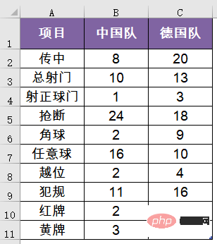
Speaking of the 2021 Tokyo Olympics, the Chinese men’s football team defeated the German team 5:0. The statistics of each project are as follows:
In order to make these data more intuitive, we can change it to the following:
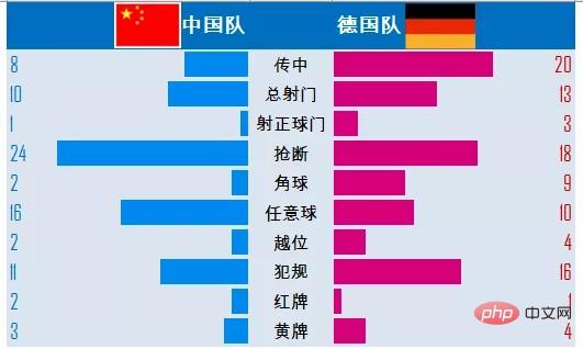
Achieving such an effect in Excel is actually not complicated. Next, Lao Zhu will talk about the specific steps with you:
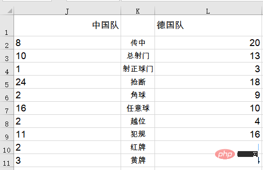
First adjust the data structure and The project is placed between the two teams.
Then adjust the column width to 20, and set the cell alignment to left and right respectively.
Select the leftmost data range J2:J11 and set conditional formatting.
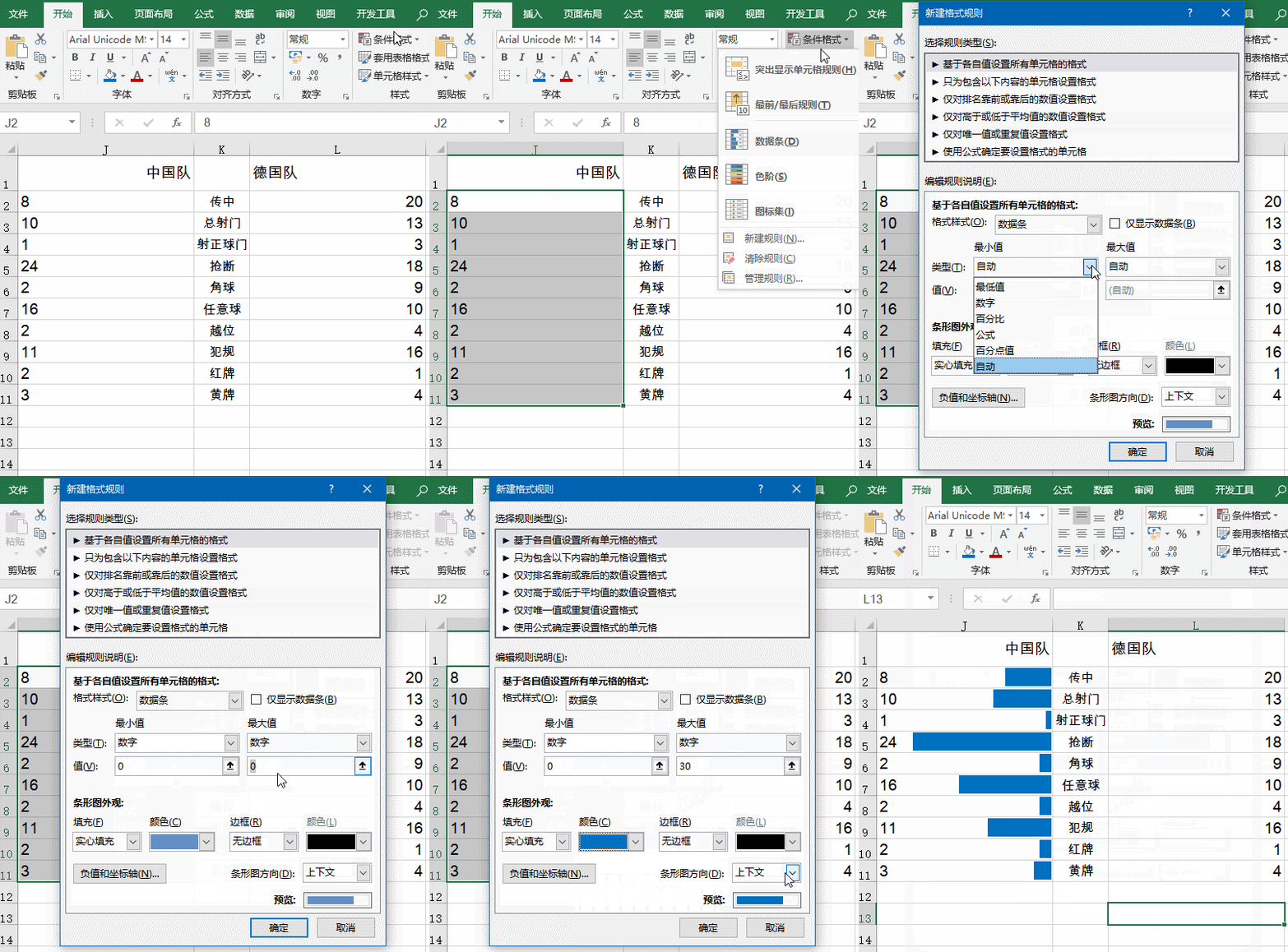
Select the rightmost data range L2:L11 and set conditional formatting.
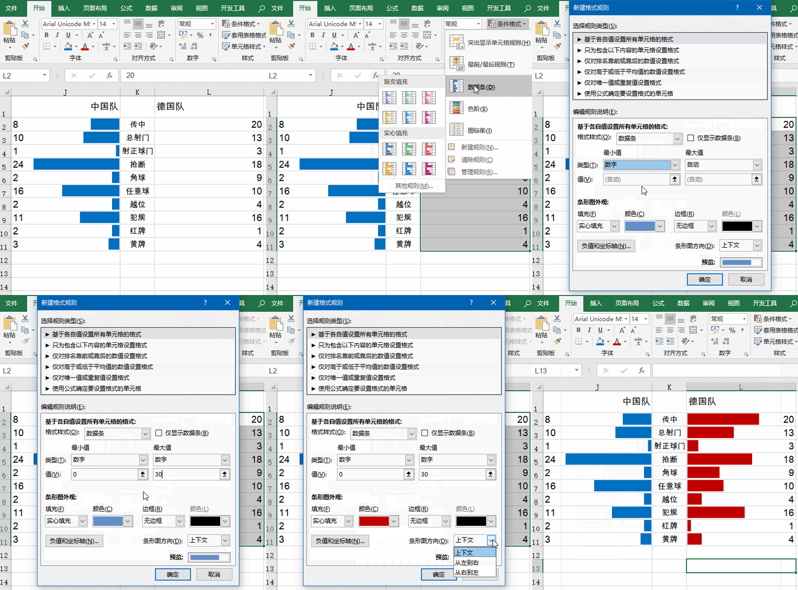
Set cell format.
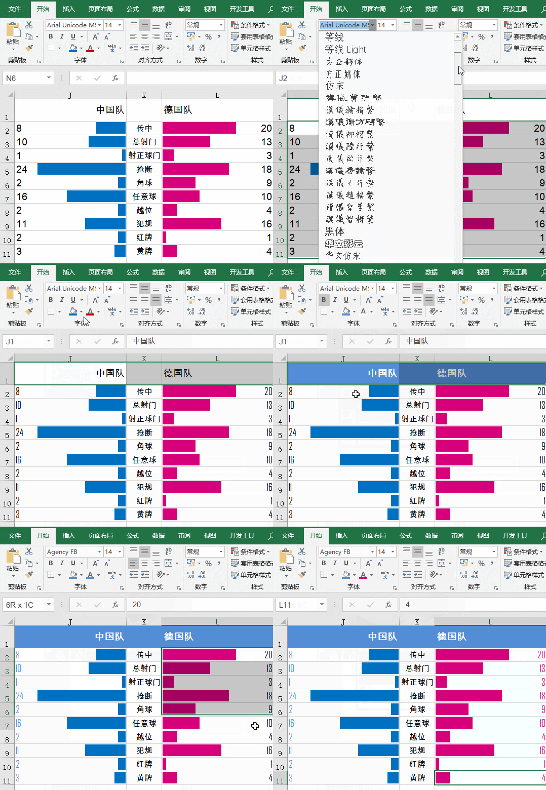
Continue to beautify:
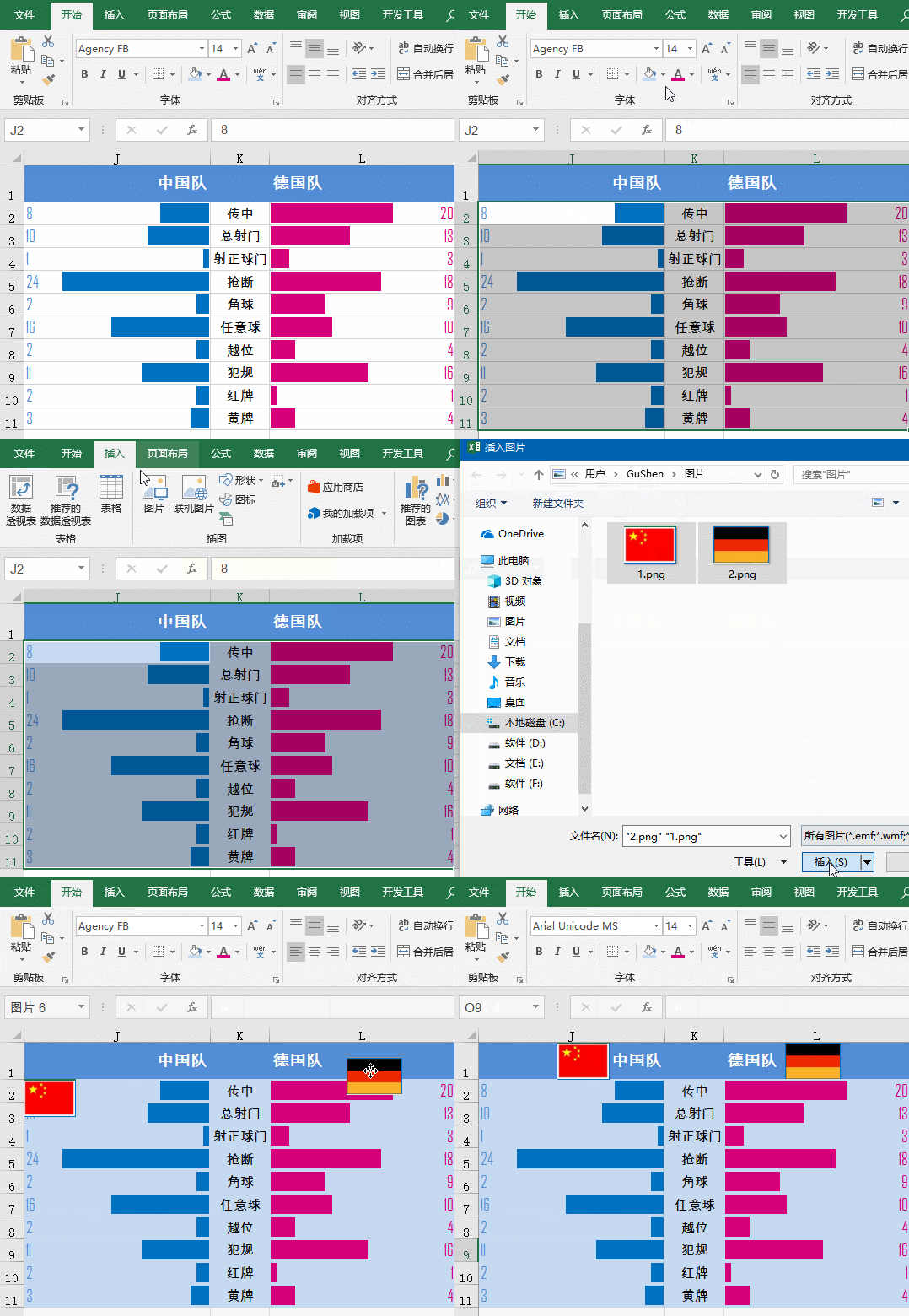
After simple processing, it will look taller immediately, okay?
This type of paired bar chart, also called a cyclone chart, is characterized by two sets of data bars extending in the left and right directions along the middle vertical axis. It is often used to compare the data of two types of things in different projects, such as the proportion of support and opposition of different think tanks for a certain project, the comparison of various technical indicators before and after the transformation of a certain equipment, etc.
Related learning recommendations: excel tutorial
The above is the detailed content of Example Analysis: How to use conditional formatting to create a whirlwind chart in Excel. For more information, please follow other related articles on the PHP Chinese website!
 Compare the similarities and differences between two columns of data in excel
 excel duplicate item filter color
 How to copy an Excel table to make it the same size as the original
 Excel table slash divided into two
 Excel diagonal header is divided into two
 Absolute reference input method
 java export excel
 Excel input value is illegal


