Can css use pixel units?
Pixel units can be used in css; the pixel unit refers to the unit relative to the monitor screen resolution and is a relative length unit. "px" is used as the pixel unit in css and is used to adjust elements. The size or spacing; this pixel length has nothing to do with the text screen pixels seen on the monitor.

The operating environment of this tutorial: Windows 10 system, CSS3&&HTML5 version, Dell G3 computer.
Can css use pixel units?
css can use pixel units
The px unit name is pixel, and pixel (px) is relative to the monitor screen In terms of resolution, this pixel length has nothing to do with the text screen pixels you see on the monitor.
And it is always an approximate value on a specific device (the principle is to be as close as possible to the reference pixel).
px is actually a unit measured in degrees.
Pixels are a unit of length that tell the browser how to resize or space items.
px pixels (CSS pixels)
px is the relative length.
CSS Pixel:
Also known as virtual pixel, device independent pixel or logical pixel, it can also be understood as intuitive pixel. CSS pixels are a web programming concept that refers to logical pixels used in CSS style code. For example, the CSS pixel count of iPhone 6 is 375 x 667px.
Virtual pixels can be understood as "intuitive" pixels, abstract units used by CSS and JS. All lengths in the browser are in CSS pixels, and the unit of CSS pixels is px.
In the CSS specification, length units can be divided into two categories, absolute units and relative units. Px is a relative unit, relative to device pixels.
On the same device, the physical pixel represented by each CSS pixel can change (that is, the first aspect of relativity of CSS pixels);
Between different devices time, the physical pixel represented by each CSS pixel can change (that is, the second aspect of relativity of CSS pixels);
px is actually the abbreviation of pixel, which is the image display The basic unit is neither a definite physical quantity, nor a point or a small square, but an abstract concept. So be sure to understand its context when talking about pixels! Be sure to understand its context! Be sure to understand its context!
Take an example to understand the relativity of css pixels
Suppose we open a page with a PC browser. The width of the browser at this time is 800px. At the same time on the page There is a 400px wide block-level element container. It's obvious that the block container should take up half of the page at this point.
But if we zoom in on the page (via the "Ctrl key" plus the "key"), the zoom is 200%, which is twice the original size. At this time, the block container takes up the entire browser horizontally.
The paradox is that we have neither resized the browser window nor changed the CSS width of the block element, but it looks twice as big - this is because we enlarge the CSS pixels For twice as much.
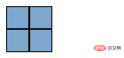
When CSS pixels are the same size as screen pixels 1:1:

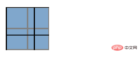
CSS pixels (black borders) begin to be stretched, at this time 1 CSS pixel Greater than 1 screen pixel

#That is to say, by default a CSS pixel should be equal to the width of a physical pixel, but the browser's magnification operation makes a CSS pixel equal to Two device pixels wide. You will see a more complicated situation later. On high-PPI devices, CSS pixels are equivalent to the size of multiple physical pixels even by default.
As you can see from the above example, CSS pixels are always just a relative value.
(Learning video sharing: css video tutorial, html video tutorial)
The above is the detailed content of Can css use pixel units?. For more information, please follow other related articles on the PHP Chinese website!

Hot AI Tools

Undresser.AI Undress
AI-powered app for creating realistic nude photos

AI Clothes Remover
Online AI tool for removing clothes from photos.

Undress AI Tool
Undress images for free

Clothoff.io
AI clothes remover

AI Hentai Generator
Generate AI Hentai for free.

Hot Article

Hot Tools

Notepad++7.3.1
Easy-to-use and free code editor

SublimeText3 Chinese version
Chinese version, very easy to use

Zend Studio 13.0.1
Powerful PHP integrated development environment

Dreamweaver CS6
Visual web development tools

SublimeText3 Mac version
God-level code editing software (SublimeText3)

Hot Topics
 1385
1385
 52
52
 How to use bootstrap in vue
Apr 07, 2025 pm 11:33 PM
Using Bootstrap in Vue.js is divided into five steps: Install Bootstrap. Import Bootstrap in main.js. Use the Bootstrap component directly in the template. Optional: Custom style. Optional: Use plug-ins.
 The Roles of HTML, CSS, and JavaScript: Core Responsibilities
Apr 08, 2025 pm 07:05 PM
HTML defines the web structure, CSS is responsible for style and layout, and JavaScript gives dynamic interaction. The three perform their duties in web development and jointly build a colorful website.
 How to write split lines on bootstrap
Apr 07, 2025 pm 03:12 PM
There are two ways to create a Bootstrap split line: using the tag, which creates a horizontal split line. Use the CSS border property to create custom style split lines.
 How to resize bootstrap
Apr 07, 2025 pm 03:18 PM
To adjust the size of elements in Bootstrap, you can use the dimension class, which includes: adjusting width: .col-, .w-, .mw-adjust height: .h-, .min-h-, .max-h-
 Understanding HTML, CSS, and JavaScript: A Beginner's Guide
Apr 12, 2025 am 12:02 AM
WebdevelopmentreliesonHTML,CSS,andJavaScript:1)HTMLstructurescontent,2)CSSstylesit,and3)JavaScriptaddsinteractivity,formingthebasisofmodernwebexperiences.
 How to set up the framework for bootstrap
Apr 07, 2025 pm 03:27 PM
To set up the Bootstrap framework, you need to follow these steps: 1. Reference the Bootstrap file via CDN; 2. Download and host the file on your own server; 3. Include the Bootstrap file in HTML; 4. Compile Sass/Less as needed; 5. Import a custom file (optional). Once setup is complete, you can use Bootstrap's grid systems, components, and styles to create responsive websites and applications.
 How to insert pictures on bootstrap
Apr 07, 2025 pm 03:30 PM
There are several ways to insert images in Bootstrap: insert images directly, using the HTML img tag. With the Bootstrap image component, you can provide responsive images and more styles. Set the image size, use the img-fluid class to make the image adaptable. Set the border, using the img-bordered class. Set the rounded corners and use the img-rounded class. Set the shadow, use the shadow class. Resize and position the image, using CSS style. Using the background image, use the background-image CSS property.
 How to use bootstrap button
Apr 07, 2025 pm 03:09 PM
How to use the Bootstrap button? Introduce Bootstrap CSS to create button elements and add Bootstrap button class to add button text


