
Sticky positioning is new to CSS3. Sticky positioning refers to the position positioning attribute value being set to sticky, which means positioning based on the user's scroll position. The element positioning is relative positioning before crossing a specific threshold, and then It is fixed positioning, and the syntax is "element {position: sticky;}".

The operating environment of this tutorial: Windows 10 system, CSS3&&HTML5 version, Dell G3 computer.
The new positioning attribute in css3 also has The attributes of positioning elements
are understood as relative positioning position:relative fixed positioning position: a mixture of fixed
position:sticky sticky positioning, based on the user's scrolling positioning
sticky English The literal meaning is to stick, to stick, so you can call it sticky positioning.
position: sticky; Positioned based on the user's scroll position.
Sticky positioned elements depend on the user's scrolling, switching between position:relative and position:fixed positioning.
It behaves like position:relative; and when the page scrolls beyond the target area, it behaves like position:fixed; and it will be fixed at the target position.
Element positioning is relative positioning before crossing a specific threshold, and fixed positioning thereafter.
This specific threshold refers to one of top, right, bottom or left. In other words, sticky positioning can only take effect by specifying one of the four thresholds top, right, bottom or left. Otherwise the behavior is the same as relative positioning.
Depends on the user's scroll positioning, the behavior is like position:relative. When the page scrolls beyond the target area, the behavior is position:fixed
What is the target area
Relative to the parent element, exceeding the threshold, this threshold is determined by top, left, right, bottom
Scrolling element
overflow is not visible element
Flow box
The size box of the nearest scrollable element of the sticky positioned element. If there is no scroll box, it is the browser window box
sticky constraint rectangle
the parent element rectangle of the sticky layout element
①The parent element cannot be overflow:hidden/overflow:auto/overflow:scroll/overflow:overlay
②The height of the parent element cannot be lower than the sticky height, otherwise the effect cannot be displayed
③The attribute value in any direction of top/left/right/bottom must be specified
④The scope is within the parent element, and the effect takes effect within the parent element
⑤In the visible range Inside is relative, otherwise it is fixed
⑥Multiple sticky elements in the same container are independently offset from each other and may overlap
p sticky{
	position:-webkit-sticky;/*safair*/
	position:sticky;
	top:0;
}nbsp;html>
<meta>
<title></title>
<style>
body {
height: 2000px;
width: 100%;
background-color: rgb(214, 160, 169);
}
p {
height: 200px;
width: 400px;
margin-top: 50px;
background-color: rgb(189, 137, 238);
border: 1px solid rgb(126, 235, 189);
}
nav {
position: sticky;
background-color: rgb(146, 189, 238);
top: 20px;
/*设置距离顶部20px的时候导航栏开始固定*/
height: 60px;
line-height: 60px;
}
</style>
<p>
<nav>导航栏</nav>
</p>Effect display
The pink background box is the above flow box, and the blue is the sticky constrained rectangular box (parent element p), the purple one is the sticky element (the nav child in the parent of p)
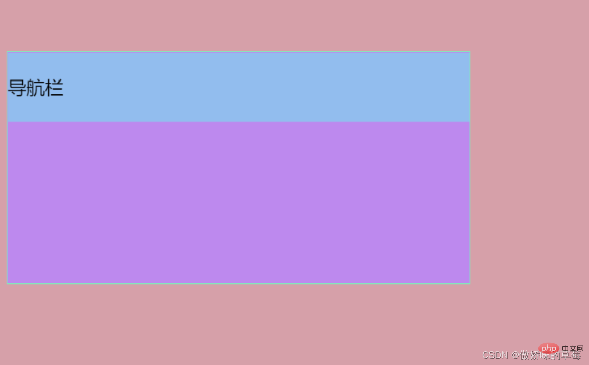
Scroll the mouse upward. When the distance is top:20px, the navigation bar is fixed, but not more than purple. The parent p
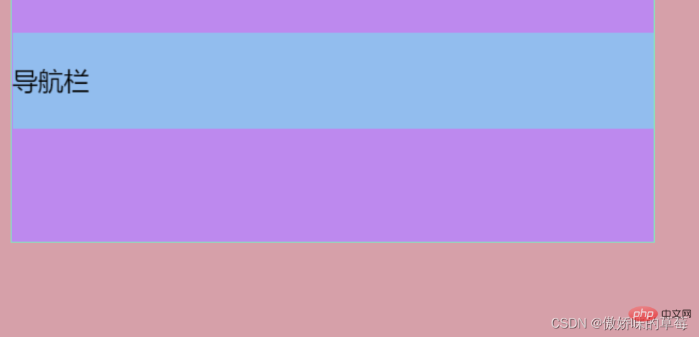
scrolls the mouse upward, the purple box sticky constraint rectangle exceeds the flow box, the blue box of the navigation bar also scrolls up, but is always in the purple box parent p Inside
Scroll the mouse upward, the purple box exceeds the pink flow box and disappears from the visual range
nbsp;html>
    <meta>
    <title></title>
    <style>
        body {
            height: 2000px;
            width: 100%;
            background-color: rgb(214, 160, 169);
        }

        p {
            height: 200px;
            width: 400px;
            margin-top: 50px;
            background-color: rgb(189, 137, 238);
            border: 1px solid rgb(126, 235, 189);
        }

        nav {
            position: sticky;
            background-color: rgb(146, 189, 238);
            top: 20px;
            /*设置距离顶部20px的时候导航栏开始固定*/
            height: 60px;
            line-height: 60px;
        }

        header {
            position: sticky;
            background-color: rgb(250, 181, 150);
            top: 20px;
            /*设置距离顶部20px的时候导航栏开始固定*/
            height: 60px;
            line-height: 60px;
            display: block;
        }
    </style>
    <p>
        <nav>导航栏</nav>

        <header>头部</header>
</p>Effect display
The box with pink background is the above-mentioned flow box, the blue one is the sticky constrained rectangular box (parent element p), and the purple one is the sticky element (p parent The nav sub-child inside), the orange one is also a sticky element (the header sub-child inside p)
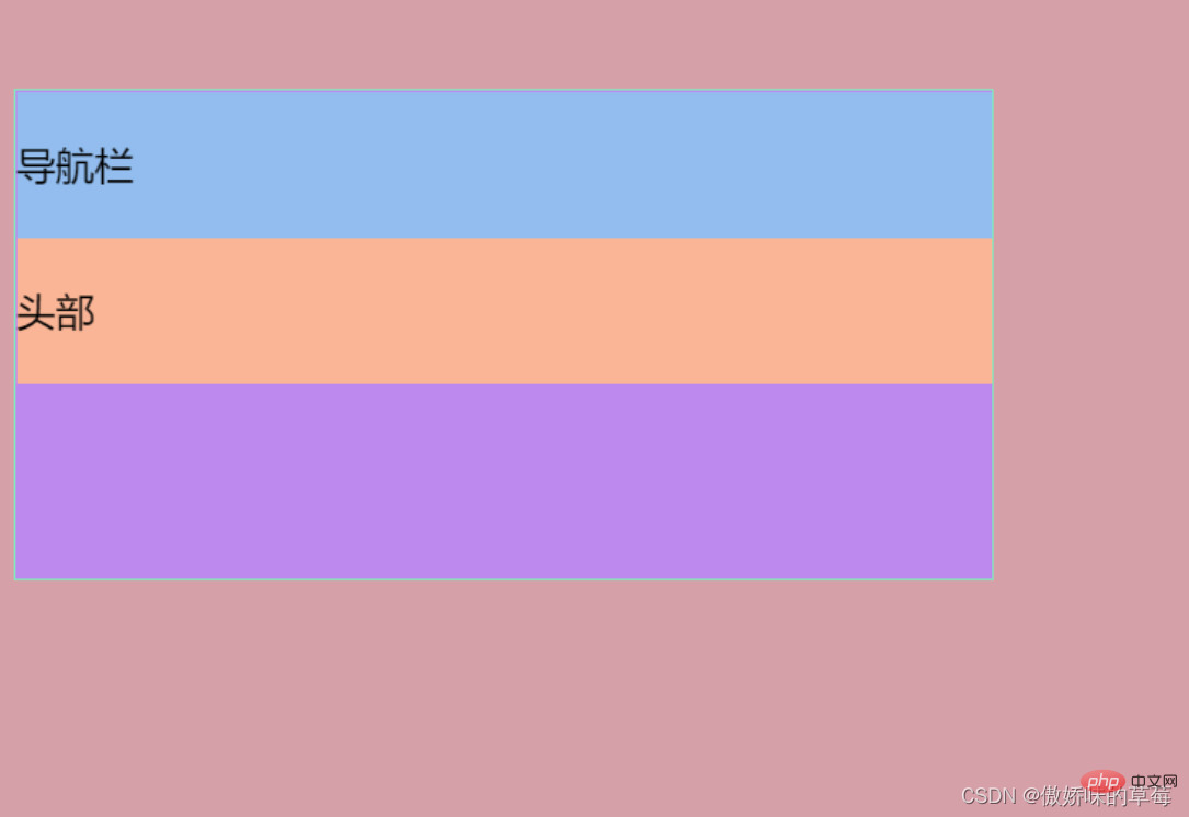
Scroll the mouse upward, the blue navigation bar is fixed, and the orange one scrolls up, The sticky constraint rectangles of the two sticky elements, blue and orange, are inside the purple p parent 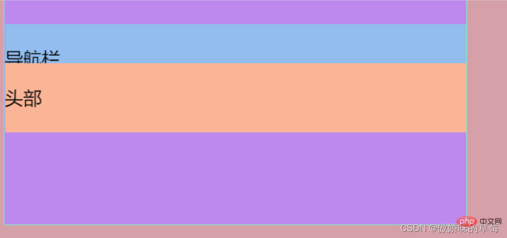
Roll the mouse upward, the blue navigation bar disappears, and the orange box is fixed, covering the navigation bar ( Prove that the following sticky elements will cover the previous sticky elements)

Scroll the mouse upward, the orange box exceeds the pink flow box and disappears from the visual range

总结:当有多个粘性元素的时候,后面的粘性元素会覆盖前面的粘性元素
前文总结了z-index的层级覆盖,来试试加上z-index会发生怎么样的覆盖效果
nav.z-index: 20 header.z-index:19
复习:css中的z-index层级问题
nbsp;html>
    <meta>
    <title></title>
    <style>
        body {
            height: 2000px;
            width: 100%;
            background-color: rgb(214, 160, 169);
        }

        p {
            height: 200px;
            width: 400px;
            margin-top: 50px;
            background-color: rgb(189, 137, 238);
            border: 1px solid rgb(126, 235, 189);
        }

        nav {
            position: sticky;
            background-color: rgb(146, 189, 238);
            top: 20px;
            /*设置距离顶部20px的时候导航栏开始固定*/
            height: 60px;
            line-height: 60px;
            z-index: 20;
        }

        header {
            position: sticky;
            background-color: rgb(250, 181, 150);
            top: 20px;
            height: 60px;
            line-height: 60px;
            display: block;
            z-index: 19;
        }
    </style>
    <p>
        <nav>导航栏</nav>

        <header>头部</header>
</p>效果展示
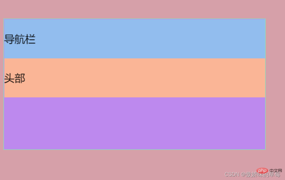
蓝色的导航栏逐渐覆盖黄色的头部
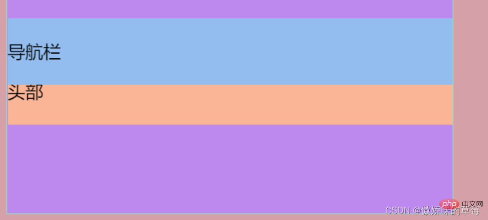

总结:粘性元素生效相当于position:fixed,z-index会生效
The above is the detailed content of Is sticky positioning new to css3?. For more information, please follow other related articles on the PHP Chinese website!