

what is bootstrap rasterization

In bootstrap, rasterization refers to dividing a row of the browser into 12 columns, and then allocating the column width occupied by the corresponding elements according to the needs of the developed page; that is, dividing according to the size of the device. Segments, each segment has a fixed width, and responsive layout is achieved through percentages and media queries.

The operating environment of this tutorial: Windows10 system, bootstrap5 version, DELL G3 computer
What is bootstrap rasterization
In bootstrap, the principle of rasterization is to segment according to the size of the device, with a fixed width for each segment, and to implement responsive layout through percentages and media queries; this allows the same set of pages to adapt to devices with different resolutions.
Basic principle of grid layout: Grid divides the page into a certain number (assumed to be n) of basic width columns in the horizontal direction
Then the developer can add content to the page as needed The corresponding element is set so that it should occupy m columns wide. (m
My understanding: Rasterization is to divide a row of the browser into 12 columns and allocate the columns yourself.
Overview of Grid System
Grid System (Grid Systems) is a clear and neat design style that uses a fixed grid. Carry out web page layout. The grid system was first used in printing media. A printing layout is divided into several grids, which is very convenient for typesetting.
Later, the grid system was applied to web page layout. When using the responsive grid system for page layout, the web page can display different page structures according to different display terminals. For example, some modules will be arranged differently or hidden on small-screen devices.
Basic usage of Bootstrap grid system.
1. The Bootstrap grid system defines different classes for different screen widths. Just add the class name directly to the element.
2. Rows must be contained in a layout container so that they can be properly arranged and padded.
3. A group of columns can be created in the horizontal direction through rows, and only columns can be used as direct child elements of rows.
4. Use the style .row for rows and the style .col-*-* for columns. The content should be placed in the columns. When the number of columns is greater than 12, another row will be arranged.
Student Information Form Case
Case implementation ideas:
1. First, you need to create a p element with the class name row in the layout container as Row;
2. Then create columns inside the row container. The rows and columns in a layout container form a grid system.
3. The rows and columns in the grid system are similar to the rows and columns in the table.
1. Write HTML code
    <p>
        </p><p>
            </p><p>姓名</p>
            <p>年龄</p>
            <p>性别</p>

        <p>
            </p><p>张三</p>
            <p>25</p>
            <p>男</p>
2. Write CSS style
    .row {
        background-color: #eee;
        font-size: 30px;
    }
    .col-md-4 {
        border: 1px solid #fff;
        text-align: center;
}When the browser display width is greater than 992px, the effect is as follows:
When the browser width is greater than 768px, the effect is as follows: 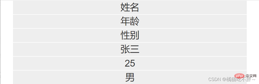
When the browser width is less than 768px, the effect is as follows: 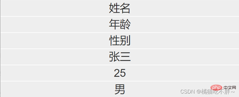
Related recommendations: bootstrap tutorial
The above is the detailed content of what is bootstrap rasterization. For more information, please follow other related articles on the PHP Chinese website!

Hot AI Tools

Undresser.AI Undress
AI-powered app for creating realistic nude photos

AI Clothes Remover
Online AI tool for removing clothes from photos.

Undress AI Tool
Undress images for free

Clothoff.io
AI clothes remover

AI Hentai Generator
Generate AI Hentai for free.

Hot Article
Hot Tools

Notepad++7.3.1
Easy-to-use and free code editor

SublimeText3 Chinese version
Chinese version, very easy to use

Zend Studio 13.0.1
Powerful PHP integrated development environment

Dreamweaver CS6
Visual web development tools

SublimeText3 Mac version
God-level code editing software (SublimeText3)
Hot Topics
 1378
1378
 52
52

 How to get the bootstrap search bar
Apr 07, 2025 pm 03:33 PM
How to get the bootstrap search bar
Apr 07, 2025 pm 03:33 PM
How to use Bootstrap to get the value of the search bar: Determines the ID or name of the search bar. Use JavaScript to get DOM elements. Gets the value of the element. Perform the required actions.
 How to do vertical centering of bootstrap
Apr 07, 2025 pm 03:21 PM
How to do vertical centering of bootstrap
Apr 07, 2025 pm 03:21 PM
Use Bootstrap to implement vertical centering: flexbox method: Use the d-flex, justify-content-center, and align-items-center classes to place elements in the flexbox container. align-items-center class method: For browsers that do not support flexbox, use the align-items-center class, provided that the parent element has a defined height.
 How to write split lines on bootstrap
Apr 07, 2025 pm 03:12 PM
How to write split lines on bootstrap
Apr 07, 2025 pm 03:12 PM
There are two ways to create a Bootstrap split line: using the tag, which creates a horizontal split line. Use the CSS border property to create custom style split lines.
 How to use bootstrap in vue
Apr 07, 2025 pm 11:33 PM
How to use bootstrap in vue
Apr 07, 2025 pm 11:33 PM
Using Bootstrap in Vue.js is divided into five steps: Install Bootstrap. Import Bootstrap in main.js. Use the Bootstrap component directly in the template. Optional: Custom style. Optional: Use plug-ins.
 How to insert pictures on bootstrap
Apr 07, 2025 pm 03:30 PM
How to insert pictures on bootstrap
Apr 07, 2025 pm 03:30 PM
There are several ways to insert images in Bootstrap: insert images directly, using the HTML img tag. With the Bootstrap image component, you can provide responsive images and more styles. Set the image size, use the img-fluid class to make the image adaptable. Set the border, using the img-bordered class. Set the rounded corners and use the img-rounded class. Set the shadow, use the shadow class. Resize and position the image, using CSS style. Using the background image, use the background-image CSS property.
 How to resize bootstrap
Apr 07, 2025 pm 03:18 PM
How to resize bootstrap
Apr 07, 2025 pm 03:18 PM
To adjust the size of elements in Bootstrap, you can use the dimension class, which includes: adjusting width: .col-, .w-, .mw-adjust height: .h-, .min-h-, .max-h-
 How to set up the framework for bootstrap
Apr 07, 2025 pm 03:27 PM
How to set up the framework for bootstrap
Apr 07, 2025 pm 03:27 PM
To set up the Bootstrap framework, you need to follow these steps: 1. Reference the Bootstrap file via CDN; 2. Download and host the file on your own server; 3. Include the Bootstrap file in HTML; 4. Compile Sass/Less as needed; 5. Import a custom file (optional). Once setup is complete, you can use Bootstrap's grid systems, components, and styles to create responsive websites and applications.
 How to use bootstrap button
Apr 07, 2025 pm 03:09 PM
How to use bootstrap button
Apr 07, 2025 pm 03:09 PM
How to use the Bootstrap button? Introduce Bootstrap CSS to create button elements and add Bootstrap button class to add button text
