Is media query a new attribute in css3?
Media query is a new feature of CSS3, which can be used for responsive design of the page; using "@media" query, it can be used to define failed styles for different media types, and can also be used for different screens. Size style sets different styles, the syntax is "@media [media medium] and|or (condition) and|or (condition){style}".
The operating environment of this tutorial: Windows 10 system, CSS3&&HTML5 version, Dell G3 computer.
Is media query a new attribute of css3?
1. Media query is a new feature of css3, which can be used for responsive design of the page.
2. You can design multiple sets of different styles for different screens and different resolutions.
Media Query Syntax
@media [媒体介质] and|or (条件) and|or (条件){
//样式
.class{
}
}
//页面可见高度小于等于500px时,设置字体大小为10px
@media screen and(max-height:500px){
.class{
font-size:10px
}
}Using @media queries, you can define different styles for different media types.
@media can set different styles for different screen sizes, especially if you need to set up a responsive page, @media is very useful.
When you reset the browser size, the page will also be re-rendered based on the width and height of the browser.
CSS Syntax
@media not|only mediatype and (mediafeature and|or|not mediafeature) {
  CSS-Code;
}not, and, and only can be used to jointly construct complex media queries, and you can also combine multiple media queries into a single rule by separating them with commas.
not, only and and keyword meaning:
not: The not operator is used to negate media queries. If this condition is not met, it returns true, otherwise it returns false. . If present in a comma-separated list of queries, it will only negate the specific query to which it is applied. If you use the not operator, you must also specify the media type.
only: The only operator is used to apply a style only if the entire query matches, and is useful for preventing older browsers from applying the selected style. When only is not used, older browsers will simply interpret screen and (max-width: 500px) as screen, ignore the rest of the query, and apply its styles to all screens. If you use the only operator, you must also specify the media type.
, (comma) The comma is used to combine multiple media queries into a single rule. Each query in the comma-separated list is processed separately from other queries. Therefore, if any query in the list is true, the entire media statement returns true. In other words, the list behaves like the logical or operator.
and: The and operator is used to combine multiple media query rules into a single media query. When each query rule is true, the media query is true. It also Used to combine media functions with media types.
Media types describe general categories of devices. Unless the not or only logical operators are used, the media type is optional and the all type is (implicitly) applied.
You can also use different style files for different media:
<!-- 宽度大于 900px 的屏幕使用该样式 -->
<link rel="stylesheet" media="screen and (min-width: 900px)" href="widescreen.css">
<!-- 宽度小于或等于 600px 的屏幕使用该样式 -->
<link rel="stylesheet" media="screen and (max-width: 600px)" href="smallscreen.css">
(Learning video sharing: css video tutorial, html video tutorial)
The above is the detailed content of Is media query a new attribute in css3?. For more information, please follow other related articles on the PHP Chinese website!

Hot AI Tools

Undresser.AI Undress
AI-powered app for creating realistic nude photos

AI Clothes Remover
Online AI tool for removing clothes from photos.

Undress AI Tool
Undress images for free

Clothoff.io
AI clothes remover

AI Hentai Generator
Generate AI Hentai for free.

Hot Article

Hot Tools

Notepad++7.3.1
Easy-to-use and free code editor

SublimeText3 Chinese version
Chinese version, very easy to use

Zend Studio 13.0.1
Powerful PHP integrated development environment

Dreamweaver CS6
Visual web development tools

SublimeText3 Mac version
God-level code editing software (SublimeText3)

Hot Topics
 What does placeholder mean in vue
May 07, 2024 am 09:57 AM
In Vue.js, the placeholder attribute specifies the placeholder text of the input element, which is displayed when the user has not entered content, provides input tips or examples, and improves form accessibility. Its usage is to set the placeholder attribute on the input element and customize the appearance using CSS. Best practices include being relevant to the input, being short and clear, avoiding default text, and considering accessibility.
 What does span mean in js
May 06, 2024 am 11:42 AM
The span tag can add styles, attributes, or behaviors to text. It is used to: add styles, such as color and font size. Set attributes such as id, class, etc. Associated behaviors such as clicks, hovers, etc. Mark text for further processing or citation.
 What does rem mean in js
May 06, 2024 am 11:30 AM
REM in CSS is a relative unit relative to the font size of the root element (html). It has the following characteristics: relative to the root element font size, not affected by the parent element. When the root element's font size changes, elements using REM will adjust accordingly. Can be used with any CSS property. Advantages of using REM include: Responsiveness: Keep text readable on different devices and screen sizes. Consistency: Make sure font sizes are consistent throughout your website. Scalability: Easily change the global font size by adjusting the root element font size.
 How to introduce images into vue
May 02, 2024 pm 10:48 PM
There are five ways to introduce images in Vue: through URL, require function, static file, v-bind directive and CSS background image. Dynamic images can be handled in Vue's computed properties or listeners, and bundled tools can be used to optimize image loading. Make sure the path is correct otherwise a loading error will appear.
 What is node in js
May 07, 2024 pm 09:06 PM
Nodes are entities in the JavaScript DOM that represent HTML elements. They represent a specific element in the page and can be used to access and manipulate that element. Common node types include element nodes, text nodes, comment nodes, and document nodes. Through DOM methods such as getElementById(), you can access nodes and operate on them, including modifying properties, adding/removing child nodes, inserting/replacing nodes, and cloning nodes. Node traversal helps navigate within the DOM structure. Nodes are useful for dynamically creating page content, event handling, animation, and data binding.
 What language is the browser plug-in written in?
May 08, 2024 pm 09:36 PM
Browser plug-ins are usually written in the following languages: Front-end languages: JavaScript, HTML, CSS Back-end languages: C++, Rust, WebAssembly Other languages: Python, Java
 What do ref and id in vue do?
May 02, 2024 pm 08:42 PM
In Vue.js, ref is used in JavaScript to reference a DOM element (accessible to subcomponents and the DOM element itself), while id is used to set the HTML id attribute (can be used for CSS styling, HTML markup, and JavaScript lookup).
 How to set unknown attributes in vscode vscode method to set unknown attributes
May 09, 2024 pm 02:43 PM
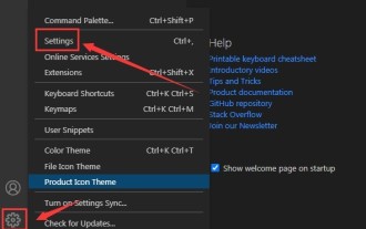
1. First, open the settings icon in the lower left corner and click the settings option. 2. Then, find the CSS column in the jumped window. 3. Finally, change the drop-down option in the unknownproperties menu to the error button.


