How to automatically add head shadow on scroll using pure CSS
Using pure CSSHow to automatically add head shadow when scrolling? The following article will introduce to you some tips on CSS levels! Take a look at how to automatically add head shadow when scrolling, hope it helps!

In web pages, shadows are often used to highlight hierarchical relationships, especially top navigation. However, sometimes the design feels that it is not necessary to display the shadow at the beginning, and only after scrolling Appear. For example, in the example below, pay attention to the shadow of the head. [Recommended learning: css video tutorial]

As you can see, the shadow only appears after scrolling. Under normal circumstances, this can be achieved by using JS to listen to scroll events and dynamically add class names. However, after some attempts, I found that this effect can be easily achieved using only CSS. The following is the implementation effect
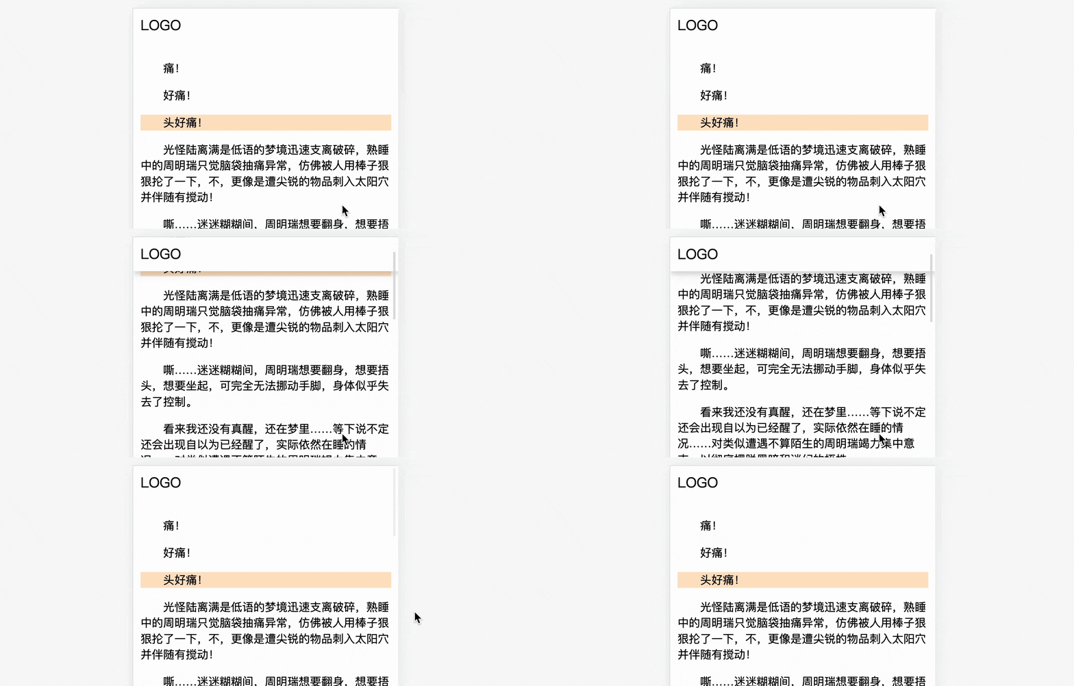
You can also visit CSS auto header shadow(codepen.io) in advance to see the actual effect. How to implement it? Take two minutes to see it~
1. Fixed head positioning
Assume there is such a layout
<header>LOGO</header>
<main>很多内容文本</main>
Simply modify
header{
  background: #fff;
  font-size: 20px;
  padding: 10px;
} There are many ways to fix the head position. The more common one is to use fixedpositioning
header{
  position: fixed;
  top: 0
} However, fixed positioning is If it does not take up space, it will block the content area, so it is generally necessary to reserve a part of the head space, such as this
main{
  margin-top: 头部的高度
} Here, I recommend using sticky positioning, While absorbing the ceiling, the original placeholder can also be retained
header{
  position: sticky;
  top: 0
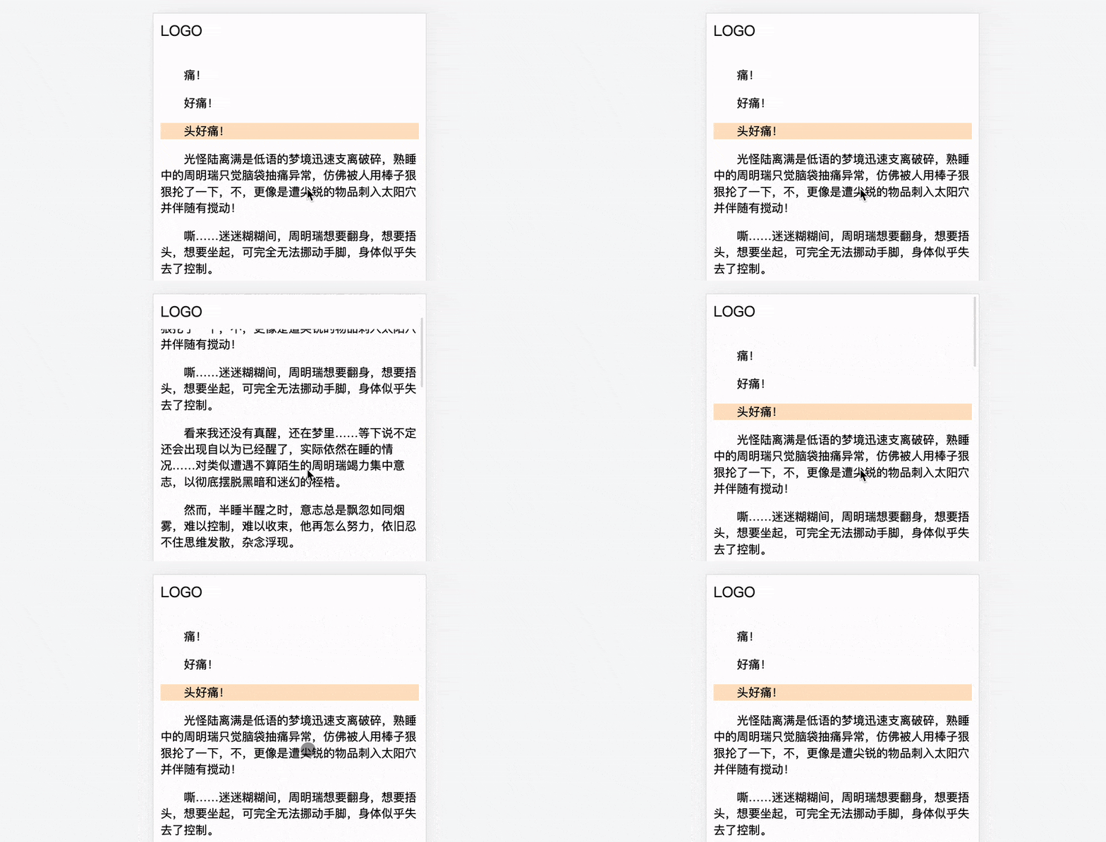
}The effect is as follows, but there is no shadow
2. CSS Implementation Principle
To achieve this effect, you need a little "CSS blindness". Suppose there is a layer of shadow, which is blocked by an element by default, which is called the "occluder" below. Here you need to consider the hierarchical relationship of each part, which is a little complicated, as shown below (side hierarchical relationship diagram)
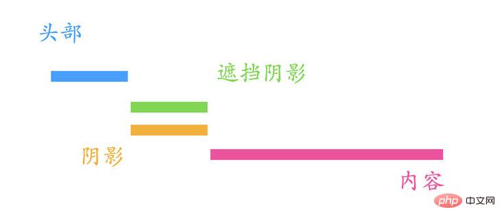
The hierarchical relationship is: Head > Occupant> Shadow> Content
During the scrolling process, the shadow will be automatically visible, and the occluder will be covered by the head. Note that the occluder and the content scroll together. The dynamic demonstration is as follows
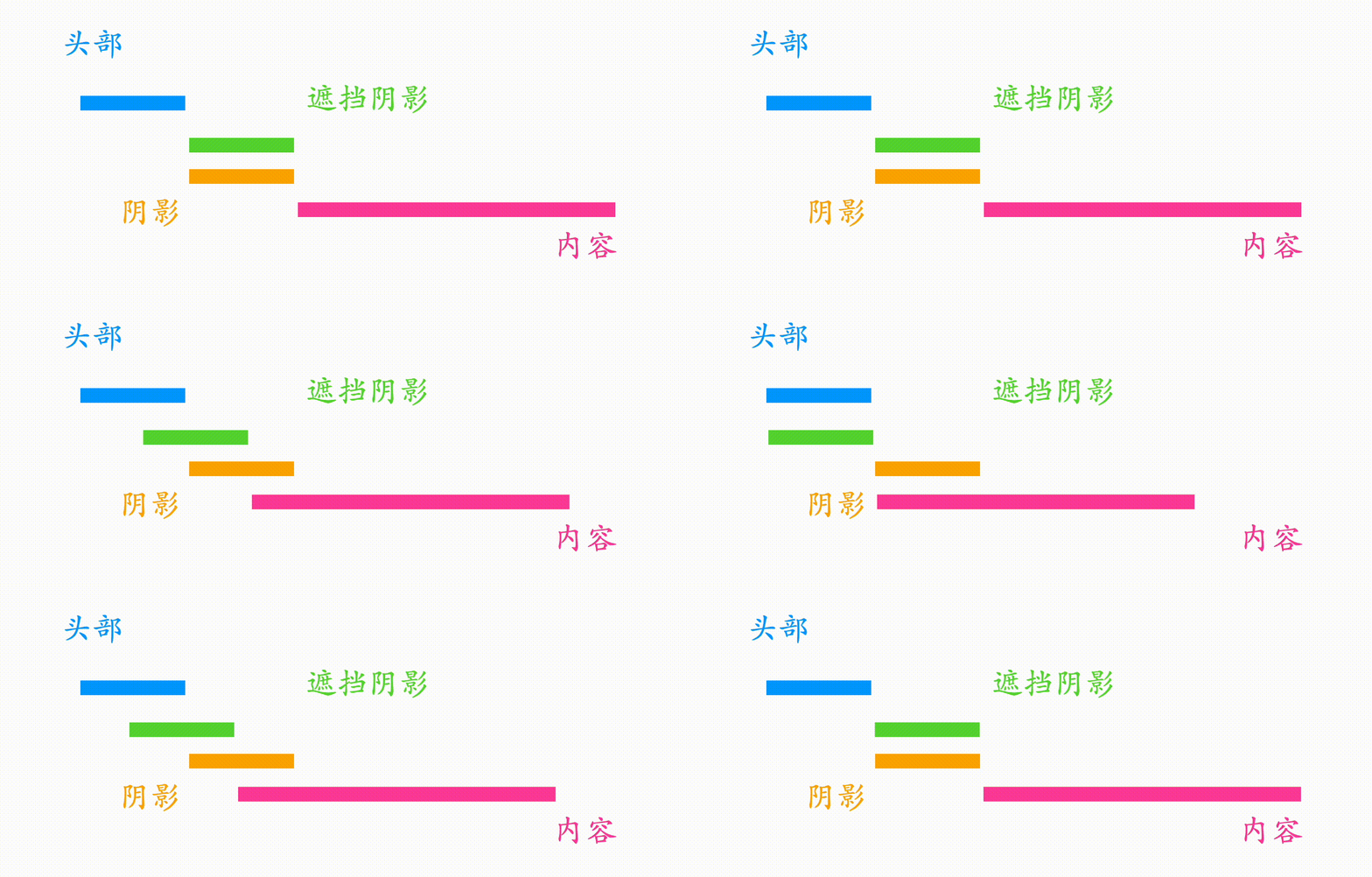
The principle is like this, let’s look at the specific implementation
3. CSS specific implementation
Based on the above principle, an element needs to be added here. Both shadows and obstructions can be generated using pseudo elements.
<header>LOGO</header>
<shadow></shadow>
<main>很多内容文本</main>
The position of the shadow here is fixed and does not need to occupy space, so it can be used directly fixed Positioning, you don’t need to set the top value, because the default position is at the non-positioning position (reflecting the benefits of sticky), that is, the head Bottom
shadow::before{
  content: '';
  box-shadow: 0 0 10px 1px #333;
  position: fixed; /*无需 top 值*/
  width: 100%;
}
fixed When positioned without setting the top or left value, it will still be at the original position, but will be fixed at this position
Occlusions can be filled with solid colors , and it needs to scroll with the content and does not need to occupy space. At the same time, in order to improve the level , you can set a absolute positioning
shadow::after{
  content: '';
  width: 100%;
  height: 15px;
  background: #fff;
  position: absolute; /*无需 top 值*/
}
absolute When the top or left value is not set, the positioning will still be at the original position and will scroll along with the content.
Now let’s look at the hierarchical relationship. The head, shadow, and occlusion have all been positioned. , according to the order of dom, the hierarchical relationship at this time is: Occluder>Shadow>Head>Content
The head should be the highest, so the hierarchy needs to be changed separately
header{
  /**/
  z-index: 1;
}The hierarchical relationship is: Head > Occluder > Shadow > Content
In this way, the effect shown at the beginning of the article is achieved, and the effect is as follows

四、更柔和的阴影
其实上面的效果已经很好了,但是稍微有点生硬。仔细观察,在慢慢滚动过程中,阴影有一种“向上推进”的感觉,如下
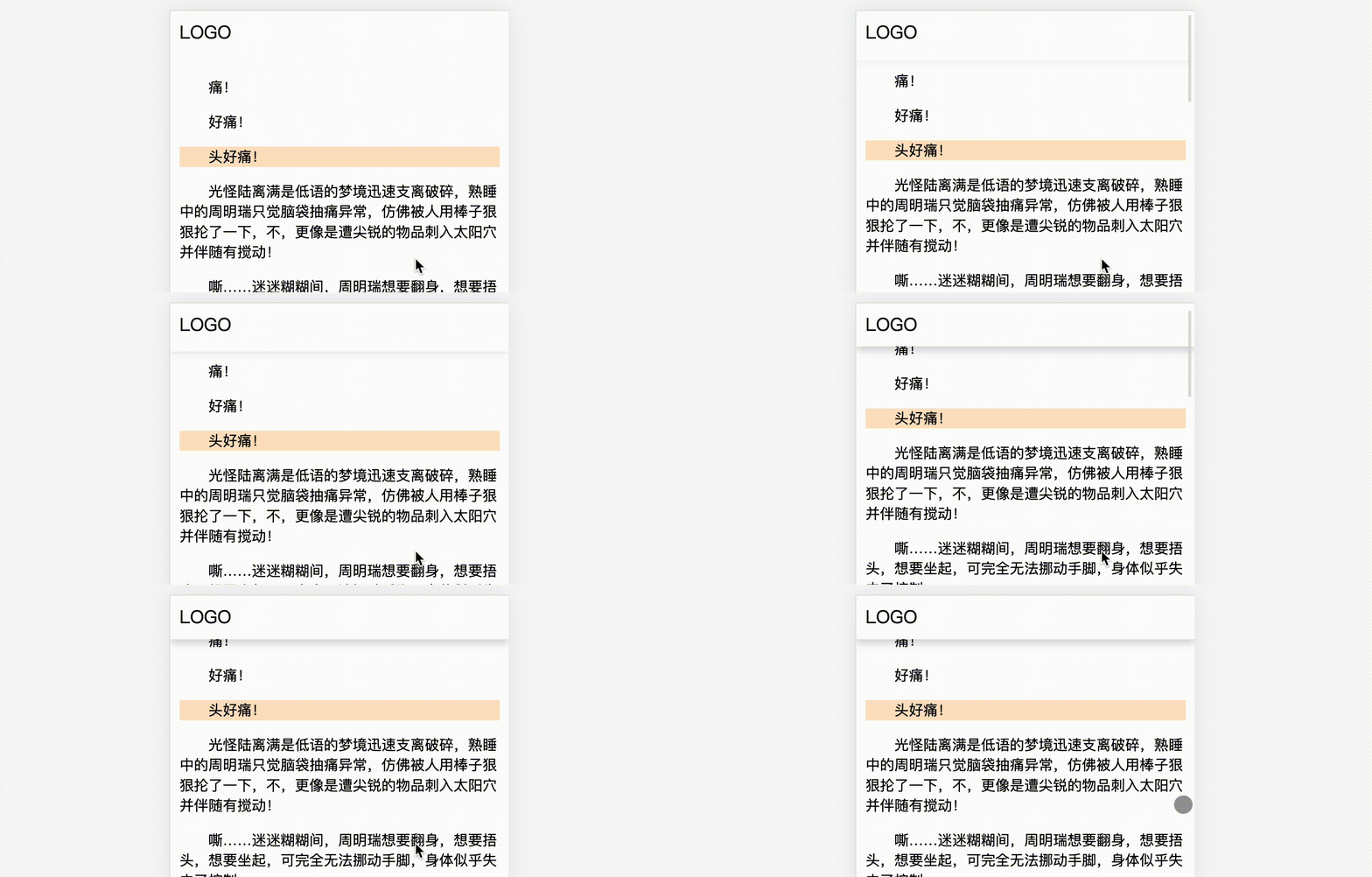
有没有办法让这个过程更柔和一点呢?比如透明度的变化?
当然也是可以的,实现也比较简单。上面比较生硬的原因是,遮挡物是纯色的,如果换成半透明渐变是不是就好一些呢?
shadow::after{
  height: 30px;
  background: linear-gradient(to bottom, #fff 50% , transparent);
}效果如下
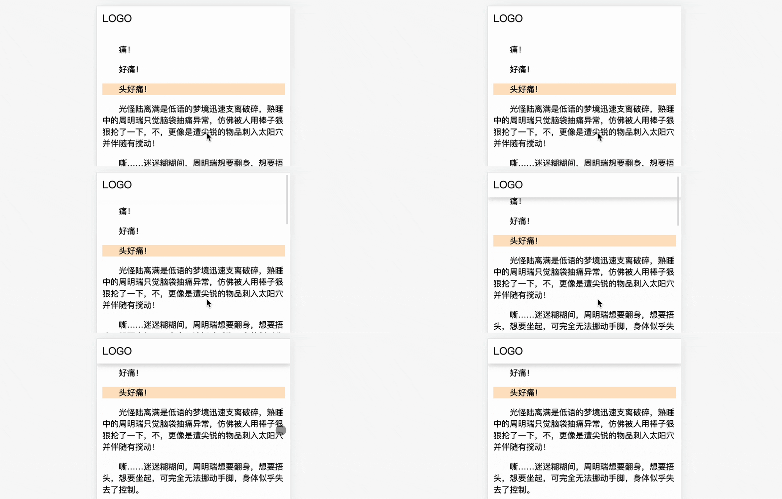
这样阴影出现的效果就不再是“向上推进”的效果,你觉得怎么样呢?
重点来了~下面是完整 CSS 代码(20行不到~)
header{
  position: sticky;
  background: #fff;
  top: 0;
  font-size: 20px;
  padding: 10px;
  z-index: 1;
}
shadow::before{
  content: '';
  box-shadow: 0 0 10px 1px #333;
  position: fixed;
  width: 100%;
}
shadow::after{
  content: '';
  width: 100%;
  height: 30px;
  background: linear-gradient(to bottom, #fff 50% , transparent);
  position: absolute;
}HTML 结构也很简单
<header>LOGO</header>
<shadow></shadow>
<main>很多内容文本</main>
你可以访问在线链接 CSS auto header shadow(codepen.io):
https://codepen.io/xboxyan/pen/yLvdgXw
五、总结和展望
以上就是全部分享内容了,是不是又掌握一个 CSS 小技巧?用到了3个定位属性,几乎零成本,复制几行代码,马上就可以用起来了,下面总结一下实现要点:
固定头部的布局推荐用
sticky实现,好处是可以保留头部占位,无需额外预留整体实现思路是CSS 障眼法和 CSS 层级,相互遮挡
fixed定位在不设置 top 或者 left 值时,仍然位于原先位置,但是会在这个位置固定下来absolute定位在不设置 top 或者 left 值时,仍然位于原先位置,也会跟随内容滚动纯色遮挡在滚动时有些生硬,半透明渐变遮挡在滚动时会更加柔和
在未来,像这类滚动相关的交互都可以通过@scroll-timeline来实现,有兴趣的可以提前了解这方面内容,只是现在几乎不可实际生产使用(目前需要手动开启实验特性),可以预料,随着 CSS 新特性的不断发展,像这类“CSS 奇技淫巧”肯定会被官方逐步替代,体验也会更加完善,但并,并不是说这些思考是无用了,实际需求千千万,官方不可能一一照顾到,就算有规划,有草案,可能已经是多年以后了,所以学习 CSS 一定不要停止思考,停止想象,这大概也是 CSS 比较有趣的地方吧~
(学习视频分享:web前端入门)
The above is the detailed content of How to automatically add head shadow on scroll using pure CSS. For more information, please follow other related articles on the PHP Chinese website!

Hot AI Tools

Undresser.AI Undress
AI-powered app for creating realistic nude photos

AI Clothes Remover
Online AI tool for removing clothes from photos.

Undress AI Tool
Undress images for free

Clothoff.io
AI clothes remover

AI Hentai Generator
Generate AI Hentai for free.

Hot Article

Hot Tools

Notepad++7.3.1
Easy-to-use and free code editor

SublimeText3 Chinese version
Chinese version, very easy to use

Zend Studio 13.0.1
Powerful PHP integrated development environment

Dreamweaver CS6
Visual web development tools

SublimeText3 Mac version
God-level code editing software (SublimeText3)

Hot Topics
 How to isolate styles in components in vue
May 09, 2024 pm 03:57 PM
Style isolation in Vue components can be achieved in four ways: Use scoped styles to create isolated scopes. Use CSS Modules to generate CSS files with unique class names. Organize class names using BEM conventions to maintain modularity and reusability. In rare cases, it is possible to inject styles directly into the component, but this is not recommended.
 How to register for Bitstamp exchange pro? Is it safe? Is it formal?
Aug 13, 2024 pm 06:36 PM
How to register BitstampPro? Visit the BitstampPro website. Fill in your personal information and email address. Create a password and accept the terms. Verify email address. Is BitstampPro safe? Authentication required. Enforce the use of two-factor authentication. Most assets are stored in cold storage. Use HTTPS to encrypt communication. Conduct regular security audits. Is BitstampPro legitimate? Registered in Luxembourg. Regulated by the Luxembourg Financial Supervisory Committee. Comply with anti-money laundering and know-your-customer regulations.
 How to implement the custom table function of clicking to add data in dcat admin?
Apr 01, 2025 am 07:09 AM
How to implement the table function of custom click to add data in dcatadmin (laravel-admin) When using dcat...
 What is the format of the source file?
May 09, 2024 pm 10:51 PM
Source files are uncompiled files containing original code or data, and their formats vary between programming languages and applications. Common formats include text files (.txt, .csv), programming languages (such as .py, .java), markup languages (such as .html, .css), image files (such as .png, .jpg), video files (such as .mp4, .avi), and other formats such as JSON (.json), PDF (.pdf), Word document (.doc), etc.
 The latest ranking list of virtual currency trading platform APP (inventory of top 10 virtual currency trading platforms)
Mar 04, 2025 pm 03:51 PM
This article lists the top ten leading cryptocurrency exchanges in the world, including OKX, Binance, Gate.io, Huobi, Kraken, Coinbase, KuCoin, Crypto.com, Bitfinex and Bitstamp. With their strong technical strength, rich product lines, strict compliance operations and innovative ecological construction, these exchanges have taken the lead in the global cryptocurrency market. The article will introduce their special functions, technical architecture, security measures, compliance qualifications and ecosystem construction respectively, providing reference for investors to choose a suitable trading platform.
 What does z-index mean?
May 09, 2024 pm 11:21 PM
z-index is a CSS property that controls the order in which elements overlap on the page, similar to the order in which paper is stacked. Here's how it works: Every element has a default z-index value of 0. Elements with higher z-index values will overwrite elements with lower z-index values. z-index can be used to create floating elements, control the order of overlapping elements, and create three-dimensional effects. When using, you need to consider things such as avoiding overuse, using negative values, and paying attention to browser compatibility.
 Share the top ten official website addresses of the world's formal virtual currency trading software in 2025
Feb 15, 2025 pm 04:42 PM
With the development of the cryptocurrency market, formal virtual currency trading software has become the focus of investors' attention. In the fierce competition, some trading platforms stand out and provide safe and reliable services. According to industry research and comprehensive rankings, this article will list the top ten best virtual currency trading software in the world in 2025 and provide its official website address. These platforms have been strictly reviewed and are designed to provide users with excellent trading experience and investment guarantees.
 What exactly is Bitstamp exchange like? Is Bitstamp exchange safe?
Aug 16, 2024 pm 06:02 PM
The Bitstamp exchange is known for its security and reliability, boasting the following features: Cold Storage and Multi-Signature: Most funds are stored offline, requiring multiple authorizations to approve transactions. Compliance and Regulation: Regulated by the Luxembourg Financial Regulatory Commission and compliant with anti-money laundering and KYC regulations. Network security measures: including DDoS protection, SSL encryption and regular security audits. Insurance and Fund Protection: Theft or loss is insured by Lloyd's of London and has a backup fund to protect user funds. Customer support and response: 24/7 customer support, right on the matter


