
 Web Front-end
Front-end Q&A
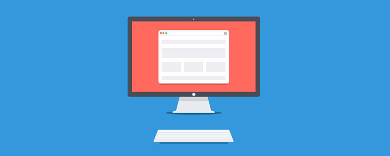
Let's talk about height design in responsive web pages. Do you need to reduce the height of the browser?
Web Front-end
Front-end Q&A
Let's talk about height design in responsive web pages. Do you need to reduce the height of the browser?
Let's talk about height design in responsive web pages. Do you need to reduce the height of the browser?

When you see this title, you may think it’s a typo again, responsive height design? Are you serious? Because "responsive web design" typically checks browsers on multiple widths and device sizes. We generally adjust horizontal responsiveness by reducing the width, but I rarely see consideration of vertical responsiveness by reducing the browser height. At this time, Zhimimi may have a slight fluctuation in his heart, with some questions: Do we need to lower the height of the browser? Yeah, let's keep talking about it.
When we are designing a website, it is not good to make assumptions without relying on actual data. The responsibility of horizontal and vertical testing is also very important.
Why test the height?
For a designer, an unreasonable assumption is one of the important factors that ruins a website design. For example, it is incorrect to assume that users must be browsing a website by using the full width and height of the screen. Instead, we need to consider the worst-case scenario.

Zhimi, do you understand? The reality is that not all users use browsers the way we expect them to. I find that the website looks terrible when I lower the browser height.
Browser DevTools
Resizing the browser (vertically) is not the only way to change the viewport height. When we open the browser DevTools, it will also occupy the height of the browser.

The arrow area in the above figure represents the height of the current viewport. For smaller laptop screens, we will only see a small part of the web page.
The real question is: can we enhance the user experience when the viewport height is smaller? Yes, it's possible, let's take a look.
Vertical Thinking in CSS
As designers and developers, some of us only focus on the width changes of the design and ignore the viewport height changes. For example, in development, the UI provides variations of specific components across different viewport widths. But what about different viewport heights?

#In the image above, we have a navigation menu that adjusts based on the height of the viewport. . If the viewport size is small (e.g., iPhone 5), navigation items will appear as a two-column grid. This way of thinking is often abandoned, or optimized until someone says it should be done.
The above requirements can be achieved in two different ways in CSS:
- Vertical media queries
- Viewport units
Vertical Media Queries
Zhimimi must know how to use width media queries in CSS.
@media (min-width: 700px) {
  .element {
    /* do something.. */
  }
}Less commonly used is the vertical media query, which checks the viewport height.
@media (min-height: 500px) {
  .element {
    /* do something.. */
  }
}

/* or */

@media (orientation: landscape) {
  .element {
    /* do something.. */
  }
}Viewport Units
Using Viewport Units can help provide a better experience for users. For example, control the vertical spacing between elements based on the viewport height.
.hero__title {
  margin-bottom: calc(10px + 5vh);
}
As shown above, for larger screens (such as iMac 27 inches), the bottom margin will become very large. We have two ways to solve the problem of excessive margins.
- Media queries
- CSS comparison function
The first way (media queries) is more supported. If the screen is large, we need to set a maximum value for the bottom margin.
@media (min-width: 2200px) {
  .hero__title {
    margin-bottom: 40px;
  }
}Another method is to use CSS clamp()Comparison function, clamp() The function of the function is to return a value in an interval range.
.hero__title {
  margin-bottom: clamp(10px, 5vh, 40px);
}Use Case 1: Overlapping Content
In this example, there is a section area with titles and illustrations in it, and the section height is equal to 100% of the viewport height.

Everything looks fine until the viewport height gets smaller. The height of the section will not be enough to accommodate the illustrations and text content. Therefore, it will overlap other parts on the page.

Note how the illustration overlaps the section below. This happens because there is enough vertical space. Take a look at HTML and CSS.
<p>
  </p><p>
    </p><p><!-- content --></p>
    <img  class="hero__thumb lazy" src="/static/imghw/default1.png" data-src="figure.png" alt="Let's talk about height design in responsive web pages. Do you need to reduce the height of the browser?" >
css
.hero {
  height: 100vh;
}

.hero__thumb {
  flex: 0 0 550px;
  width: 550px;
}The following are several solutions to solve such problems:
- 为插图设置固定大小(宽度和高度),而不是仅设置宽度,缺乏高度将会继续存在这个问题。
- 仅当视口高度大于
700px时才为height: 100vh(媒体查询值可能会根据上下文而有所不同)。
我们可以将两者结合起来,获得更强大的解决方案。
.hero__thumb {
  width: 400px;
  height: 300px;
  object-fit: contain; /* To avoid compressing the image */
}

@media (min-height: 700px) {
  .hero {
    height: 100vh;
}好的,现在我们同意使用垂直媒体查询更好。然而,使用100vh是有风险的,因为即使我们限制了插图的大小,也可能无法对文本内容执行相同的操作。如果文本内容变长,同样的问题会再次发生,参见下图:

为了解决这个问题,我们可以使用min-height而不是height。 这样,如果内容变长,高度将扩大并且不会重叠。
@media (min-height: 700px) {
  .hero {
    min-height: 100vh;
  }
}固定头部
在滚动时固定标题并不是一件坏事,但是,我们要确保只有在垂直空间足够好的情况下才固定标题,这样体验才会好。

这是一个关于风景类的网站,这里我们可以看到,当高度过小的时候,这个固定高度整体就会占用很大的空间。这个对用户真的重要吗?大多数情况是不重要的,因为一般用户不会缩小成这样去看一个网站。当前,如果我们要优化也是可以就是,思路就是通过垂直媒体查询,判断高度小于某个高度的时候就将固定定位改成静态定位。
@media (min-height: 700px) {
  .site-header {
    /* position: fixed or position: sticky */
  }
}隐藏不太重要的元素
我在Twitter.com的导航栏上注意到了这个模式。其思想是将垂直媒体查询和Priority+模式结合起来。

调整视口高度的大小时,次重要的元素(书签和列表)将被删除并附加到“更多”菜单中,这是垂直媒体查询的一个很好的用例。
.nav__item--secondary {
  display: none;
}

@media (min-height: 700px) {
  .nav__item--secondary {
    display: block;
  }
}减少间距-导航
如果我们网站有侧边栏或侧边栏,当视口高度很小时,我们可以减少一些导航项之间的垂直间距,这也会增强整体设计。

.nav__item {
  padding-top: 4px;
  padding-bottom: 4px;
}

@media (min-height: 700px) {
  .nav__item {
    padding-top: 10px;
    padding-bottom: 10px;
  }
}模态框
我们知道,模态框至少应该水平居中。但是,有时我们还需要垂直居中,我们一般会使用下面的方案:
.modal__body {
  position: absolute;
  left: 50%;
  top: 50%;
  transform: translate(-50%, -50%);
  width: 500px;
}
但是,当内容变长时就会有问题,模态框会垂直填满屏幕,用户将无法滚动它。

引发这种情况下,有几点原因:
- 模态框没有高度
- 模态垂直居中(这会问题更快的出现)
下面是修复后的 css:
.modal__body {
  position: absolute;
  left: 50%;
  top: 3rem;
  transform: translateX(-50%);
  width: 500px;
  min-height: 200px;
  max-height: 500px;
  overflow-y: auto;
}

@media (min-height: 700px) {
  .modal__body {
    top: 50%;
    transform: translate(-50%, -50%);
  }
}注意,我使用了min-height和max-height。 min-height是即使内容很短也要保持模态看起来好,max-height是使用特定值限制其高度,而不是添加固定的高度。

总结
在设计一种体验时,最好从宽度和高度的角度来考虑。垂直地调整浏览器的大小可能有点奇怪,但它也有它的优势。在本文中,我们讨论了垂直测试的重要性,以及我们如何进行垂直测试,最后,提出了一些示例和用例,希望对智米们有用。
(学习视频分享:web前端)
The above is the detailed content of Let's talk about height design in responsive web pages. Do you need to reduce the height of the browser?. For more information, please follow other related articles on the PHP Chinese website!

Hot AI Tools

Undresser.AI Undress
AI-powered app for creating realistic nude photos

AI Clothes Remover
Online AI tool for removing clothes from photos.

Undress AI Tool
Undress images for free

Clothoff.io
AI clothes remover

AI Hentai Generator
Generate AI Hentai for free.

Hot Article
Hot Tools

Notepad++7.3.1
Easy-to-use and free code editor

SublimeText3 Chinese version
Chinese version, very easy to use

Zend Studio 13.0.1
Powerful PHP integrated development environment

Dreamweaver CS6
Visual web development tools

SublimeText3 Mac version
God-level code editing software (SublimeText3)
Hot Topics
 1368
1368
 52
52

 Tutorial on using CSS to implement responsive image automatic carousel effect
Nov 21, 2023 am 08:37 AM
Tutorial on using CSS to implement responsive image automatic carousel effect
Nov 21, 2023 am 08:37 AM
With the popularity of mobile devices, web design needs to take into account factors such as device resolution and screen size of different terminals to achieve a good user experience. When implementing responsive design of a website, it is often necessary to use the image carousel effect to display the content of multiple images in a limited visual window, and at the same time, it can also enhance the visual effect of the website. This article will introduce how to use CSS to achieve a responsive image automatic carousel effect, and provide code examples and analysis. Implementation ideas The implementation of responsive image carousel can be implemented through CSS flex layout. exist
 PHP and Vue: a perfect pairing of front-end development tools
Mar 16, 2024 pm 12:09 PM
PHP and Vue: a perfect pairing of front-end development tools
Mar 16, 2024 pm 12:09 PM
PHP and Vue: a perfect pairing of front-end development tools. In today's era of rapid development of the Internet, front-end development has become increasingly important. As users have higher and higher requirements for the experience of websites and applications, front-end developers need to use more efficient and flexible tools to create responsive and interactive interfaces. As two important technologies in the field of front-end development, PHP and Vue.js can be regarded as perfect tools when paired together. This article will explore the combination of PHP and Vue, as well as detailed code examples to help readers better understand and apply these two
 Tutorial on implementing responsive sliding menu using CSS
Nov 21, 2023 am 08:08 AM
Tutorial on implementing responsive sliding menu using CSS
Nov 21, 2023 am 08:08 AM
A tutorial on using CSS to implement a responsive sliding menu requires specific code examples. In modern web design, responsive design has become an essential skill. To accommodate different devices and screen sizes, we need to add a responsive menu to the website. Today, we will use CSS to implement a responsive sliding menu and provide you with specific code examples. First, let's take a look at the implementation. We will create a navigation bar that automatically collapses when the screen width is smaller than a certain threshold and expands by clicking the menu button.
 How to create a responsive tag cloud using HTML, CSS and jQuery
Oct 27, 2023 am 10:46 AM
How to create a responsive tag cloud using HTML, CSS and jQuery
Oct 27, 2023 am 10:46 AM
How to use HTML, CSS and jQuery to create a responsive tag cloud. A tag cloud is a common web element used to display various keywords or tags. It usually displays the importance of keywords in different font sizes or colors. In this article, we will introduce how to use HTML, CSS and jQuery to create a responsive tag cloud, and give specific code examples. Creating the HTML Structure First, we need to create the basic structure of the tag cloud in HTML. You can use an unordered list to represent tags
 Questions frequently asked by front-end interviewers
Mar 19, 2024 pm 02:24 PM
Questions frequently asked by front-end interviewers
Mar 19, 2024 pm 02:24 PM
In front-end development interviews, common questions cover a wide range of topics, including HTML/CSS basics, JavaScript basics, frameworks and libraries, project experience, algorithms and data structures, performance optimization, cross-domain requests, front-end engineering, design patterns, and new technologies and trends. . Interviewer questions are designed to assess the candidate's technical skills, project experience, and understanding of industry trends. Therefore, candidates should be fully prepared in these areas to demonstrate their abilities and expertise.
 Is Django front-end or back-end? check it out!
Jan 19, 2024 am 08:37 AM
Is Django front-end or back-end? check it out!
Jan 19, 2024 am 08:37 AM
Django is a web application framework written in Python that emphasizes rapid development and clean methods. Although Django is a web framework, to answer the question whether Django is a front-end or a back-end, you need to have a deep understanding of the concepts of front-end and back-end. The front end refers to the interface that users directly interact with, and the back end refers to server-side programs. They interact with data through the HTTP protocol. When the front-end and back-end are separated, the front-end and back-end programs can be developed independently to implement business logic and interactive effects respectively, and data exchange.
 C# development experience sharing: front-end and back-end collaborative development skills
Nov 23, 2023 am 10:13 AM
C# development experience sharing: front-end and back-end collaborative development skills
Nov 23, 2023 am 10:13 AM
As a C# developer, our development work usually includes front-end and back-end development. As technology develops and the complexity of projects increases, the collaborative development of front-end and back-end has become more and more important and complex. This article will share some front-end and back-end collaborative development techniques to help C# developers complete development work more efficiently. After determining the interface specifications, collaborative development of the front-end and back-end is inseparable from the interaction of API interfaces. To ensure the smooth progress of front-end and back-end collaborative development, the most important thing is to define good interface specifications. Interface specification involves the name of the interface
 Exploring Go language front-end technology: a new vision for front-end development
Mar 28, 2024 pm 01:06 PM
Exploring Go language front-end technology: a new vision for front-end development
Mar 28, 2024 pm 01:06 PM
As a fast and efficient programming language, Go language is widely popular in the field of back-end development. However, few people associate Go language with front-end development. In fact, using Go language for front-end development can not only improve efficiency, but also bring new horizons to developers. This article will explore the possibility of using the Go language for front-end development and provide specific code examples to help readers better understand this area. In traditional front-end development, JavaScript, HTML, and CSS are often used to build user interfaces
