 Web Front-end
 CSS Tutorial
 Use CSS skillfully to realize various strange-shaped buttons (with code)
Use CSS skillfully to realize various strange-shaped buttons (with code)
This article will show you how to use CSS to easily realize various strange-shaped buttons that appear frequently. I hope it will be helpful to everyone!

How to use CSS to implement an inset corner button, and how to implement a button with an arrow?
This article is based on some buttons that appear frequently in design drafts and use CSS to implement slightly difficult and tricky buttons, and explains how to use CSS to implement them as much as possible. [Recommended learning: css video tutorial]
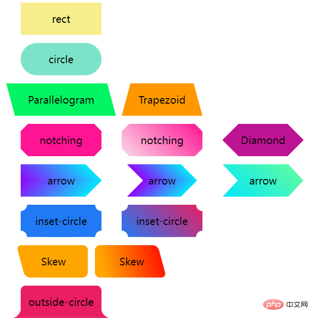
Let us first take a look at these button shapes that often appear:

Rectangle And rounded corner buttons
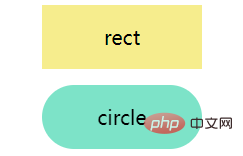
Normally speaking, there are only two types of buttons we encounter-rectangular and rounded corners:

They are very simple. Width, height, rounded corners and background color.
<div class='btn rect'>rect</div> <div class='btn circle'>circle</div>
.btn {
    margin: 8px auto;
    flex-shrink: 0;
    width: 160px;
    height: 64px;
}
.rect {
    background: #f6ed8d;
}

.circle {
    border-radius: 64px;
    background: #7de3c8;
}Trapezoid and Parallelogram
Next, based on the deformation of the rectangle, the Trapezoid and Parallelogram buttons will often appear.
To achieve them, you can mainly use transform, but please note that after using transform, the text in the label will also be deformed in the same way, so we usually Use pseudo-elements of elements to achieve styling, so that the text within the button is not affected.
Parallelogram
Use transform: skewX(). Pay attention to the above and use the pseudo-element of the element to implement the parallelogram without affecting the internal text. .
<div class='btn parallelogram'>Parallelogram</div>
.parallelogram {
    position: relative;
    width: 160px;
    height: 64px;

    &::before {
        content: "";
        position: absolute;
        top: 0;
        left: 0;
        bottom: 0;
        right: 0;
        background: #03f463;
        transform: skewX(15deg);
    }
}
If you don’t want to use pseudo-elements, in addition to transform: skewX(), parallelograms can also be implemented using gradients.
It's probably like this:
{
    background: linear-gradient(45deg, transparent 22%, #04e6fb 22%, #9006fb 78%, transparent 0);
}Trapezoid
The trapezoid is a little more complicated than the parallelogram. It relies more on perspective. In fact, it uses a certain amount of 3D transformation. The principle is a rectangle rotating around the X axis, like this:

Use perspective and transform: rotateX() That’s it, of course, they can be written together:
<div class='btn trapezoid'>Trapezoid</div>
.parallelogram {
    position: relative;
    width: 160px;
    height: 64px;

    &::after {
          content:"";
          position: absolute;
          top: 0; right: 0; bottom: 0; left: 0;
          transform: perspective(40px) rotateX(10deg);
          transform-origin: bottom;
          background: #ff9800;
    }
}
Cut corners--solid color background and gradient background
The next step is the corner graphics , the most common method is mainly achieved with the help of gradientlinear-gradient, look at such a graph
<div></div>
.notching {
    background: linear-gradient(135deg, transparent 10px, #ff1493 0);
    background-repeat: no-repeat;
}The result is as follows,

Based on this, we only need to use multiple gradients to achieve 4 such graphics, and use background-position to locate the four corners:
<div class="notching">notching</div>
.notching {
    background:
        linear-gradient(135deg, transparent 10px, #ff1493 0) top left,
        linear-gradient(-135deg, transparent 10px, #ff1493 0) top right,
        linear-gradient(-45deg, transparent 10px, #ff1493 0) bottom right,
        linear-gradient(45deg, transparent 10px, #ff1493 0) bottom left;
    background-size: 50% 50%;
    background-repeat: no-repeat;
}
Use clip-path to realize the corner graphics of the gradient background
Of course, there is a problem with this technique. When the background color is required to be a gradient color, this method is more clumsy.
Fortunately, we have another way to use clip-path to cut out a corner shape. In this way, the background color can be any customized color, whether it is a gradient or a solid color It’s all a piece of cake:
<div class="clip-notching">notching</div>
.clip-notching {
    background: linear-gradient(
        45deg,
        #f9d9e7,
        #ff1493
    );
    clip-path: polygon(
        15px 0,
        calc(100% - 15px) 0,
        100% 15px,
        100% calc(100% - 15px),
        calc(100% - 15px) 100%,
        15px 100%,
        0 calc(100% - 15px),
        0 15px
    );
} Simply implement a gradient background, and then the core is to use clip-path: polygon() to cut out what we want based on the gradient rectangular graphic The shape (an 8-sided polygon):

Of course, the above code is very easy to think of the following 6-sided polygon, using gradients and clip-path can be easily obtained:

Arrow button
The next is the arrow button, carefully observe the corner cut button above, when the corners on both sides are cut When it drops enough, it becomes an arrow shape.
We can use double gradients to implement a single arrow button:
<div class="arrow">arrow</div>
&.arrow {
    background: linear-gradient(
                -135deg,
                transparent 22px,
                #04e6fb 22px,
                #65ff9a 100%
            )
            top right,
        linear-gradient(
                -45deg,
                transparent 22px,
                #04e6fb 22px,
                #65ff9a 100%
            )
            bottom right;
    background-size: 100% 50%;
    background-repeat: no-repeat;
}An arrow comes out:

它是由上下两个渐变块组合得到的,换个颜色立马就能明白:

那如果是这样一个箭头造型呢?

一样的,它也是两个渐变的叠加,渐变的颜色是透明 --> 颜色A --> 颜色B --> 透明。当然,同样在这里也可以使用 clip-path:
这里给出 clip-path 的解法:
{
    background: linear-gradient(45deg, #04e6fb, #65ff9a);
    clip-path: polygon(
        0 0,
        30px 50%,
        0 100%,
        calc(100% - 30px) 100%,
        100% 50%,
        calc(100% - 30px) 0
    );
}内切圆角
下面这个按钮形状,多出现于优惠券,最常见的解法,也是使用渐变,当然,与切角不同,这里使用的径向渐变。
首先,看这样一个简单的例子:
<div></div>
div {
    background-image: radial-gradient(circle at 100% 100%, transparent 0, transparent 12px, #2179f5 12px);
}可以得到这样一个图形:

所以,只需控制下 background-size,在 4 个角实现 4 个这样的图形即可:
<div class="inset-circle">inset-circle</div>
&.inset-circle {
    background-size: 70% 70%;
    background-image: radial-gradient(
            circle at 100% 100%,
            transparent 0,
            transparent 12px,
            #2179f5 13px
        ),
        radial-gradient(
            circle at 0 0,
            transparent 0,
            transparent 12px,
            #2179f5 13px
        ),
        radial-gradient(
            circle at 100% 0,
            transparent 0,
            transparent 12px,
            #2179f5 13px
        ),
        radial-gradient(
            circle at 0 100%,
            transparent 0,
            transparent 12px,
            #2179f5 13px
        );
    background-repeat: no-repeat;
    background-position: right bottom, left top, right top, left bottom;
}
借助 mask 实现渐变的内切圆角按钮
如果背景色要求渐变怎么办呢?
假设我们有一张矩形背景图案,我们只需要使用 mask 实现一层遮罩,利用 mask 的特性,把 4 个角给遮住即可。
mask 的代码和上述的圆角切角代码非常类似,简单改造下即可得到渐变的内切圆角按钮:
<div class="mask-inset-circle">inset-circle</div>
.mask-inset-circle {
    background: linear-gradient(45deg, #2179f5, #e91e63);
    mask: radial-gradient(
            circle at 100% 100%,
            transparent 0,
            transparent 12px,
            #2179f5 13px
        ),
        radial-gradient(
            circle at 0 0,
            transparent 0,
            transparent 12px,
            #2179f5 13px
        ),
        radial-gradient(
            circle at 100% 0,
            transparent 0,
            transparent 12px,
            #2179f5 13px
        ),
        radial-gradient(
            circle at 0 100%,
            transparent 0,
            transparent 12px,
            #2179f5 13px
        );
    mask-repeat: no-repeat;
    mask-position: right bottom, left top, right top, left bottom;
    mask-size: 70% 70%;
}这样,我们就得到了这样一个图形:

当然,读懂上述代码,你需要首先弄清楚 CSS
mask属性的原理,如果你对它还有些陌生,可以看看我的这篇文章:《奇妙的 CSS MASK》:https://github.com/chokcoco/iCSS/issues/80
圆角不规则矩形
下面这个按钮形状,也是最近被问到最多的,先来看看它的造型:

不太好给它起名,一侧是规则的带圆角直角,另外一侧则是带圆角的斜边。
其实,它就是由圆角矩形 + 圆角平行四边形组成:

所以,借助两个伪元素,可以轻松的实现它们:
<div class="skew">Skew</div>
.skew {
    position: relative;
    width: 120px;

    &::after {
        content: "";
        position: absolute;
        top: 0;
        left: 0;
        right: 0;
        bottom: 0;
        border-radius: 10px;
        background: orange;
        transform: skewX(15deg);
    }
    &::before {
        content: "";
        position: absolute;
        top: 0;
        right: -13px;
        width: 100px;
        height: 64px;
        border-radius: 10px;
        background: orange;
    }
}
由于一个伪元素叠加在另外一个之上,所以对其中一个使用渐变,一个则是纯色,其颜色是可以完美衔接在一起的,这样就实现了渐变色的该图形:

外圆角按钮
接下来这个按钮形状,常见于 Tab 页上,类似于 Chrome 的分页:

我们对这个按钮形状拆解一下,这里其实是 3 块的叠加:

只需要想清楚如何实现两侧的弧形三角即可。这里还是借助了渐变 -- 径向渐变,其实他是这样,如下图所示,我们只需要把黑色部分替换为透明即可,使用两个伪元素即可:

代码如下:
<div class="outside-circle">outside-circle</div>
.outside-circle {
    position: relative;
    background: #e91e63;
    border-radius: 10px 10px 0 0;

    &::before {
        content: "";
        position: absolute;
        width: 20px;
        height: 20px;
        left: -20px;
        bottom: 0;
        background: #000;
        background:radial-gradient(circle at 0 0, transparent 20px, #e91e63 21px);
    }
    &::after {
        content: "";
        position: absolute;
        width: 20px;
        height: 20px;
        right: -20px;
        bottom: 0;
        background: #000;
        background:radial-gradient(circle at 100% 0, transparent 20px, #e91e63 21px);
    }
}即可得到:

You can see the complete code for all the above graphics here: CodePen Demo -- CSS Various Button Shapes | CSS Various Shape Buttons
https://codepen.io/Chokcoco/pen/QWMoBGO?editors=1100
To summarize
Based on the above implementation, it is not difficult for us to find that some slightly special buttons, It is all achieved through splicing, blindfolding, masking, etc.
And among them:
- Gradient (linear gradient
linear-gradient, radial gradientradial-gradient, multiple gradient) - Mask
mask - Crop
clip-path - Transform
transform
plays an important role. If we use them skillfully, we can handle these graphics at our fingertips, and we can also face the deformations based on them calmly.
The above graphics, combined with filter: drop-shadow(), can basically achieve irregular shadows.
Furthermore, more complex graphics are as follows:

Let’s cut the picture. Although CSS is good, you need to consider the investment in actual use. output ratio.
Finally
The purpose of this article is more of a simple manual. In practice, there may be better ways to achieve the above effects. This article does not enumerate them one by one. Additional corrections are welcome. .
Okay, this article ends here, I hope this article will be helpful to you:)
Original address: https://segmentfault.com/a/1190000041044028
Author: chokcoco
(Learning video sharing: Getting started with web front-end)
The above is the detailed content of Use CSS skillfully to realize various strange-shaped buttons (with code). For more information, please follow other related articles on the PHP Chinese website!

Hot AI Tools

Undresser.AI Undress
AI-powered app for creating realistic nude photos

AI Clothes Remover
Online AI tool for removing clothes from photos.

Undress AI Tool
Undress images for free

Clothoff.io
AI clothes remover

AI Hentai Generator
Generate AI Hentai for free.

Hot Article

Hot Tools

Notepad++7.3.1
Easy-to-use and free code editor

SublimeText3 Chinese version
Chinese version, very easy to use

Zend Studio 13.0.1
Powerful PHP integrated development environment

Dreamweaver CS6
Visual web development tools

SublimeText3 Mac version
God-level code editing software (SublimeText3)

Hot Topics
 1378
1378
 52
52
 How to write split lines on bootstrap
Apr 07, 2025 pm 03:12 PM
There are two ways to create a Bootstrap split line: using the tag, which creates a horizontal split line. Use the CSS border property to create custom style split lines.
 How to insert pictures on bootstrap
Apr 07, 2025 pm 03:30 PM
There are several ways to insert images in Bootstrap: insert images directly, using the HTML img tag. With the Bootstrap image component, you can provide responsive images and more styles. Set the image size, use the img-fluid class to make the image adaptable. Set the border, using the img-bordered class. Set the rounded corners and use the img-rounded class. Set the shadow, use the shadow class. Resize and position the image, using CSS style. Using the background image, use the background-image CSS property.
 How to resize bootstrap
Apr 07, 2025 pm 03:18 PM
To adjust the size of elements in Bootstrap, you can use the dimension class, which includes: adjusting width: .col-, .w-, .mw-adjust height: .h-, .min-h-, .max-h-
 The Roles of HTML, CSS, and JavaScript: Core Responsibilities
Apr 08, 2025 pm 07:05 PM
HTML defines the web structure, CSS is responsible for style and layout, and JavaScript gives dynamic interaction. The three perform their duties in web development and jointly build a colorful website.
 How to set up the framework for bootstrap
Apr 07, 2025 pm 03:27 PM
To set up the Bootstrap framework, you need to follow these steps: 1. Reference the Bootstrap file via CDN; 2. Download and host the file on your own server; 3. Include the Bootstrap file in HTML; 4. Compile Sass/Less as needed; 5. Import a custom file (optional). Once setup is complete, you can use Bootstrap's grid systems, components, and styles to create responsive websites and applications.
 How to use bootstrap button
Apr 07, 2025 pm 03:09 PM
How to use the Bootstrap button? Introduce Bootstrap CSS to create button elements and add Bootstrap button class to add button text
 How to view the date of bootstrap
Apr 07, 2025 pm 03:03 PM
Answer: You can use the date picker component of Bootstrap to view dates in the page. Steps: Introduce the Bootstrap framework. Create a date selector input box in HTML. Bootstrap will automatically add styles to the selector. Use JavaScript to get the selected date.
 How to use bootstrap in vue
Apr 07, 2025 pm 11:33 PM
Using Bootstrap in Vue.js is divided into five steps: Install Bootstrap. Import Bootstrap in main.js. Use the Bootstrap component directly in the template. Optional: Custom style. Optional: Use plug-ins.


